Why you can trust TechRadar

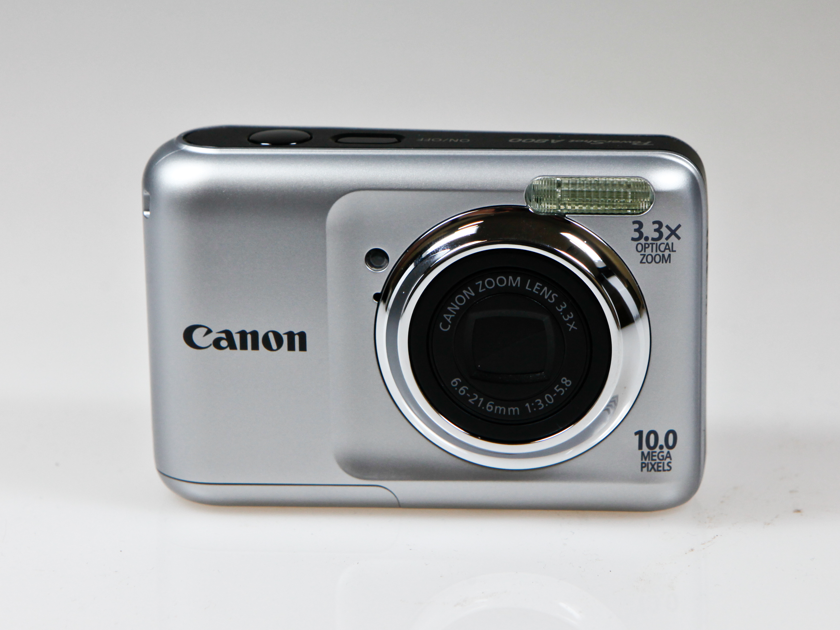
The PowerShot A800 replaces the PowerShot A495, but it's a minor upgrade rather than a great leap forward. However, it's certainly no cosmetic upgrade, as the boxy looks and portly girth evoke a compact camera from five years ago. Indeed, the PowerShot A800 is a porker compared to the sleeker (and pricier) IXUS range, and while you can just about squeeze it in a pocket, the camera will create an unsightly/embarrassing bulge.
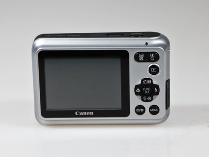
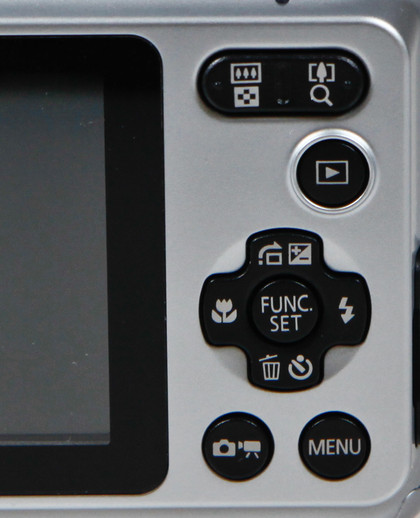
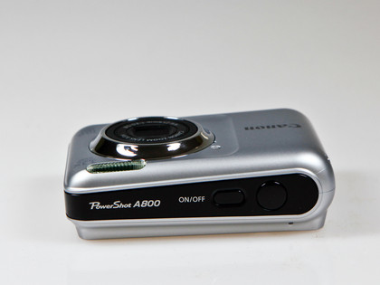
Although the body's made from plastic, it feels sturdy enough, with a reassuringly robust lens cover. The button layout is logical, but there are a few ergonomic niggles. The power button is frustratingly close to the shutter release button, for instance, and some of the button icons might not be very obvious to beginners/casual photographers.
Having two buttons for key camera settings (Menu and Func. Set) isn't unusual these days, but it could further confuse newbies. Also, it's not at all obvious how to access the Scene Modes either, so much so that we reckon many owners won't even realise they're on offer (they're activated via the button with the camera icon next to Menu).

Meanwhile, the shutter release button feels crude, and it tends to fire when you only want to depress it half way. All these are minor hassles rather than deal-breakers, however, and a few minutes with the manual should sort most people out.

The menu system is up to Canon's usual standard and the camera very easy to use once you've figured out what's accessed by the Menu button and what's accessed by Func Set. Battery life has been boosted too, and you can now fire off 300 shots before the juice runs out.
Current page: Canon PowerShot A800: Build quality and handling
Prev Page Canon PowerShot A800: Overview Next Page Canon PowerShot A800: Performance