Why you can trust TechRadar
Panasonic Lumix DMC-FS18 Review: Build quality & handling
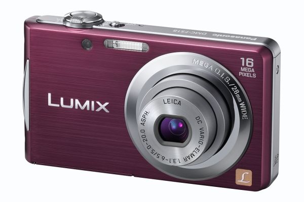
When you first remove the Lumix DMC FS18 from its box, the neat, lightweight, sturdy build is apparent, and the selective use of chrome trim gives the camera an up to date feel.
The ergonomics are well thought out, and the slightly raised thumb pad and function buttons are perfectly placed for thumb operation. The buttons stand slightly proud of the rear surface, and operate with a positive click giving user confidence.
There is a Q.Menu button that allows quick access to well laid out and easy to follow sub menus. Next to this is a Display button that toggles through three different displays on the rear screen. The user can have all the cameras' information displayed, none at all or a noughts and crosses style fine line grid to assist composition, which will prove a useful feature for novices.
Beginners will also be pleased to see the no nonsense menu layout is logical and simple to navigate around whatever mode the camera is in, and the shooting mode choices are large and clear so it is unlikely the wrong one could be selected.
The Lumix DMC FS is designed to give optimum results in a simple package and this is it does extremely well.
Current page: Panasonic Lumix DMC-FS18 Review: Build quality
Prev Page Panasonic Lumix DMC-FS18 Review: Overview Next Page Panasonic Lumix DMC-FS18 Review: Performance