Why you can trust TechRadar
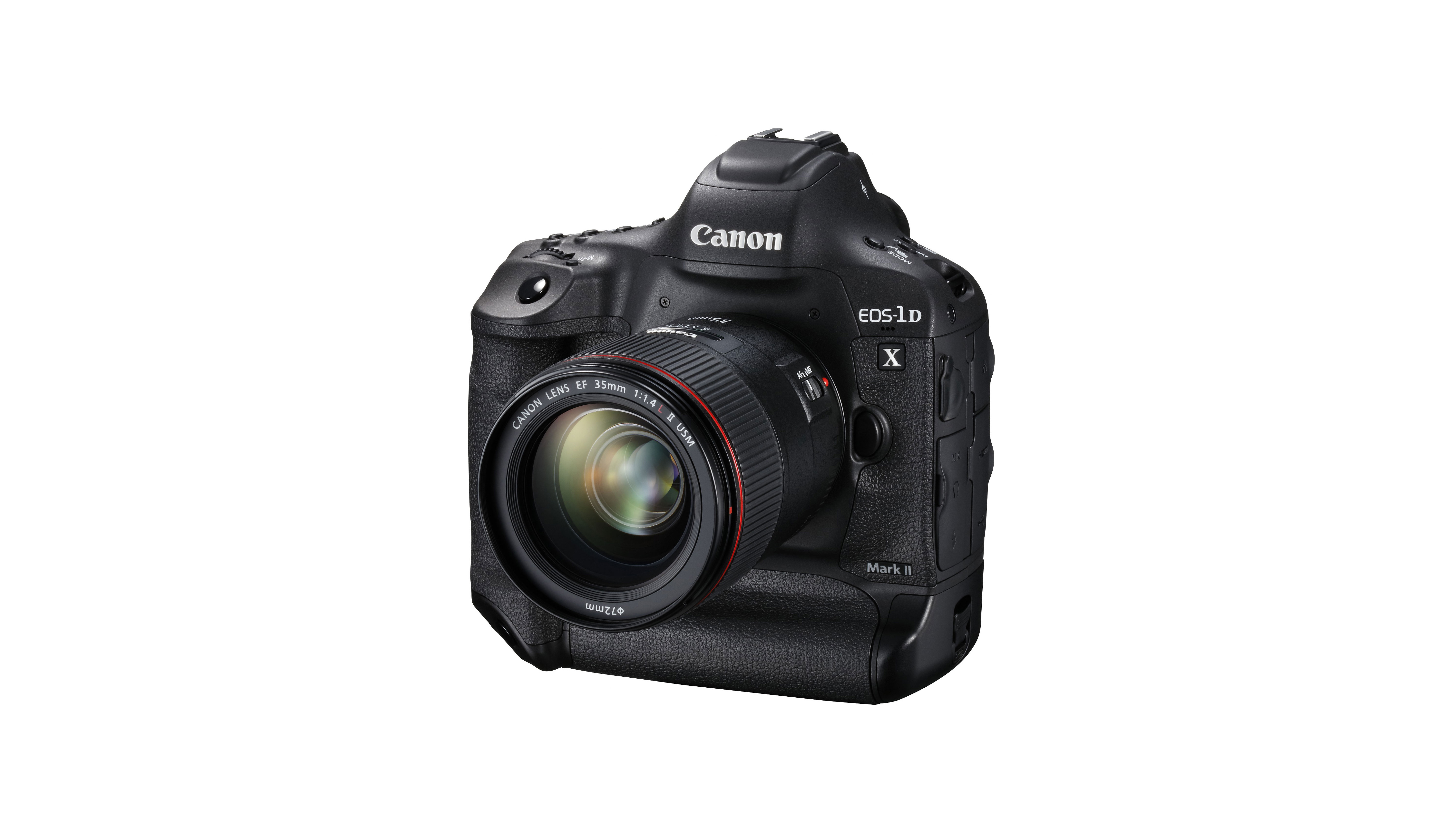
Just like the camera it replaces, the Canon EOS-1D X Mk II is a big brute of a camera, with a magnesium alloy shell and weatherproof seals that keep the high-tech insides well protected. It also looks very similar to the old model, with a familiar control arrangement that makes swapping between the two very easy.
One of the most distinguishing features of this type of camera is the twin-grip arrangement, with a vertical grip being integral to the body in addition to the standard horizontal grip; it makes shooting upright images that little bit more comfortable.

Significantly with the 1D X Mk II, when you reach out with your thumb for the mini-joystick controller to shift the AF point, it's in the same location whichever grip you're holding. This makes it easier to find, especially in the early days when you're familiarising yourself with the camera – and it's something that Nikon hasn't managed to do with its D5.
The vertical grip has other controls associated with it, including a shutter release, a main dial and an AF area selection mode button, all conveniently placed for your index finger. There's also a row of three buttons on the back of the grip – for exposure lock, AF start and AF-point selection by default – which can be pressed easily with your thumb.
In a slight change from the previous model, the ridge that divided the function buttons near the lens mount from the grip has been removed, and this makes those buttons easier to locate when you're looking through the viewfinder.

One of the most notable changes that the Mk II version introduces over the original 1D X is that the 3.2-inch 1,620k-dot screen on the back is touch-sensitive – a first for a Canon full-frame camera. However, the touch control is only used in Live View mode for setting the AF point, and in Video mode for turning on or off the continuous autofocusing (as well as setting AF point).
That's a shame, because Canon has one of the best touch-screen implementations around. While the main menu options may be a little small for selecting with a finger on the screen, the Quick Menu is larger and could be navigated by touch.
On the subject of the Quick Menu, this has been made customisable, which is useful. This enables you to specify which items you want to access, as well as how much space each occupies on the screen so that some can be made easier to see. Those who swap frequently between stills and video shooting may wish it was possible to create two custom Quick Menus, one for each shooting mode.

Both the 1D X and 1D X Mk II have 3.2-inch Clear View II TFT screens, but the original camera's has 1,040,000 dots while the Mk II's has 1,620,000. Those extra 580,000 dots make quite a difference; the screen is the clearest and sharpest I've ever seen, and it stands up to reflections well – and when you take a shot with a good lens the image seems to pop out at you from the screen, giving you confidence that you've got the job done. The viewfinder is also bright and clear, but it doesn't offer anything over the 1D X's.
I wouldn't say the Mk II is a quiet camera, but the new cam mechanism makes the mirror movements feel controlled when you're shooting at 14fps, and the blackout period is very brief.
