Why you can trust TechRadar
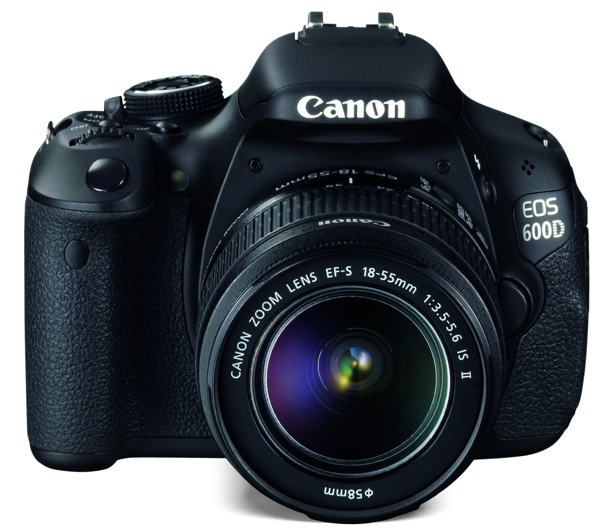
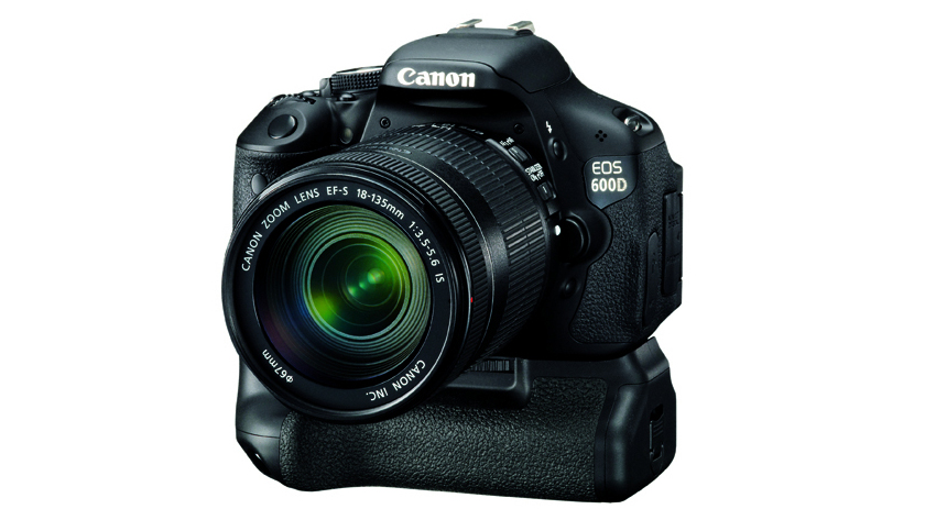
Just as many of the Canon EOS 600D's specifications mirror those of the EOS 550D, so does the design of its body. From the front it simply looks like the newer model has bulked up a little, while on the top-plate the only changes are to the design and functionality of the mode dial, and the addition of the display button, whose former space on the rear is now taken by an Info button.
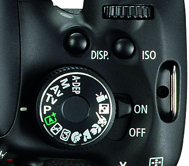
The mode dial is sufficiently tall to be easily turned and the new texture around its side makes it easier to grip than before, but it's a shame it doesn't rotate all the way around, particularly because the movie option is right at the other end of the dial to all creative settings. For the most part, though, if you only tend to stick to either creative or the scene modes, this shouldn't be too great an issue.
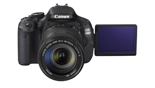
Most other alterations concern the rear of the camera; the eye sensor used to help conserve battery life is nowhere to be seen, having been displaced by the larger articulated LCD screen, while the menu pad and thumb rest are each a shade smaller for the same reason.
The LCD screen moves freely about its hinge, although accessing the Menu and Info buttons above it can be awkward when the screen is pulled away from the camera's body, because in most positions it's directly in the way.
Despite the smaller thumbrest, it still provides just enough room for someone with averagely-sized hands, although only just; some will no doubt find it a little too cramped.
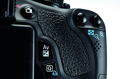
The body maintains much of the same style as the 550D, with the same stainless steel chassis and polycarbonate resin casing, but a slightly more matte finish. A number of buttons have, however, been subject to minor aesthetic revisions, while slight changes to overall dimensions have added a little more body to the camera's grip. Even so, the grip still feels a little lacking even with average hands, with the lack of room meaning the user's fingertips often feel pushed against the body.
The menu system offers little by way of surprise, adhering to the same tabbed and colour-coordinated format that has graced many former EOS models. Those new to Canon's system should easily pick up its operation; while the left hand brings up the menu and alternates between display information, the right uses both the command dial and directional buttons to move across and down each menu tab respectively.
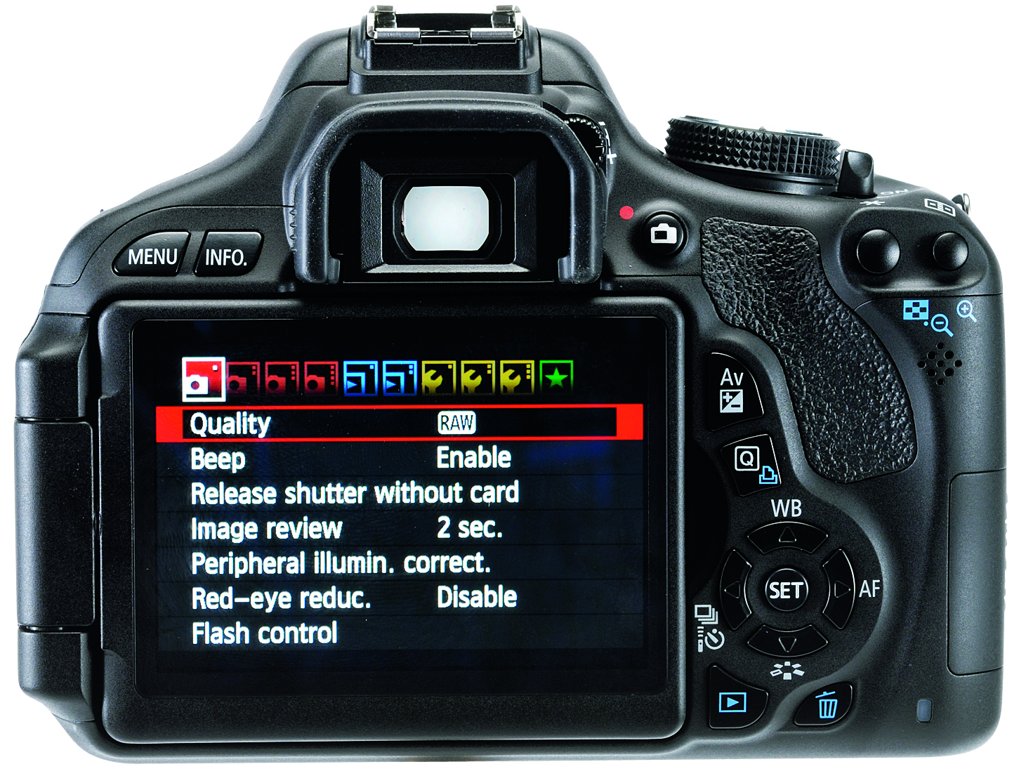
The less experienced also benefit from Canon's helpful Feature Guide, which explains all functionality succinctly, while those with a little more shooting time behind them can personalise their camera's with 11 custom functions and file commonly used options under a My Menu tab.
Current page: Canon EOS 600D: Build quality and handling
Prev Page Canon EOS 600D: Features Next Page Canon EOS 600D: Performance