Why you can trust TechRadar
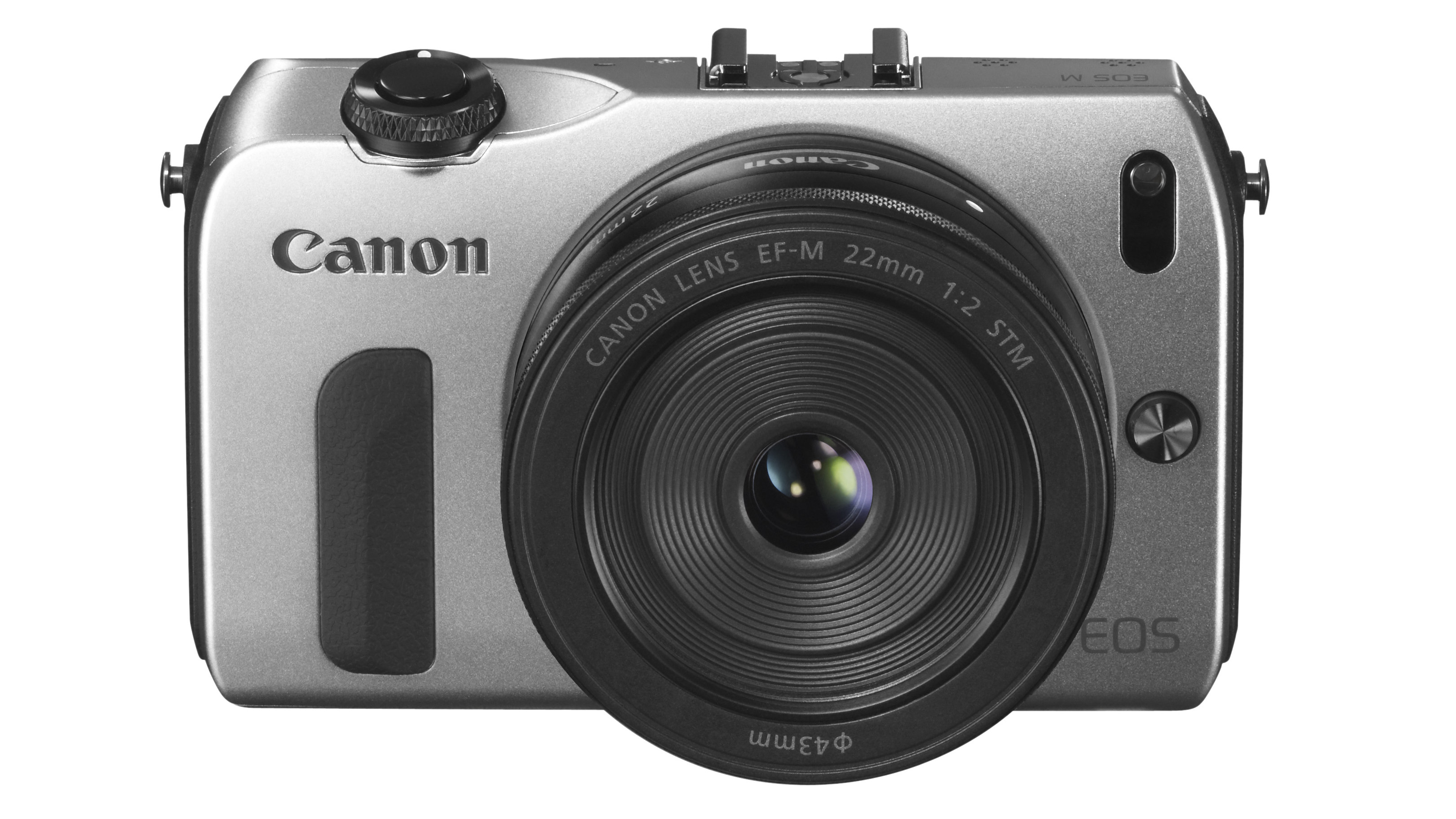
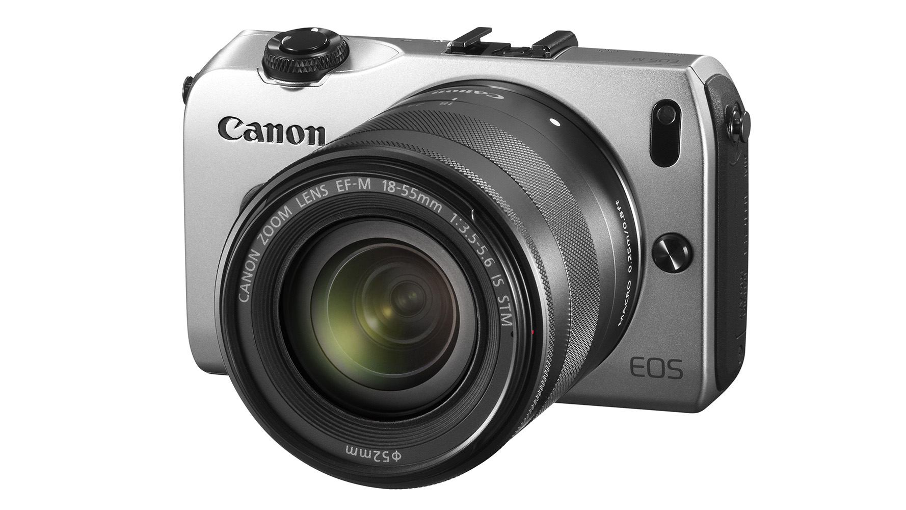
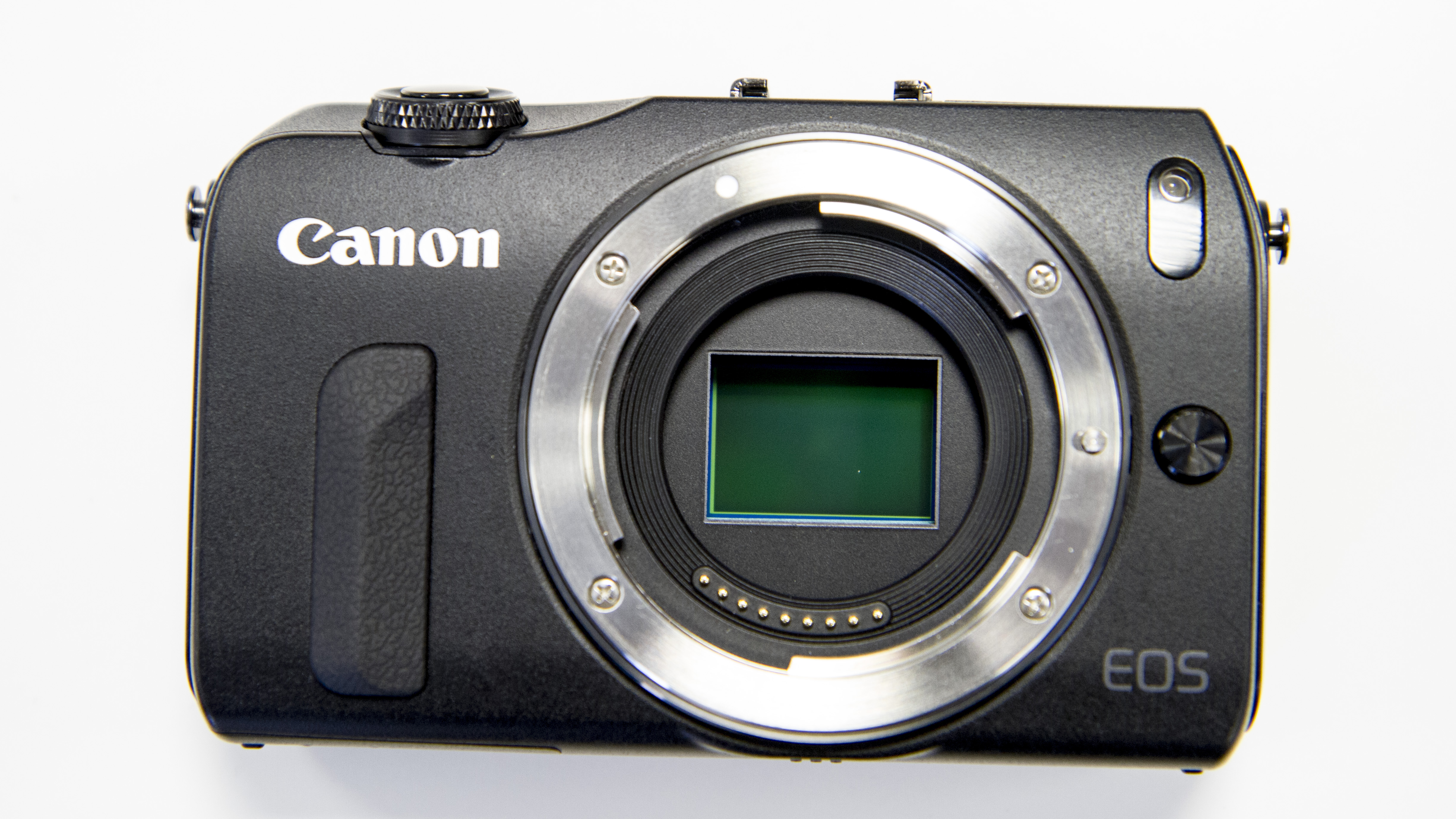
Appearance and size wise, the EOS M is like one of Canon's mid-range Powershot compact cameras with a bigger-than-usual lens.
Its stainless steel, magnesium alloy, polycarbonate and glass fibre construction also gives its body a solid, high-quality feel.
This high-build quality is complemented well by the new EF-M 18-55mm kit lens which has a metal barrel and feels superbly built, with smoothly rotating zoom and focusing rings that have just the right tension. Interestingly, although this lens is smaller than the Canon EF-S 18-55mm f/3.5-5.6 IS II sold in the EOS 650D kit, at 210g it is 10g heavier.

Unfortunately, the EOS M only has a shallow ridge of plastic to serve as a finger-grip and this doesn't give much purchase - especially with the 18-55mm kit lens mounted.
The strap is needed unless you are happy to carry the camera by the lens or by holding the top and bottom of the camera.
Although it doesn't have the same number of button and dial controls as the top-end G1X and G12, all the key features are within quick and easy reach via the touch screen.

Thankfully, Canon has opted for a capacitive screen (like an iPhone's) so it doesn't rely on pressure and instead responds to a touch of a finger. It is one of the most responsive screens we have seen on a camera and it makes quick work of changing settings via the main menu and Quick menu.
There are still navigation buttons and a wheel on the back of the camera, so they can be used to scroll through settings options and make changes, but using the touchscreen is quicker and more intuitive.
A switch around the shutter release allows the user to choose between Scene Intelligent Auto (green square), Camera and Video mode.

In Camera mode a touch of an icon on the screen brings up the various options, including manual, aperture and shutter priority, as well as Creative Auto and a selection of scene modes. It's very quick and easy to do.
The touch controls are also useful when reviewing images, as a swipe moves from one to another while the pinch-zoom movement can be used to zoom in and out to inspect details.
In most situations the screen provides a very clear view of the scene, but it suffers from reflections in bad lighting, making composing images a bit trickier.
With SLRs like the 650D you would usually employ the viewfinder in such conditions, but this option isn't available with the EOS M.
