Why you can trust TechRadar
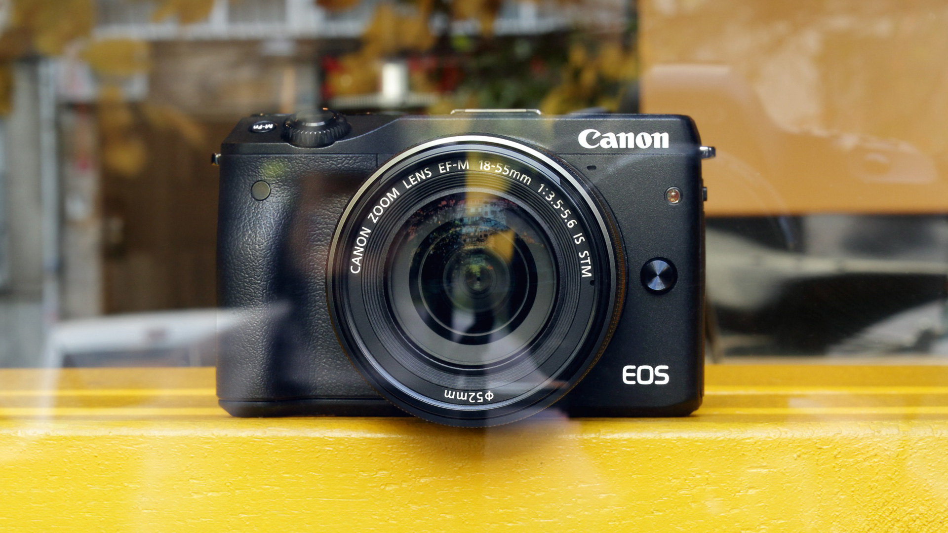
In looks the EOS M3 sits roughly halfway between a G-series compact camera like the Canon G16 and an SLR like the Canon 100D. It has the rectangular shape of the G16 – actually the top-plate is even flatter – combined with the more ergonomically contoured finger grip on its front.
At 366g (including battery and memory card), the M3 is a little lighter than the 100D, but it feels a little heavier than you might expect – it's deceptively dense. It also feels nice and robust. These two points are likely to be down to the stainless steel element of its steel, magnesium alloy and polycarbonate resin construction.

On the back of the camera is a small, but very effective thumb-ridge that is made from, or at least covered in, the same rubber-like material that coats the front finger grip. This front grip has quite a fine texture and a smart, modern appearance and it provides a superb purchase, making the camera feel comfortable and secure in your hand.
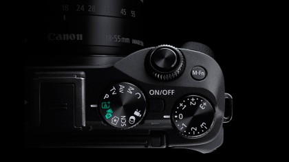
Canon has used a similar, but not identical, control layout to the G16 for the M3 and I found it really easy to use. I especially appreciated the exposure compensation dial on the top-plate as it enables speedy adjustments to be made to exposure. This dial doesn't have a lock, but it has a fairly stiff action so it doesn't get knocked out of position easily.

The mode dial alongside the exposure compensation dial is also useful, allowing quick changes in exposure mode and an easy means of checking the camera's set-up.
I found the control dial around the shutter release easy to reach and use. By default in aperture priority mode it's used to set aperture and in shutter priority mode, shutter speed. In manual exposure mode it and the control dial around the navigation keys are used to set exposure.
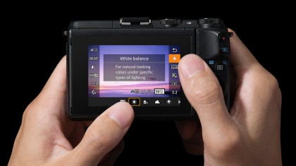
Although the M3 has a full complement of physical controls, the 3-inch 1,040,000-dot LCD screen is touch-sensitive. Canon has implemented the touch-controls very well and you can slip seamlessly between using the screen and using the physical controls. Helpfully, both the main menu and the Quick menu can be navigated and selections made using the responsive touch-screen or the physical controls.
I find it especially helpful to set autofocus point via the screen – however, there's a fairly wide border around the screen where it's not possible to set an AF point.
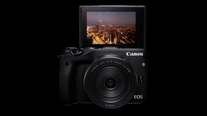
The screen can be tilted up through 180 degrees and downwards through 75 degrees for easier shooting from high or low angles. This is useful, especially for shooting selfies, but a fully articulating screen like the ones on the 750D and 760D would be much more helpful when shooting upright images.

The screen is an sRGB ClearView II device with 3:2 aspect ratio, which suits the native aspect ratio of images from the sensor and it provides a very clear view indoors and in shaded situations. Reflections are an issue in direct sunlight, but with the screen set to its maximum brightness it is still possible to compose images. It's a shame that Canon hasn't built a viewfinder in to the M3, but at least there is an optional one available.
It's easy to connect the M3 to a smartphone using the Wi-Fi system and images can be transferred and shared quickly.
