Why you can trust TechRadar
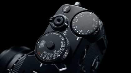
In response to user feedback, Fuji opted to drop the Drive/Zoom in, AE/Zoom out and AF/Delete controls that were previously located on the left-hand side of the LCD screen, and using the camera, even for a brief period of time, shows this to make perfect sense. The playback and delete buttons are now next to each other, which allows for the quick deletion of images with just one hand, something that wasn't possible before. The Drive mode option now occupies the top directional button that was previously a control for the camera's macro mode.
Given the breadth of controls this accesses, from single-frame and burst shooting to Advanced filters and a raft of bracketing options, it's clearly a much better use of space. Not only that, but these options are all arranged in a single vertical column, which makes them easy to access. All rear controls are just as clearly labelled as before, and although some are a touch smaller than the X-Pro1's, they appear to travel a little more positively into the body.

While the X-Pro1's menu system was already well regarded – notable for its clarity the logical organisation of its various options – Fuji has managed to considerably improve things here. The slightly darker background and brighter text makes non-selected options easier to read, and the new font is easier on the eye too. Fuji has also made much better use of graphics for each tab, making it easier to see where, for example, flash, movie, focus and other options are located from any other screen.
Each screen now offers a maximum of eight options rather than the previous seven, and a consequence of this is that the text is marginally smaller, although this makes it somewhat easier to digest as everything is closer together. There's also a My Menu option which can have 16 options assigned to it and ranked in order of preference, which is perfectly at home on a camera of the X-Pro2's billing, and many external controls can be customised to taste too.

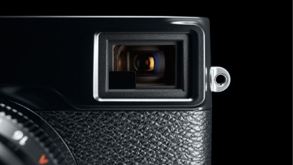
The camera's electronic viewfinder is significantly improved over the X-Pro1's. Details appear with far greater clarity and lagging is negligible, meaning that the camera very much delivers on the promise of offering an optical viewfinder experience (that said, as with any electronic viewfinder, scenes with a wide dynamic range show details in shadow and highlight details better with the optical finder). Aliasing artefacts when shooting fine details also appear to be far less of an issue and less of a distraction than before, particularly when set to the High Performance mode. In many ways, this is an electronic viewfinder for people that don't like using them.
The only slight annoyance is that the exposure compensation scale at the side of the viewfinder is smaller and decidedly harder to read than before, which is particularly a shame here given the ease with which the exposure compensation dial tends to be knocked out of place. It can, however be changed to a more simple numerical display and shown among other exposure information at the bottom of the viewfinder.
The camera performs best on its High Performance power management setting, although this is also the most power hungry. In terms of clarity and brightness of the electronic viewfinder the Standard option is a good alternative, with slightly less stability and a little more tearing (visible disconnection or breaks within the finder image) as the camera or subject moves by comparison, although focusing speeds appear to be the same. The Economy setting doesn't do too badly with regards to clarity in bright light, although the feed is slightly more affected by artefacts and in darker conditions the gulf between this and the other two settings becomes particularly apparent, with a darker and less clear view. This is perhaps best stuck to if using the optical viewfinder and/or the battery is close to depletion.
As the optical viewfinder doesn't take its view through the lens, it's more usable with shorter optics that won't obstruct the view as much as longer ones. Whichever lens you use, the framing marks which adjust as the lens is zoomed gives a better idea of focal length, adjusting for parallax correction when the shutter is half pressed. As on the X-Pro1 there appears to be a little distortion with the optical finder, although there does appear to be a small improvement in contrast on the new model, and exposure and other shooting information is crisper and easier to read.
On the X-Pro1 the viewfinder lever simply moved to the right to alternate between optical and electronic displays – here, it also moves to the left to activate the electronic rangefinder function when using the optical viewfinder. This has two benefits: first, it shows what kind of effect exposure compensation or white balance settings will have on the image, and second, as it magnifies a portion of the frame, it provides a better idea of correct focus. What's particularly good is that you can apply focus peaking to this window alone, so that you can maintain a view of the whole scene while using this to fine-tune focus.
