Why you can trust TechRadar
In the past Panasonic has demonstrated that it knows how to make cameras with a high-quality feel, and the Lumix DMC-G3 is no different. The G3's body is solid to the touch and while it doesn't seem excessively heavy, it isn't lightweight in the flimsy sense either.
Panasonic has managed to make the G3 around 25% smaller than the G2, with the fingergrip being the most noticeably shrunken area. Happily, the grip is still pronounced enough to make the camera comfortable to hold during and between shots, though a slightly more textured surface would give it more purchase.
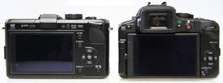
Above: GF1 v G3 rear view
One of the issues with the GF2 is that there's very little space on its back for the user's thumb, even though it's missing some of the control buttons of the G2. As result, settings are prone to being changed when a finger or thumb strays onto the touchscreen. This doesn't appear to be an issue with the Panasonic G3. Shooting from awkward angles is also made much easier by the LCD's articulating joint, which as well as making the scene visible means that the camera's controls can be accessed easily.
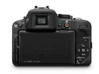
The G3's screen may be the resistive rather than the capacitive type that is found in the iPhone and iPad and is usually credited with being more responsive, but you won't find yourself having to repeatedly jab at the screen. In most cases the Panasonic G3 responds quickly to the touch controls being used.
One of the great things about the G3 is that there's more than one way to access and adjust the most frequently used features. The sensitivity settings, for example, can be accessed via the shortcut button on the back of the camera or via the Quick Menu.
The Quick Menu options can be reached either by pressing the Q. Menu button (which doubles as Function button 2) near the bottom of the back of the camera or by pressing the appropriate icon on the touchscreen.
Once the Quick Menu screen has been activated, it can be navigated either by pressing the navigation buttons on the rear of the camera, scrolling the rear dial, or using a finger on the touch screen – or a combination of these.
It's great that the Quick Menu can be customised by dragging icons on or off the active list. As a result, only the features you want to access regularly are present. However, it's a shame that the space created by the non-active features isn't closed up or filled because it means the menu is spread over more screens than it needs to be.
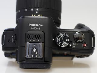
Anyone disappointed that the mode dial was shunned on the GF2 will be pleased to learn that it's in its rightful place on the Panasonic G3 – the top-plate. It has options to set the camera to any of advanced exposure modes (program, aperture priority, shutter priority and manual), plus two customs modes, Creative Control mode and the scene modes.
At first glance you could be forgiven for thinking that like the GF2 there's no exposure of focus lock (AE/AF lock), but by default the Display and Function (Fn) button 1 on the rear of the camera is set to AE/AF lock. Function button 2 is assigned to accessing the Quick Menu and is marked as such, but there is an on-screen icon that provides access to this, so it isn't a great loss to change its function.
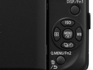
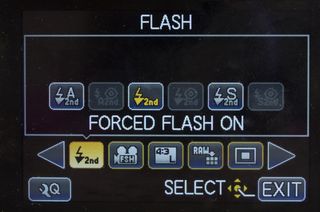
With a total of 17 functions, some may feel a little short changed by having only two function buttons to which they can be assigned. Purists may wish to go for the depth of field preview, while those who like to produce monochrome images in-camera on a regular basis may opt to access the Photo Style options. On the other hand, it could be useful to have a quick route to the flash exposure control.
Although there is a shortcut button to the drive mode options, it's a shame Panasonic hasn't stuck with the switch that's under the mode dial of the G2 and GF1 as this is very quick to operate. Using a switch would also free up a button for customisation.
One casualty of the downsizing required to make the G3 is the eye sensor which detects when the camera is being held to the eye and activates the EVF while turning off the main LCD. Instead there's a button to the left of the EVF which can be used to toggle between the LCD and the EVF. While this is a straightforward approach, it takes a little getting used to and new owners of the G3 can expect to find themselves staring at a blank EVF on a few occasions before they get used to pressing button prior to holding the camera to their eye.
Like the G2, but unlike the GF2, the G3 has a 3in articulated LCD screen with 460,000 dots, which makes composing images at awkward angles much easier than using a fixed screen or viewfinder. As usual reflections become a bit of a problem in very bright ambient light.
However, the fact that the G3's screen is touch sensitive (like the G2's) is also an issue because the inevitable fingerprints and smudges make the on-screen image harder to see. Of course you could use the supplied stylus, but this is something that is likely to get lost quickly and reaching for it each time you want to make settings adjustments is a pain.
Although the LCD provides a good view on most occasions, there are times when it is better, or it seems more natural, to use the EVF. The G3's 1,440,000 dot is the same as the one in the G2, but Panasonic claims the better processing engine in the new camera should improve the viewing experience.
It's true that the G3's EVF is one of the best available, and details are sharp and clear, but it still makes the photographer feel divorced from the world around them. The image is clearly digital and colour drag is still an issue so rainbow colours follow the viewfinder information and icons etc when the camera is moved.
While the Lumix G3 is the sort of camera that most enthusiasts can pick up and use straight away, it takes a little longer to get to know it and the customise it to your preferences. It is worth experimenting with the various options until you find the best set-up.
With the 14-42mm kit lens mounted the G3 makes a great camera to slip in your bag or carry in your hand ready to capture everyday goings on as well as holidays and days out. It looks great with the GF1 user's favourite optic – the 20mm f/1.7 pancake lens and the newer 14mm f/2.8 pancake as well.
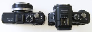
Above: Panansonic GF1 (left) v G3 (right) top view
Current page: Panasonic G3: Build and handling
Prev Page Panasonic G3: Overview and features Next Page Panasonic G3 review: Performance
