Why you can trust TechRadar
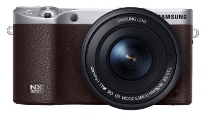
Rather than having the SLR-like design of the NX1, the NX500 has the more rectangular shape of the NX300 and other entry-level/mid-range compact system cameras. Its metal body feels pretty solid, although there's a faint clicking or creaking sound when you hold the grip tightly, suggesting that there's a little bit of flex. Unlike the NX1, the NX500 isn't weatherproofed.

The front grip has a more defined edge than the NX300's, which makes it more effective in your hand. Meanwhile on the back of the camera is a small but well-designed thumb-ridge which allows you to get a good grip.
Dials and buttons
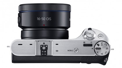
Exposure mode can be selected quickly using the knurled metal dial on the far right of the top-plate. This dial doesn't have a lock, but it isn't knocked out of position very easily.
According to Samsung, the dial and button placement on the NX500 was in part determined by monitoring the brain responses of a collection of willing volunteers that the company wired up to find the most favourable location. Whether or not these people were photographers is unclear, but for the most part the NX500's button arrangement is pretty good.

However, like the Sony Alpha 7 II, the video activation button is in a rather awkward position on the top corner of the thumb-ridge on the back of the camera. This means that if you're hand-holding the camera your grip has to be adjusted to press the button and it could result in a bit of wobbling at the start and end of footage.
I also found the exposure compensation button rather awkward to use in the default set-up. This is on the back of the camera and it needs to be pressed down while rotating one of the command dials to adjust exposure. Thankfully it's possible to customise the use of this button as well as the AEL (auto exposure lock) and the two command dials. I elected to set one of command dials to adjust exposure compensation directly when shooting in aperture and shutter priority mode.
Kit lens and iFn control
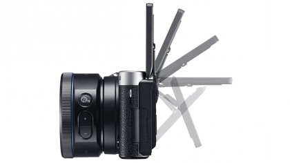
Samsung sells the NX500 with the 16-50mm f/3.5-5.6 Power Zoom ED OIS lens, and there's no body only option (in the UK at least). This lens is a neat fit on the camera and it complements the size and style well. It's also an i-Function optic, which means that there's a button on the side of the barrel that can be used to control some camera features.
Sign up for breaking news, reviews, opinion, top tech deals, and more.
There are two options for using this button, iFn Standard or iFn Plus. In iFn Plus mode, pressing the iFn button changes the purpose of the exposure compensation and AEL button. It gives a quick means of adjusting two customisable features, but the 12 options available aren't features I tend to change that often so I prefer to use the Standard option. In this mode, pressing the button turns the manual focus ring into a control dial capable of adjusting one of four features; aperture, sensitivity, exposure compensation and white balance. Repeated pressings of the button toggles through the options while turning the lens ring adjusts the setting.

There's also an Fn (Function) button on the camera body which brings up a maximum of 12 features for adjustment on the screen. Although several of the features have dedicated controls, I found this another convenient way of changing white balance, Picture Wizard (JPEG image style) and focus mode. It would be nice if this menu could be customised, so you have access to the features that you use most.
AMOLED display
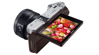
The NX500 doesn't have a viewfinder, so images must be composed on the AMOLED screen on the back of the camera. This is an excellent unit and when viewed straight-on it's possible to see the scene even in quite bright light (when the screen's brightness is boosted). The level of detail and clarity is impressive and it makes you want to take pictures because they look so good on-screen. However, in bright light it's much less clear when viewed from a slight angle and reflections become very problematic.

Fingerprints don't help with the screen image's visibility, so it's worth carrying a cloth to give it a wipe occasionally because the touch-control is excellent – it's very responsive and well implemented. When reviewing images a quick swipe of the screen scrolls to the next shot and a double tap zooms in. The main and function menus can also be navigated and features selected and adjusted by tapping or swiping the screen.
The menu is also very clear and generally well laid out, and most of the terms used are straightforward and not overly complex. A few, however, may have you checking the downloadable manual for an explanation. Framing Mode, for instance, rather than being an option to apply frames to your image or a method of adjusting aspect ratio, actually controls whether the screen displays the impact of exposure compensation adjustments or not.
An oddity that's familiar from the NX1 is that Tracking AF mode is set via Touch AF options (along with Touch AF, AF point and One touch shot) in the main menu or via the screen icon. It's not listed amongst the AF options accessible by pressing the AF button or the Function menu.
Another disappointment is that the camera's level display was quite badly inaccurate straight out of the box and needed to be calibrated to avoid sloping horizons. I've consulted another reviewer about this and they had exactly the same problem. Happily the calibration process is very simple, but you would expect it to be set correctly in the factory.
