TechRadar Verdict
The Carlsberg of dedicated nav devices. Probably the best you can buy.
Pros
- +
Fab new interface
- +
Great new graphics
- +
Life-time maps and data
- +
Great performance
- +
HD traffic
Cons
- -
Low-res screen
- -
Speed cameras are subsription based
- -
Almost
- -
Nothing
- -
Else
Why you can trust TechRadar
Launching a whole new range of sat navs is a risky business for TomTom. After all, as market leader there's only way to go. The temptation must be leave well alone.
But our early experience with the brave new redesign in the form of the TomTom Go 6000 revealed something of a triumph. Can the TomTom Go 5000 possibly be as good?
Let's hope so. Because the Go 6000 revealed a honed and toned TomTom with an interface optimised to make it easier and quicker to do the things that really mattered. It's navigation condensed down to the core essentials and all the better for it.
The new interface just looks better, too, and with capacitive rather than resistive touch control the whole shebang is simply more responsive. Promising stuff all round.
Features
Like the Go 6000, the Go 5000 sits atop its respective range. However, in this case we're talking five-inch form factor to the Go 6000's six-inch. It's an immediately important distinction and not one that automatically makes the Go 5000 inferior.
That's because bigger isn't necessarily better when it comes to satnavs. For some, six inches might actually be too big, too bulky a device to have permanently stuck to their windscreen.
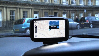
By most other metrics, the this five-inch Go 5000 and the larger Go 6000 are largely comparable. Both sport TomTom's new interface and almost exactly the same feature set.
There are a few detail differences. The most significant is again screen related. The TomTom Go 5000's screen sports just 480 by 272 pixels. No exactly HD, then. As we'll see, this isn't quite the death sentence for good graphics you might think. But we'd still prefer to see a few more pixels.
That said, at least the screen has capacitive touch. There was a time when some companies argued that resistive touch, which requires a more deliberate prod, better suited in-car systems.
Thank science, however, reason has prevailed and capacitive has taken over. It's so much more accurate and responsive.
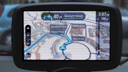
Maps-wise, as standard we're talking both 2D and 3D maps and lifetime updates for 45 countries European countries. Your actually limited to four or more country updates per year, so it's not quite limitless Euro maps forever.
The TomTom Go 5000 also comes with TomTom's Always Connected Traffic and Speed Camera services. It's an interesting new take on connectivity.
Not even lip service paid to fancy internet features like Google searches, Google Send-to-Car other or connected apps and features. It's an integrated data connection purely for delivering high definition traffic data and keeping you up to date with speed camera locations.
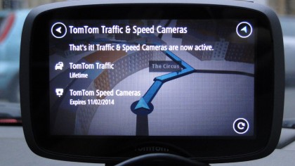
In that sense, it's very much in tune with the new TomTom regime. Drop the frills nobody uses. Make the important better and easier to use. So Always Connected doesn't require an account or a subscription. It just works – and across Europe, too, without roaming charges.
Elsewhere there are the usual TomTom refinements, like My Places for storing favourite locations, a POI database, voice guidance and full seven-digit UK postcode support.
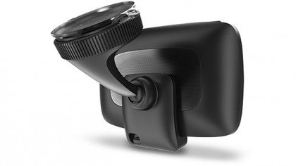
Finally, TomTom of course includes a custom cradle complete with suction pad for mounting on the screen and a 12V power adapter for in-car charging. Handily, the charger also supports generic USB devices.
What you don't get are any of those aforementioned internet connected features, Bluetooth connectivity for your phone or any of that jazz. Like with said, this is essentially a pure navigation device.
Screen
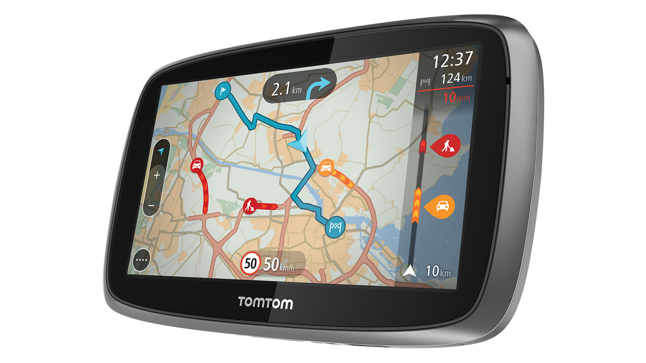
Size-wise, the TomTom Go 5000's screen is just how we'd have it. Five inches is pretty much right in the sweet spot.
On the one hand, you get good legibility and an interface big enough to be easy and ergonomic to use. On the other, it's it's small enough not to be too cumbersome or block the view of the road ahead.
The screen scores well for brightness and colours, too. It's not going to scare a high end smartphone, but it's certainly fit for purpose. The inclusion of capacitive touch is very welcome, too. It's just so much more responsive than the resistive touchscreens TomTom used to make.
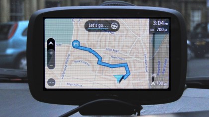
But what of that 480 by 272 resolution? In practice, it's not a major problem. Yup, the device does look low res. If you're used to a 1080p smartphone, for instance, you'll immediately. But thanks to TomTom's efforts revising the look and feel of the interface, the graphics still look fresh and modern.
Performance
As it happens, that low-res screen actually benefits performance. Fewer pixels means less work rendering graphics and the result is a very slick and zippy nav device.
Where TomTom's of old would chug along with very low frame rates, the TomTom Go 5000 renders maps and menus nice and smoothly. It makes the device much, much more pleasant to use.
That appies to both 2D mode and 3D mode, which includes models of buildings and landmarks. Admittedly, those models are pretty low detail and probably serve more as eye candy rather than actually help you get anywhere. But if you like 3D, TomTom now does it. And the traditional 2D view remains, of course.
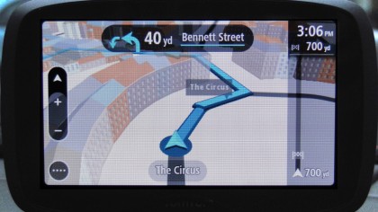
One of our favourite things about these new TomTom devices is the logic of the interface. The TomTom Go 5000 is no different. Where old TomToms were functional but confusing to first-time users, these new devices are much more friendly.
Tap the screen and map mode and a simplified menu pops up allowing you quick access to the most import stuff including destination input, routing details, your favourite destinations and the quick-report function for telling other users about a speed camera location.
A quick swipe to the left brings up another quartet of options: My Routes, Parking, Petrol stations and Traffic and Speed Cameras.
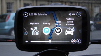
With the old TomTom, for instance, finding parking or a petrol station would have meant drilling down pretty deep into several menus. But these are things you want pretty pretty frequently. So TomTom has pulled them out and given them their own icons. Now it's just tap, swipe, tap and you're there. Much better.
As for broader performance, the Go 5000 is pretty quick to both calculate routes initially and recalculate on the fly. And as a TomTom device, mapping accuracy and routing is about as good as it gets.
By no means does that mean routing is perfect. If you know an area really well, you'll often be able to beat the TomTom's routing brain with some local knowledge of nifty little short cuts. But you're unlikely to get better routing from another device – especially as this device has TomTom's full traffic data service.

The new graphics are great from a legibility perspective too. The slicker look and higher frame rate probably doesn't actually make it easier to see where you're going. But this new TomTom look works at least as well in that regard and looks miles nicer. So we call that a win.
We like the logic of the new interface, too. In mapping mode it's very clear and uncluttered and the newly added support for transparencies has a real benefit.
It means you can have a panel down the right hand side showing distances to significant waypoints on your route, including speed cameras and petrol stations, but still have the map showing underneath. So you get useful information without fully cropping the map. Nice.
Verdict
TomTom has done it again. As a straight navigation device, it doesn't come any better.
We liked
The new interface is fantastic. It looks great. It gets you access to the things you actually need quickly and easily. We like that the data feature has been simplified for both use and maintenance. It's there simply for traffic and speed cameras and you don't have to worry about maintaining a data contract. It works for the life of the unit. We like the responsive new capacitive touchscreen, too.
We disliked
Very, very little, in truth. The screen could be higher resolution, purely for pretties. But it doesn't actually impinge on functionality. Of course, we'd love if it was cheaper. But that's always the case.
Final verdict
Dedicated navigation devices have gone through something of a crisis of confidence. That's thanks to the rise of the smartphone. With almost everyone now toting smartphones with navigation ability, who needs a TomTom?
For a while, it seemed like the answer was every more complex nav devices that mirrored the functionality of smartphones. But TomTom's latest have proved what a dead end that idea is. The real answer is to makes navs so good at actually being navigation devices, they're worth having as well as a smartphone.
The TomTom Go 5000 does just that. It's very probably our favourite navigation device.
Technology and cars. Increasingly the twain shall meet. Which is handy, because Jeremy (Twitter) is addicted to both. Long-time tech journalist, former editor of iCar magazine and incumbent car guru for T3 magazine, Jeremy reckons in-car technology is about to go thermonuclear. No, not exploding cars. That would be silly. And dangerous. But rather an explosive period of unprecedented innovation. Enjoy the ride.
