TechRadar Verdict
The TomTom 60 gets the job done but it's significantly less pleasant to use than TomTom's more expensive sat navs.
Pros
- +
Great maps
- +
Good interface
- +
Low price
- +
Big screen
Cons
- -
Resistive touchscreen
- -
Mediocre performance
- -
No integrated data
Why you can trust TechRadar
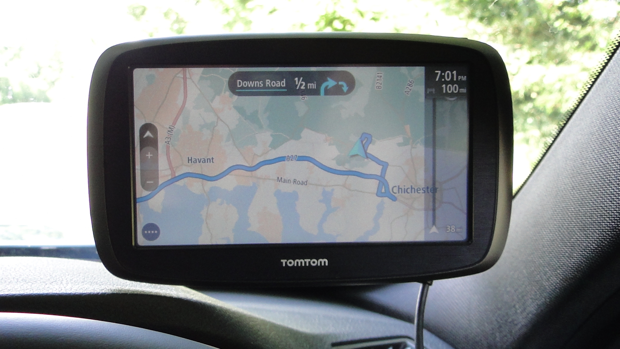
Here we go, then, with yet another new TomTom navigation device, the TomTom Go 60. Surely the world already has enough TomTom's to choose from?
Actually, the Go 60 does have a plausible raison d'etre. And a simple one, to boot. It's meant to be cheap. Cheap for a 6-inch TomTom from its top-to-bottom all-new range, that is.
At £179, it's just over half the price of the range-topping TomTom Go 6000. Intriguingly, it's exactly the same price as the mid-range five incher, the Go 500.
It sounds a bit complicated, but actually it's fairly straight forward. It's a three-tier range, from the entry-level Go x0, through the mid-range Go x00 and the top-end Go x000, where the 'x' indicates screen size in inches.
Anywho, the Go 60 represents our first taste of the new entry-level models, so the question is how much you lose out on compared to the pricier units. The TomTom Go 5000 and Go 6000, for instance, are probably the best car sat nav units you can currently buy.
If the Go 60 comes close to offering the same experience for half the price, it's an obvious winner, too.
Features
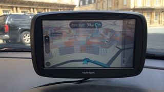
For the most part, the feature set is pretty familiar. You get TomTom's new-style mapping complete with 3D buildings and its much improved new interface as seen in all the new models.
There's free traffic data for life, too. But there's no integrated 'always connected' feature for the Go 60. Instead, you connect to your smartphone via bluetooth and piggy back on its data connection.
In practice that means you'll need your smartphone plugged in and charging, too. Otherwise you'll quickly wipe out the charge on your smartphone on all but the shortest journeys. Just something to bear in mind.
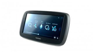
Screen-wise, we're talking 6-inch screen and 800 by 480 pixels, just like the Go 6000. But here's the catch. It's a resistive rather than capacitive touchscreen. Bummer. For starters, that means you lose the pinch-to-zoom gesture support of the pricier TomTom's. But more on the screen response in a moment.
As for speed camera data and map updates, you get three months of the former, after which you'll need to cough up £19.99 a year to keep it up to date.
The maps you get free forever and there's coverage of 45 European countries. Well, more accurately, you can update the maps in full four times a year. Plenty good enough.
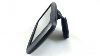
Rounding the specs out are voice control, the usual points of interest database malarkey, two hours of battery life, an integrated mount with suction pad and a charging cable with 12v USB adapter rather than just a fixed 12V adapter permanently attached to the end of the cable.
Performance
The immediate out-of-the box impression is along the lines of, hmmm, this is familiar but it feels a bit cheap.
The screen is recessed and has a slightly grainy look. The response to touch is mediocre and suddenly you realise this cheaper TomTom has a resistive rather than capacitive touchscreen – and by the looks of it a TN panel, at that.
You do get all the nice new map graphics with slick transparencies, 3D buildings and all that jazz. Then there's the simplified and optimised interface and menus that get you to the important things faster and with fewer pokes to the screen (see our TomTom 5000 review for a bit more exposition).
Put simply, it's very likely the best optimised, easiest-to-use nav interface currently around. Likewise the mapping accuracy and routing is about as good as it gets.
However, in the TomTom Go 60, the map renders at a pretty low frame rate, perhaps thanks to a slower, cheaper CPU. Combine that with the resistive screen and it's just not as nice to use as the pricier models.
The voice control feature is a bit underwhelming, too. As far as we can tell, you can't input UK postcodes via voice. Given that's most people's favoured way of inputting destinations (not to mention the shortest and quickest), that's disappointing.
At this stage, we're also getting a bit frustrated with the live traffic and active re-routing features. This is an area where all products fall short. TomTom is as good as or as bad as anyone else.
But the point is that even now, traffic data seems lagging and behind what is actually happening on the ground and when you know the local area well, you notice it simply doesn't have the brains to send you through those clever little routes that avoid traffic. One day, perhaps.
That said, the new-style integrated mount works well and, generally, the Go 60 gets the job done, just in a more workman like manner than the more expensive members of the TomTom range.
Verdict
The TomTom Go 60 gets TomTom's great new interface and map graphics, something we really appreciate. It also gets a screen that matches the priciest TomTom for size and pixel count. And all for not far off half the price. We also like having map updates free for life.
Sadly, that screen sports resistive touch, which isn't nearly as nice to use as capacitive. The frame rate of the mapping is disappointing, too. Generally, the device is far less pleasant to use than the more expensive new TomToms. Lack of support for postcodes in the voice control is a bummer, too, and the need to connect a smartphone for live services means you'll have to keep two devices powered in-car.
We reckon the Go 600 for £219 is probably worth the extra money thanks to its capacitive screen. But it's your money and your choice.
Technology and cars. Increasingly the twain shall meet. Which is handy, because Jeremy (Twitter) is addicted to both. Long-time tech journalist, former editor of iCar magazine and incumbent car guru for T3 magazine, Jeremy reckons in-car technology is about to go thermonuclear. No, not exploding cars. That would be silly. And dangerous. But rather an explosive period of unprecedented innovation. Enjoy the ride.
