TechRadar Verdict
Pros
- +
Slick unit
- +
Good screen
- +
Easy to use
- +
The price is right
Cons
- -
No traffic info
Why you can trust TechRadar
If you're looking to get away by car this summer, then the new TomTom Start 20 sat nav is something you should consider taking along for the ride.
This entry level sat nav is ideal for anyone who's getting a sat nav for the first time - or for those who only occasionally need help getting from A to B - like holidaymakers heading to the coast.
To prove the point, the TomTom Start 20 has seen TomTom gives its entry-level range a radical overhaul. This one boasts an ultra-slim body with an 11cm touchscreen display, a brand new operating system - which aims to be even easier to use than before - improved Points of Interest and two million kilometres of additional roads.
Just the kind of thing we love to get our teeth into.
New features
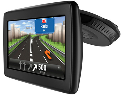
One of the most obvious changes from the TomTom Start 2 - aside from the body and 480 x 272 pixel widescreen display - is a new ball-and-socket mounting arm, which swivels around so you can mount the TomTom Start 20 either on your car's windscreen or on the dash.
You'll need a dash or air vent (not included) if you want to do the latter.
The mounting arm enables you to position the TomTom 20 at almost any angle, while its suction cup is robust enough to stop it from coming loose - a problem that dogged some TomTom sat navs in the past. To help you mount the TomTom Start 20 either on your windscreen or your dash, it now comes with an orientation sensor, so the on-screen menus and maps are always the right way around.
Other features of the TomTom Start 20's body include a large, easily accessible power button on the bottom left (with the screen facing towards you), built in speaker, and an SD card expansion slot - which TomTom says will activated with a software update this summer.
The TomTom Start 20 is easy to charge and sync with your Mac or PC too - it uses a new 12v USB power adapter and mini USB cable.
Inside you'll find all the usual sat nav gubbins, plus 4GB of internal flash memory, although there's no built-in Bluetooth so you won't be able to use the TomTom Start 20 to help you make and take hands-free calls. You also won't be able to use the TomTom Start 20 to get Traffic Message Channel (TMC) data on your route unless you pay an extra £50 for a dedicated receiver.
This £130 version of the TomTom Start 20 includes maps for the UK and Ireland, although you can also get a European version for an additional £20 - we think this nominal extra spend is worth it.
Menus
The biggest changes to TomTom Start's range come in the form of a new operating system with enhanced navigation that aims to make it even easier to find your way around.
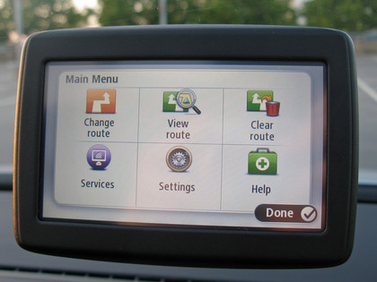
Right from the get-go, it impresses with bright, clear icons and logical sub-menu system that's easy to find your way around. One thing you do notice, however, is that you do need to press the touchscreen quite firmly for it to register each selection you make.
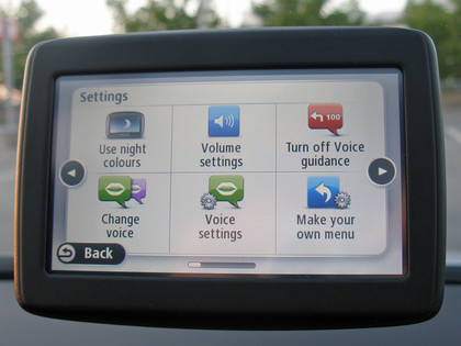
Getting around the menus is also more leisurely than quick, which suggest that the TomTom Start 20 is a little underpowered when compared to its more expensive siblings.
Delve into the sub-menus and it becomes obvious how feature-rich the TomTom Start 20 is - you can do everything from customising the colours of the map screen to planning your route by car, bike or on foot.
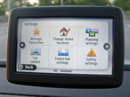
You can even choose which icons appear on the main navigation screen from 'make your own menu' which gives you the option to add things like 'drive to car park' and 'suggest driving breaks' icons to the screen.
Navigation
The best thing about the new TomTom Start 20 though has to be actually using it to get around.
Whether you're simply going across town or heading to the other end of the country, it'll quite simply get you there with minimum fuss - which, of course, is what a sat nav is supposed to do. You'd be surprised by how many get it wrong.
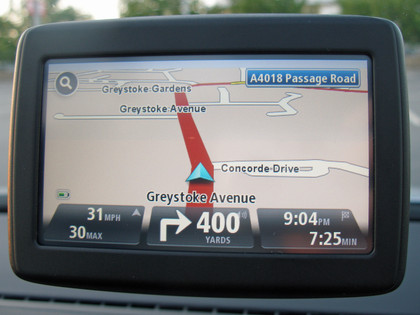
What's amazing is that TomTom has already made its killer route mapping and navigation even better by adding a couple of simple extras - like telling you what the name of the road is that you need to turn on to e.g. 'at the next roundabout take the second exit on to High Street' instead of the usual 'at the next roundabout take the second exit on to the A4050'.
It's a little thing, but it makes a huge difference especially when you're struggling with busy, complicated junctions.
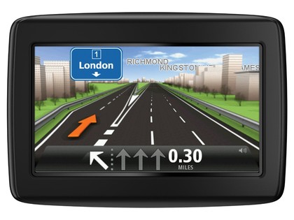
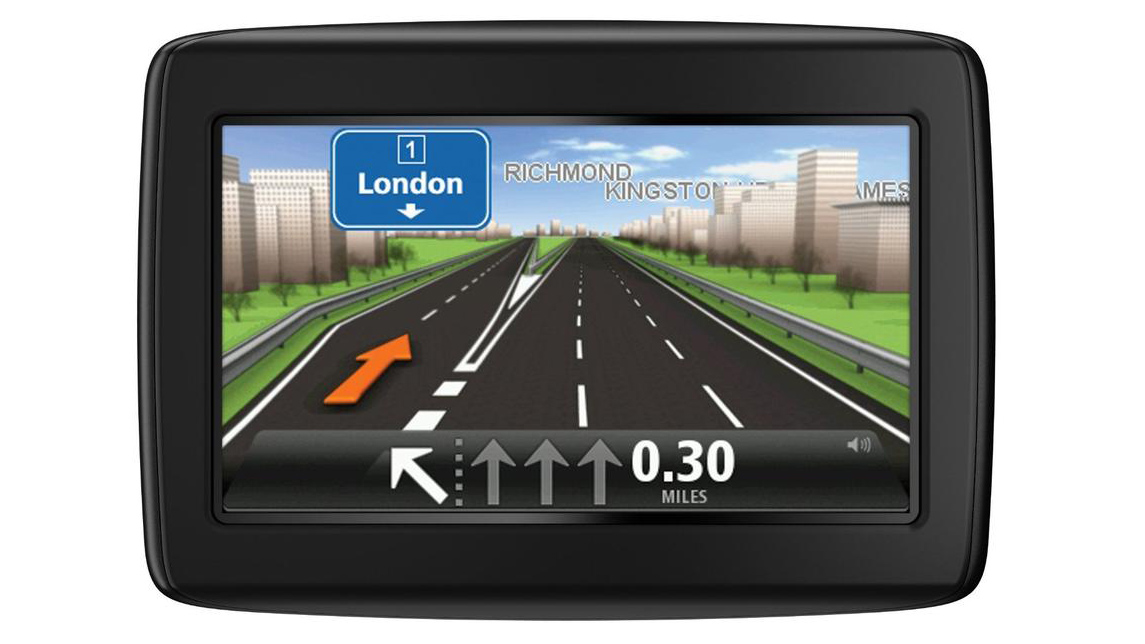
Going alongside side that are new, even more detailed junction views, which make it abundantly clear what you need to do at motorway intersections with the lane structure clearly displayed along with flashing amber arrows telling you which lanes you should be in.
TomTom's evidently also done a lot of work on its Points Of Interest, which covers everything from nearby cash machines and petrol stations to more exotic stuff like restaurants and zoos. All of a sudden, that shopping mall that previous TomTom's failed to take us to without typing in the exact postcode have appeared in the lost of Points of Interest options and you can even find a decent restaurant if you want one - TomTom no longer just serves up a list of fast food joints and little else.
