TechRadar Verdict
Infotainment and driver assist technologies aside, the Camry is a fine car. It's not necessarily the sexiest or most dynamic, but you can't really go wrong with it, if you want the generic definition of a car.
Pros
- +
Comfortable seats
- +
Sharp blind-spot monitor
- +
Easily accessible driver assist controls
- +
Smooth powertrain
Cons
- -
Poor adaptive cruise control
- -
Stunted infotainment system
- -
Unnecessarily stiff suspension
Why you can trust TechRadar
American car buyers love the Toyota Camry – enough to buy 429,355 vehicles in 2015 alone. It's been the number one selling car in the US for the last 12 years, practically selling itself despite market preferences leaning toward sport utility and crossover utility vehicles.
The Camry is a vastly important vehicle for Toyota, but the competition is better than ever, which forced the company to fast track updates and upgrades to stay competitive. Toyota sent techradar a 2016 Camry XSE with its convenience package, navigation and JBL premium audio, its advanced technology package, a moonroof and integrated Qi wireless charging to test. All of that brought the MSRP to $31,560 (not available in the UK, AU$41,402 for the Altara SL trim with 18" wheels and sport suspension option).
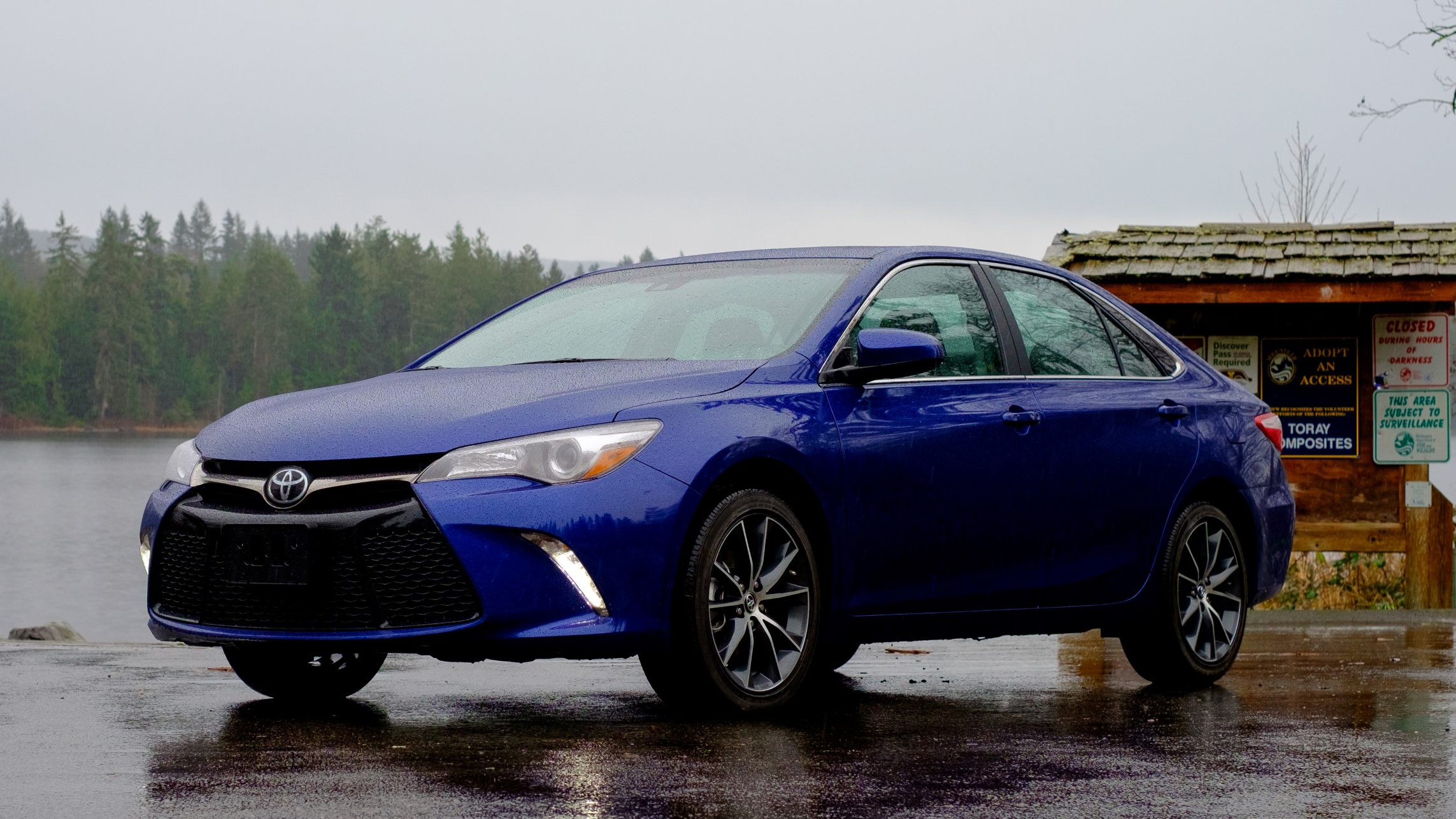
Toyota's current-generation Camry initially launched as a 2012 model year (MY) vehicle, but it received an aggressive exterior makeover during its mid-cycle refresh for MY2015 to make the car more visually exciting. I personally don't mind the styling too much. The Camry has an aggressive stance, especially in SE or XSE trims, which are the sportier-looking models, but Toyota left the green house (or the window layout of the car) alone.
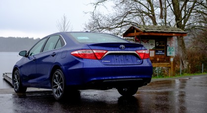
If you park the current generation and the last two generations of Camry's next to one another, the green house looks virtually the same. It may be nitpicking, but the aggressive styling from below the beltline (or below the side windows) doesn't match with everything above, and that's irksome. I prefer the subtle designs of the Kia Optima and Volkswagen Passat over the Toyota Camry.
Reach for the door handle, and a sensor placed on the back of it unlocks the car. A press of the capacitive touch button locks the car. The unlock sensor and lock button are only available on the front doors, which is understandable for this segment. I've only seen rear door handles with locking and unlocking features in luxury cars, such as the Mercedes E-class.
Interior
Step inside, and you're treated to an all-black interior with red stitching. The interior materials are mostly high-quality and come in a soft-touch finish. The hard plastic parts have a smooth matte coating that looks sharp, but doesn't feel slippery or attract oily fingerprints.
I find the partial leather and ultrasuede seats provide plenty of side bolster and back support for my 5-foot-7-inch and 195-pound frame. The seat heaters get toasty quickly, too.
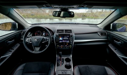
Look forward, and the Camry has standard analog gauges with an LCD sandwiched in between. The engine coolant temp gauge is a nice addition, so you can quickly tell if the engine is at operational temperature, which is a feature more new cars are removing. The LCD display provides a visual representation of the driver assists, music information, turn-by-turn directions and trip meter.
I don't have any qualms with the Camry's interior layout. Toyota has done a great job of keeping traditional buttons and knobs – just how I like an interior.
While I am nitpicking, I don't like the giant font used on all the lettering. The font is easy to see and read, which is beneficial to your typical Camry driver, but I feel like a grandpa when driving it.
Infotainment system
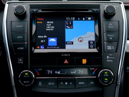
Driving infotainment in the Camry is a 7-inch Toyota Entune system with HD Radio, SiriusXM, USB and Bluetooth connectivity. Toyota claims the 7-inch touch screen display is high-resolution, which translates to 800 x 480. Despite the (in my opinion) low resolution, the display looks sharp and vibrant from the driver's seat, most likely because the screen is driven by a digital interface instead of analog.
The home screen is quite bare but displays commonly accessible information, including music information, weather and a mini map. It's customizable, too, but I left it in the default configuration.
Listening to SiriusXM and HD Radio is straightforward without any surprises. You can mix SiriusXM and HD Radio stations in a shared list of presets. Playing files from a flash drive is a terrible experience.
Toyota excluded a simple feature – browse your music by folder. I'm not sure how this slipped by, but you can't navigate a USB drive by your own folder and file structure, which is ridiculous. It makes sense to search your music by track info from an iPhone, but I prefer to organize my flash drives the way I want it, with mix folders, not playlists.
Navigation functions are just like every other car in the mid-size segment. Heck, the mapping software and maps look very similar to the Kia Optima. There are no surprises here; the maps are flat but it works. The typical lock outs when the car is moving are in place, so you can't enter a new destination when the car is moving. Voice commands are available, but they're frustratingly terrible as they are in every other infotainment system.
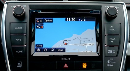
Phone connectivity via Bluetooth works with my Motorola Nexus 6 and iPhone 6s. Text messaging is supported, but you're limited to basic replies. You're better off using Google Now or Siri anyways. Speaking of Siri, Eyes-free is supported with iPhones by holding down the voice recognition button.
There's app support for iHeart Radio, MovieTickets.com, OpenTable, Pandora and Facebook Places. Toyota requires a dedicated Entune application installed on your phone with a login. Your Entune login lets you connect Entune to the supported applications.
It's a mild annoyance, but with the Entune app, the car uses your phone as an internet connection instead of the app's API, which would stream audio via Bluetooth with some quality loss. It provides Toyota with greater flexibility, but I'm not sold on the necessity.
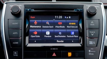
Aside from Pandora and iHeartRadio, why would you bother with any of the other apps? The interface is slower and clunkier than using your phone.
Facebook Places support puzzles me the most. Why would I put the car in park, check in via the car and then shut the car off when I can shut the car off, get out, take a picture and then check in via Facebook on my phone.
Frankly, this shows how Toyota is disconnected from reality when it comes to infotainment system technologies. There is absolutely no reason to access these apps from the car, but Toyota refuses to support Android Auto or Apple CarPlay and wants to do its own thing, unfortunately.
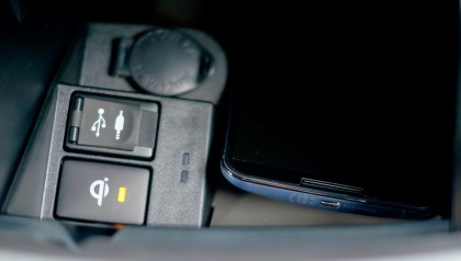
Rounding out the infotainment system is the integrated Qi wireless charger, installed in the cubby below the climate controls. A button with status light turns the charger on or off. Unfortunately, my Motorola Nexus 6 was too big for the charger, so I was unable to test it out. However, it's a Qi charger, so if your phone fits, it should charge.
Current page: Design, interior and infotainment
Next Page JBL GreenEdge sound and driver assists