TechRadar Verdict
A quick way to build simple portfolio sites, but way too underpowered for experienced users.
Pros
- +
Can produce stylish portfolio sites
- +
10-day trial, no payment details required
- +
A quick way to build basic sites
Cons
- -
Very few templates
- -
Clunky interface
- -
Limited customization options
- -
Overpriced for what you get
Why you can trust TechRadar
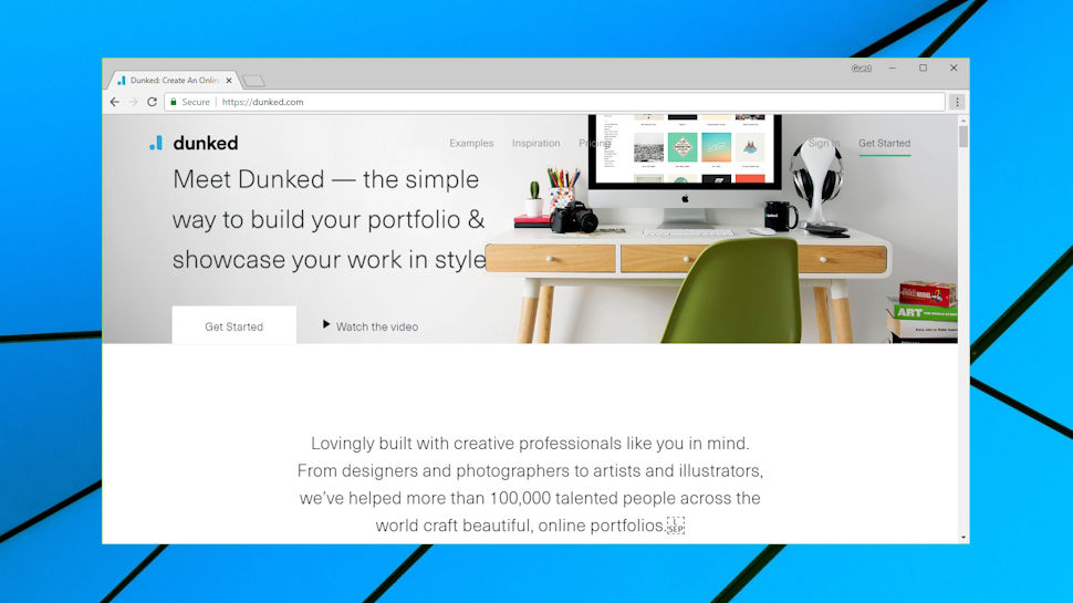
Dunked is a specialist portfolio website builder aimed at helping creative professionals - photographers, artists, designers, illustrators - build stylish online portfolio sites to show off their work.
The service could work for personal users, too, or anyone who wants to showcase a range of media content. Choose a template, upload images, maybe import media from sites like YouTube, Vimeo, Flickr, SoundCloud and 500px, then drag and drop until the site looks exactly how you want.
Dunked is about speed and simplicity above all else, and there's not a lot you can do to make the site your own. There are only 17 templates, and many of these follow a very similar pattern: a title, a block of text, and a panel of thumbnails which can be clicked to zoom in on that content.
There's also none of the advanced extras you'll get with more general-purpose website builders: a blog, forms, web store, bookings, mailing lists, or any kind of social media integration beyond simple icons and links.
There are some configuration options, including a little layout control, a choice of font and color schemes, and the ability to directly edit site HTML and CSS. These can't match the best of the competition, though, and Dunked probably won't be a good choice for anyone who needs fine-grained control over their website.
This won't necessarily be a problem for less demanding users, of course, and a quick browse through the Dunked Examples page shows the service can deliver quality results. Although there are clear similarities between the sites, there is some scope for variation, and the finished designs are clean and professional.
Prices start at $8 (£6.15) a month paid annually for the Professional plan. This has some significant limits, and only supports 100 projects, 100 pages and 1,000 images.
If you do need more, the Dunked Agency plan enables building unlimited projects, each with unlimited pages, and a maximum of 5,000 images. It's yours from $19 (£14.62) a month paid annually.
These prices seem a little expensive to us, especially when compared to regular shared hosting. Wix isn't a specialist in portfolio sites, but it's more than capable of building them, has far more features than Dunked, and its Unlimited plan gives you a free domain, 20GB storage and a web store to sell your products for only £11 ($14.30) a month.
One notable plus point for Dunked is its free ten-day trial of the Agency plan, with no credit card details required. It's a risk-free way to find out exactly what the product can do for you.
- We've also highlighted the best website hosting

Getting started
Try signing up with some web services and you're presented with lengthy forms demanding your address, phone number, company details and who knows what else. So, it's good to see Dunked take a simpler route by asking only for your name and email address.
Conveniently, Dunked also enables choosing your own temporary URL as a sub-domain of dunked.com (yourchoice.dunked.com).
Complete a captcha and that's it, you're done, Dunked redirects you immediately to its web console and sends you a simple Welcome email with links to your site, its administration page and the Dunked support knowledgebase.

The web console is probably as minimalist as we've ever seen. A left-hand sidebar offers four menu options (Projects, Pages, Templates, Customize) and a few tiny icons, while the body of the page has a New Project button, and there's barely anything else. Although this seems simple, as least in theory, it did leave us with some questions.
The site doesn't ask you to choose a template before you start, for instance. Newbies may not realize it's an option at all.

Opening the Templates page reveals thumbnails of your various options, and asks you to click an Activate button for your favorite. The choice of language puzzled us - did this mean we had to 'activate' a profile somehow before we could use it? - but effectively it just means 'select this template for your site.'
We tapped New Project and were asked to upload or choose the media we'd like to embed (images, audio, video). Images can be dragged and drop in bulk from your own system, but importing web content requires entering URLs one by one, which could get tedious if you're using several.
Images have some size restrictions, too, with Dunked not supporting anything larger than 5,000 pixels in length or width. This is displayed clearly on the page, but if you accidentally select larger images, the website tediously uploads them, one by one, before telling you each time that they can't be used.
You're able to enter more details for the project, including a title, description, date, client, URL, even defining password protection. Most of this is optional, though, and initially you can get by with a site title alone.

There's no active preview within the web console where you'll see changes represented as you make them. Instead you must tap a Preview icon as required to open a new browser tab, to view and explore your site.

Editing your site
Dunked sites are relatively fixed in their design. There is no full-screen WYSIWYG editor where you can resize and reposition objects, add new content blocks or right-click to change their properties.
What you can do is head off to a Customize section, where a left-hand sidebar offers various site-wide settings and a preview pane displays your site and updates it to match any changes in real-time.
Most of the customizations are relatively basic. You can set details such as a site logo, tagline or footer text, choose fonts and color schemes, configure social icons and hide or remove page elements (menus, titles, tags and more.)
The interface is often awkward to use. Clicking Typography enables choosing new fonts for 13 separate areas of your website, for instance, but there's no way to change them all at once. You must click all 13 drop-down lists, one after the other, and select your chosen font each time. (Oh, and font sizes are set in an entirely different section.)
The Colors section similarly allows defining the colors of various site elements, but there are no pre-defined color schemes or any other speedy way to set everything at once. You're forced to make your changes one-by-one, then wait as the preview window clears and updates each time.
There's no direct help within the Customize screen, no links to support documents, barely even any tooltips. And if you make a mistake, there's no Undo. The best Dunked has to offer is an option to restore the template default settings, forcing you to start again.
You do get a sprinkling of more advanced features, including the ability to add custom CSS rules or directly edit the site HTML and CSS. This does at least give you Undo support via the standard text box Ctrl+Z and right-click menu option, but again, there's no help, and you need to know exactly what you're doing to produce anything useful.
Dunked didn't impress us with its configurability, then, but that's not going to be an issue for everyone. The service is capable of producing some attractive sites with its default settings, and if these work for you, the Customize page can be ignored for most of the time.

Performance
It may not exactly be packed with features, but even the most basic of website builders needs a decent support service, so we were interested to see what Dunked has to offer.
The website knowledgebase got off to a bad start as it's not available via HTTPS. A quick check suggested Dunked hosts its support site with Salesforce, but although it has an SSL certificate, it applies to Salesforce' desk.com and not dunked.com. The company doesn't make that mistake with your website, fortunately, but it doesn't exactly create an impression of great technical expertise.
Browsing the knowledgebase content didn't improve our mood. The small number of articles don't even cover every area of the Dunked interface, and the ones you get are short, sometimes out of date, and often poorly presented or missing useful information.
For example, an Existing Templates page links to demo sites for all seventeen Dunked templates. Sounds convenient, right? That is, until you see the page has no thumbnails to enable previewing the site designs, just a text list of their names. To fully understand what's on offer you're forced to open all seventeen.
There is a real, live, human support team, although they're only available via email, 9am to 5pm EST. We send them a test question and received a helpful response, though in an unexceptional 5 hours.
Moving on to our final performance test, we discovered our website was hosted by a Rackspace server, apparently in San Antonio, Texas. Speed checks showed excellent connection times in the US, reasonable in Europe and more average everywhere else.
That was very acceptable for shared hosting, but it can't tell us how the service will perform with media-heavy sites, crammed with high res content. If Dunked sounds appealing, we'd recommend you take the trial to see what it can do for you.
Final verdict
Dunked enables creative professionals to produce good-looking portfolio sites, but it's extremely limited. If you want to do anything more than add content to a template, you'll be better off elsewhere.
- We’ve picked out the top 10 best website builders for small businesses

Mike is a lead security reviewer at Future, where he stress-tests VPNs, antivirus and more to find out which services are sure to keep you safe, and which are best avoided. Mike began his career as a lead software developer in the engineering world, where his creations were used by big-name companies from Rolls Royce to British Nuclear Fuels and British Aerospace. The early PC viruses caught Mike's attention, and he developed an interest in analyzing malware, and learning the low-level technical details of how Windows and network security work under the hood.
