TechRadar Verdict
Pros
- +
Comfortable to wear
- +
Tracks activity and sleep
- +
OLED a helpful motivator
- +
Altimeter for stairs tracking
Cons
- -
10,000 reports of skin rashes
- -
Annoying clasp
- -
Proprietary charger
- -
Sleep tracking is inaccurate
Why you can trust TechRadar
Update: Fitbit Force has been recalled, so we updated our review to address its skin irritation issues and compare it to wearables that came out days after its release.
Fitbit Force was initially a few pedometer steps ahead of its activity tracking rivals, but like the average person's fitness routine, it ended up throwing in the towel mere weeks after New Year's.
The startup company's activity and sleep tracking wearable gave almost 10,000 users rashes in the US and Canada. A Fitbit Force recall in February has taken it off the market for the time being with the promise of a new version that people aren't allergic to.
That's a shame because Fitbit Force expertly marries the Fitbit One with the Fitbit Flex, its two predecessors that were very much a work-in-progress. The still-available Fitbit One's clip-on implementation caused it to be easy to lose or forget to use everyday. Nothing makes you drop a routine more than literally dropping and losing a thumb-drive-sized device.
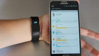
Fitbit Flex remedied that by taking cues from the original Nike FuelBand and Jawbone Up, fashioning the activity tracker into a wristband. Sadly, it lost a few features in the transition, namely the One's floor-tracking altimeter and all-important OLED display.
The Fitbit Force became "the Fitbit tour de Force" in its four months of availability. It combining all of the best features of the One with wearable convenience and its compatibility with both iOS and Android, when other trackers were exclusive to one or the other, stood out.
That's why many of its quantified self owners who aren't allergic are standing by what is still one of the best wrist-worn activity trackers. It may be worth it, even if it means carrying a bottle of Neosporin or Brulidine at all times.
Display
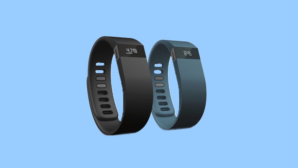
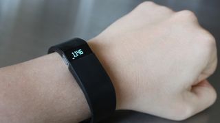
The OLED screen on the Fitbit Force is small, but it's the fitness band's biggest new feature. It displays steps, distance, calories burned, very active minutes, floors climbed and the time.
These six numbers are six more than the Fitbit Flex gave us; it had five lame LED lights that indicated the percentage of steps taken through the day. Five little dots don't exactly motivate you to your goal like actual metrics do.
Seeing 8,000 steps when your goal is 10,000 steps might make you go outside and jog right before the midnight reset. It's much more encouraging to see this number climb in real time on your wrist. Four out of five dots doesn't inspire the same rise-from-the-couch drive.
The time, the only number that can't be sped up with activity, makes wearing the Fitbit Force even more practical. It doubles as a wristwatch and cuts down on checking a smartphone for the current time.
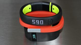
In this way, Fitbit keeps pace with the Nike FuelBand SE, which also offers the current time, though Nike animates the time through a futuristic-looking dot matrix LED that spans the length of the rubber bracelet.
The sneaker company also does a better job allowing users to gauge their progress even during a time check. A colorful bottom bar grows from red to orange to yellow to green with more activity every time the device is check, no matter which statistic you're looking at. Fitbit Force's monochrome OLED only has this bottom progress bar animation available on its steps menu.
The Force's OLED is less flashy, measuring just .75 of an inch by .375 of an inch. But it displays distance, floors climbed and very active minutes, three metrics the Nike band leaves out. It also bests the Jawbone Up 24, which came out weeks after the Force and lacks any sort of display. It requires its users to wirelessly sync their device to an iOS or Android app to see any results.

Skin irritation and recall
Fitbit Force was rushed to launch days before the Nike FuelBand SE and Jawbone Up 24 were announced, and the company seems to have gotten burned with a rash-resulting fitness band.
It said the allergic reactions were being experienced by a "small percentage" of users, which included the 10,000 who reported skin irritation and 250 more who received blistering. Rolling the dice with a small chance of itchy skin blemishes isn't the most appealing way to stay healthy.
Fitbit is therefore offering a refund of $140 (about £84, AU$155) wearable, which is slightly more than the $129.95 (about £78, AU$143) device was worth on store shelves. The company told TechRadar that this is to cover the sales taxes in all but the most tax-heavy states.
Fitbit CEO James Park said that a the company is "working on [its] next-generation tracker and will announce news about it soon." It remains to be seen whether or not this is a hypoallergenic version of the Fitbit Force or a completely new activity monitor with a host of additional features.
Design
Don't let the "Force" name fool you. Unlike going to the gym, you won't feel forced to wear the latest Fitbit wristband. Once you put the water-resistant Fitbit Force on, it's relatively easy to forget unless you often go swimming or take baths - or experience skin irritation.
That contrasts with the less comfortable Nike FuelBand SE even though it weighs the same 30 grams. The difference is that Fitbit Force inherits the previous model's flexible body and slightly wider design. The FuelBand SE is made of stiff rubber and is a little more concentrated on the wrist. It felt like we were anchored with a handcuff throughout the day in our comparison tests.
Neither of these fitness bands are as lightweight as the Jawbone Up 24, which is only 20 grams and made of a softer medical-grade rubber that's hypoallergenic. As you can imagine, Jawbone has been driving that last point home recently. Fitbit Force isn't nearly as stylish either.
The Fitbit Force, which came in two colors, black and slate, is top-heavy. It thins out as it wraps around a wrist, making it look and feel more like a real wristwatch. That makes it easier to wear when typing compared to the evenly distributed weight of the Nike FuelBand, which looks like a less fashionable bracelet, even with its hint of new colors.
Comfort and style may seem like an afterthought compared to more tech-pleasing features like a bright OLED display and floor-tracking altimeter. But if you don't feel like wearing a fitness device every hour of the day, chances are it's going to collect dust faster than the Wii Fit fitness board.
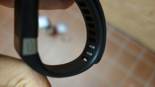
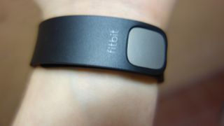
The one major Fitbit Force design flaw has to do with its clasp. Same as the Flex, it's hard to insert the pair of gray prongs into two of the nine oval holes. You almost need a third hand to make it happen. It does get easier with practice and the long battery life means taking the device off to charge isn't a daily chore. Both the easier to fasten FuelBand SE and overlapping ends of the Jawbone Up 24 take the lead here.
Interface
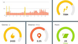
Fitbit Force tracks steps, distance, calories burned, very active minutes and floors climbed with accuracy that's along the line of the Flex. This means it rounds up the number of steps taken with about five extra strides for every hundred taken. That adds up after a while.
It always inflated the total in our tests compared to the more conservative FuelBand SE and Jawbone Up. That wasn't a problem when it was matched up against the original FuelBand that miscounted arm movements and "accidental" air punches. But Nike's newest band has incorporated anti-cheating measures, so the results no longer even out.
All of this doesn't matter if Fitbit Force still compels you to continually achieve goals. The good news is that Fitbit's mobile app and web-based dashboard are the unsung motivators of this wearable technology. The Force makes the process of syncing even easier thanks to Bluetooth 4.0. The tracker and the easy-to-read progress charts are constantly connected without gratuitously running down the battery.
There are also tabs for seeing how Fitbit-owning friends are doing, a food plan to keep track of diet and calorie intake, weight tracking via Fitbit Aria or Withings scale, and fun-to-earn badges. All of this is also condensed in a weekly progress report that arrives via email. There are some weeks in which this email is "accidentally" deleted instead of opened, knowing what's inside. Oops.
Every one of Fitbit's charts is an automatic process except for the food plan. You still have to manually log in the food you eat. Fitbit, unlike Nike, opened its API to partners, but there's nothing out there that automatically tracks food intake. Not even the HAPIfork cuts it here.
Fitbit is miles ahead of Nike with its logging of data, but it still lags behind the far superior Up 24. Jawbone's colorful charts, while only available on iOS and Android apps and not the web, really drive movement and better sleeping habits, and task users with new goals based on previous results. It also has a slightly better food database that uses a barcode to automatically add items. That's a really convenient feature Fitbit shouldn't be without.
Sleep tracking
Not moving around is the goal of Fitbit Force's sleep tracking functionality. Pressing in the device's one-and-only button for a few seconds when in bed transitions it into a timer mode that begins counting up. When you wake up, holding down the button stops the timer.
Charting restless moments and deep sleep is helpful in theory, but the sleep tracker's accuracy is a bit suspect. This is something has been consistent in the Fitbit Flex and One. The Jawbone Up 24 or even an inexpensive app like Sleep Cycle on a smartphones seem to do a better job of differentiating between REM sleep, restless moments and being wide awake.
The process of pressing in the Fitbit Force's single button to activate sleep mode is also fairly irritating too because it's easy to forget to do - you're not lazy, you're just tired. Dozing off means without activating this mode means sleep data isn't logged, though the time spent sleeping can be manually entered without the meaningful peaks and valleys.
Jawbone Up 24 not only fills in the blanks with more accuracy if you forget, it tries to guess the sleeping time to help you out. It's much a smarter sleeo tracker. We're looking forward to what the even more sleep-centric Withings Aura is capable of when it comes out.
All Fitbit devices with sleep tracking have "normal" and "sensitive" settings, the latter of which we recommend. The default normal setting conveys the sleep you wish you had gotten the night before and too often doesn't pick up blatant walking around, counting it as restless sleep.
Silent alarm
The returning silent alarm is the more useful sleep-related feature. The Fitbit Force wristband can vibrate and wake you up at a specified time without having to hear a nagging alarm clock.
That's extra handy if you are sleeping next to someone who doesn't have to wake up at the same time as you.
Waking up to the Fitbit Force's silent alarm is almost as if someone is gently tugging on your arm to get you to wake up. It's as peaceful as waking up early can get.
Jawbone's line of wearables has the same vibrate-to-wake functionality, something that Nike didn't add both to its FuelBand SE. However, both Force rivals added an inactivity vibration reminder that guilt trips users into moving throughout custom periods of idleness. It's a anti-sedentary feature we wish Fitbit Force included.
Battery life
Having Bluetooth 4.0 on board the Fitbit Force makes life easier because the low-energy protocol can constantly sync to the Fitbit app without requiring daily charges.
The Fitbit Force specs promise seven to ten days of battery life and generally that's what we found in our tests. It also fully charged within an hour. The Nike FuelBand SE lasts a similar number of days, while the Jawbone Up is on the lower end of that range, requiring recharges every seven days.
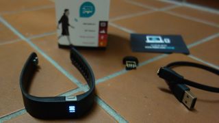
The extended battery life is good for two reasons. First, the Fitbit clasp is a pain to latch once it's been taken off, so the fewer times this has to happen, the better. Second, if there's one misstep with this device, it's including a proprietary USB charging cable. It's too short and extremely easy to lose. You don't want to be carrying this tiny cable around with you day-to-day.
Compatibility
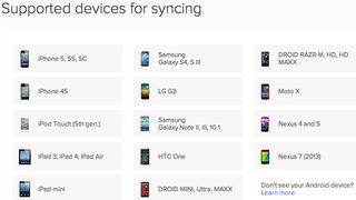
Burned by Nike's refusal to make FuelBand Android compatible? All Fitbit devices now work with 18 Google-powered smartphones and tablets in addition to the Bluetooth 4.0-equipped iOS devices, which translates to iPhone 4S and up and iPad 3 and up.
The total number of compatible Android's is up from the four that synced Fitbit data when the Force first launched. Now all of the popular phones are here: Samsung Galaxy S4, Galaxy Note 3, Moto X and Nexus 5.
Everyone else, including non-mainstream Android device owners and Windows Phone 8 users, have to sync the Fitbit Force with the Bluetooth USB dongle that comes in the box. It's another thing that can be lost and it's a little more cumbersome of an operation, but at least it does the job wirelessly.
For some reason, the Fitbit Force, like previous models won't sync natively with a computer that already has Bluetooth built in. That would have been less obtrusive than a USB nub.
Fitbit Force vs Nike FuelBand SE vs Jawbone Up 24
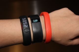
Fitbit Force, Nike FuelBand SE and Jawbone Up 24 all came out around the same time, but Fitbit got out in front of its competition and changed up its wearable rather dramatically. Nike merely tweaked its existing hardware and Jawbone just added wireless syncing and an improved app.
The new Fitbit, with an OLED display to call its own, features more metrics on the watch face, includes an in-depth online dashboard and works with more Android devices. Jawbone Up 24 only recently added Android support and Nike is still iOS exclusive.
The Fitbit dashboard is a better motivator than Nike's closed system, though its sleep tracking stats aren't very accurate and the food plan is still a manual process. Nike doesn't include a way to track foods eaten, floors climbed, very active minutes, calories in vs out, weight, or sleep quality. Jawbone Up 24 has all of these features, but lacks the vital screen on the device itself.
Fitbit commendably trusts fitness app rivals like RuKeeper and MapMyRun with an open API so that users can freely move data between programs. More importantly, it trusts users to tinker with the stats by logging custom activities. This is essential because swimming and bicycling don't count toward goals and metric totals otherwise. There's nothing worse than owning a FuelBand and not getting credit for these common calorie-burning activities.
Finally, Fitbit Force is more comfortable to wear thanks to its flexible and lightweight design over the harder rubber-feeling of the Nike FuelBand. The Jawbone Up 24 is even more comfortable, but, again, the missing screen is going to be a deal-breaker for a lot of people who want data with the click of a button, not the 10-second sync of an app.
Notifications
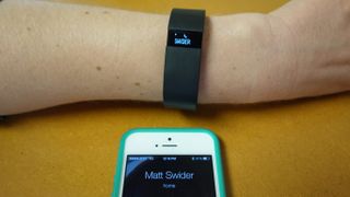
Fitbit Force has a few more features than its competition, and it tried to go the extra like with incoming call notifications. Fitbit wanted to officially cross the threshold into smartwatch territory.
This Caller ID notification would have been helpful for those moments when you're busy cooking food and your smartphone was in another room charging, but its post-launch inclusion never came about. We would have loved to know who was calling and whether it was worth rushing over to pick up the phone or a number we'd rather send to voicemail.
Fitbit promised to add smart call notifications to iOS 7 devices in time for Force's first firmware update, and despite the fact that we got to check it out in person last year, it was delayed. The only call notification that seems to be happening now is the Fitbit Force recall.
In that time, Samsung Galaxy Gear, which includes S Health fitness tracking, launched with call notification capabilities and the Galaxy Fit will do the same with an even better design in April.
Fitbit Force is 10,000 steps in the right direction for an activity tracking device. It added a much-needed OLED display and floor-tracking features of the Fitbit One to the form factor of the Fitbit Flex. Separately, these two devices were imperfect. Now, in a comeback story worthy of a Hollywood biopic treatment, the startup created challenge to the bigger Nike and Jawbone only to be torpedoed by a rash scandal.
We liked
Even though Fitbit Force launched at just $129.95 (about £78, AU$143), it tracks more data than the FuelBand SE at $150 (£129, about AU$158) and lays out activity history in an advanced app dashboard that drives you to meet goals and earn badges. It supports 18 Android devices and trusts users enough to let them to log activities that weren't counted by the tracker. There's nothing less motivating than feeling cheated by a rubber band at the end of a weightlifting workout.
We disliked
Fitbit didn't get everything right, starting with the unfortunate skin irritation issues that made some users anything but healthy. Not as unforeseen, the sleep monitoring hasn't gotten any more accurate since we first tested out the Fitbit One. The more comfortable Jawbone Up 24 does a better job here and when it comes to its more motivating app. There's also no inactivity vibration that reminds us to get up off of our butts every once in a while. Matters are further complicated by the hard-to-button Fitbit Force clasp and proprietary charging cable.
Verdict
Sure, there's a Fitbit Force recall, but we have heard from a several loyal owners who aren't turning it in for a full refund, a testament to how well the activity tracker works. It's flexible design gives it more of a relaxed fit than the Nike FuelBand SE and it has a screen and web interface, both of which the Jawbone Up 24 lacks.
Fitbit Force, without the possibility of a rash, is still one of the best ways move all 100,000 steps that are recommended for a single day. It's always-available metrics log more types of data than all of Fitbit's mainstream competitors with steps, distance, calories burned, very active minutes, floors climbed. Of course, none of this matters if you're susceptible skin irritation or don't want to risk it. In that case, the Jawbone Up 24 is a good alternative or you can sit on the bench until the release of an inevitable iWatch and Google smartwatch.

