Why you can trust TechRadar

As Creative's brand-leading MP3 player, you'd think its performance would be right up there competing with Apple's iPod touch, but that's not really the case here.
The price of this 16GB model is just £129 - the same price as the new 16GB iPod nano and nearly half the price of the 16GB 3rd generation iPod touch.
So that's why we'll be comparing the X-Fi 2 to the nano rather than the touch.
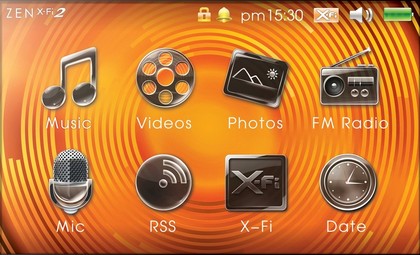
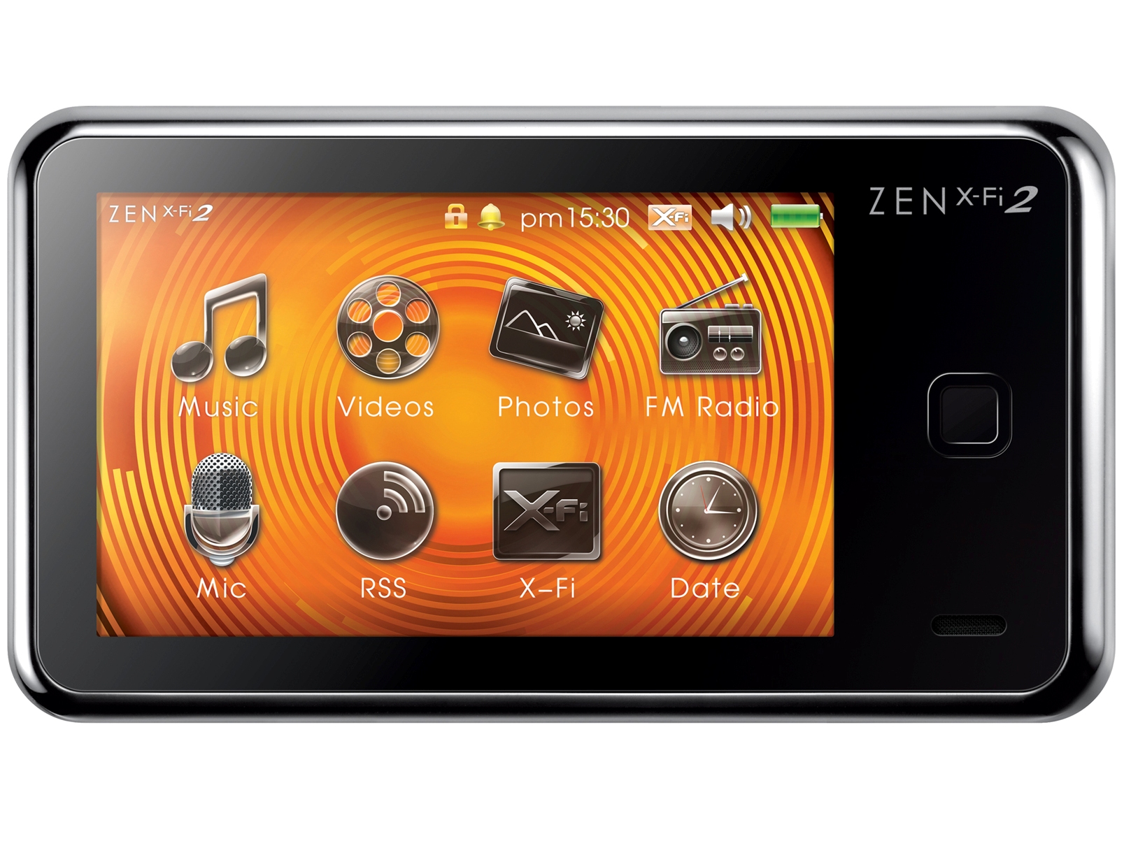
So, the question on everyone's lips is bound to be - is the touchscreen on the Zen X-Fi 2 any good?
Well, it's fairly safe to say that anyone who's been using devices like iPhone, iPod touch, HTC Hero and so on, will find the X-Fi 2's touchscreen an absolute nightmare to use.
Sluggish touchscreen
But that's more a reflection on the superiority of more expensive capacitive screens in comparison to the resistive one we have here. With capacitive screens, you can literally glide your finger over it and the device will respond.
Resistive screens need a much firmer press, and tend to be more sticky and less responsive.
The practical upshot of this is that the Zen X-Fi 2 is a bit sluggish, and the touchscreen is not terribly easy to use. Scrolling through menus is a bit of a clunky affair, and consequently it takes time to get to the album or song you want.
However, with a bit of practice you can used to it and it's not quite as noticeable - until of course you have another go on a capacitive device.
Still though, we just can't work out why Creative has chosen a touchscreen interface for this player. It's totally unnecessary and frankly, ruins it as a product.
To give an example of how clunky this bad boy is; if you're listening to music and the player is in your pocket, how do you change the volume? You have to take it out your pocket, press the unlock button and then a bubble appears on the screen. You have to drag this bubble off the screen in order to unlock the device.
This is not as easy as it sounds - it typically takes two or three attempts before it works. And when it does finally respond, the bubble doesn't glide smoothly off stage with your finger - it lags half a second behind and then clunks off with about 3 jerky movements.
Then you've got to tap the screen to bring up the options, then click the volume button, then drag the dial to the desired level. We timed this process at 11 seconds at a push. With the iPod touch 64GB it takes 4 seconds - Apple was clever enough to put volume controls as 'real buttons' on the side of the device for volume control, and it's much much easier to unlock too.
And that's just one example of how it takes an age to do something on the X-Fi 2, when other players are far quicker and easier to use. For the record, it also takes four seconds on the original X-Fi.
More issues
The lack of an accelerometer also means the X-Fi 2 screens is permanently anchored in landscape mode. And so unless you want to navigate the player while reading the menus sideways, it's impossible to use with only one hand.
The Zen range hasn't had one-hand functionality since the aforementioned super-brilliant Zen Vision:M.
Current page: Creative Zen X-Fi 2: Performance
Prev Page Creative Zen X-Fi 2: Features Next Page Creative Zen X-Fi 2: Sound qualityJames was part of the TechRadar editorial team for eight years up until 2015 and now works in a senior position for TR's parent company Future. An experienced Content Director with a demonstrated history of working in the media production industry. Skilled in Search Engine Optimization (SEO), E-commerce Optimization, Journalism, Digital Marketing, and Social Media. James can do it all.

