Why you can trust TechRadar

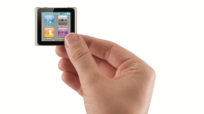
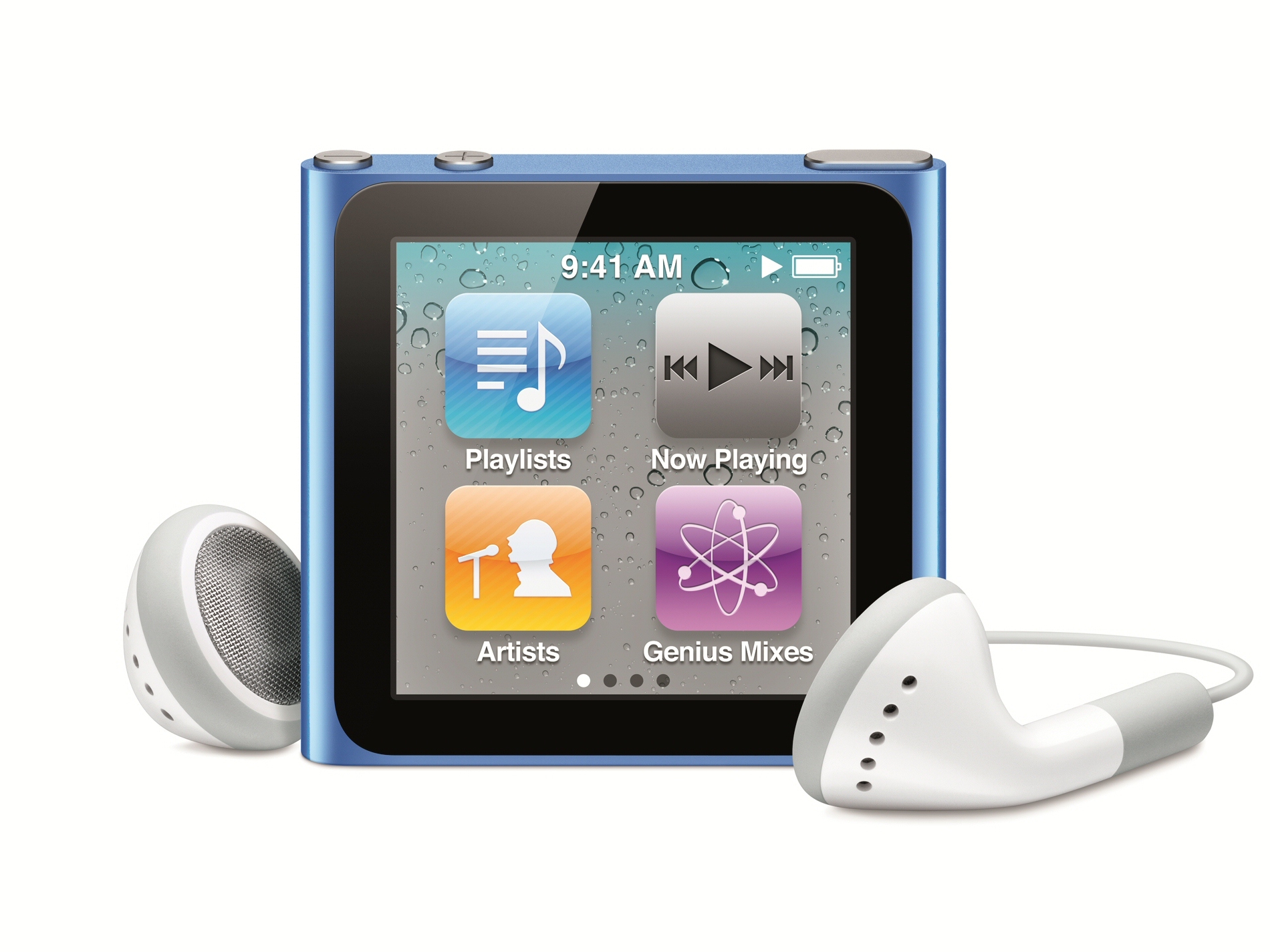
The screen itself is perfectly square, measuring 3.9cm on the diagonal, and a resolution of 240 x 240 pixels. You get four icons on each screen, and from the Home screen you have access to Playlists, Now Playing, Artists and Genius Mixes.
Swipe left and you get another screen containing Radio, Podcasts, Photos and Settings. The next screen contains Songs, Albums, Genres and Composers and finally the last screen boasts Fitness and Clock.
As with the iPhone, pressing and holding an icon makes it wiggle, so you can move apps between screens. You can also change the wallpaper in the Settings app. Good use is made of inertia scrolling when navigating through lists, and you can also press and hold to bring up an alphabet letter to jump straight to it.
Navigating with touchscreen
It's not immediately obvious how you move back up a level in a menu, but a right swipe always takes you back one screen from wherever you are. Tapping and holding anywhere will take you back to the Home screen.
Once you understand all this, you'll find navigating menu items on the new nano is much easier than using a click wheel.
Apps like Playlists, Genius Mixes, Genres, Composers, Podcasts, Albums and Songs are just different ways of accessing your music collection and are much the same as they've always been.
As you'd expect, the Now Playing app displays album artwork for whatever track is currently playing. Tap once to bring up player controls and swipe left from here to access more controls for creating a Genius mix based on the playing song, or scrub through the track.
The Radio app uses the earphones as an antenna and makes good use of multi-touch, enabling you to scroll through FM frequencies, or you can just tap the arrow icon to scan for a station with a good signal. You can also pause live radio for 15 minutes.
The Fitness app isn't the full Nike + iPod Sport Kit experience - instead its just a pedometer, which is a bit disappointing, but you can plug in the Nike + iPod Sport Kit accessory to the 30-pin dock connector port.
Current page: Apple iPod nano: Features
Prev Page Apple iPod nano: Overview Next Page Apple iPod nano: Performance
Graham is the Senior Editor for AI at TechRadar. With over 25 years of experience in both online and print journalism, Graham has worked for various market-leading tech brands including Computeractive, PC Pro, iMore, MacFormat, Mac|Life, Maximum PC, and more. He specializes in reporting on everything to do with AI and has appeared on BBC TV shows like BBC One Breakfast and on Radio 4 commenting on the latest trends in tech. Graham has an honors degree in Computer Science and spends his spare time podcasting and blogging.
