TechRadar Verdict
Pros
- +
It's cheap
- +
Superb screen
- +
Small and light
- +
Great choice of books
Cons
- -
Not so good with pictures
- -
Books could be cheaper
- -
Some controls a bit awkwawrd
- -
Experimental features need more work
Why you can trust TechRadar
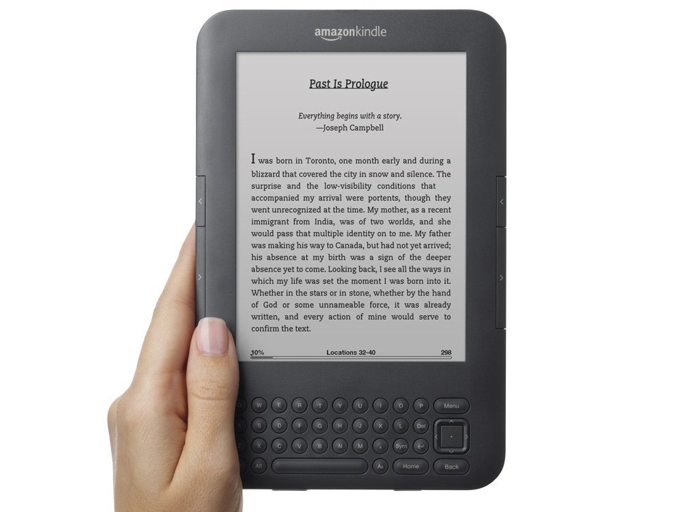
The Amazon Kindle Keyboard has been the most hyped eBook reader of the year.
With a hugely competitive £109 price-tag, decent specs and the backing of the UK's biggest book etailer, even before launch it's made many of the other eBook readers out there look outclassed and hugely overpriced.
But does it live up to expectations?
The Amazon Kindle looked for a while as though it was going to be lost in the tablet hype-fest as a hopelessly under-specced footnote on the path to iPad supremacy.
But with the new Kindle Keyboard, Amazon has absolutely shown there's plenty of life in the dedicated eBook reader yet.
It's the first Kindle to be properly supported in the UK from its release date, including having a dedicated UK store (the Kindle 2 was eventually available here using the US store to make purchases).
This Kindle Keyboard has a bigger battery with 14 per cent more capacity (enough to last a month with W-Fi turned off), an extra 1GB of memory (4GB in total) and is noticeably smaller and lighter than its predecessors.
It's available is a Wi-Fi only edition, or one with added 3G support. The latter version comes in a choice of colours – white or dark grey – with the wi-fi version it's grey only.
In practice, the improvements in the Kindle specifications don't make a lot of odds.
The battery life, already long, is now a claimed one month (sorry, deadlines meant we couldn't put that to the test!).
Storage capacity was already thousands of books, and is now a claimed 3,500 - and with the 3G and Wi-Fi network connectivity enabling you to download from the web at will, capacity is effectively infinite.
But there is one change which does make a big difference – the new display.
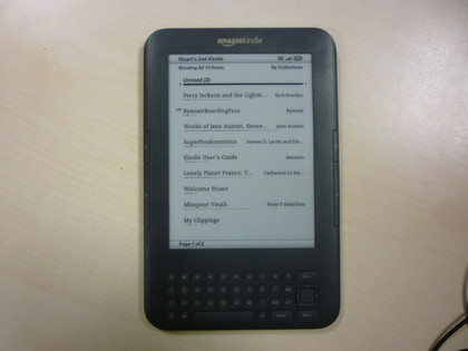
Amazon claims a 50 per cent increase in contrast ratio, and it's certainly a big improvement - certainly one of the best eReader screens we've seen.
More than one of the people we showed it to assumed that it still had a fake display sticker on it, like the ones mobile phones have in shops, and were amazed that it was actually on and that this was the real display.
The display is sharp and the text is a deep black, making it very easy to read. Far easier, in fact, than on touchscreen tablets like the iPad.
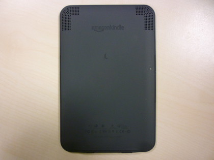
The background is not pure white, more of an Etch-A-Sketch grey, and if you look carefully you can see ghost text from the previous screen. This is a side effect of the ultra-low-power E Ink Pearl electronic paper display which wipes and redisplays once, rather than continuously refreshing like a conventional LCD panel.
In practice the effect is no more noticeable than the show-through you get form a real book. The 800x600 display might be expected to exhibit jaggies, especially as there is no anti-aliasing, but the chosen fonts work well.
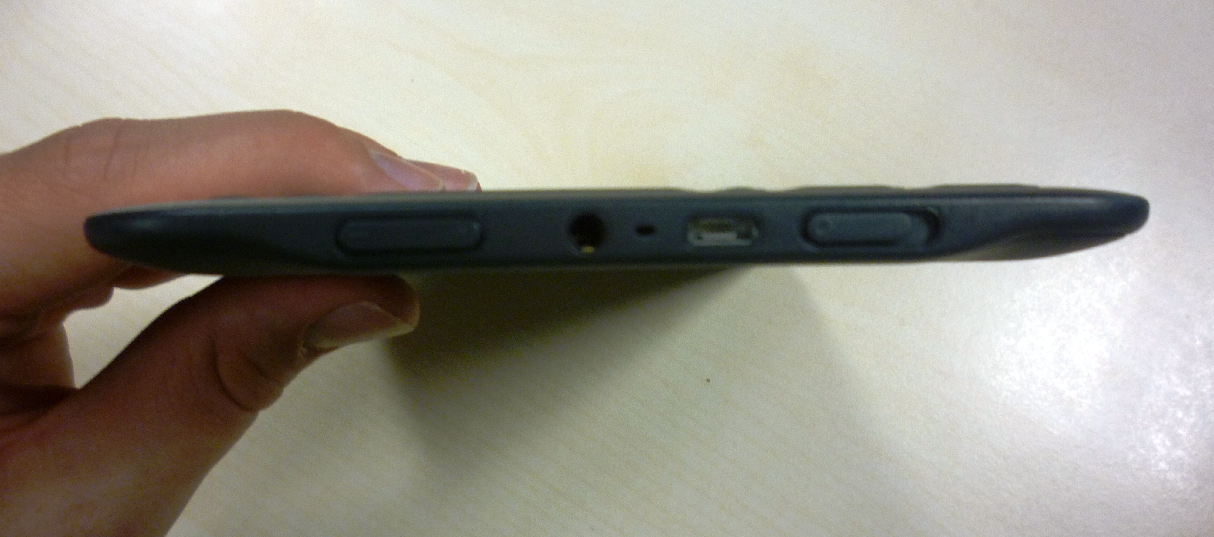
There is a definite pause when you transition pages, and the screen flicks black – no wow-factor animated page turns here - with a screen refresh time of around a quarter second per frame. It jars a bit at first but you rapidly don't notice it.
Reading with the new Kindle
Unlike the iPad and the plethora of Android based tablets, the Kindle Keyboard is designed to do one thing, and to do it well – display books. It has some other bolted-on functions, but they are very much secondary, and we'll come to them later.
It's as a book reader that the Kindle Keyboard excels. It's form factor is perfect – about the height and width size a small paperback, but much thinner (unless you read a lot of poetry). It's weight, at 240g, is low enough to hold comfortably in one hand for as long as you like.
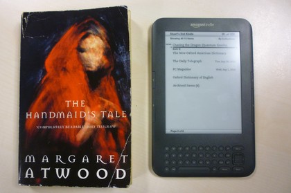
New Amazon Kindle 3 next to a regular paperback
It weighs roughly two thirds less than an iPad, and 140g less than a Samsung Galaxy Tab.
Page forward and back controls, duplicated on either side for lefties, are ergonomically perfect once you've got used to the bottom-top buttons rather than right-left for forward and back.
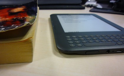
Compared to using the Kindle app on the iPad, it's much easier to turn pages and of course you don't get accidental page turns from touching the screen by mistake.
