Why you can trust TechRadar
The Nook Simple Touch GlowLight is very easy to set up and navigate. The first time you turn it on after charging it will show you a load of terms and conditions. Accept these (you can always go back and dip into them on a particularly bleak Wednesday if you desire) by delving into the settings.
The e-reader will also prompt you to set your time zone, connect to your Wi-Fi network and register your Nook so you can buy publications to read.
The Home screen has Reading Now (the last book you were reading, including the page you were on), New Reads (items in your library) and What to Read Next, which is a list of some recommendations based on the e-books and publications you've bought.
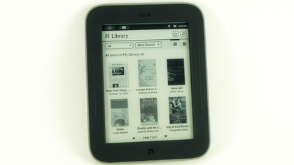
We tested the US version, which came pre-loaded with 20 titles, including the latest J K Rowling, Reader's Digest, Charlie and the Chocolate Factory, Pride and Prejudice, The Wall Street Journal (we told you it was highbrow) and OK! magazine (err... hmm).
You can choose to browse your entire library or select to just see books or newsstand items, or go even more in-depth, by choosing to only see LendMe publications, My Files (the titles you've added from other devices), Archived items or Everything Else, whatever that means.
You can also create customisable shelves, by creating a title for a new shelf and checking the titles you want to put on that shelf. Easy peasy. If you don't fancy seeing thumbnail images of your book covers, you can elect to just see a text-based list of your library items.
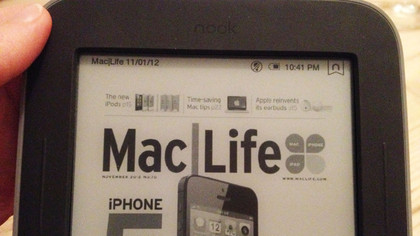
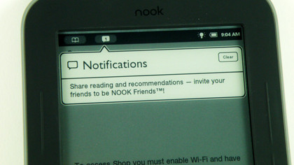
The Nook Simple Touch GlowLight also has a header of icons on the Home page and in publications. This shows an open book icon that takes you back to your current e-book - or tells you the name of your current title if you're in it already - and icons for notifications, GlowLight status, battery remaining and the time.
Tapping on the GlowLight, battery or time icons brings up a Quick Settings pop-up menu that enables you to turn the GlowLight on or off, adjust the brightness of the GlowLight with a slider and quickly turn Wi-Fi on or off by ticking or unticking a box.
We found the GlowLight at its default full brightness was a bit much, so turned it down a little for a more comfortable light. This may need adjusting in different lighting scenarios, so it's helpful to have such quick access to it.
Conversely, in bright light the built-in anti-glare screen was bright and readable, even with mid-lunch sticky fingers on it, while waiting for a train.
When reading a book, newspaper or magazine, there's also a smart ribbon-shaped icon with an 'n' in that header bar. Tap this icon when on a page that you want to bookmark, and it will turn from white to black to show it's marked. Tap it again to remove the bookmark.
To get more content on your Nook Simple Touch GlowLight, hit the hard Menu button and select Shop. Here you can search by title or author, and browse by genre or by collections ('Lists'). The Shop landing page will also tell you what Barnes & Noble recommends for you, and what's on offer that day.
It's unfortunate that there isn't a list of free e-books on here, although we're not surprised that the bookseller has omitted such a thing. There is, however, a Books under $5 on the US version, alongside various bestseller lists. And you can get a lot of classic novels for free, you just have to search for them.
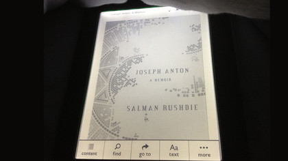
Having looked at a few titles on the New Releases list, the pricing matched that of the Kindle store, in the US at least.
Getting your own books from your computer onto the Nook Simple Touch GlowLight is a breeze - just connect the two via the micro USB to USB adaptor with the supplied lead, then drag and drop your files.
Our EPUB e-book showed up in our library immediately after we disconnected the Nook, and formatted and worked perfectly.
It did lack a thumbnail cover image, but that may have been because it was a free file, since our free download of Wuthering Heights from the Nook store also lacked a cover image. We wouldn't say it's usually worth paying the premium for a cover, since the Library image is so small - the 'Cover' page of the books when you read them is often a text-only title page, not a work of art.
The Nook Simple Touch GlowLight supports both EPUB and PDF files for publications. Our PDF file also copied over, although the formatting did look a bit strange in places.
It should theoretically support JPG, GIF, PNG and BMP image files too, but we couldn't get any of ours to open once they were on the e-reader. Our photos wouldn't have looked great anyway - the black and white e-ink technology is really only suited for reading.
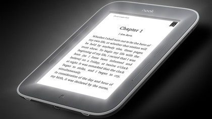
Speaking of which, books were very easy to read, with contrast very much like a real paperback, so it won't strain your eyes. There is a strange dissolve transition between pages that can look a little jarring at times. There are no nice page turn effects like you see on Apple newsstand titles.
When reading a book, the e-ink leaves a faint impression of the words on the previous page, which builds up subtly but noticeably for six pages, before the whole screen refreshes on the seventh page, or at set points such as a chapter cover page. When moving from a graphic-heavy page to a text-only page, it can appear to flash a little, which is uncomfortable to look at.
To go through pages, you can flick left and right, tap the right or left of the touchscreen or use the hard buttons either side of the screen, which you can configure in the Settings. Sometimes the touchscreen confuses a right-tap with a centre-tap, but it's accurate most of the time, especially once you're used to it.
Tap the centre of the screen to bring up Content, Find, Go To, Text and More buttons.
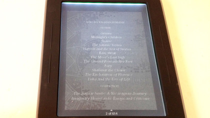
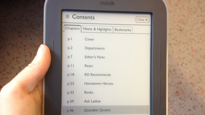
Content gives you a contents page of chapters or article titles, and tapping on a title takes you to that section. Other tabs on this page are notes and highlights, and bookmarks.
Navigating multi-page menus such as this requires swiping left and right, using the hard buttons or tapping tiny black on-screen arrows. Those with child-sized hands could use these, but anyone with normal-sized fingers will struggle with accuracy here.
Find brings up a search bar and QWERTY keyboard, as you might expect. The portrait-only keyboard has a slight delay when tapping out words, but the search is quick to retrieve results.
Click on the entry you want from the search results and there's a horrible flash of the old page and a dissolve into the new page. The word you searched for is highlighted, and a search bar is at the bottom, along with arrows to navigate to the next and previous results - a bit like find and replace in Word.
Go To brings up a status bar telling you the page you're on, a sliding status bar showing your progress, a button to go back and another to go to a specific page.
The slider is very sensitive, so a slight movement could throw you ten pages ahead, depending on the length of the book. But it could be useful if you want to jump to a rough position in the book, then flick through to find the bit you were thinking of.
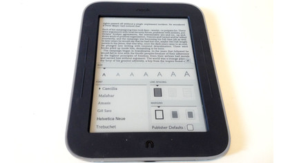
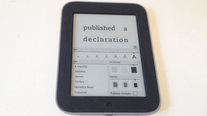
Text enables you to change the typeface, line spacing and margins. The default is Caecilia, a clear serif font, with medium text size, line spacing and margins. Clicking a different option brings up a live preview on the top half of the page.
There are are six fonts, offering a good range of character width, height and serif or sans serif-ness. You might want to adjust the type to suit your book - for example we found Caecilia was our favourite for Pride and Prejudice, but OK! was better in Helvetica Neue. We think Gill Sans is the devil, so steered clear of that.
Unfortunately you can't set different text settings for each book, so you will have to manually change them for each title. Alternatively, leaving the Publisher Defaults box ticked produces what the publisher of each book or magazine thinks are the optimum settings for that book's genre and target audience. This is a great option that we found pretty accurate for most titles.
More requires a Wi-Fi connection, and gives you a screen with a synopsis and star rating, plus buttons to share or archive the book, customer and editorial reviews and related titles.
Social connections
When you're reading a book, you can also use social features. Tap and hold your finger down on a word or passage to bring up options to highlight it, add a note, share it or look it up. The latter tool is invaluable for those looking to expand their vocabulary.
Share links up to your Facebook, Twitter and Google accounts, with the ability to set these up now if you haven't done so already, by simply entering your login details.
We generally delete Facebook friends who quote passages of books as their status updates, but perhaps your friends are more tolerant. Or perhaps you'd like to email yourself a passage from a text book.
It's a shame this doesn't work in reverse, with you able to email e-books to the Nook, negating the need for cables, but it's an affordably priced device, so can't do everything.
LendMe is another social feature that enables you to lend and borrow books with your Nook-owning friends. It's available on many titles but not all, and is set up to be visible to your Nook friends by default, though you can change this in Settings.
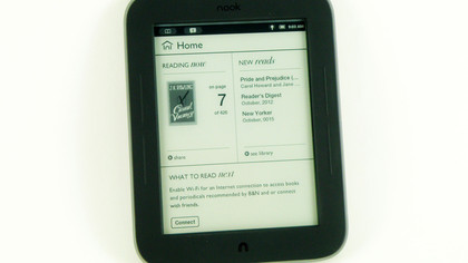
Settings is accessed by tapping the hard screen menu button, and is accompanied on that home screen by buttons for Home, Library, Shop, Search and GlowLight, which all do as you'd expect.
Search brings up results from the library and book store, and remembers your recent searches if you clicked on a result. It only works with exact spellings, and doesn't search the content inside a publication, only the title.
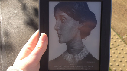
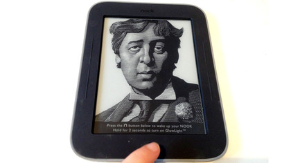
In Settings>Screen, you can set up the screen timeout from two minutes to one hour, and the screensaver to be authors or nature images. Sadly, you can't choose which author, so it alternates between Walt Whitman, Virginia Wolfe, the Bronte sisters, Gertrude Stein, Joseph Conrad, Oscar Wilde, Homer and Edgar Allen Poe - complete with his raven.
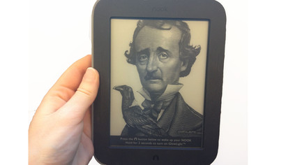
Poe was a bit scary when we woke up the Nook and he flashed negative for a second, before dissolving into the pages of our book. Great if you want to be terrified before bed, but awful if you get nightmares easily, like us.
Barnes & Noble says the Nook Simple Touch GlowLight's battery will last for one month with the GlowLight on, if you read for one hour per day.
We spent three days playing with its settings, switching it on and off, downloading titles, switching between publications and sharing every other word in our e-book, with the GlowLight on for about a third of the time, and only ran the battery down to 70%, so we think this is a reasonable estimation.
