Why you can trust TechRadar
The interface of the Samsung Gear 2 Neo is a tricky thing to design, I reckon. You've got a 1.63-inch screen to play with, and limited buttons - so how do you make it intuitive?
Well, no brand has quite found the solution yet, but Samsung has made a decent fist of it. I won't be happy until I don't have to make it painfully obvious that I'm using a smartwatch by cradling my arm around to get a level surface to swipe on, but that will hopefully come as the platform develops.
The main method of interaction is simple: swipe left and right, and down to get back to the menu above. Depending on where you are in the watch this can be easier said than done, as often I'd find that I was tapping the wrong area if I wasn't deliberate enough in my swipes.
But generally it worked really well, and the materials used in the glass on the Gear 2 make it a pleasant experience to swipe upon.
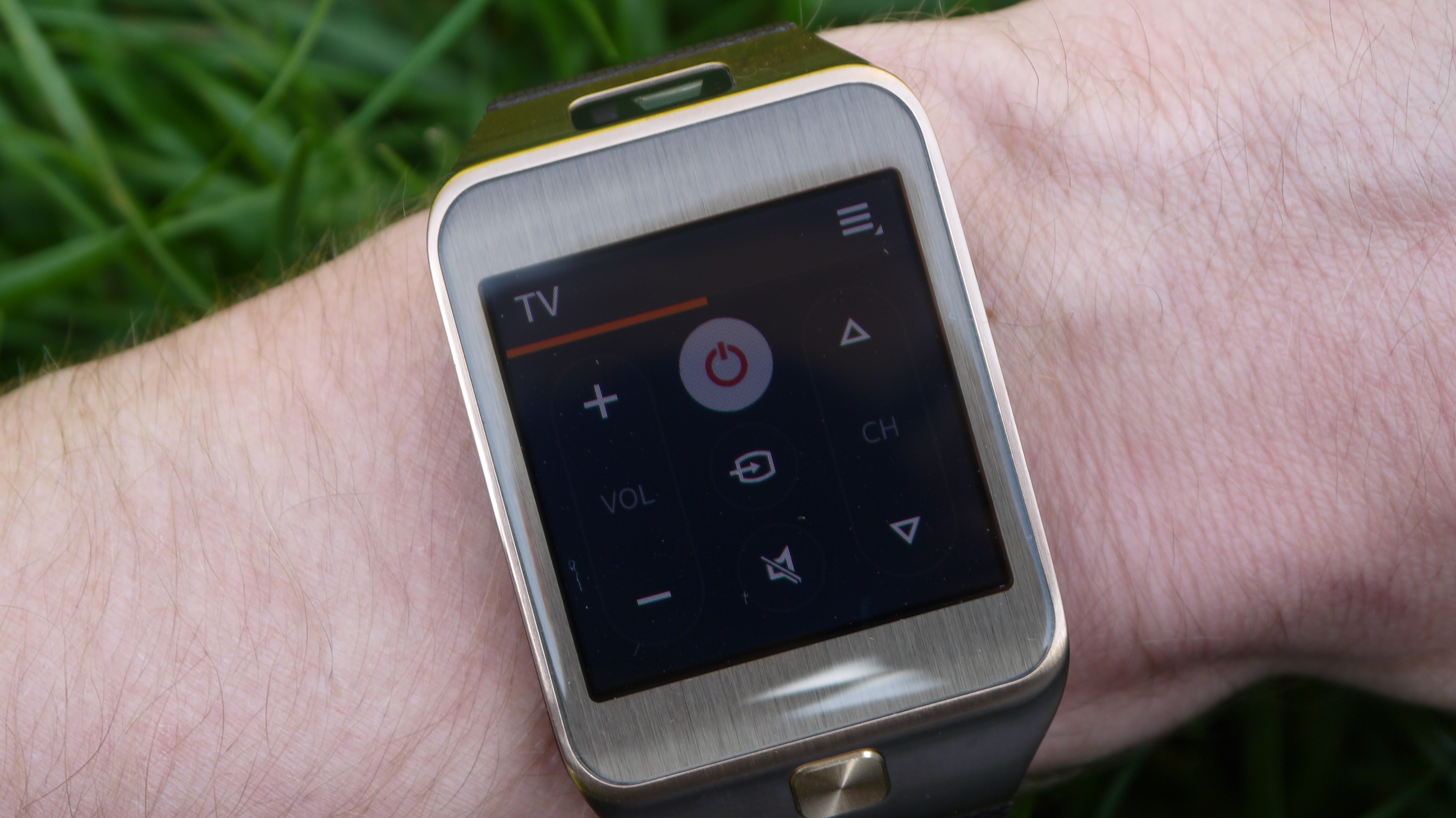
A double tap with two fingers on the screen will show you the battery life and connection settings, but that's not obvious from the outset – it's only because I remembered the action from the Galaxy Gear that I found it.
While I'm giddy with excitement the Neo loses the camera, I do miss being able to swipe down from the top of the screen to start the snapper. This action is now redundant, and should be used for something.
I still think there's a lot more to do when it comes to making the Gear 2 Neo a more intuitive device for getting through the system - I quickly lost count of the times that I had forgotten which screen I had left the exercise app, or pedometer, or music player and needed to get to them quickly, meaning I was left swiping through reams of apps.
The annoying thing is most of these are repeated in the actual Apps icon, leading to an identical layout and menu that features more apps and doesn't have a homescreen.
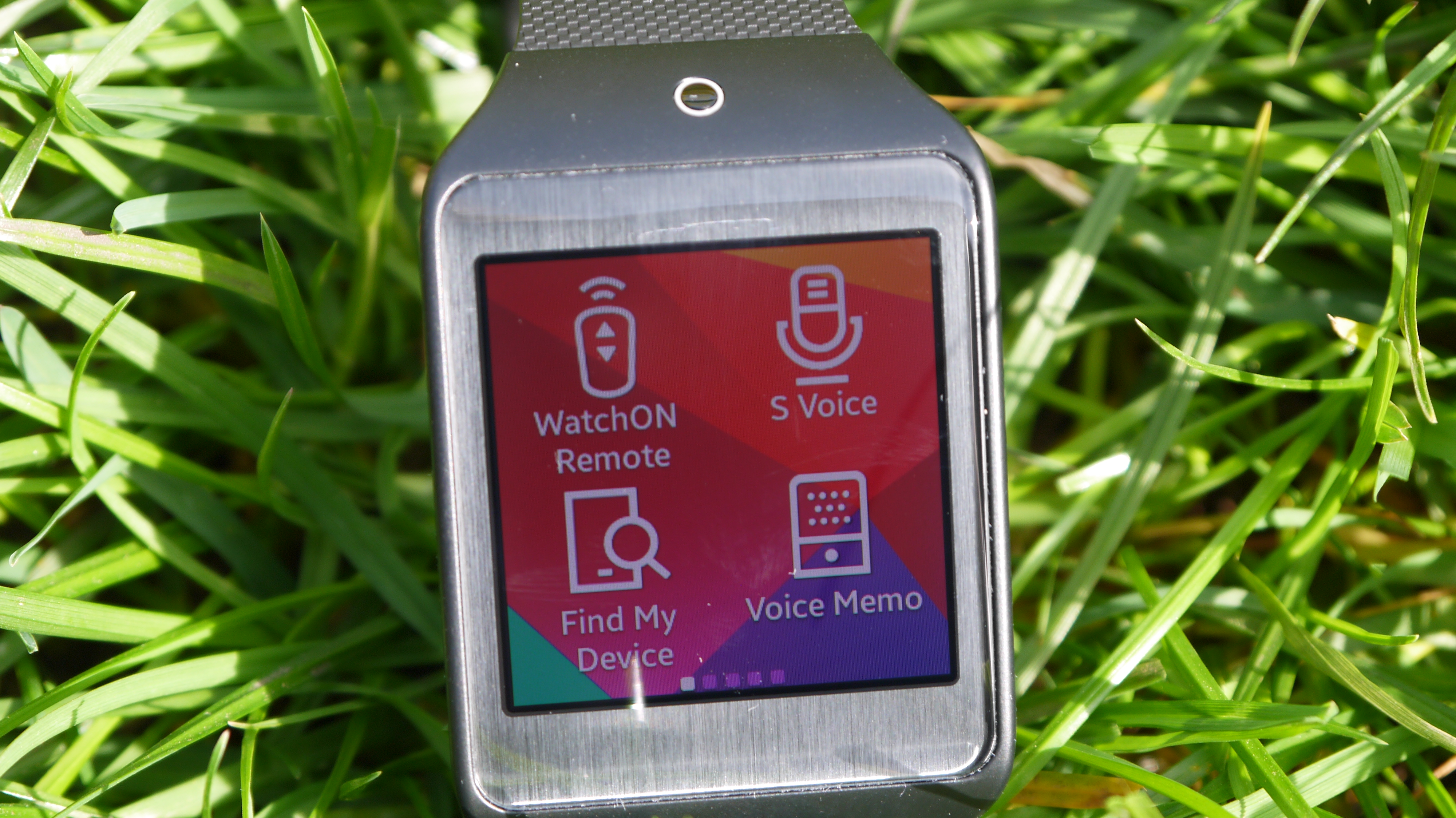
What happened to the larger icons of before? Or just two per screen? This worked better in my opinion, rather than these tiny 4-icon grids. Samsung clearly realised this was needed as you can now pinch to zoom in from the homescreens to increase the size, or do this in the settings menu, but that's not clear from the outset.
You can customise the order of the apps and screens on the Gear 2 more easily than before through long-pressing, but in reality it's a droning list of the same white icons - Samsung needs to find a smarter way of delving through and finding the apps you want.
One way of doing this is using the clock with the shortcuts underneath, which you can customise as you see fit. This is a neat way of doing it (providing you're not enamoured with one of the other cool themes for the clock face) and the range of stuff you can have there means you can have the shortcuts you need quickly.
Samsung's been a little more clever with this iteration of the Gear range too, as the 'lift to wake' option, where you simply raise your arm with the same action you might to check the time on a standard wristwatch and the screen will fire up.
There will be times when this doesn't work straight away, leading to a more pronounced wrist-raise to activate the screen (when it would have been easier to press the home button to wake it from sleep) but hey, it's all part of the game.
It didn't turn on as much in the cinema as the original Gear did, but it wasn't bulletproof. And with the ability to customise the wallpaper the screen is a LOT brighter when it activates now, and will annoy fellow darkness-dwellers.
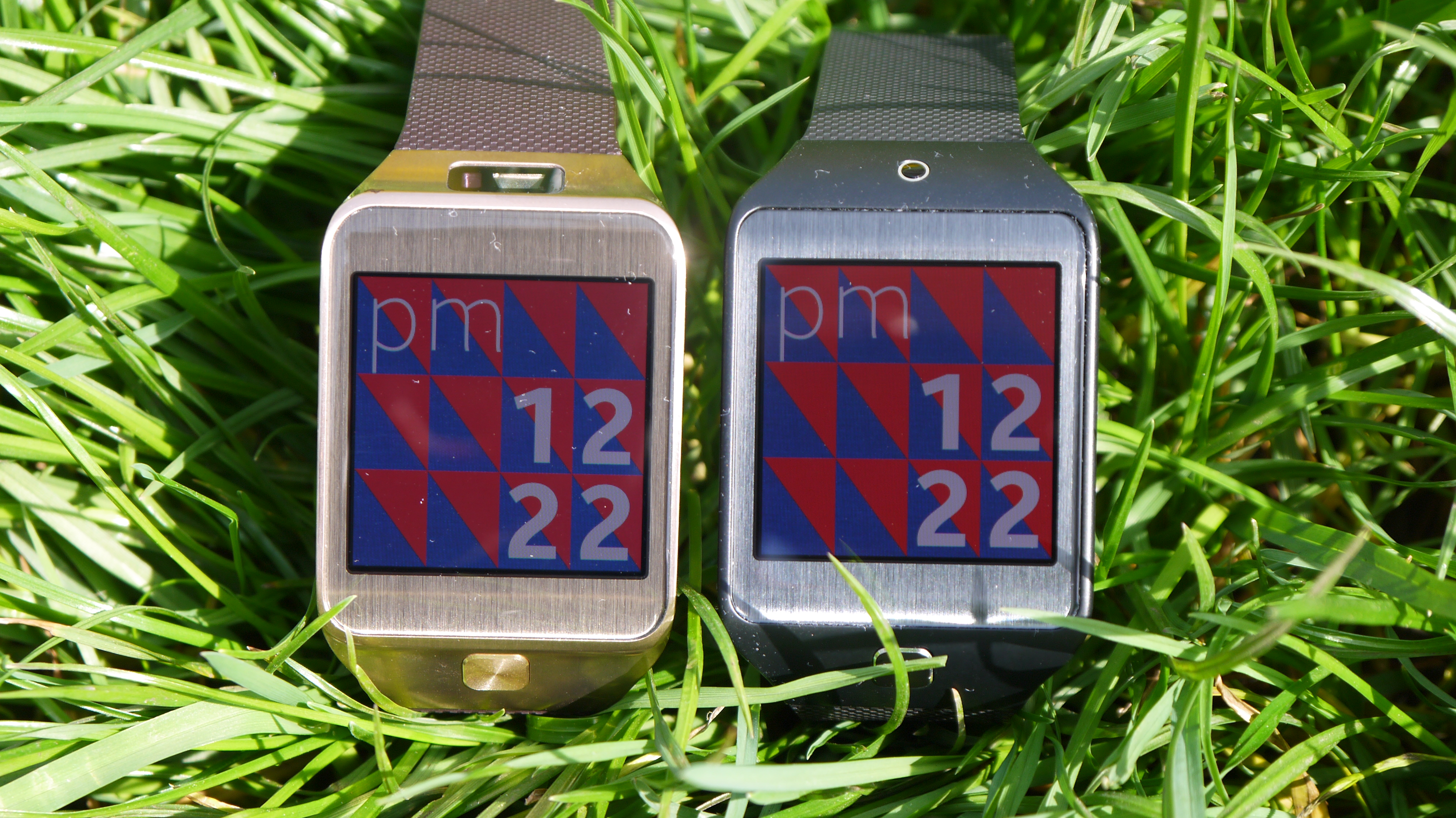
Samsung would do well to have a quick toggle to deactivate this mode: it's one of the most useful actions on the watch in day to day life, but there are times when you want it turned off for a short period - it's the same as having a ringtone switched on, so why not offer the option?
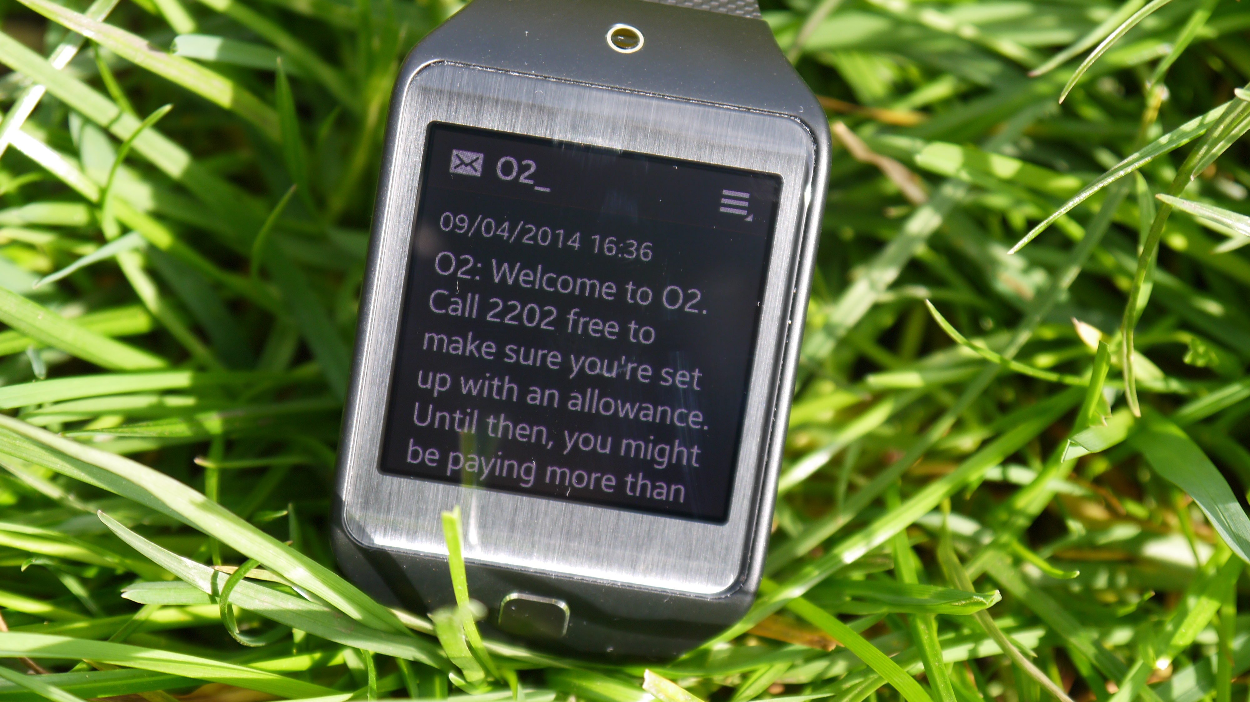
The screen brightness on the Gear 2 Neo is excellent as well - even in bright sunlight, it's perfectly visible, and once again I salute Samsung's efforts into making OLED a credible alternative to LCD in these places.
You can even long-press the power button and tap the display into Outdoor Mode, which will raise the brightness to a legible level (ranging from 1-6, but only for five minutes before it drops to 4 to make sure you don't blitz the battery.
Notifications on the watch are obviously one of the most important things on offer here, meaning you can get information when you receive a text, a call or a calendat reminder.
On top of that you can access other third party notifications, so if it appears in the notification bar of your phone you can see it on the watch.
The excellent part of this is that, if enabled, you can make it so that tapping the notification then picking up the phone will activate whatever app automatically. So be it seeing a picture message, going straight into eBay to stop that sonofagun outbidding you or opening up Real Racing 3, it's a fluid and simple way of doing things.
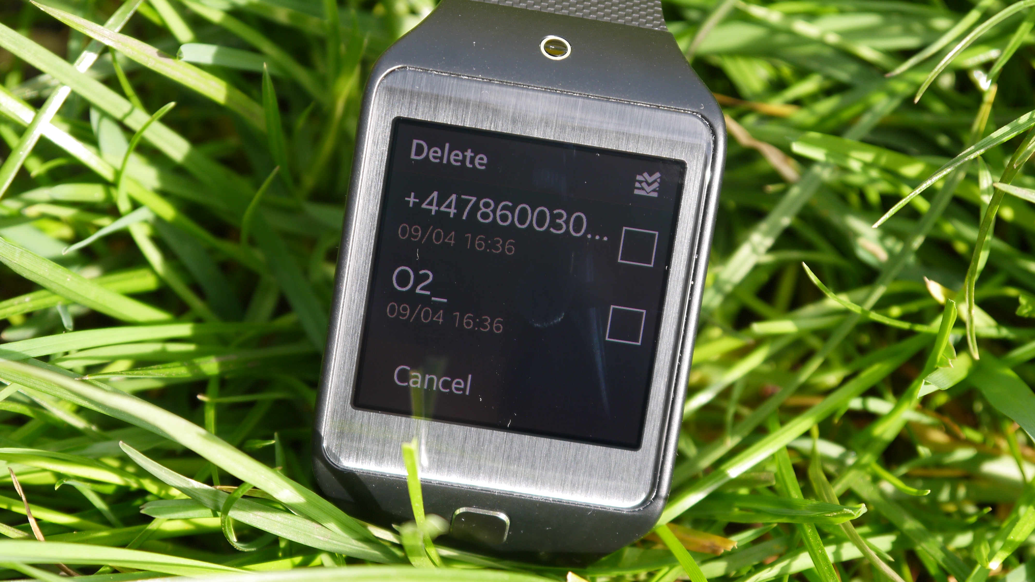
One thing that irritates the life out of me on the Gear 2 Neo is the notifications app. You head in there, and a small bar at the top shows that you can unmark or delete the notifications.
However, just as you're about to tap, it disappears and the list moves up, so I often tapped the wrong area, and when you learn it, and have to wait, it doesn't make things easier.
The call quality is better though, should you want to take a call on your watch. You don't seem to need to hold it as close to your face, compared to the first Gear, which means when driving you can continue a call much more easily.
Plus you don't have to pretend you're holding a phone to your ear to make sure you can hear what they're saying too.
The overall speed of the Gear 2 Neo is good too, with very little in the way of slowdown. I can't run the same benchmarks I usually do, but it's got a dual-core 1GHz Exynos CPU and can run both very efficiently, thanks to the Tizen OS under the hood.
There's a little lag between transitions, but it's mostly stable so I can easily live with that.
One odd point with the Gear 2 Neo: there's a gallery app still installed when it's not needed. You can't even push pictures directly from the phone to the smartwatch, so unless you connect the Neo to the PC and drop files directly over, you can't see anything in there.
Come on Samsung: let's save some internal space.

Gareth has been part of the consumer technology world in a career spanning three decades. He started life as a staff writer on the fledgling TechRadar, and has grew with the site (primarily as phones, tablets and wearables editor) until becoming Global Editor in Chief in 2018. Gareth has written over 4,000 articles for TechRadar, has contributed expert insight to a number of other publications, chaired panels on zeitgeist technologies, presented at the Gadget Show Live as well as representing the brand on TV and radio for multiple channels including Sky, BBC, ITV and Al-Jazeera. Passionate about fitness, he can bore anyone rigid about stress management, sleep tracking, heart rate variance as well as bemoaning something about the latest iPhone, Galaxy or OLED TV.
