Why you can trust TechRadar
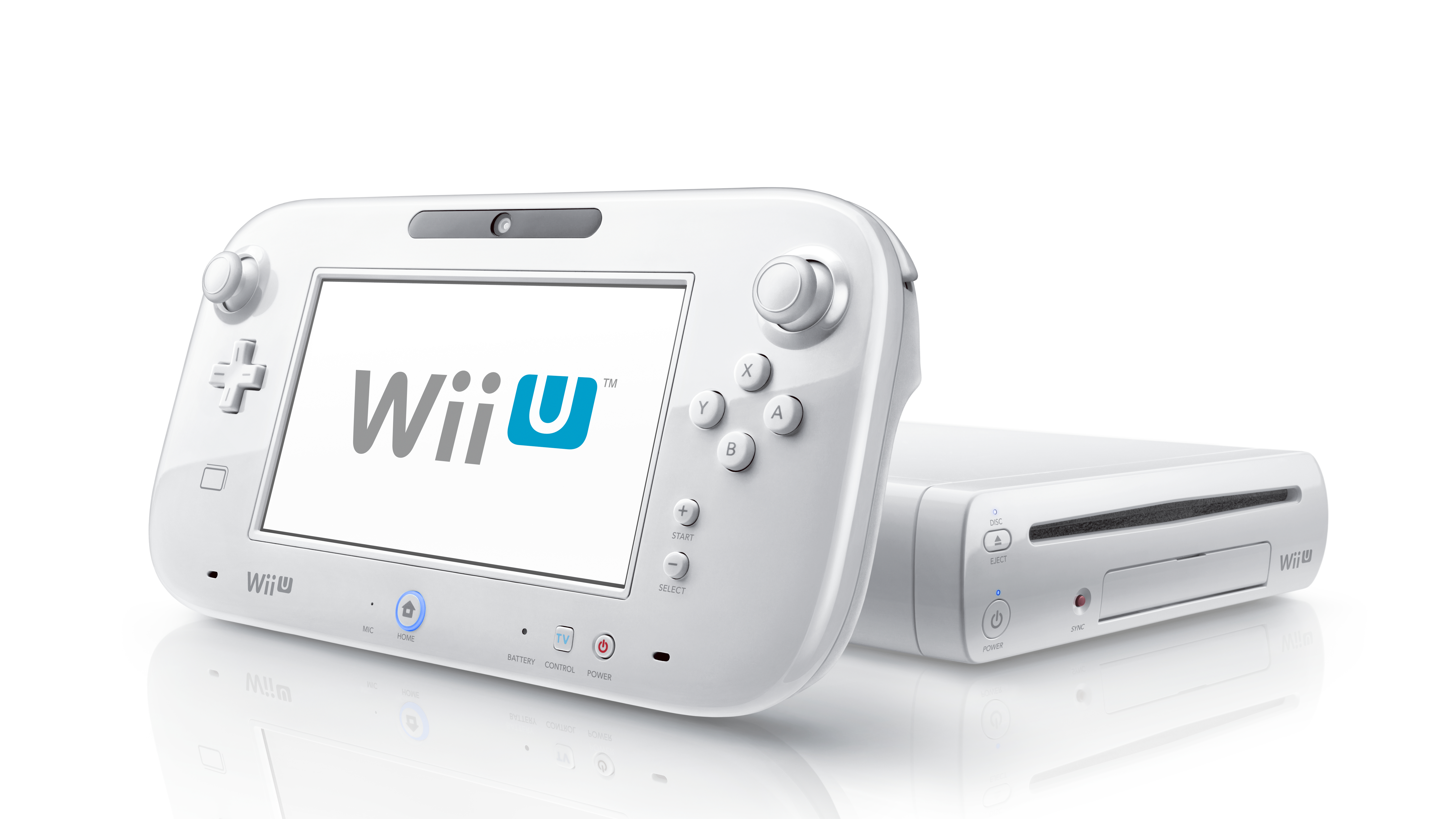
If the GamePad's second screen makes the Wii U concept feel like a blown-up take on Nintendo's handheld ethos, the 3DS-esque interface and home screen only confirm that.
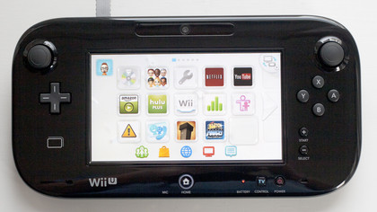
Upon loading up the console, by default the GamePad screen displays three rows of five icons each, whereupon you'll find access to whichever game is in the disc drive, settings, and installed apps and downloaded games. Below those large icons are five smaller, permanent ones that include access to Miiverse, eShop, the web browser, the incoming TiVii app, and notifications.
Five identical screens can be filled up with your games and apps of choice, and all can be navigated either via touch or using the physical inputs of the GamePad. It's a crisp, clean, and to-the-point approach that works well for the system and looks great on the smaller screen.
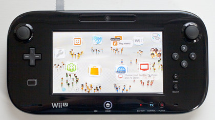
Meanwhile, on your TV you'll see your created Mii character amidst friends' creations and a mass of other random Miis standing near floating app and feature icons in the sky. It's just another way of viewing the myriad abilities of the Wii U – plus little dialogue bubbles suggest things to check out – and you can swap the two screens at any point.
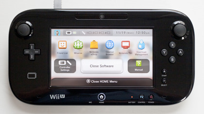
As on the Nintendo 3DS, tapping the Home Button on the Wii U GamePad pulls up a hub menu that includes a battery life indicator, date and time, access to controller settings, and links to the Friend List and Download Management screen. As with most Wii U menus, what you see on the GamePad is also what appears on the TV.
Also a trend throughout the Wii U menu experience: sluggishness. It's everywhere you turn, whether it's waiting 15 seconds for the settings menu to load up or the same delay in getting back to the Wii Menu after exiting an app. The interface is in clear need of optimization and refinement in that regard, as getting from one place to another proves a slow-paced venture.
Another awkward element of the Wii U interface is its handling of original Wii games and content. Not only does that all take place on a separate screen, but the hardware actually reboots and simultaneously shuts down the GamePad, forcing you to use a Wii Remote with the sensor bar – and what you'll get is a perfect facsimile of the Wii menu screen in all its jagged, low-resolution glory.
Inelegant seems too kind a description for what's essentially a closed-off console within a console. Even getting content from your old Wii to the Wii U is a drawn-out and cumbersome process requiring both being connected online while using an SD card to transfer the actual content. It works, and the step-by-step process is well explained, but not ultimately having that content accessible with the GamePad and via the Wii U menu is disappointing.
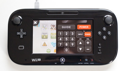
While the Nintendo TiVii feature has been delayed until December, one helpful TV-related ability is here on day one. You can use the GamePad to control both your TV and cable/satellite box, and the setup process is absolutely breezy. We simply tapped in the name of the TV manufacturer and cable provider and it worked for both on the first try.
Once that's done, simply tap the TV Control button on the lower right of the GamePad to pull up a black remote overlay, which lets you input channels, access the guide, change volume, and toggle the power of either device. It could replace the standard channel surfing routine for many heavy users; for others, it'll still be a helpful perk for when the remote's too far away.
