TechRadar Verdict
It may not have the fitness tracking of a classic Garmin runner’s watch but the way the Vivomove HR incorporates low-leg smarts almost invisibly is ingenious.
Pros
- +
Looks smart
- +
Solid gym tracking
- +
Decent battery life
Cons
- -
Screen is not clear in bright sunlight
- -
Fiddly touchscreen
- -
No GPS
Why you can trust TechRadar
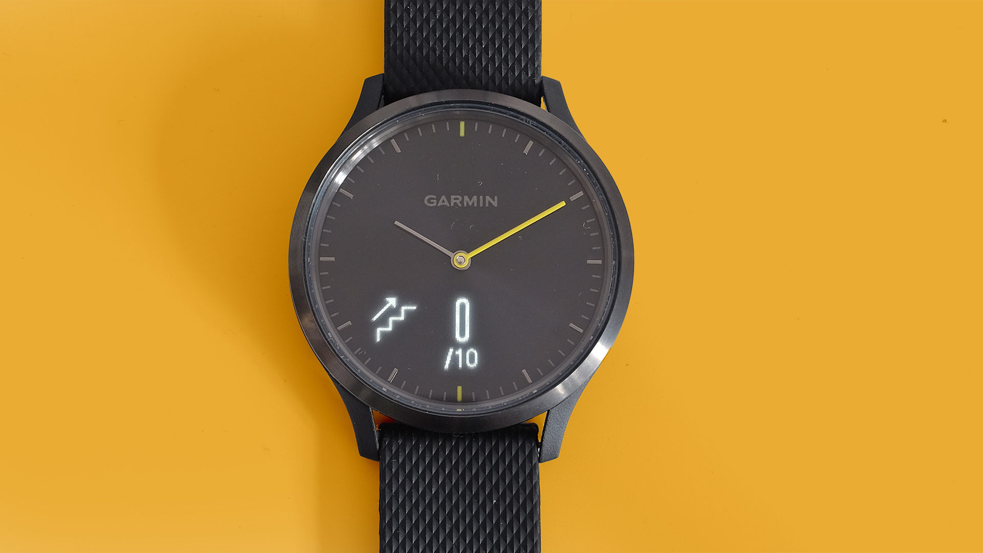
The Garmin Vivomove HR is a hybrid watch that pushes the worlds of smart and “dumb” watches closer together than most.
It has a little semi-hidden screen on its front that lets you read notifications, check your exercise stats and even stress levels. Sure, it doesn’t have apps like a Vivoactive 3, but is far smarter than other hybrids that try to look like an analogue watch.
The main rival is the Nokia Steel HR, which looks a little more elegant but has fewer fitness and smart features.
Garmin Vivomove HR price and release date
You can buy the Garmin Vivomove HR now around the world after it was announced at IFA 2017. The RRP for the cheapest version is set at £169.99 or $199.99 (about AU$250), but you may be able to find it for a little bit less.
If you want the more expensive metal and leather version of the watch it will cost £249.99 or $299.99 (about AU$380). That one isn't available in all markets right now though. For example, in the UK you won't be able to buy that version until Q2 of 2018 so that's probably set for the end of June this year.
Design
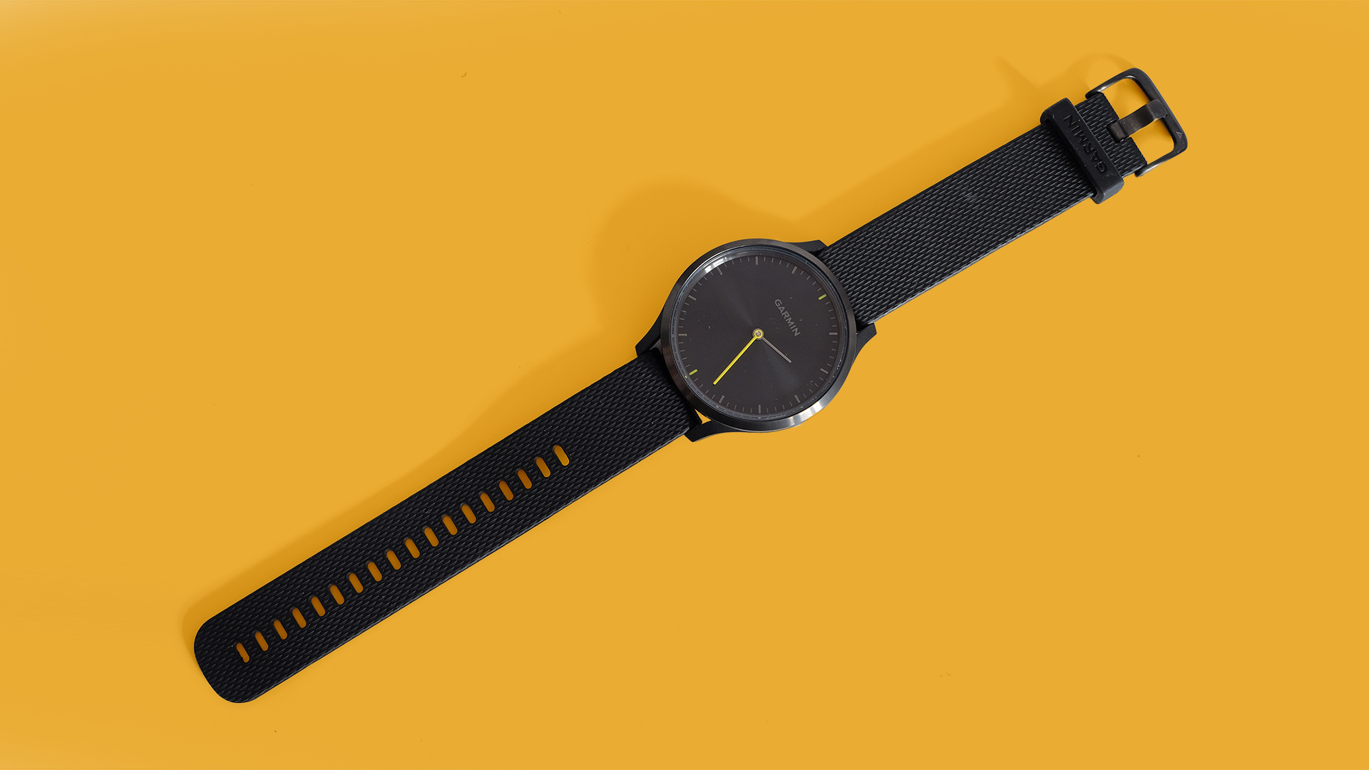
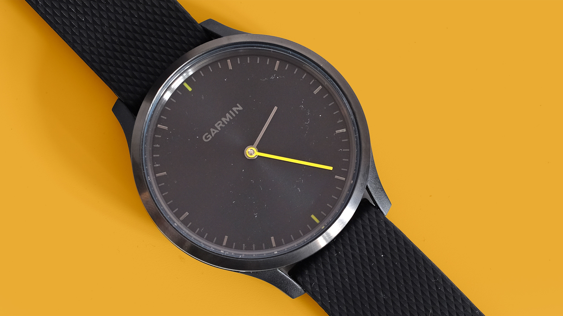
The Garmin Vivomove HR’s main design goal is to pass for an analogue watch. And it’d pull it off if it wasn’t for the Garmin name on the front. We all know Garmin doesn’t make plain old watches, right?
Its face is a flat circle with a reactive finish, sending beams from its centre when it catches the light. There are little “minute” pips around the face’s edge and normal-looking minutes and hours hands.
Until you look a little deeper there’s no obvious sign this is a smartwatch. Garmin makes a Premium version, but this is the more affordable standard Vivomove HR, which has a slightly sporty yellow minutes hand. You can also get it with a pink and gold face, and white strap.
Both of these standard models look smart, but not super-expensive. The edge of the glass covering is not perfectly finished. You can see it too much, where we should really see just the metal bezel and the face below.
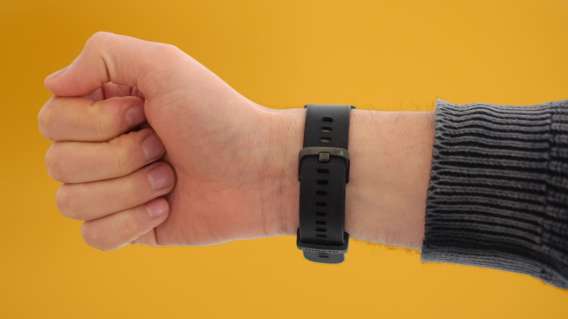
However you can upgrade to the altogether classier-looking Vivomove HR Premium models. These get rid of the colorful parts to the face and switch a silicone strap for a leather one.
Their construction also appears to be slightly different. The standard Vivomove HR we have here has a steel surround, but the part below that forms the underside and the strap mount is hard plastic. Premium models use more metal.
It feels like the kind of hard plastic you might find on one of Garmin’s higher-end runner’s watches, not cheap and flimsy stuff. Not as classy or expensive-feeling as steel, though, is it?
Plastic does help keep the weight down. This watch is very light, and the silicone strap has a good bit of give to it. You can do it up fairly tight without it feeling too tight. Wearing it 24/7 is viable.
Screen and features
So how is this a smartwatch? The Garmin Vivomove HR has an LED screen below its facia. It’s a two-line monochrome display that pops up when you double tap on the little display area or flick your wrist.
Look closely in a well-lit room at the right angle and you can perceive the screen’s border when the screen is not active. But you do need to try.
The Garmin Vivomove HR has no buttons, no crown. You interact with it through the touchscreen. This highlights one of the watch’s few real issues. Using the touchscreen can often feel fiddly.
On occasion a double tap doesn’t seem to register, particularly in the first few days as you get used to the Vivomove HR. It’s a strange issue as flicking through the actual pages of the watch’s micro interface is fast and responsive. Only the double tap gesture trips things up.
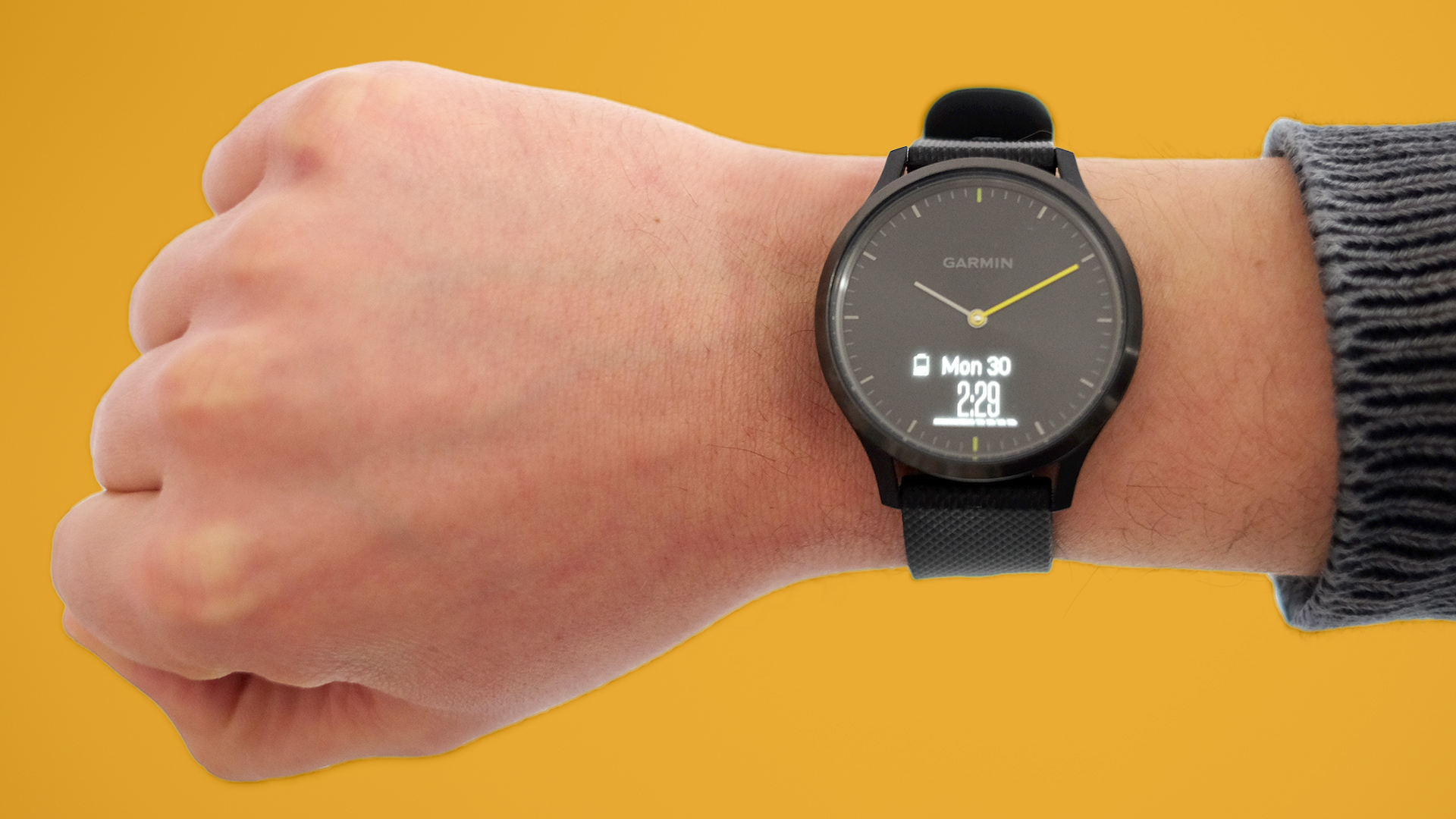
The screen is also not that clear outdoors. Inside it’s very bright and reasonably sharp. However, the more ambient light it has to deal with, the less bright and sharp it appears.
Some have all-but written off the Garmin Vivomove HR because of this. Reviewing it in London, though, where the sun is an infrequent visitor, we actually found it entirely usable while out on the street.
Let’s get a little deeper into what this screen part does.
Double tap on its window and you’ll see the home screen display. You choose what this shows: we picked the date and our step count. Flick right-to-left and the Vivomove HR scrolls through pages of exercise stats and smart features.
On the smarts side you get the weather, music controls and your notifications. You won’t want to pore over the day’s messages on a Vivomove HR. It can only fit a word or three on the screen. However, it’s surprisingly effective at relaying quick SMS and WhatsApp messages.
Checking quick notifications lets you avoid getting your phone out.
The Vivomove HR’s screen uses software very similar to Garmin’s small fitness bands. This watch is a bit like an analogue model with a Vivosmart 3 crammed in under the surface.
- Find the best deals on Garmin products with our Garmin promo codes.
Andrew is a freelance journalist and has been writing and editing for some of the UK's top tech and lifestyle publications including TrustedReviews, Stuff, T3, TechRadar, Lifehacker and others.
