Why you can trust TechRadar
Battery life
- Lasts up to a week
- We got 5 days out of it with everything on
- Charges quickly
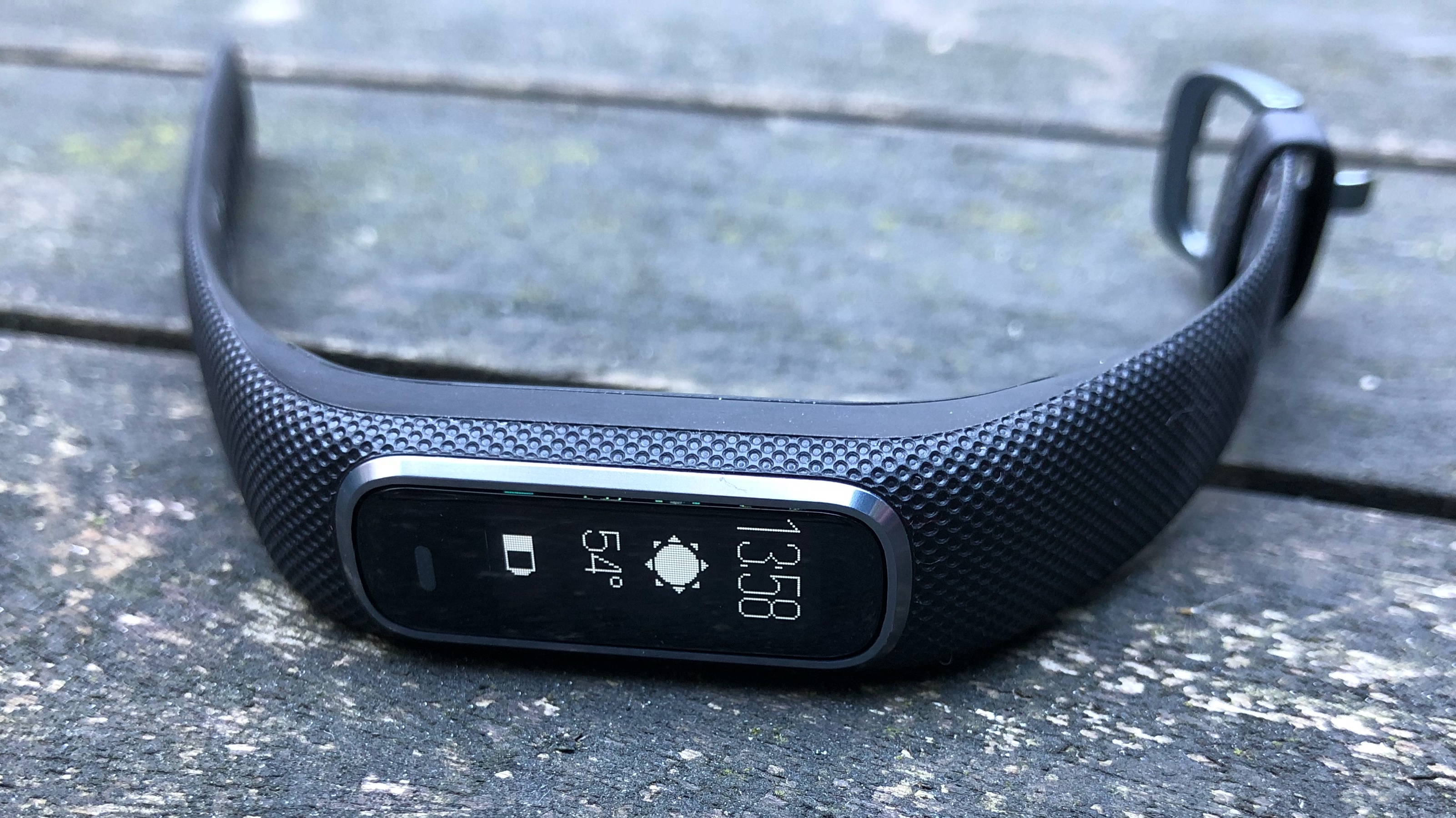
Garmin promises the Vivosmart 4 can keep going for up to 7 days, but that’s without the Pulse Ox sleep tracking switched on.
We had everything on and found it lasted just over 5, which is really great considering we walked everywhere with it, used notifications and worked out most of those days too.
Charging is fast, just over an hour powered us through those 5 days. This is one area where it really shines and if you’re not sure whether to choose this or a more advanced smartwatch, battery may be the determining factor.

Notifications
- Customizable phone notifications
- Sometimes text cuts off and is unreadable
You can get vibration alerts for all notifications, including calls, text messages and apps, which you can customize within the app so you won’t see anything you’d rather not have on your wrist.
You can often view the first line of the notification and a little icon to indicate if it’s an email, message or alert from an app.
In this way you’re mostly being notified about a notification rather than being able to read it fully and this worked better for some notifications than others. For example, email showed an envelope, who it was from and a subject line, which was handy.
If you’ve got an Android device, you can reply with preset messages to texts, but on iOS you can’t. Although this doesn’t seem like a big pain point as it’s tricky to do it via the screen.

Interface
- Screen can be a bit unresponsive
- Interface is generally intuitive
The screen isn’t always as responsive as we’d have liked it to be, which is one of the biggest bugbears with the tracker. It was never completely unresponsive, it just took more than two taps to activate the screen a lot of the time and sometimes the lift to switch on feature for telling the time didn’t work at first either.
When you’re navigating through the bright OLED touchscreen, it does also take some patience to learn how to work it, what everything means and where the different menus are. But it is mostly intuitive and should only take you a day or two to get your head around.
There’s a sensor at the bottom that isn’t a physical button, but acts like one, giving you a little buzz of haptic feedback when you push it. The function of this ‘button’ changes, but mostly takes you back to the home screen and time, which is handy when you get a bit lost in the menus.

App
- Easy to see progress at a glance
- Lots of information is available and generally easy to grasp
The Garmin Connect app is one of our favorites. It’s simple to understand because the home screen features a set of cards displaying key pieces of information. Glance at the home screen and see which sections you’ve received a green tick for, or tap on one of the areas to see the data in much more detail.
The app is great for when you don’t need to know much other than how you slept, but if you want to really dive into how you’ve been doing the charts, colors and bold text ensure that making sense of pretty detailed data is as user-friendly as possible.
Current page: Battery life, interface and app
Prev Page Fitness and tracking Next Page Verdict and competitionBecca is a contributor to TechRadar, a freelance journalist and author. She’s been writing about consumer tech and popular science for more than ten years, covering all kinds of topics, including why robots have eyes and whether we’ll experience the overview effect one day. She’s particularly interested in VR/AR, wearables, digital health, space tech and chatting to experts and academics about the future. She’s contributed to TechRadar, T3, Wired, New Scientist, The Guardian, Inverse and many more. Her first book, Screen Time, came out in January 2021 with Bonnier Books. She loves science-fiction, brutalist architecture, and spending too much time floating through space in virtual reality.

