Early Verdict
It’s not going to redefine mobile phones, but the Nokia 3.2 still feels like a useful device for those on a budget, especially with its bulky battery.
Pros
- +
Low price
- +
Large battery
Cons
- -
Fragile design
Why you can trust TechRadar
The Nokia name is usually associated with ancient brick phones, but in recent years, revived under the stewardship of HMD Global, we've seen it kept up a steady output of mid-range and budget handsets.
The latest in this roster is the Nokia 3.2, which launched alongside the slightly superior Nokia 4.2 at MWC 2019.
The device builds on the Nokia 3.1's design and features, with a few upgrades to keep it competitive in the modern mobile market, but while remaining firmly in a low-end market position.
Update: The Nokia 3.2 is now available in buy in the UK.
- Hands on reviews: Nokia 9 Pureview | Nokia 4.2 | Nokia 1 Plus
- These are the best Nokia phones you can buy currently
Nokia 3.2 release date and price
The Nokia 3.2 is now available to buy in the UK, with the handset being stocked at Amazon, John Lewis, Argos and AO.com.
Nokia says it will be available in 2GB of RAM and 16GB of storage and 3GB/32GB variants, although only the former is currently available in the UK.
The Nokia 3.2 price starts are $139, £129.99, AED 469 (around AU$200) for the 2GB/16GB model, while the 3GB/32GB Nokia 3.2 price is $169 / AED 569 (roughly £130, AU$240).
These are comfortably low prices for a smartphone, but if you're a heavy app user the low memory might be a slight turn-off.
Nokia 3.2 design and display
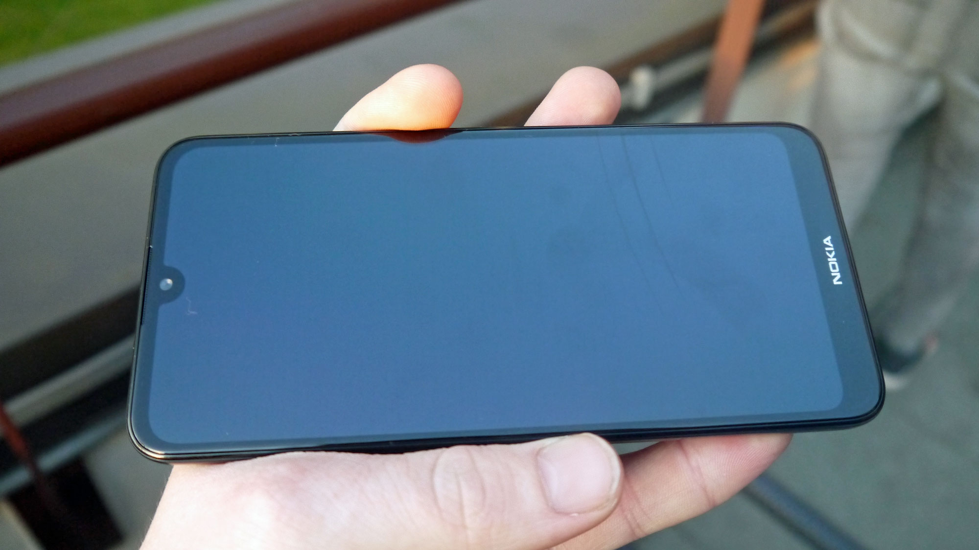
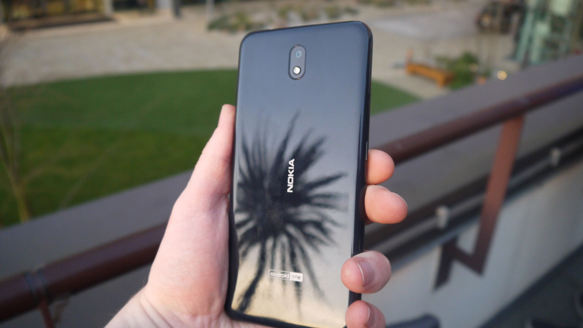
The first thing we noticed about the Nokia 3.2 is how light the device felt – it almost feels weightless, even compared to other lightweight devices (including other Nokia devices like the 4.2).
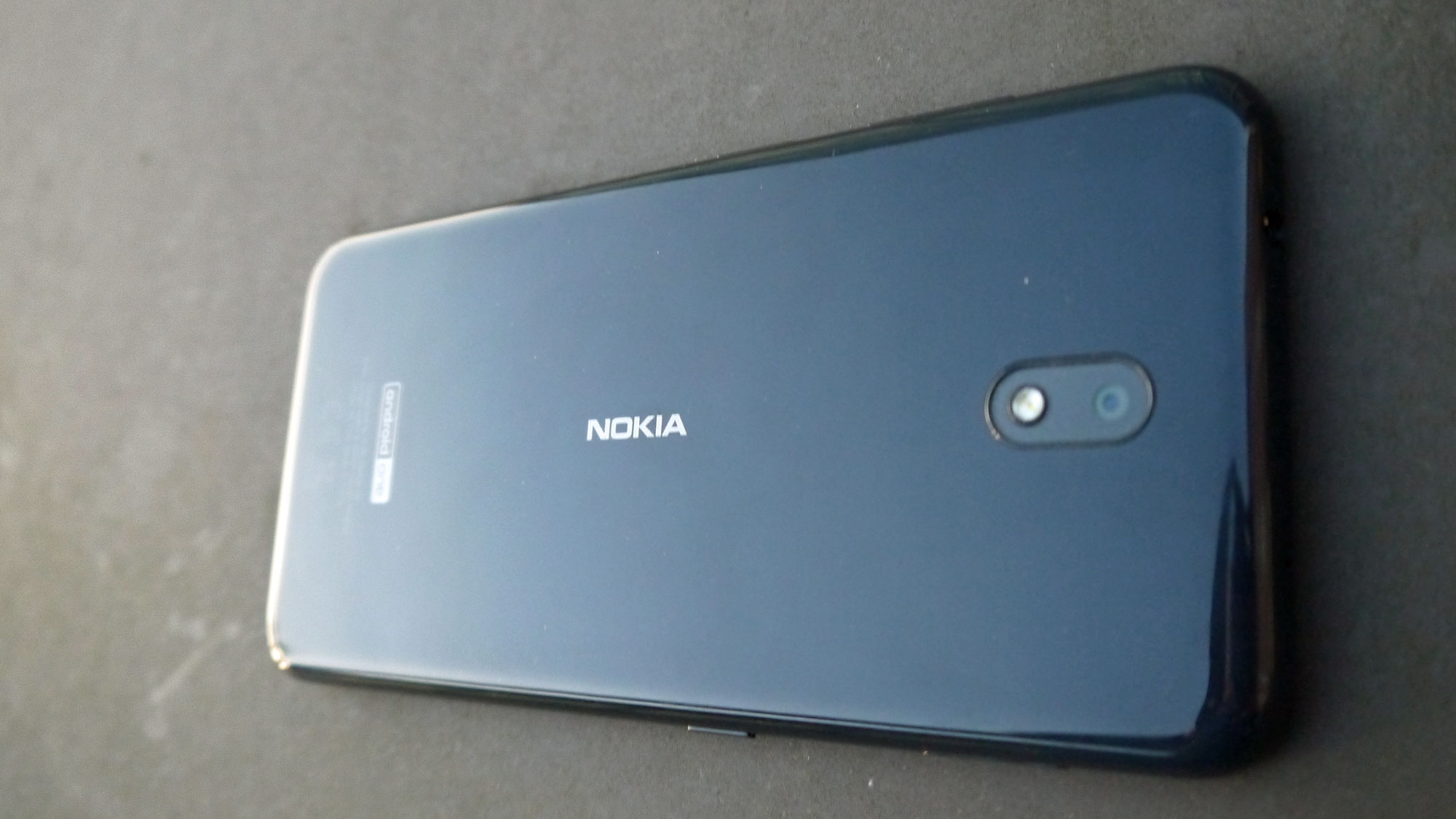
The device has a plastic frame, and coupled with the lack of heft this does make it feel a little cheap and fragile in the hand. When using the device it felt like it would buckle if we held it too firmly (although it didn’t), and we were a little worried that it would shatter if dropped.
Despite this it has a sleek look, with a minimalist design on the front and rear (compared at least to the new Nokia 9 PureView, launched at the same time, and sporting no less than five cameras on its rear).
It also has a USB-C port and 3.5mm headphone jack – it's great to see a Nokia stick with the headphone jacks when other brands are dropping them, but the 9 PureView ditches the jack too, so perhaps the 3.3 will be jack-less too.
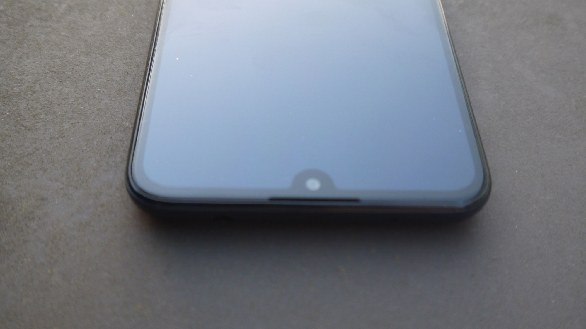
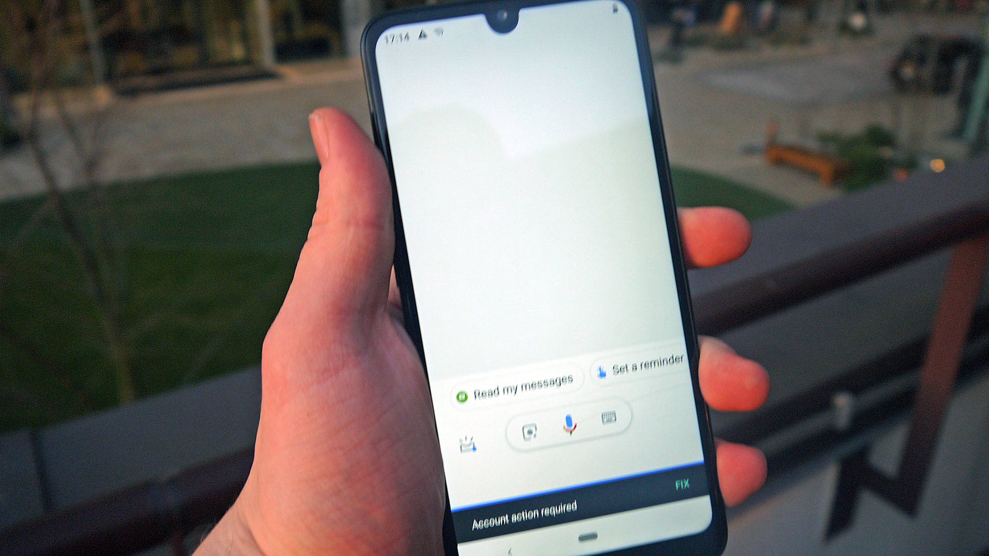
The Nokia 3.2’s display is a large 6.2-inch 19:9 panel, broken up only by a small 'teardrop' notch at the top, and with minimal bezel at the bottom. It’s a good-looking design, and one that wouldn’t look out of place on a pricier handset.
When viewing the device's screen, however, it’s clear we’re not dealing with a top-tier device – the colors are a little dim, and even at higher brightness settings the display seems a bit dark.
This shouldn’t be a problem for most users – it’s still good enough to play games or movies well, and the single-lens camera doesn’t take pictures that are vibrant enough to be compromised by the display, but it may be noticeable for those taking a step down from a more expensive device.
Nokia 3.2 camera
The Nokia 3.2 is no photographic powerhouse – it only has a single rear camera, which is quite minimal when the marginally-more-expensive 4.2 has at least two, although it’s a 13MP snapper so it’ll still take fairly decent-looking pictures.
In our brief hands-on time, we found it fairly competent at taking outdoor pictures at dusk, and although the picture wasn’t incredibly detailed, it’s a fine camera if your photography is for social media or messaging rather than professional ventures.
On the front of the device is a 5MP selfie camera. Again, it didn’t take breathtaking pictures, but they’re good enough for the odd Snapchat selfie, and you’d have to put its shots alongside those from more expensive handsets to notice its shortcomings.
Nokia 3.2 battery and specs
For such a small device, the Nokia 3.2 has a pretty powerful battery – at 4,000mAh, it’s bigger than most flagship devices (even the Galaxy S10 Plus, Samsung’s plus-sized progeny, only has a 3,400mAh power pack).
In conjunction with the Android Pie operating system’s adaptive battery and adaptive brightness features, Nokia claims the phone will offer two-day battery life, a claim we’ll be able to test properly when we get our hands on the device for our full review – given the size of the battery, though, it certainly seems plausible.
To help differentiate its phones from the slew of other budget smartphones on the market, Nokia has introduced a couple of novel features to the 3.2 and 4.2 handsets.
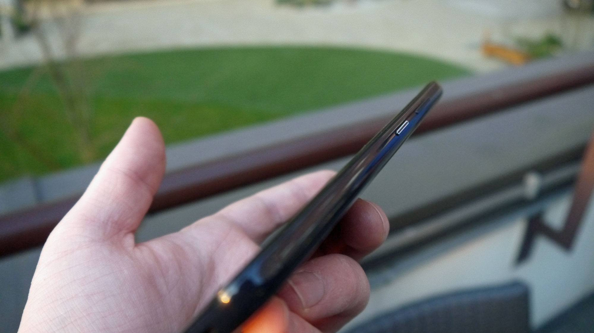
One of these is an LED notification light embedded within the power button, which glows gently when the phone receives a notification. This is a welcome additional option alongside the standard vibrations and alert sounds, although of course it would only be useful if you keep the phone in plain sight.
The other new feature is the presence of a Google Assistant button on the left edge of the device, which summons the assistant when pressed. This is a useful feature for people who are used to hands-free access to the phone, and the button was in a comfortable position to use.
The button was a little slow to respond however, and the feature wasn't as quick as it is on other devices.
The Nokia 3.2 runs a Snapdragon 429 chipset, which is a fairly powerful processor for mid- and low-range phones and provides a few advantages, and while the operating system felt a little slow at times, in general the device ran smoothly.
Early verdict
The Nokia 3.2 feels like a pretty competent low-end smartphone – its specs and camera are comfortably middle-of-the-road, and its display and battery life seem impressive given its relatively low price.
We were a little turned off by its design, with its thin plastic shell making it feel a little fragile, but a cheap case would fix this issue.
When we’ve had more time with the device we’ll be able to test it more fully, and see how well it performs when it comes to playing games, movies and music - and of course we’ll be sure to check out that two-day battery life claim.
MWC (Mobile World Congress) is the world's largest showcase for the mobile industry, stuffed full of the newest phones, tablets, wearables and more. TechRadar is reporting live from Barcelona all week to bring you the very latest from the show floor. Head to our dedicated MWC 2019 hub to see all the new releases, along with TechRadar's world-class analysis and buying advice about your next phone.

Tom Bedford joined TechRadar in early 2019 as a staff writer, and left the team as deputy phones editor in late 2022 to work for entertainment site (and TR sister-site) What To Watch. He continues to contribute on a freelance basis for several sections including phones, audio and fitness.
What is a hands on review?
Hands on reviews' are a journalist's first impressions of a piece of kit based on spending some time with it. It may be just a few moments, or a few hours. The important thing is we have been able to play with it ourselves and can give you some sense of what it's like to use, even if it's only an embryonic view. For more information, see TechRadar's Reviews Guarantee.