TechRadar Verdict
It's not the very best phone at the price, but with its big screen and unusual finish the HTC U12 Life offers a useful alternative to the glut of glass-backed phones.
Pros
- +
Unusual design
- +
Big screen
- +
Reasonable price
Cons
- -
Glass body feels more plastic
- -
Slow, unrefined HDR mode
- -
App loads slightly slower than rivals
Why you can trust TechRadar
The HTC U12 Life is a lower-cost alternative to the HTC U12 Plus. It does not look or feel much like that top-end phone, though.
It's slimmer, the camera arrangement is different, and the back feels like plastic rather than the glass it actually is. And all the specs are lower-end.
If you're just out for a phone without the scary price of a top-end model while not entirely stripped of features, you're in the right place. The HTC U12 Life costs £299 (around $390/AU$555, but with no current plans for a US or Australian launch). But competition elsewhere is strong.
The Honor 8X, Moto G6 Plus and Nokia 7.1 all have more higher-end touches than the HTC U12 Life. It is the camera that lets the HTC down in isolation though. It simply lacks some crucial smarts almost every other phone over £200/$250 has these days.
If you don't want a Motorola or a notch, though, this is a reasonable option.

Key features
- Large, notch-free screen
- Sensible mid-range specs
- Plastic rather than glass or aluminum shell
A substantial screen and flashy visual design at a reasonable price are the HTC U12 Life's top-line selling points. The screen is a substantial six inches across. There's no notch, but it is the now-default taller 18:9 shape.
Other important elements include a dual rear camera, with 16MP and 5MP sensors, and 64GB of storage. The HTC U12 Life also has a fingerprint scanner and a headphone jack.
Manage your expectations about the design before ordering though. While the HTC U12 Life's glass back finish has a hint of glamour and is more recognizable than most phones, it feels more like plastic.
Pick up an HTC U12 Life then a Motorola One 30 seconds later and you'll instantly feel the difference. The HTC's shell does not lend it a particularly high-end feel.
The phone has the Snapdragon 636 chipset, a relatively recent Qualcomm processor also seen in the Nokia 7.1. However, the HTC U12 Life does seem slower to launch apps than rivals, which is a knock to the day-to-day performance.

Design
- Striking rear
- No official water resistance
- Moderately large frame
2018 messed with how easy it is to judge phone size when ordering online. The old rule: 6-inch phones are huge, and only really for enthusiasts and the giant-handed.
That has changed. A phone with a big screen inch count will feel smaller than it used to if it has an 18:9 screen, and smaller still if it features a notch. Notched mobiles tend to have longer screens, for more inches for each millimeter of phone width. And width is what makes a phone feel large.
The HTC U12 Life is a standard 18:9 ratio phone. It feels fairly similar to an older 16:9, 5.5-inch phone. It's not so large you should start measuring your hands, but is bigger than the Motorola One or Nokia 7.1.
Its build is also different to every big-name alternative. At this price a glass or metal back is standard procedure and the U12 Life does offer a glass body - but it does feel more like plastic. A premium finish when held in the hand this is not.

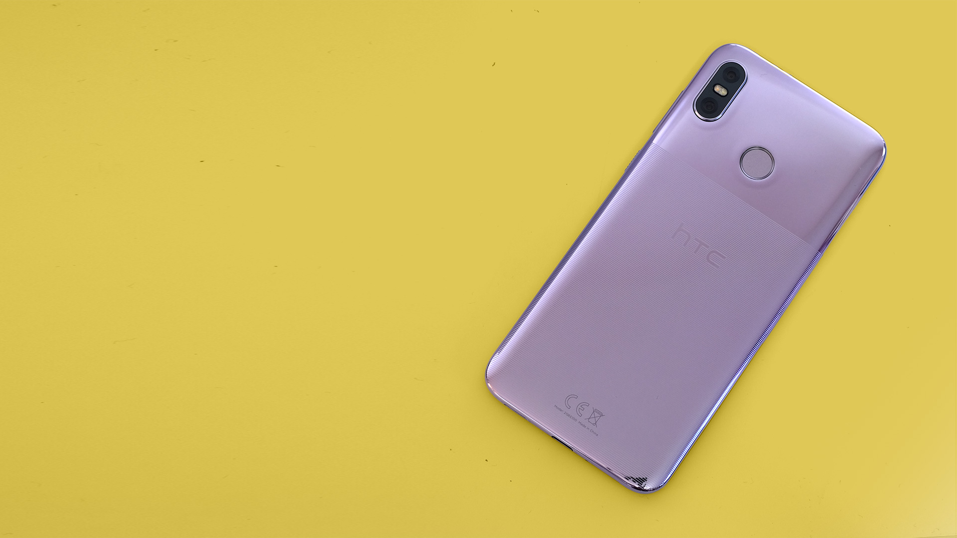
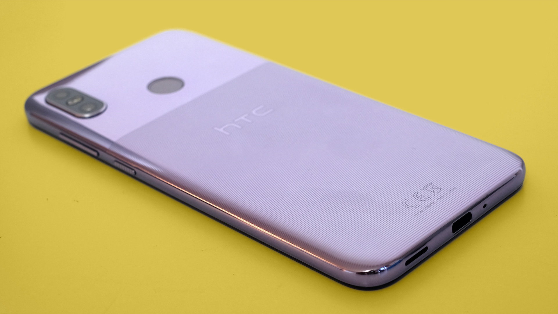
As the build is not particularly competitive, you had better love its look. The HTC U12 Life’s rear has a two-zone style. Its top part is ultra-glossy, and looks a little like colored glass. You can get it in pink, which HTC calls Twilight Purple, or dark blue.
About two-thirds of the HTC U12 Life’s back is not glossy, though. Thin textured lines run across the rear.
As well as providing a distinctive look, there are a couple of practical benefits to these ridges. They make fingerprints less visible, and add an unusual feel. The aim is clearly to make the HTC U12 Life feel like something other than plain glass, and it's mostly successful.

The HTC U12 Life does have USB-C charging, a solid 64GB of storage and a rear fingerprint scanner, though. This scanner takes a beat longer than the fastest but is still reliable and fairly quick.
A 3.5mm headphone jack is one of the benefits of buying a phone at this price rather than one that's much more expensive. Not all manufacturers leave such sockets out of their top models, but HTC does.
You do miss out on water resistance, though. 2017’s HTC U11 Life had a great IP67 rating, allowing for full-on submersion in water. This time there's no official waterproofing at all.
It’s not expected at the price though, and the slightly cheaper Motorola One has a splash resistant nano layer but no serious water protection.

Screen
- Sharp screen
- 1080p-grade resolution
- Limited auto brightness intelligence
The HTC U12 Life has a 6-inch 18:9 screen. There's no notch so you don't get that $1000 phone look. However, there are plenty of notch haters out there who will be relieved to have an option that does not have one.
This leaves the phone with larger areas above, and in some cases below, the screen that are simply blank. A little under 80% of the front is display.
Of course, if you care mostly about gaming and video streaming, a notch isn't useful anyway. The HTC U12 Life's screen is large, with roughly the same display width as the OnePlus 6.
Sharpness is good too. Resolution is 1080 x 2160 pixels, and as this is an LCD rather than an OLED, there's almost zero sign of the underlying pixel structure. Small fonts only look less than pristine if you get your eye right up to the panel.
Color performance is decent too. The HTC U12 Life doesn't look under-saturated.

There's relatively little control, though. Most rivals offer natural and vivid profiles, but you don't get any choice here. There's just a color temperature slider, in Settings.
In use, only one negative part sticks out after a few days, though. The HTC U12 Life has a pretty basic Auto brightness setting. Most phones at this level have customizable auto brightness, letting you tweak the backlight level without reverting to manual control.
Touch the slider here and Auto Brightness switches off. It's kind of annoying, indicative of a lack of software intelligence.
Andrew is a freelance journalist and has been writing and editing for some of the UK's top tech and lifestyle publications including TrustedReviews, Stuff, T3, TechRadar, Lifehacker and others.

