Why you can trust TechRadar
Interface and Performance
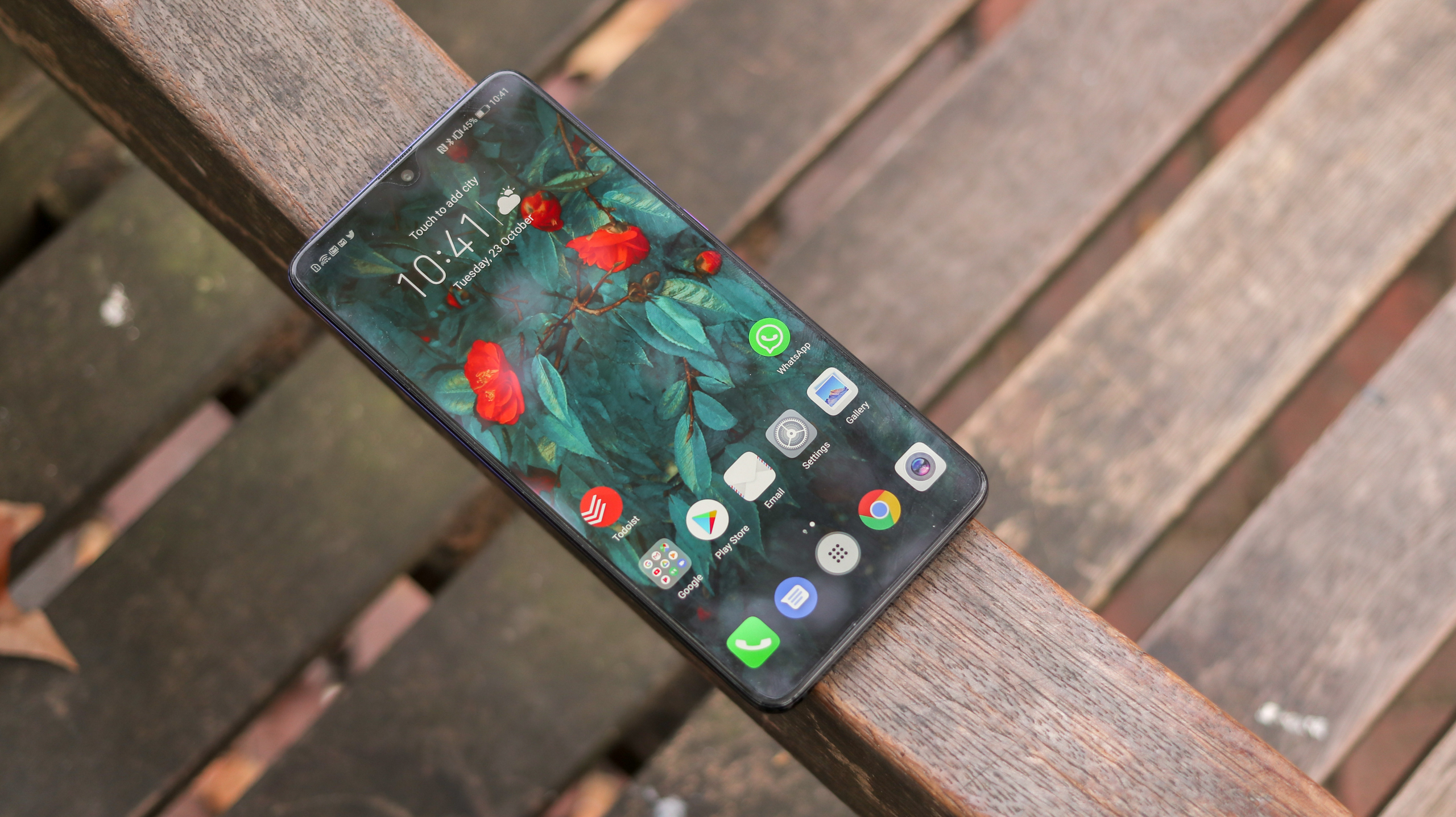
The Huawei Mate 20 is running Android 9, with Huawei’s EMUI 9 overlaid. Having the latest version of Google’s mobile OS onboard is good news, because you’re about as future-proofed as you can get when it comes to app compatibility and security updates. Unlike the Pixel 3s and other devices signed up to Google’s Android One standard, though, you don’t have a stock experience.
Huawei’s customizations are extensive, from visually overhauling almost every element of the OS through to adding a huge amount of functionality to Google’s framework.
In many respects, this makes the Mate 20 better than stock counterparts. The Digital Wellbeing feature for example has been rebadged by Huawei to Digital Balance. In Huawei’s version, it’s been better tailored for parents, with passcode protection features – a notable feature missing from Google’s stock Wellbeing tools, and one that’s available in Apple’s iOS 12.
The camera is also much more fully featured than those of the Pixel series, with full manual modes and handheld long-exposure presets.

Gestures
The Mate 20 series also adopts iPhone X-style gestures, meaning you can go to your home screen with a swipe up from the bottom, or access all your running apps if you hold midway through the swipe up.
A swipe right or left from either side of the screen can also serve as a back command, while a swipe up from either bottom corner can fire up Google Assistant. This frees the screen of the navigation bar, and it’s intuitive – it took no more than a day for us to get comfortable with it.
It’s also preferable to the hidden navigation bar featured on Samsung devices, which requires a swipe to bring into the frame.
As is the case with most Huawei customization, you can also turn gestures off, enabling the traditional navigation bar at the bottom of the display.

Core UI
The fundamental Huawei experience lives on in EMUI 9: no apps tray by default, skeuomorph interface elements made to look like their real-life counterparts, and a bunch of useful and not so useful enhancements.
Huawei has also gone to great lengths to streamline its newest iteration of EMUI, with less options in the settings and the promise of smooth performance, even after 18 months of use, according to Huawei.
While we can’t verify that latter claim after a week with the phone, we can confirm that EMUI is less overbearing than it has been in the past. The settings are tidier, interaction is smooth and performance across the board is excellent.
The elements that prevent it from being the eye-candy stock Android or Oxygen OS, however, are the icons, fonts and finishes within Huawei’s proprietary apps. It’s subjective, and this isn’t a reflection on how functional they are, but they do feel visually at odds with Android and Google’s apps, opting for a realistic, more iOS style as opposed to cell shading and simplified material design. In turn, Huawei’s experience also jars with third-party apps made for Android that have a stock look and feel to them.

Huawei also loads up a small stash of bloatware: eBay, Booking.com, Facebook and Netflix, along with some superfluous Huawei applications and proprietary services like Password Vault. You can ignore or uninstall most of the apps and services – and some, like Private Space, which enables two user accounts, are actually useful.
What’s particularly smart about Private Space is that you can assign a different fingerprint to each account, meaning that the print that unlocks the phone will unlock straight into that user’s designated account.
These sorts of thoughtful additions are scattered throughout – a double tap with your knuckle will take a screenshot, while a double tap with two knuckles will start screen recording, for example.
Huawei has also added handy gesture functionality once you take a screenshot. Swipe down to take a scrolling screenshot, or swipe up to share it to an app or contact – it’s handy, intuitive and time-saving.
EMUI Desktop


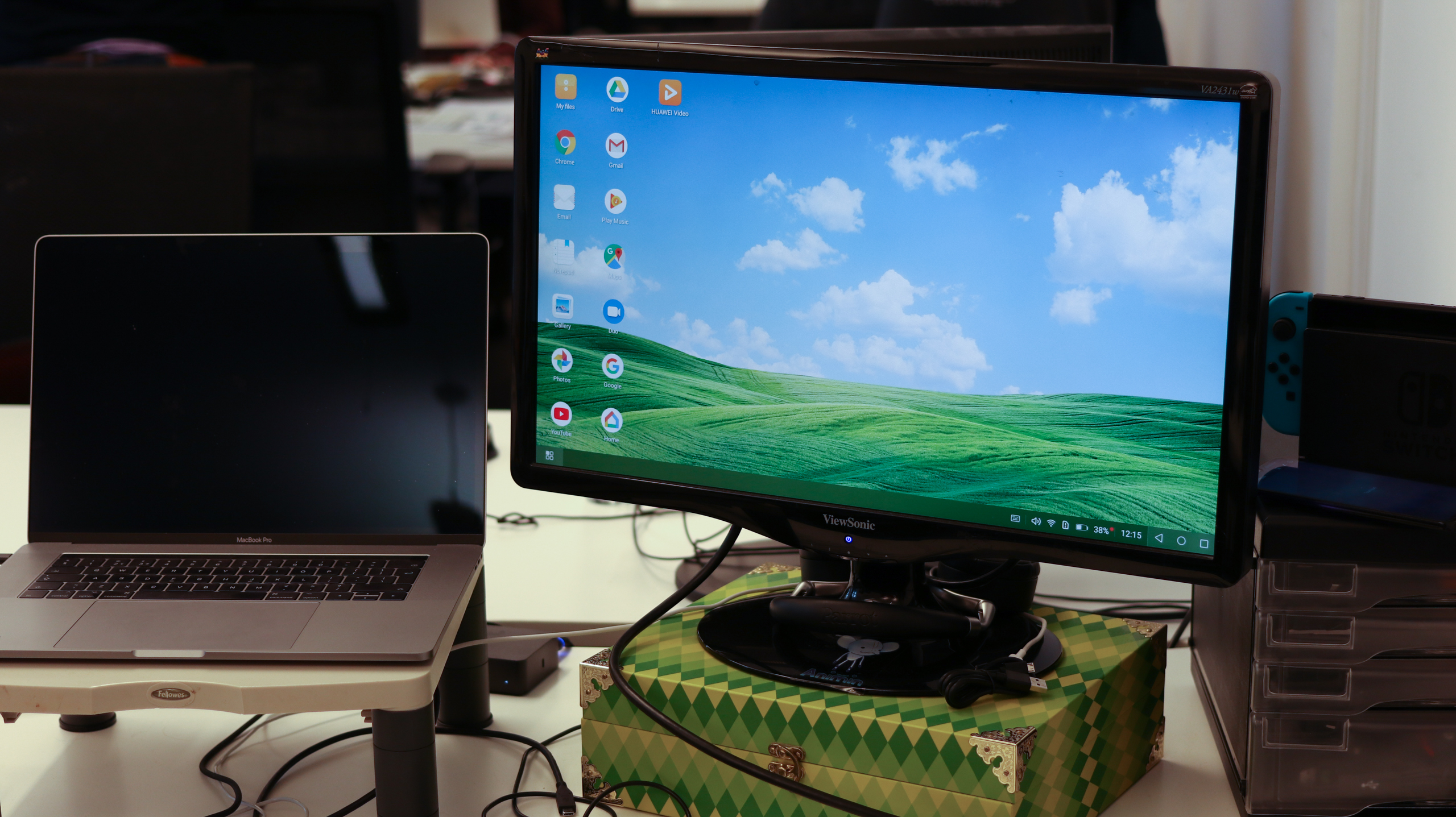
There’s also a Samsung DeX/Windows-style interface called EMUI desktop, which now supports wireless projection via miracast. What was good about EMUI desktop when it launched was that it didn’t require a pricey proprietary dock to fire it up like Samsung’s experience did – any USB-C to HDMI cable would do the trick.
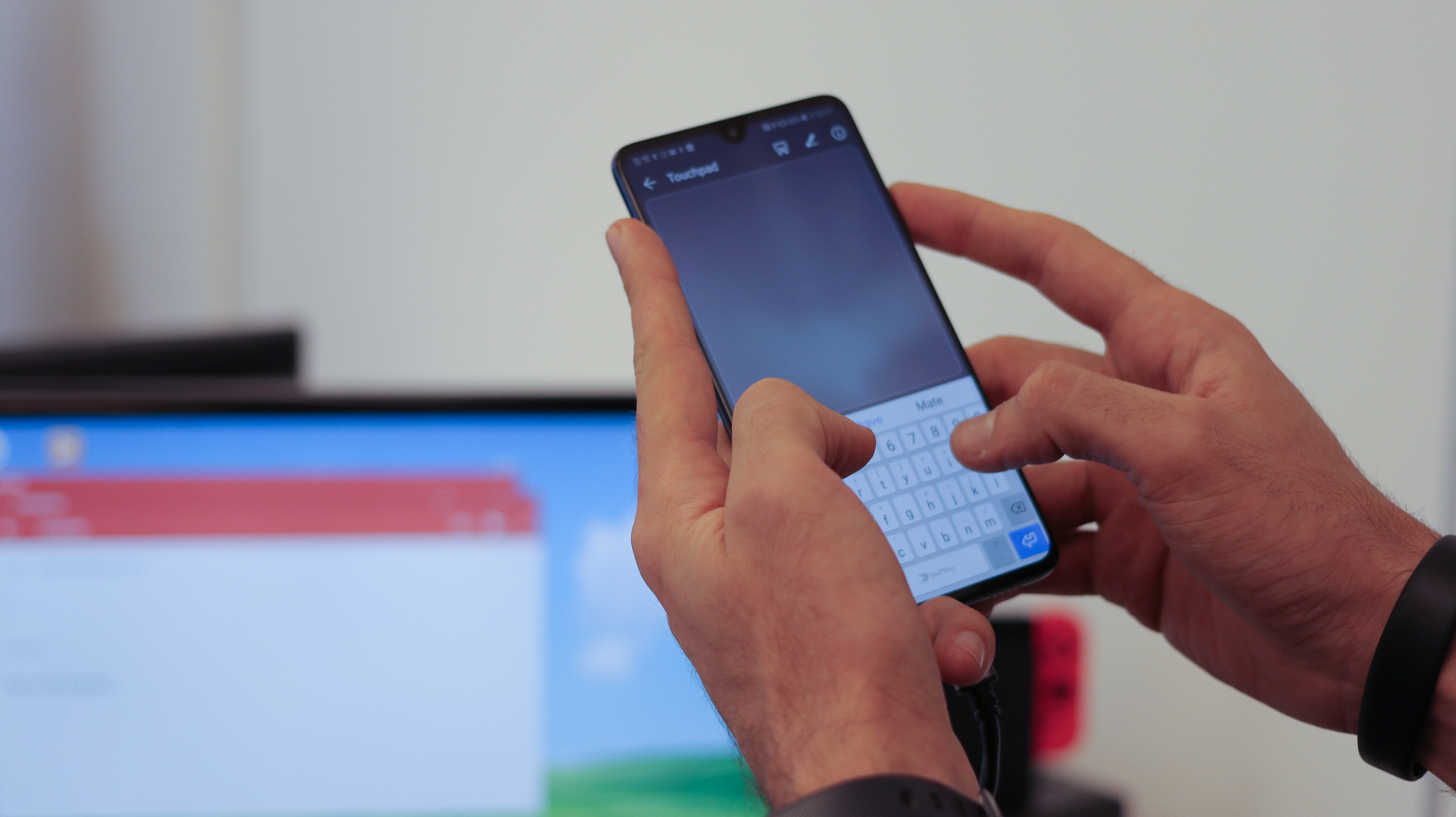
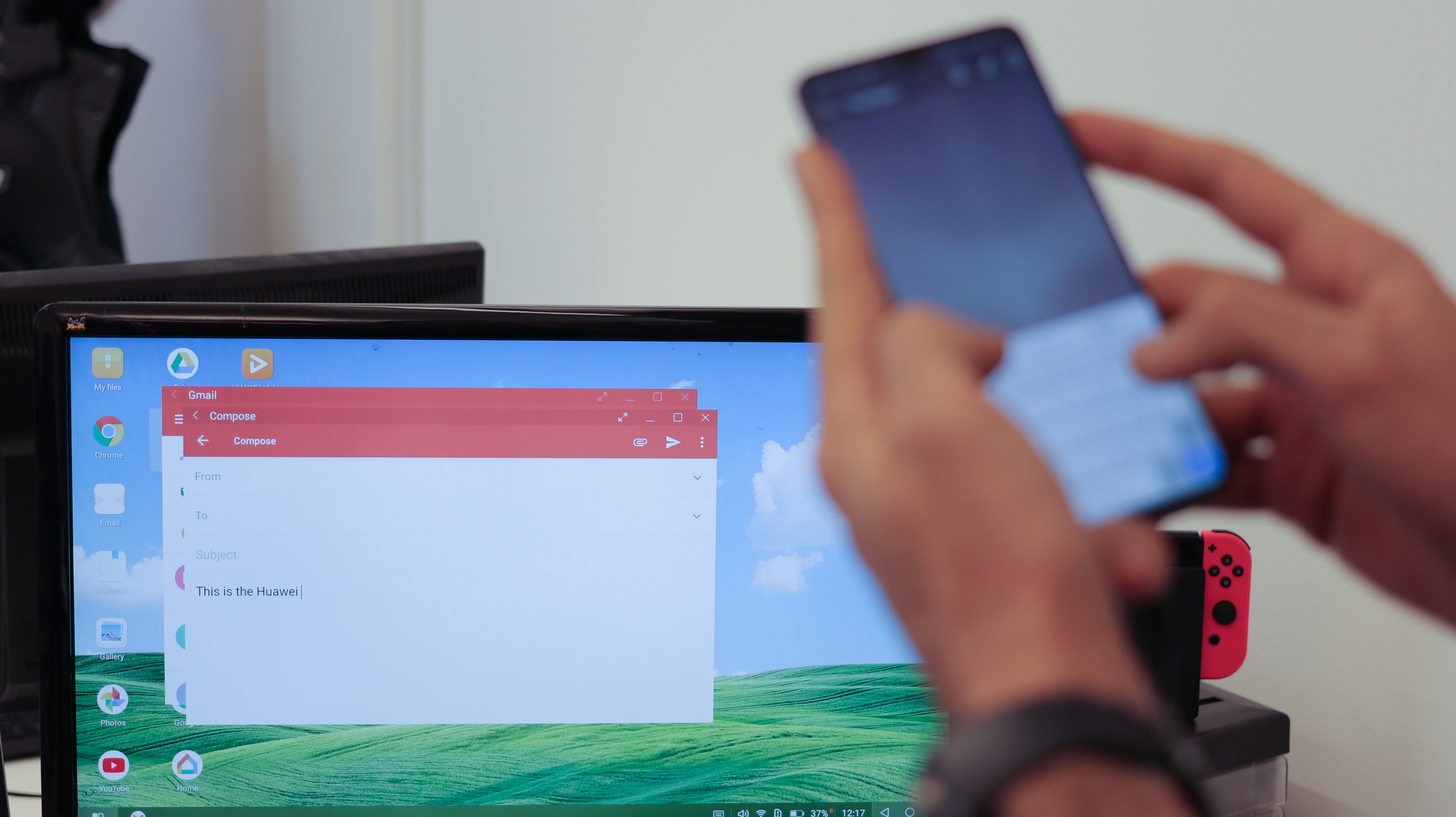
This is still the case, and the experience has been improved in almost every respect. It still supports either Bluetooth or USB keyboard and mouse input, and it’s very natural to use word-processing applications and browse the web within it.
Huawei is also closing the gap between itself and Samsung from a quality point of view. A couple of small refinements, such as better notification management and apps displaying in tablet view, however, still put DeX slightly ahead of EMUI Desktop – but only slightly.
As for the wireless projection, it’s usable in a pinch but the latency is noticeable, so it ends up being a nice-to-have feature for anyone with a Miracast-enabled device, rather than an experience we would opt for frequently.
Across the board, EMUI 9 is a refinement. It has a tonne of useful additions, and didn’t raise any red flags in our time with the Mate 20 – we just wish it all looked that little bit more like Android.
Performance
To say the Kirin 980 processor nails it is an understatement. In our time with the Mate 20, everything from gaming to photography, and from video trimming to video playback, was smooth and cool.

The chip actually benchmarked better in the Mate 20 than it did in the Mate 20 Pro, possibly owing to its lower-resolution screen, with the Mate 20 achieving a Geekbench Multi-Core score of 9,900.
Despite running more powerful internals and an identical sized battery, the battery still managed to last longer than last year’s Mate 10, suggesting the Kirin 980 is both a more powerful and a more efficient chip than the 970 was.
By creating its own processors, Huawei can also break through limitations set by Qualcomm’s Snapdragon series – something no other manufacturer except for Apple can do.
It’s why Huawei was able to hit three rear cameras before the competition in the P20 Pro, and it’s why the Kirin 980 on the Mate 20 can reach download speeds of 1.4Gbps while the Snapdragon 845 is capped at 1.2Gbps.
Battery life
The Mate 20 can comfortably last two days with light to moderate use – and even with heavy use we found there was still some juice left in the tank by the end of the day, which is seriously impressive. It’s little surprise the phone does well on this front – after all, it has the same size battery as the Huawei P20 Pro and the Samsung Galaxy Note 9, two top

From a numbers point of view, the only widely available phone that trumps the Mate 20’s 4,000mAh battery is the Mate 20 Pro with its 4,200mAh unit. Meanwhile, the Sony Xperia XZ3 has a 3,330mAh cell and the Galaxy S9 Plus clocks in at 3,500mAh, while the iPhone XS Max’s battery is 3,174mAh.
It’s not all about battery size, though. Huawei offers a number of settings for fine-tuning power management, with two power saving modes and an ‘Optimize battery usage’ feature in the settings. This will sweep through your screen brightness/timeout settings, turn off rogue-syncing applications and even kill auto-rotate and vibration to get a few extra hours out of your phone.

The architecture of the Kirin 980 is also oriented to power management. Opting for a different array of cores to other chipsets, rather than feature high- and low-power cores, the 980 features two high-power, two medium-power and two low-power cores. This makes it better able to fine-tune performance to match demand. It’s also all deployed across 7nm architecture, a first for Huawei, matching Apple’s A12 Bionic in the iPhone XS series.
Basil Kronfli is the Head of content at Make Honey and freelance technology journalist. He is an experienced writer and producer and is skilled in video production, and runs the technology YouTube channel TechEdit.

