TechRadar Verdict
A really enjoyable to use, great sounding smart display. While it lacks a customizable EQ, and the screen could be bigger, on the whole, it's a great showcase for Google's connected screen Assistant experience.
Pros
- +
Louder, richer sound than the competition
- +
Competent smart screen solution
- +
Sharp, bright display
Cons
- -
No Google Play Movies or Netflix casting support
- -
Web browser access very limited
- -
No audio EQ control
Why you can trust TechRadar
This isn’t JBL’s first connected audio product. The company buddied up with Google to create the Link 10, a smart Bluetooth speaker that pairs portability with Google Assistant early in 2018.
Now, JBL has Amazon and Lenovo in its sights, taking on their Alexa and Google powered Smart Display with one of its own - the JBL Link View.
Packing an 8-inch screen, stereo speakers, a 5MP camera for video calls and splash-proofing for some seriously smart cooking, the specs are up to par.
Google’s visual assistant interface has also shaken some of the UI gremlins we encountered when it first dropped in the second half of 2018, and it’s seriously easy to get to grips with, whether you're touching it or talking to it.
This all suggests that anyone looking for a Google powered smart screen that sounds the business should look no further than the JBL Link View, but not so fast!
Remember the Lenovo Smart Display we mentioned? It’s also great, sports a larger 10-inch screen and arguably better styling. In addition, Google’s own Home Hub is a cheaper, more compact alternative and the new Echo Show (2018) is excellent too, with earth trembling bass of its own.
So where does the JBL Link View fit in?

Price and availability
The Link View is available for $249.95 (£249.99, AU$355) right now on JBL's website and third party retailers in the US and UK, though can be had for less if you shop around. This puts it on a level with Lenovo’s Smart Display when it comes to price. Meanwhile, both are a fair whack more than Google’s smaller Home Hub.
Design: Like a rectangle with ears
The JBL Link View looks clean, elliptical, and a bit early 2000s to be perfectly honest.
Its flat front and confident display of fabric either side of its screen, itself loaded up with hefty bezels, is inoffensive but it doesn’t look as special as Lenovo’s Smart Display or Google’s own Home Hub.

Turn it around though and things become clear - this speaker was designed with sound in mind. A rear facing diaphragm sporting a JBL logo takes pride of place in the center of the curved back, along with a fig. 8 power connector and micro USB port below it. There's also a microphone mute slider above on the back too.
As for additional buttons - on the topside of the display are volume controls, in addition to a slider that enables and disables the camera. A 5-megapixel camera, ambient light sensor and mics are all positioned above the screen.
Not one for dinky rooms, the speaker spans 33cm from one end to the other, though it isn’t too heavy, clocking in at around 1.3KG. It’s also splash-proof, making it a well suited cooking companion and, thankfully, Google Assistant is a dab hand in the kitchen.
Available in one color - black, the Link View is neither offensive to look at, nor is it a show stopper - it just looks good.
Screen: Big, but not the biggest
The JBL Link View’s 8-inch HD LCD screen sports a resolution of 1280 x 800, putting it somewhere in between the previously mentioned competitors when it comes to size and clarity.
Size-wise, it sits above the Google Home Hub which clocks in at 7-inches. Meanwhile, both the Amazon Echo Show (2018) and the Lenovo Smart Display are a fair bit larger at 10-inches.
It feels like JBL missed a trick here by not including a slightly bigger screen with Full HD resolution, as pairing excellent sound with immersive visuals is always a winning combo.
As for viewing angles, they're good but not excellent. Off-angle, content is perfectly visible, only with less color integrity and clarity than when viewed head-on.

And while the Link View’s LCD screen doesn’t show off the rich, inky blacks or punchy hues OLEDs do, it's absolutely up to the task of competing with its main rivals, all of which also pack LCD screens.
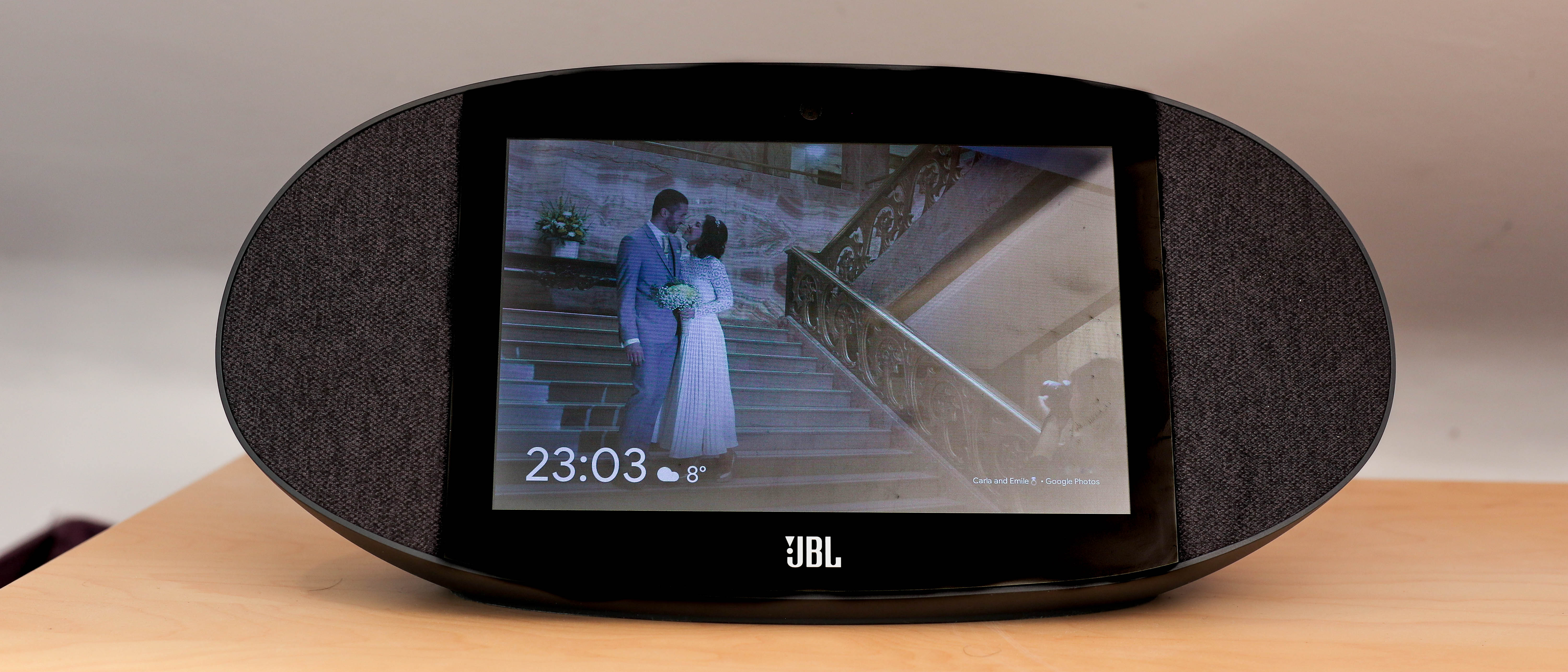
Adaptive brightness kicks in swiftly when ambient light in the room changes, dialing the screen brightness up or down automatically, and the default display showcases anything from a slideshow of snaps, art or a range of clock faces.
These can be customized in the Google Home app available for iOS and Android. Ways of getting your own pictures on-board are plentiful - Google Photo albums can be displayed and new Beta features enable support for Facebook and Flickr galleries too.
When lights turn off completely, a night clock fires up - displaying a black screen with the time in a subtle shade of grey. As for when you're ready to call it a night, a simple “Hey Google, turn off screen” will turn off the display completely.

"Hey Google, are you any good?"
Having a chinwag with Google’s Assistant is really enjoyable for the most part. Its voice recognition is a smidgen better than that of Alexa, and the fact it remembers context when searching is handy too, making chats feel more conversational.
The microphones are also very sensitive on the Link View. It was even able to detect an “Okay Google” from another room, on the other side of a family home - though don’t worry if you have multiple Google Home devices, they tend to know which one you’re talking to.
Bound into the Google ecosystem, it tries to funnel you towards services like YouTube Music as opposed to Spotify, and is bound tightly with Google News, Calendar and YouTube when catering to other requests too - though you can specify your default music service thankfully.


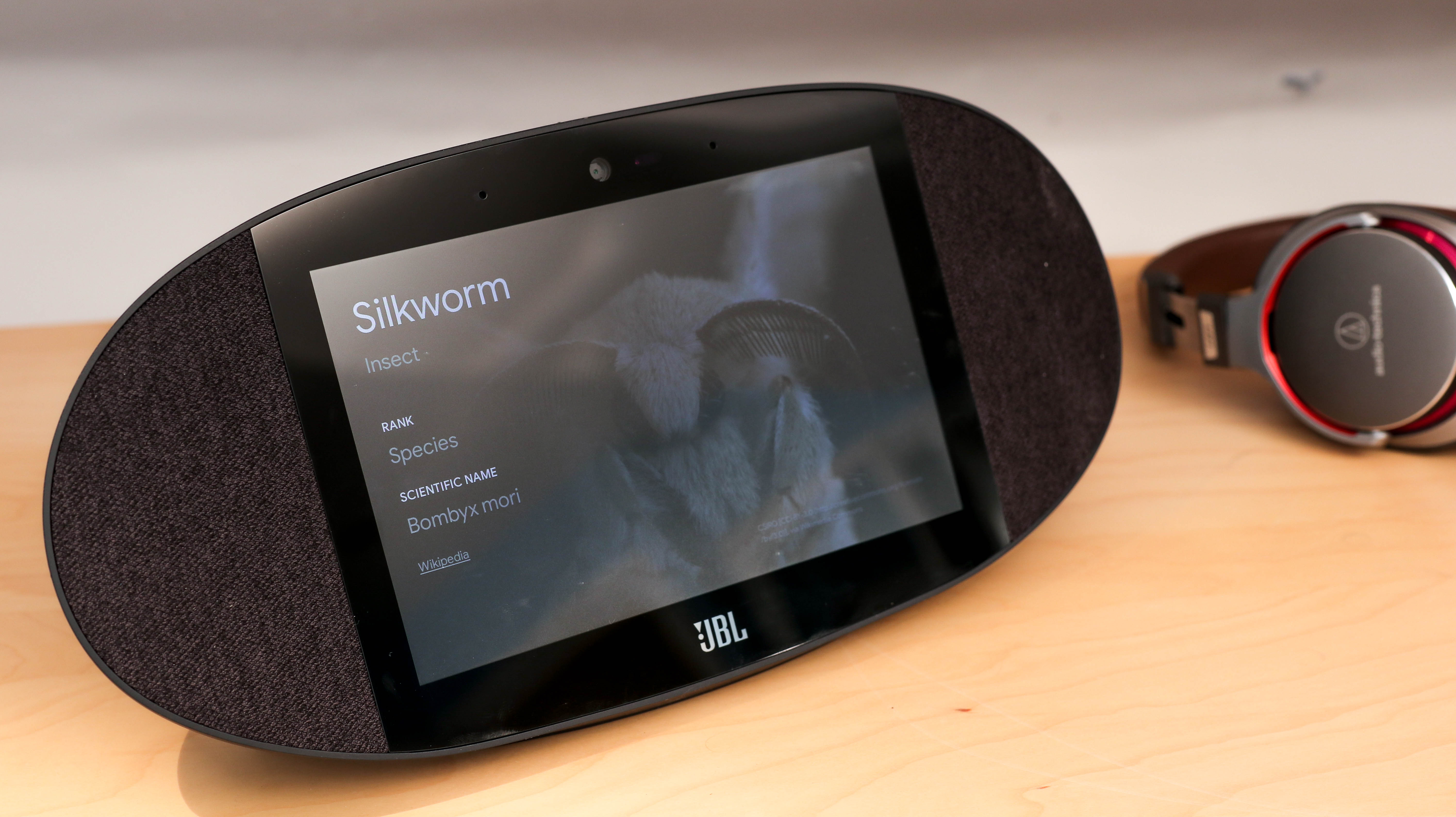
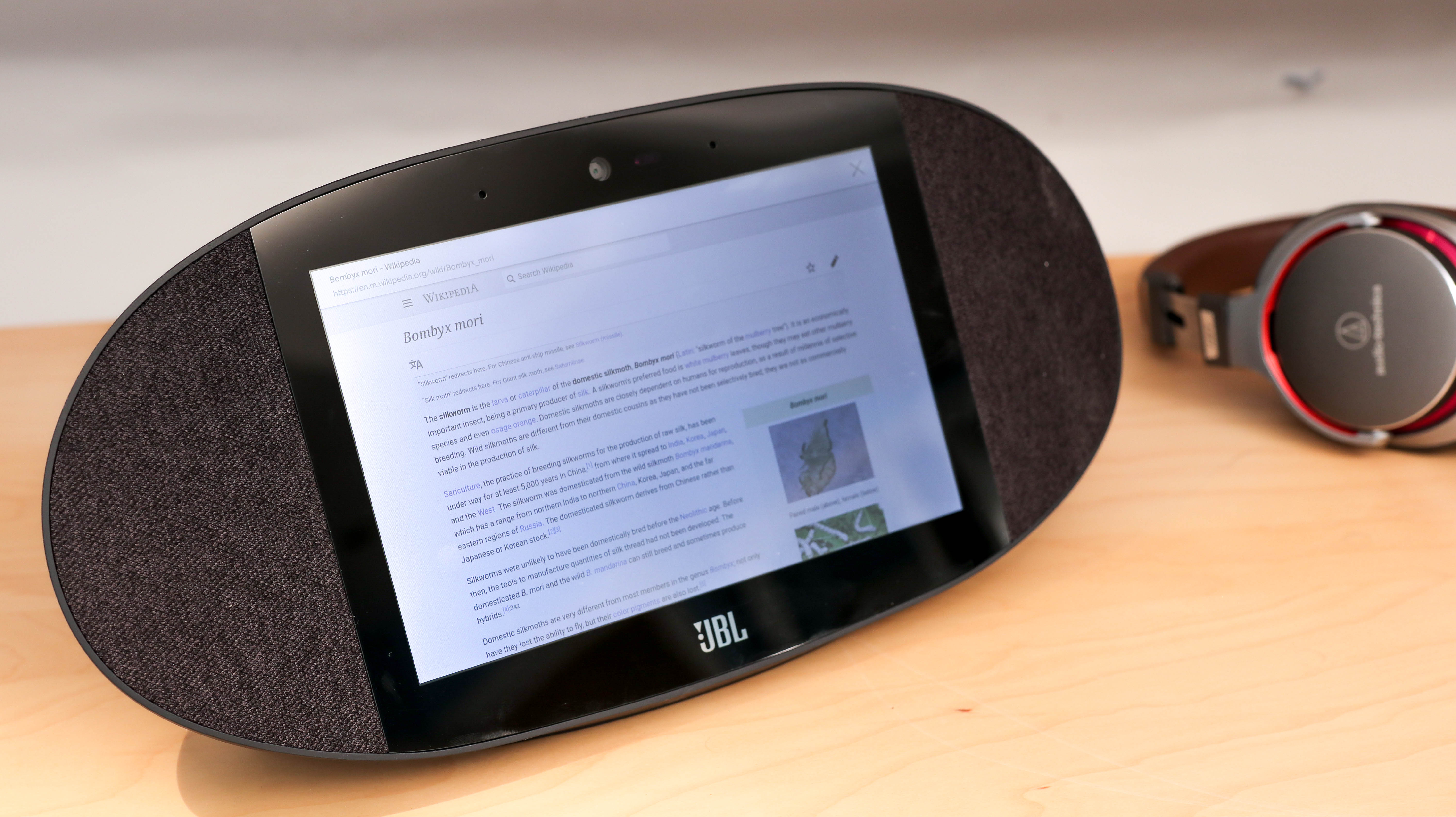
Interestingly, Google’s search engine isn’t directly accessible - “Hey Google, search the web for silkworms” pulls up an error. Meanwhile, if you ask Google to “Tell me about silk worms”, it works. This command displays a Wikipedia entry as illustrated above, through which the Link View can then go on to display full websites with a few link taps.
This all makes the omission of its halo products - Google Search and Chrome - a bit confusing and a barrier when it comes to the kind of experience we’d expect when interacting with a Google product. There's clearly a capable browser in there waiting to be unleashed.
So while the Echo Show packs a couple of web browsers, Google’s smart displays lock that feature, which in turn, makes streaming in-page video nigh-on impossible unless you cast it from your phone.
Sure, this stops the Link View from competing with tablets and keeps the screen simple and on-screen keyboard free, but it's still a bit of a shame. It feels like Google’s doing a bit of an Apple, adding limitations when they could have offered a solution for enthusiasts.
Assistant Interface and Home app
While interaction is primarily geared towards voice and touch, device settings are controlled through the Google Home smartphone app.
Here you can pair the JBL Link View to a phone, so it can act as a Bluetooth speaker which is very handy. The app also controls wallpapers, WiFi networks and more.
In fact, Google is so hell bent on keeping its Assistant screen keyboard free, you can’t even set-up or change WiFi networks on the Link View itself - you have to use the app.

This forced us to hand-off between our phone and Link View a few times before we were up and running, unlike Amazon’s Echo Show, which could be set up from start to finish using the touch display.
The walled garden Google puts up isn’t all bad though.
Google's wellness feature - Digital Wellbeing, has also made its way to the company’s displays, which is great, especially for parents. It makes it easy to filter music or videos with offensive themes, as well as third-party content.
There’s also a Down Time feature that keeps interruptions to a minimum on school nights, preventing both video and music playback so you or your little ones can kick off every evening with a mini digital detox.

The Digitial Wellbeing feature in isolation makes the Link View a decent option for parents looking for a smartphone companion for their kids.
Combined with an affordable handset like the Nokia 7.1, due to get Digital Wellbeing in 2019, the Link View could even replace a small TV or tablet, giving parents a little more control over their children’s watching and listening habits.
The trouble with smart displays...
There’s an inherent problem with all smart displays at the moment though and that’s streaming video.
Take the Echo Show (2018) - services like BBC iPlayer and YouTube have to be accessed through a web browser. Meanwhile, Netflix is off limits even through a browser and about the only thing that works perfectly with voice control is Amazon Prime Video.
As for the Google’s smart displays, YouTube works great - huzzah, but casting to devices like the Link View from your phone is hit and miss. Netflix? No can do. BBC iPlayer? Yes! It now works though it didn't a few months ago. Prime Video? Of course not!
With no one size fits all solution, if you haven’t bound yourself to an ecosystem yet - Amazon or Google - video streaming limitations could be the deciding factor; Do you go for Amazon services supplemented with an on-device web browser or Google Cast smart display for simple YouTubing?

Sounds about right
Volume on the Link View is loud and rounded when compared to other smart displays.
The speakers face forward, unlike the Echo Show, though the two are about on par in terms of volume.
Getting down to numbers, both the Link View and Amazon's smart screen clock in at around 15% louder than the Google Home Hub at max volume, though the Home Hub is much less enjoyable to listen to.
In fact, the sound JBL's smart display produces is definitely the most balanced when compared to the competition.
Having said that, one thing lacking in the Link View at the time of review is any EQ control. This means, while the mega bass-heavy Echo Show can be tweaked to even its default EQ out, as too can the pitchier Google Home Hub, the Google Home and even the Home Mini, third party smart displays like the Link View can't. Big, glaring, omission.
Given this fact, JBL did a good job of picking a balanced EQ, and with any luck, Google will roll out an update addressing this soon.
Anything else?
The 5-megapixel camera works great for Google Duo calling. It’s easy to fire up - “Hey Google, call mum, mobile”, though calls are locked to landscape, which isn’t great for video chatting with anyone using a smartphone.
Privacy mode can also be activated to disable the camera and mic. A nifty mechanical slider at the top of the device physically covers up the camera, while a mute slider at the back disables the microphone.

In a nutshell
JBL has put together a good looking smart speaker that packs a decent screen, all the while sounding better than the competition. Meanwhile, Google has created a really useful visual voice assistant that can be touched or talked to. These halves make the Link View, and it’s a lot of fun to have in the house.
Far from perfect, the lack of adjustable EQ limits its audio appeal. Meanwhile, no Amazon Prime Video and Netflix support might put off anyone considering picking one up for streaming anything beyond YouTube. Its 8-inch screen is also a couple of inches smaller than the Amazon and Lenovo competition too.
That said, Google’s smart display experience feels and looks clean and refined. Additionally, thanks to a handy array of safeguards from the big G, it could also be a great option for parents who aren't quite up for getting their kids a TV or tablet.
This all means that the JBL Link View has fast become the go-to connected screen for anyone whose priority is sound quality, making it a worthy addition to the slowly growing world of smart displays and Google Assistants.
Basil Kronfli is the Head of content at Make Honey and freelance technology journalist. He is an experienced writer and producer and is skilled in video production, and runs the technology YouTube channel TechEdit.

