Why you can trust TechRadar
New user interface
- LG's interface looks better than ever
- Multi-window mode isn't great
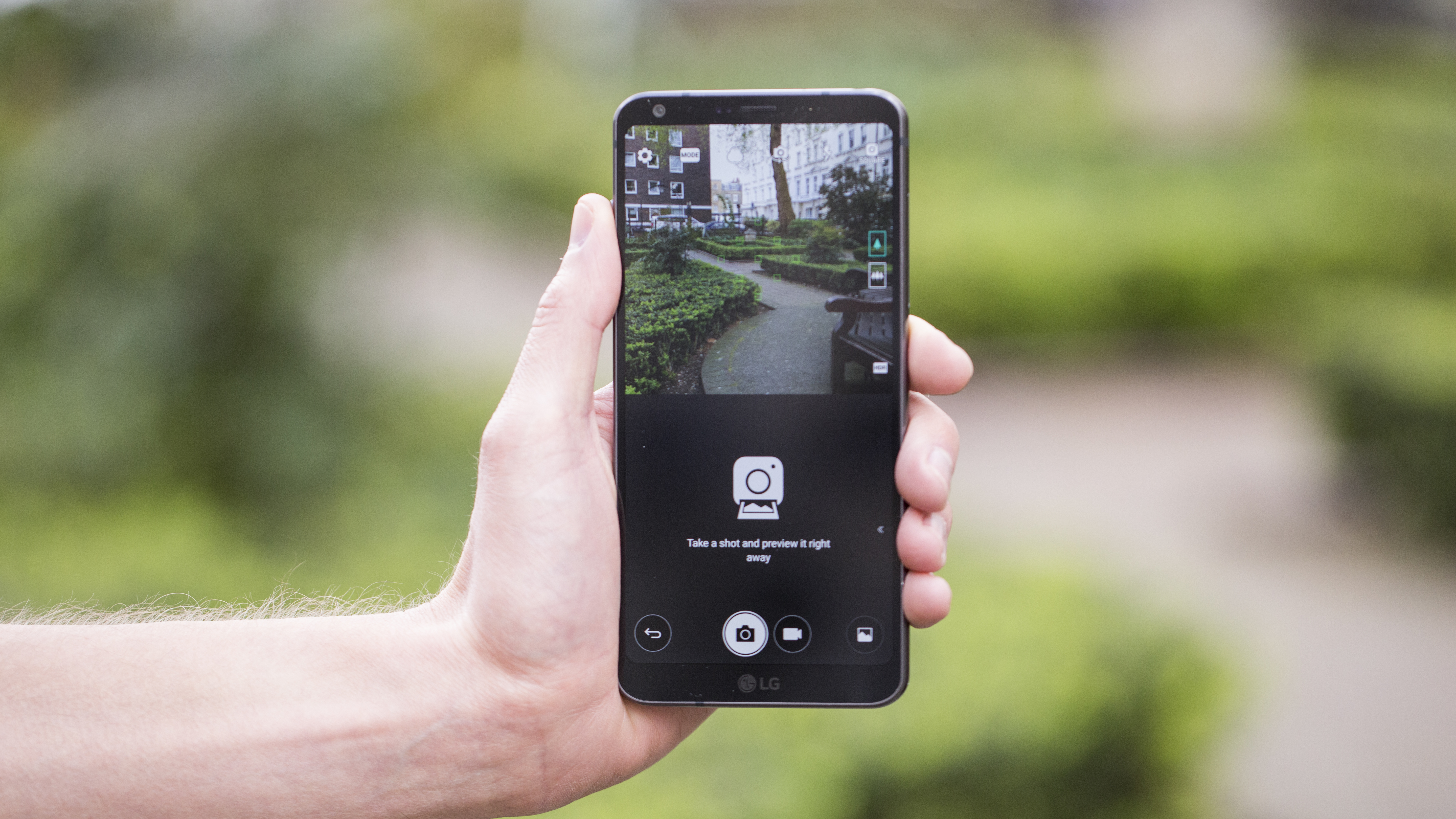
The new FullVision 18:9 display has given LG a few more pixels to work with, and now the display is essentially two squares stacked on top of one another. LG has embraced this idea and made the 'double square' a feature of the user interface throughout.
This means, for example, that in the contacts menu the contact image is larger, more settings are visible and you'll be able to see more Facebook on the screen without the need for scrolling through.

You can also rotate the phone and either have two apps running in multi-window or, for certain apps, have two different functions on the screen at once.
This latter trick is currently limited to the email and calendar though, and isn't really that new – plenty of phones have been able to do this for years, but just with a more squished preview window to see your messages and upcoming meetings.

LG's certainly made good use of the extra screen space it's managed to eke out - things like the weather app have been well thought through and look visually appealing.
The general interface doesn't seem like that much of an upgrade, but that's not a bad thing at all. It's all lightning quick under the finger, as you'd expect, and all the elements that Android 7 brings are present and correct.
One flaw that will hopefully be ironed out soon is Google Assistant - while it works pretty well, it's incredibly slow to wake from sleep if you're saying the words 'OK Google' to get it up.
The 'two square' interface isn't as useful as expected, as it's only in the square camera that you'll really notice it. The multi-window mode is still too fiddly on a phone to be a real must-have feature - although we used it from time to time, it wasn't noticeably better than on any previous LG or Samsung phones.

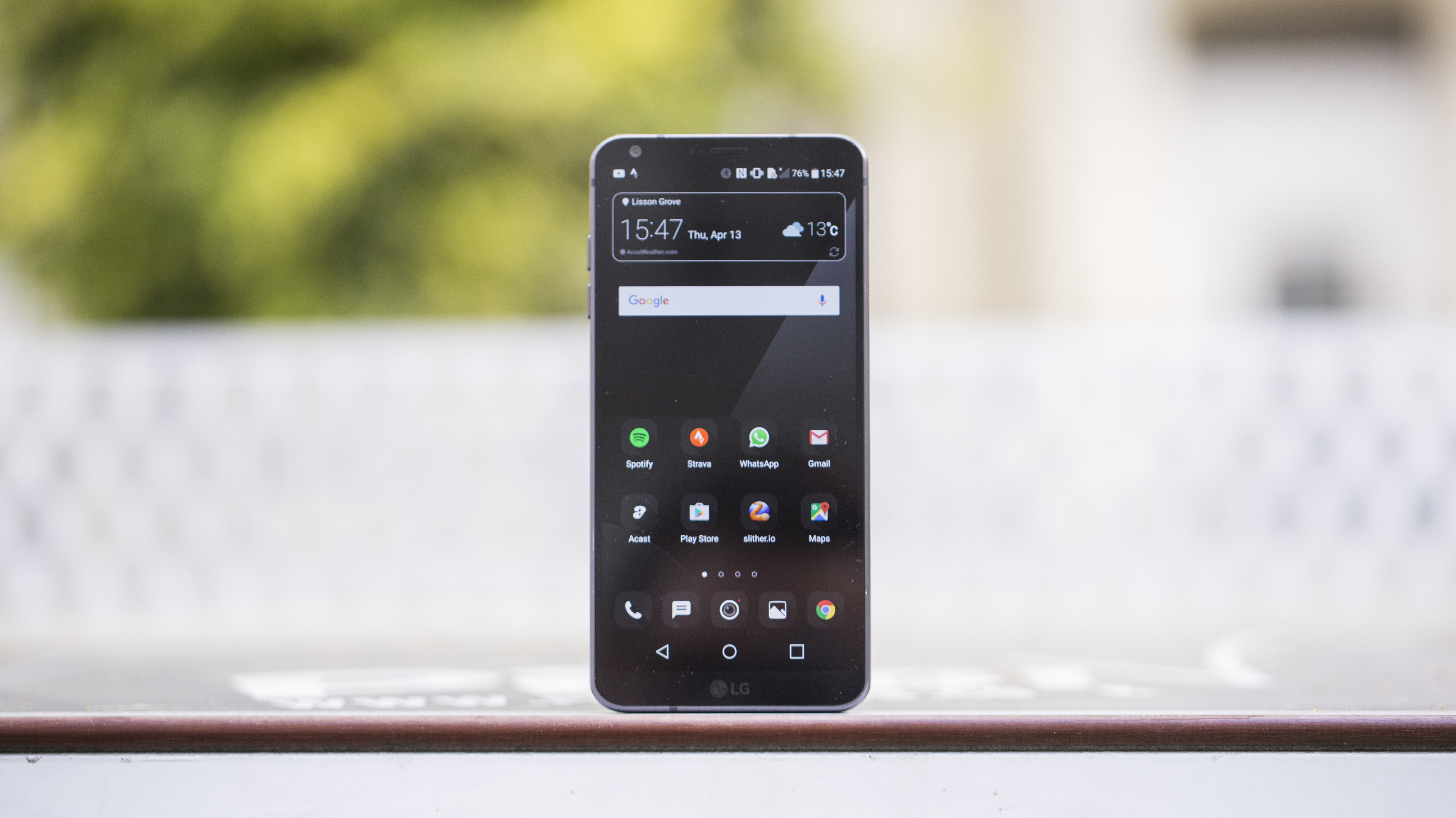
The icons on the home screen (which still comes without an app drawer by default) are tidied up too, with the rounded look applied throughout.
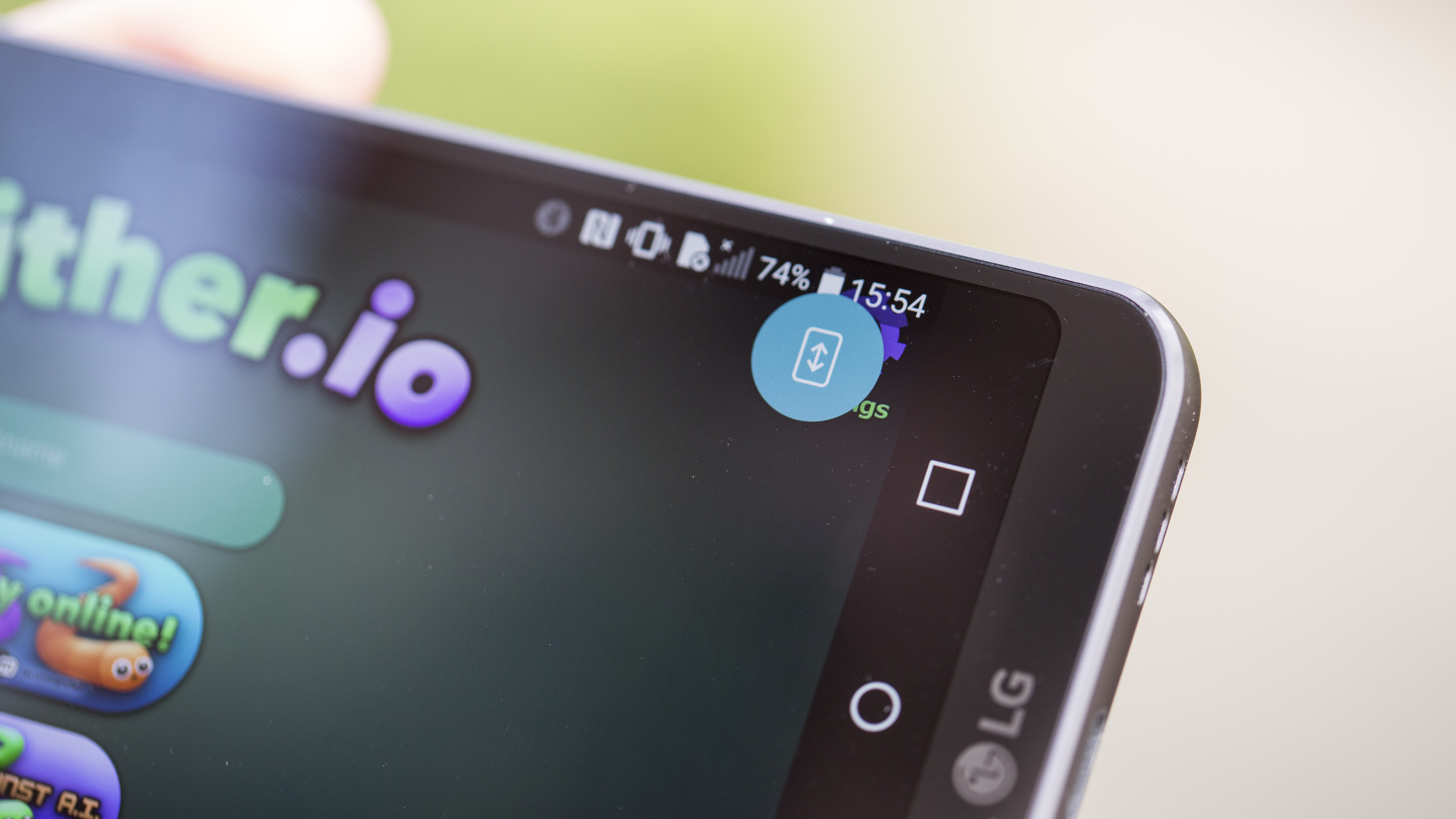
The ability to extend the screen out is nice, but the full-screen extension isn't as easy as on the Galaxy S8 - you need to pull down the notifications shade and it'll pop up... sometimes.
Ultimately, the longer screen hasn't really been used in a way that makes a massive difference here, but everything does feel a bit more immersive.
What LG has done, though, is to create a more refined and mature-looking interface compared to phones gone by - the apps drawer, icons and overall look of everything from the notifications shade to the menus just feel more premium.
It's what LG needed to do: ditching the cartoonish way things were put together and just making things looks decent in the places they're supposed to be.

Gareth has been part of the consumer technology world in a career spanning three decades. He started life as a staff writer on the fledgling TechRadar, and has grew with the site (primarily as phones, tablets and wearables editor) until becoming Global Editor in Chief in 2018. Gareth has written over 4,000 articles for TechRadar, has contributed expert insight to a number of other publications, chaired panels on zeitgeist technologies, presented at the Gadget Show Live as well as representing the brand on TV and radio for multiple channels including Sky, BBC, ITV and Al-Jazeera. Passionate about fitness, he can bore anyone rigid about stress management, sleep tracking, heart rate variance as well as bemoaning something about the latest iPhone, Galaxy or OLED TV.
