TechRadar Verdict
A good but pricey service which can automatically design some very nice logo ideas, with further automatic customisation features.
Pros
- +
Nice automatic design
- +
Easy to setup and use
Cons
- -
Little manual customisation
- -
Price is high
Why you can trust TechRadar
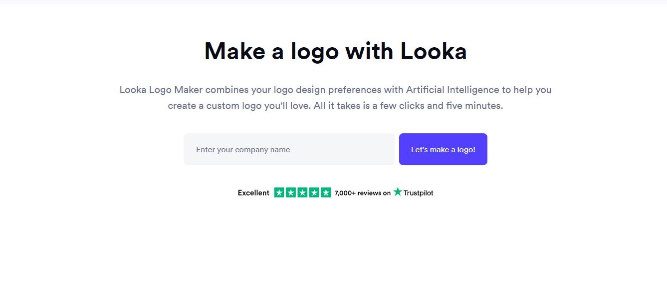
Looka’s purpose is to help you ‘design your own beautiful brand’, and to that aim, they offer a logo making tool which is the focus of this review. As the Looka Logo Maker page says, enter your company name and click on that big blue ‘Let’s make a logo!’ button.
Getting started
As usual, if you’ve experienced other similar services in the past, Looka will ask for the type of industry your work in - start writing and various options will appear in a drop down menu to hopefully help speed up the process.
The next steps are optional: selecting existing thumbnails, and choosing three distinct colours will help ‘inspire’ the AI when it designs your own, but you can just as easily skip this process.
Automated logo creation services like to include symbols, and based on your previous answers, Looka offers you a range of categories which you can select from, and it will pick a specific one for you. Alternatively, you have the option of manually choosing up to five yourself by clicking on “I want to pick my own symbols”.
Looka will then have all it needs to generate logo concepts for you.
As with so many other services, this is the time when you’ll be asked to log in or register. At least in this case, you have the option of continuing as a guest, if you want to kick the log in can further down the road and get straight to the results.
The results
The AI powered design process takes a few seconds to come up with the goods. The range of styles is quite broad and you can narrow down your results by category. By default, Looka shows you ‘All’ results, but click on ‘Modern’, ‘Script’, ‘Delicate’, or anyone of the five other options to focus your selection.
Sign up to the TechRadar Pro newsletter to get all the top news, opinion, features and guidance your business needs to succeed!
Unfortunately, Looka has to think for a few seconds each time you switch categories. We only mention this because other services are quicker at displaying new variations on request, but on the flip side, most of Looka’s default samples look very nice indeed.
A generated result is all well and good, but just how powerful are this service’s editing features?

Automatic customisation
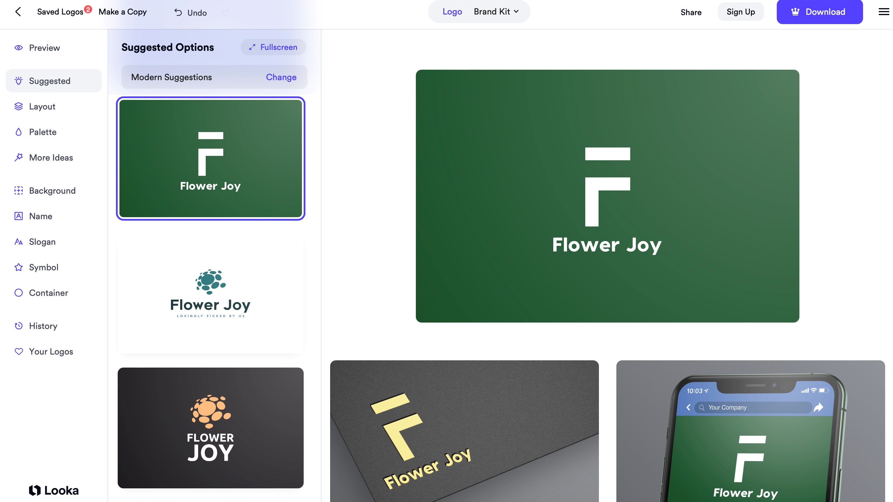
If you’ve explored other logo makers, you’ll find the interface very familiar: the main section to the right shows your current design. Scroll down to see digital renders of how it would look on a website, a social media account, a business card, and even merch. Looka weren’t kidding when they stated their focus is on creating your brand.
The middle column offers various suggestions. This is not truly editing per se, but AI driven shortcuts, should you find these alternatives more appealing than the current offering. These suggestions are based on the current designs category. You’re free to select a different one to see what else Looka can come up with.
Below the ‘Suggested’ menu, you have ‘Layout’. This keeps your preferred design’s elements (font, colours, symbol), but presents them in different ways, showing you what’s possible and maybe helping you find something more to your liking.
‘Palette’ keeps the design the same, but alters the colours. Again, you have no control over the proposed results - this is all done automatically for you.
‘More Ideas’ toys with the chosen font, changes the colours of some words and even replaces one of the letters with a similarly shaped symbol, to make you logo that little bit more unique.
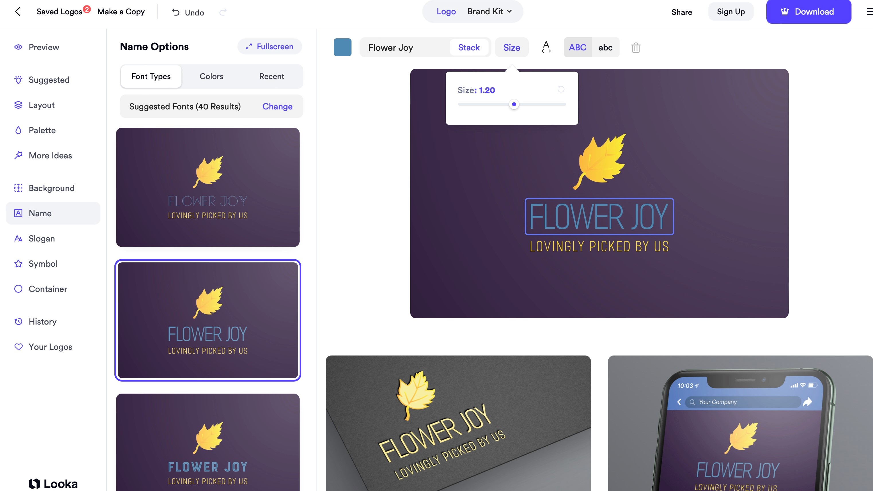
You have a little more control with the next options: ‘Background’ lets you choose a colour (from nine available), and Looka will then present you with various shades to pick from. ‘Name’ and ‘Slogan’ do the same job but for each wording separately. Again, your choices are limited to choosing a font category and Looka will select some from there. As with the other sections, the broad brushstrokes are yours to choose, and the AI will then offer you options. This can be frustrating: if you know a font you’d like to use for instance, you can’t select it yourself. You have to hope it’ll be presented as one of the various choices on display.

Where you do have some control is in the main preview section. There, you’re given a slider to alter a font’s size, the spacing between letters, and even turn all letters uppercase or lower case. You also have full control over the lettering’s colour too.
The same is true for the selected symbol, which you can also flip horizontally and vertically, and change its position relative to the wording.
Download
Once you’re happy with your design, it’s time to download it. Your payment options range from $20 (£15) for a non-transparent logo, to $65 (£50) for multiple high-res files (including vector files) with full ownership of the design, to yearly subscriptions, the cheapest of which is $96 (£84) for a full brand kit, which includes business cards, letterheads, email signatures, etc.
Final verdict
Looka produces very nice looking logos in little time, and the automatic customisation options are interesting, albeit limiting. Compared to the competition, the price is high, but their focus is on offering a uniform branding package, which might well appeal to many businesses who can’t justify an in-house designer.
We've also featured the best logo maker and designer and the best business plan software
Steve has been writing about technology since 2003. Starting with Digital Creative Arts, he's since added his tech expertise at titles such as iCreate, MacFormat, MacWorld, MacLife, and TechRadar. His focus is on the creative arts, like website builders, image manipulation, and filmmaking software, but he hasn’t shied away from more business-oriented software either. He uses many of the apps he writes about in his personal and professional life. Steve loves how computers have enabled everyone to delve into creative possibilities, and is always delighted to share his knowledge, expertise, and experience with readers.

