TechRadar Verdict
With arguably the most stylish Wear OS watch design yet, a great screen and rock-solid performance, the Michael Kors Access Grayson is a major contender. Only a lack of secondary functions and a higher-than-average price hold it back.
Pros
- +
Large, sharp AMOLED display
- +
Genuinely classy design
- +
Tactile rotating crown
Cons
- -
No NFC for Android Pay
- -
No GPS or heart rate sensor
- -
Considerably more expensive than competition
Why you can trust TechRadar
What do you want from a smartwatch? It’s an important question to ask in an increasingly fragmented wearables market, and for a certain group of people the Michael Kors Access Grayson could represent the ideal answer.
Launching with Android Wear 2.0 software onboard, it has now been updated to the rebranded Wear OS platform. As with previous smartwatches from the American fashion brand, the focus is on style rather than the spec sheet.
There are a couple of pretty basic functions missing as a result, but maker Fossil appears to have focused on nailing the core essentials - with considerable success.
Michael Kors Access Grayson price and release date
- Price: $350/£349 (around AU$589)
The Michael Kors Access Grayson hit US, UK and Australia in September 2017 with a fixed price of $350 / £349 / AU$449. It’s available direct from the Michael Kors website, as well as from House of Fraser here in the UK.
That price makes the RRP of the Grayson considerably more expensive than other fashion-forward Wear OS watches such as the $249/£230 (around AU$320) LG Watch Style and the $255/£259/AU$399 Fossil Q Venture. Fortunately, it’s pretty easy to see where the extra money has gone.
Since then, we've seen the price drop a touch and we've seen it hit £250 in the UK and just under $300 in the US. In Australia the price has stayed around the $449 mark.
Design
- Looks and feels like a proper fashion watch
- Pretty hefty on the wrist
- Three hardware buttons, including a rotating crown
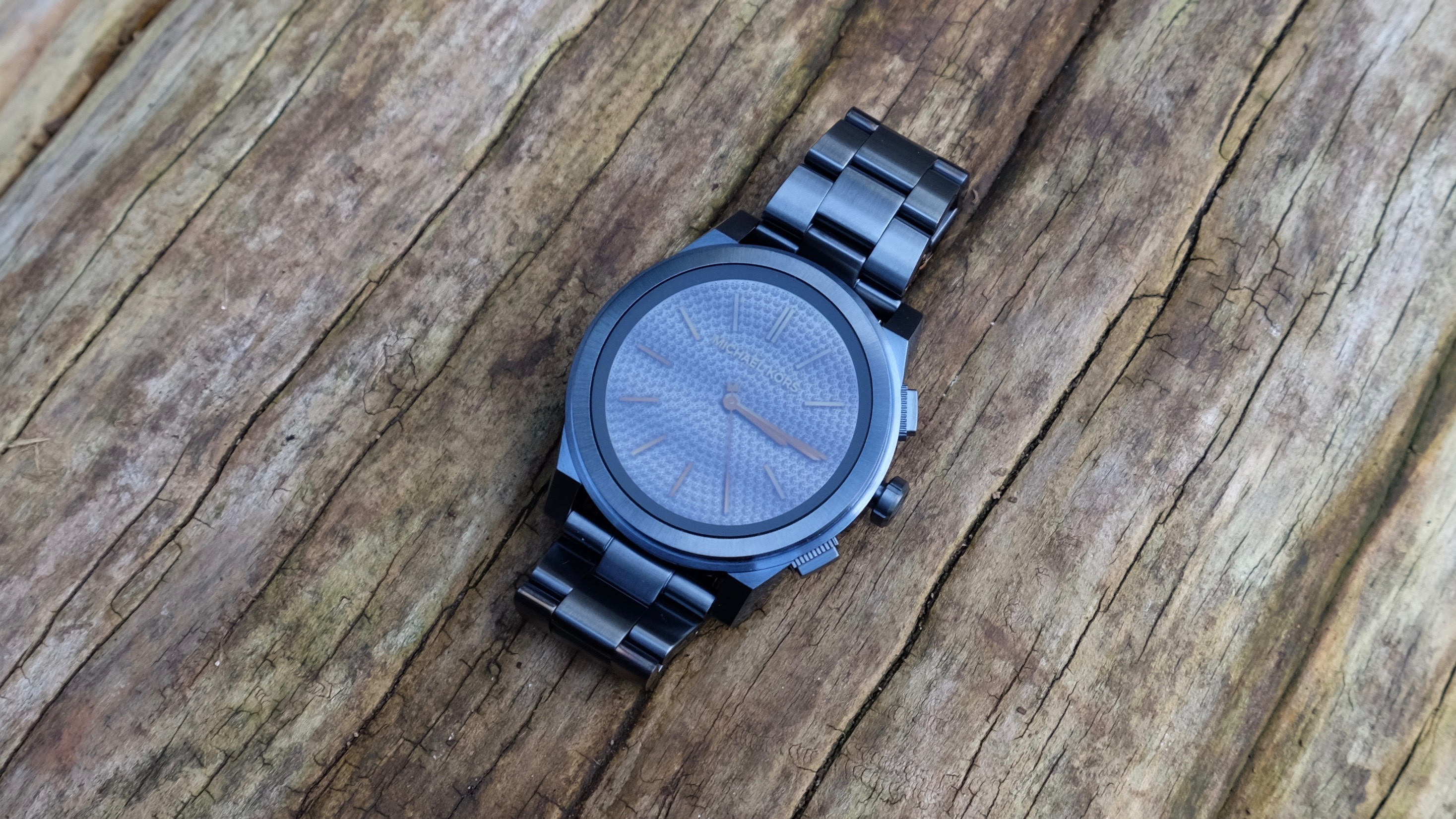
The Michael Kors Access Grayson is an undeniably handsome watch. Note that we didn’t use the term ‘smartwatch’ there.
Kors and watch maker Fossil have clearly shot for that real watch feel with the Grayson, and the results are impressive.

Don’t take that to mean that this is a dainty piece of equipment, though. This is a hefty, chunky, 47mm ion-plated wrist-piece that’s unapologetically aimed at the traditional Men's (with a capital ‘M’) market.
There's a more slender model called the Sofie, which is both more compact and considerably blingier, so if you’re skinny-wristed you might want to consider something a little more subtle.
Despite its heft, the Michael Kors Access Grayson is relatively comfortable to wear. All models come with a beveled bracelet strap which, once you’ve had it adjusted appropriately, fits snugly.

This rugged real-watch design isn’t just a facade either - with an IP67 rating, you don’t need to worry overly about exposure to water or lint.
In terms of controls, there’s a rotating crown button that acts as a home button and a Google Assistant prompt - just press and hold. It also acts as a pleasingly tactile scroll wheel that’s not too dissimilar to the Apple Watch 3 equivalent. It’s ideal if you want to minimize fingerprints on the touchscreen, and is just plain pleasant to use.
Flanking this crown are two extra buttons. By default, the top button provides access to Michael Kors’s own suite of apps, which are My Social, My Looks, and My Modes. The bottom button launches the Google Play Store, though both of these shortcuts can be personalized.

Display
- 1.39-inch AMOLED, 454 x 454
- One of the larger, sharper smartwatch displays
- Perfectly round this time
Compared to its predecessors, the Michael Kors Access Grayson has made the sizeable leap up to AMOLED technology, which has all sorts of benefits for a smartwatch.
It means you no longer need a ‘flat tire’ section at the bottom of the display, while the lack of a back light makes it more energy efficient when you just want to quickly glance at the time.
True, it’s not the brightest display in direct sunlight, but you shouldn’t struggle in most conditions.
Besides being more vibrant, the Michael Kors Access Grayson display is just plain big. At 1.39-inches it’s up there with the Asus ZenWatch 3 - and it’s sharper, too, at 454 x 454.
All of this pays off when dealing with detailed watch faces, text, or image-heavy notifications. Which essentially represents the bulk of most people’s smartwatch interactions.
