TechRadar Verdict
The Mio Slice has tried to take a different approach to the fitness tracker market, ditching steps counting in favor of the heart rate-based PAI metric. Despite this, it still falls into all the same pitfalls, with an ugly design and a basic app that lacks insight.
Pros
- +
Engaging new way of tracking fitness
- +
Accurate steps and distance monitoring
- +
Really encourages you to be active
Cons
- -
Boring, uncomfortable design
- -
App isn’t the deepest
- -
Heart rate sensor not always on point
Why you can trust TechRadar
Fitness trackers are changing, and the Mio Slice is at the forefront of that movement. Steps have long been the metric of choice for many, but simply knowing how far you’ve walked or run isn’t really the best indication of how fit you are.
Sure, you could walk 10K every day, but if it’s taking you 8 hours of slow, methodical plodding to do so, you’re not really burning off that much energy.
That’s why the Mio Slice is trying something different. Unlike the Fitbit Charge 2, Misfit Shine 2, or even the Apple Watch 2, this wrist-based fitness tracker puts step count in the shadows and instead makes PAI the metric of choice.
Before you start groaning and giving up on your exercise kick before it’s even started, trust us, this isn’t as complicated as it sounds. What it is, however, is something that could make the Mio Slice the only fitness tracker you should be considering. Potentially.
Mio Slice price and release date
- Out Now
- Costs $129/£119 (around AU$170)
Despite tracking things a little differently, when it comes to price, the Mio Slice is just like the masses.

With a $129/£119 (around AU$170) asking price, it’s slightly cheaper than both the Fitbit Charge 2 and Garmin Vivosmart HR, but more expensive than the display-bereft Misfit Ray, a simple steps tracker that can be picked up for just $100/£80/AU$138.
With no GPS but an inbuilt heart rate sensor and basic wrist-based message alerts, however, it’s a price that fits the Slice’s skill set.
Design
- Boring, basic design
- Rigid body and firm strap aren’t the most comfortable
- Four colors and waterproof to 30m
When it comes to looks, the Mio Slice is classic fitness tracker. That's not necessarily a good thing though.
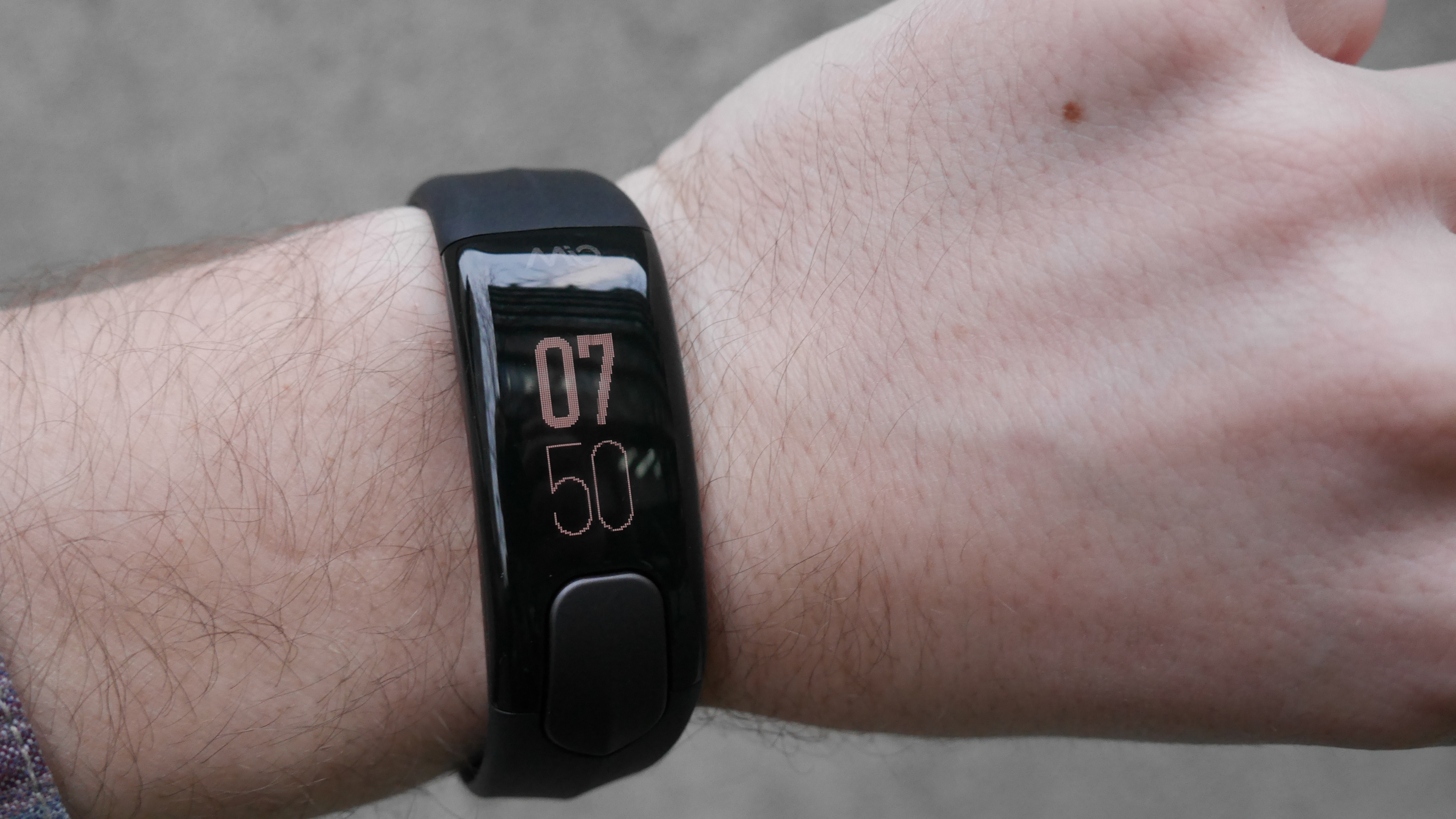
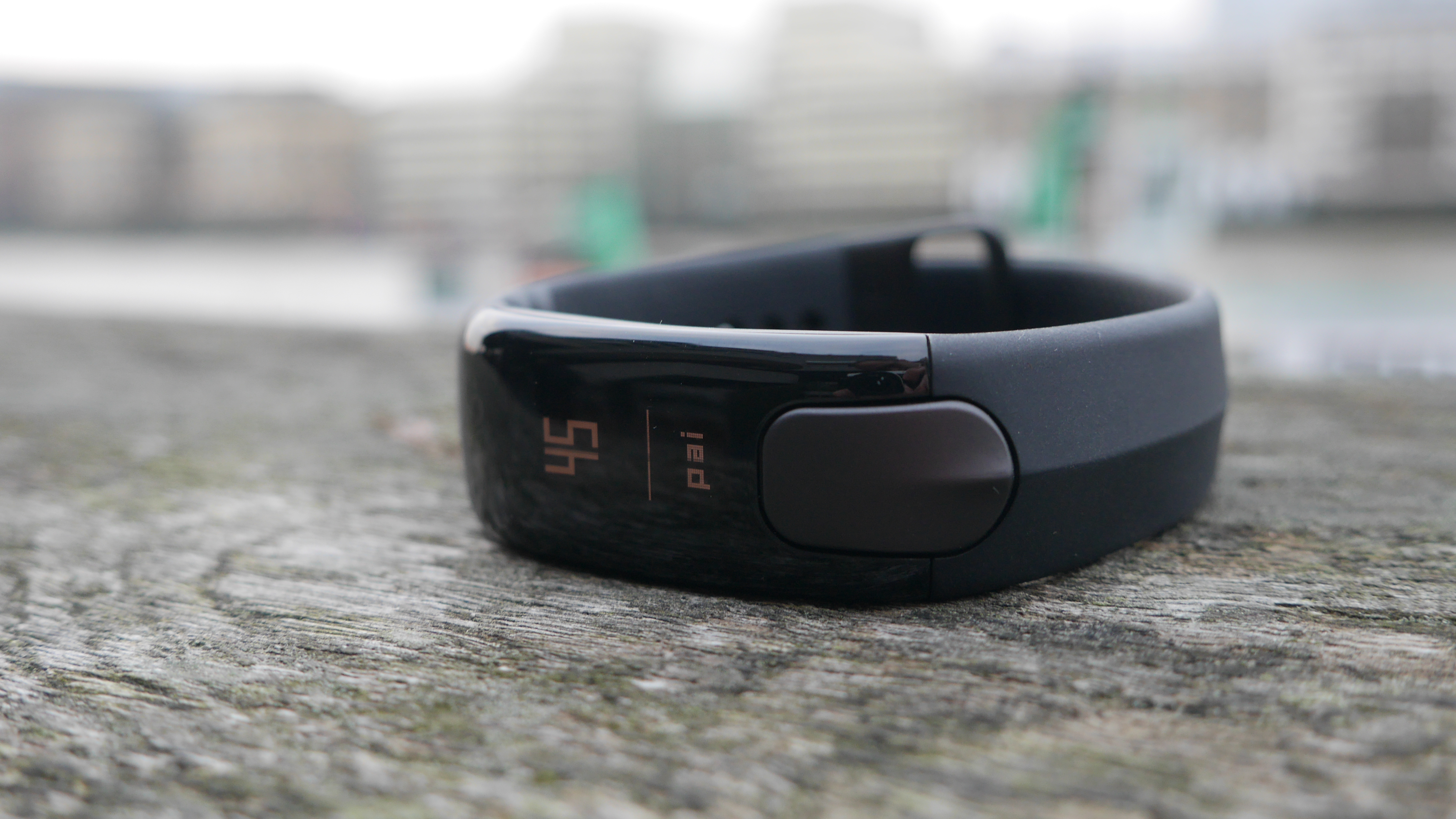
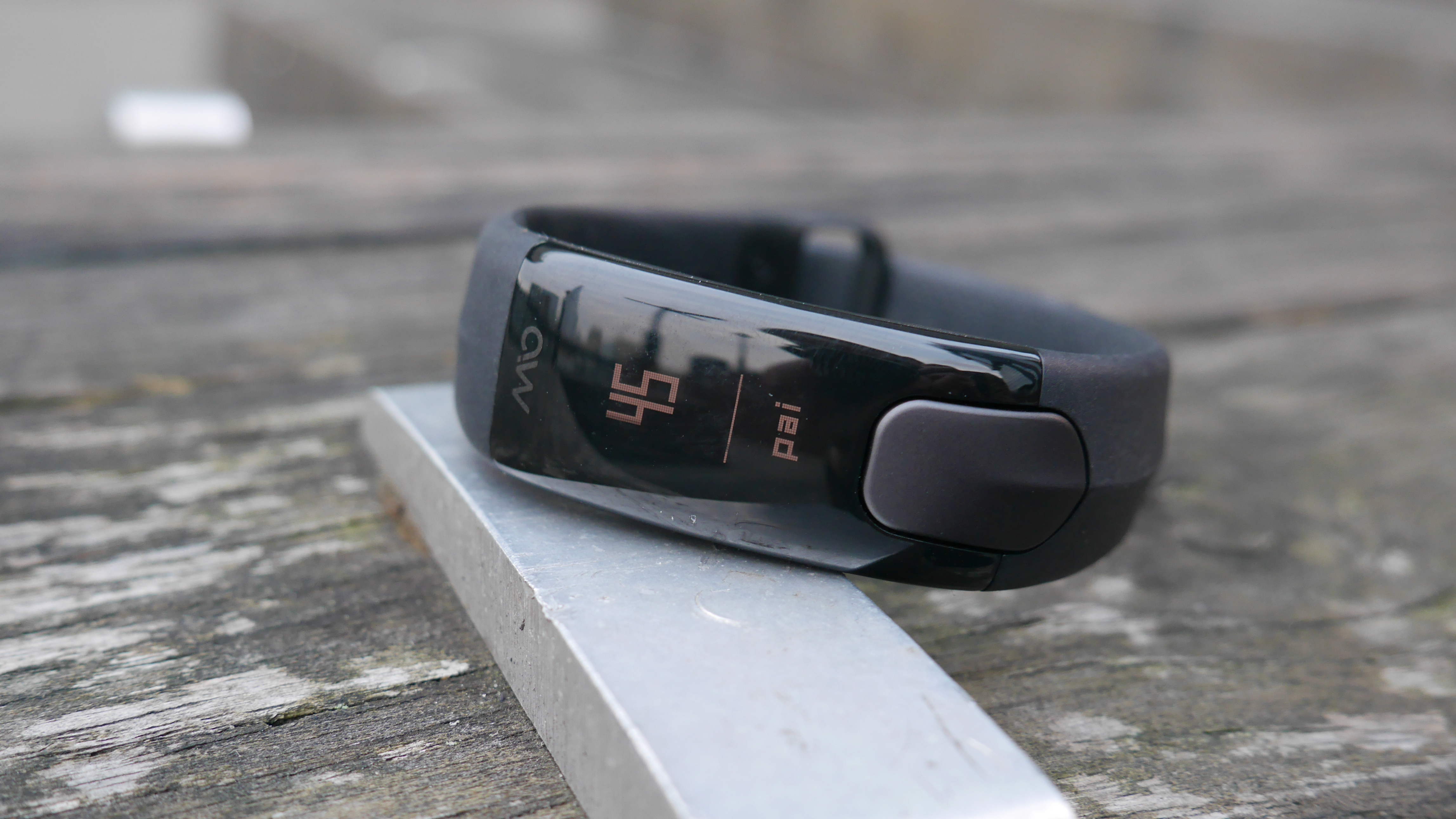
A bland, lifeless combination of plastic, rubber and metal, the Slice is a gadget that falls somewhere between fitness tracker and goth cuff in the looks department. At least the black model we tested does. With navy, ‘stone’ white and sienna (a sort of burnt orange) finishes also available, there are options with a sportier, more lifestyle look.
While they might spruce things up, colors aren’t going to fix underlying problems - the Mio Slice simply doesn’t look that nice. And it’s not particularly comfortable either.

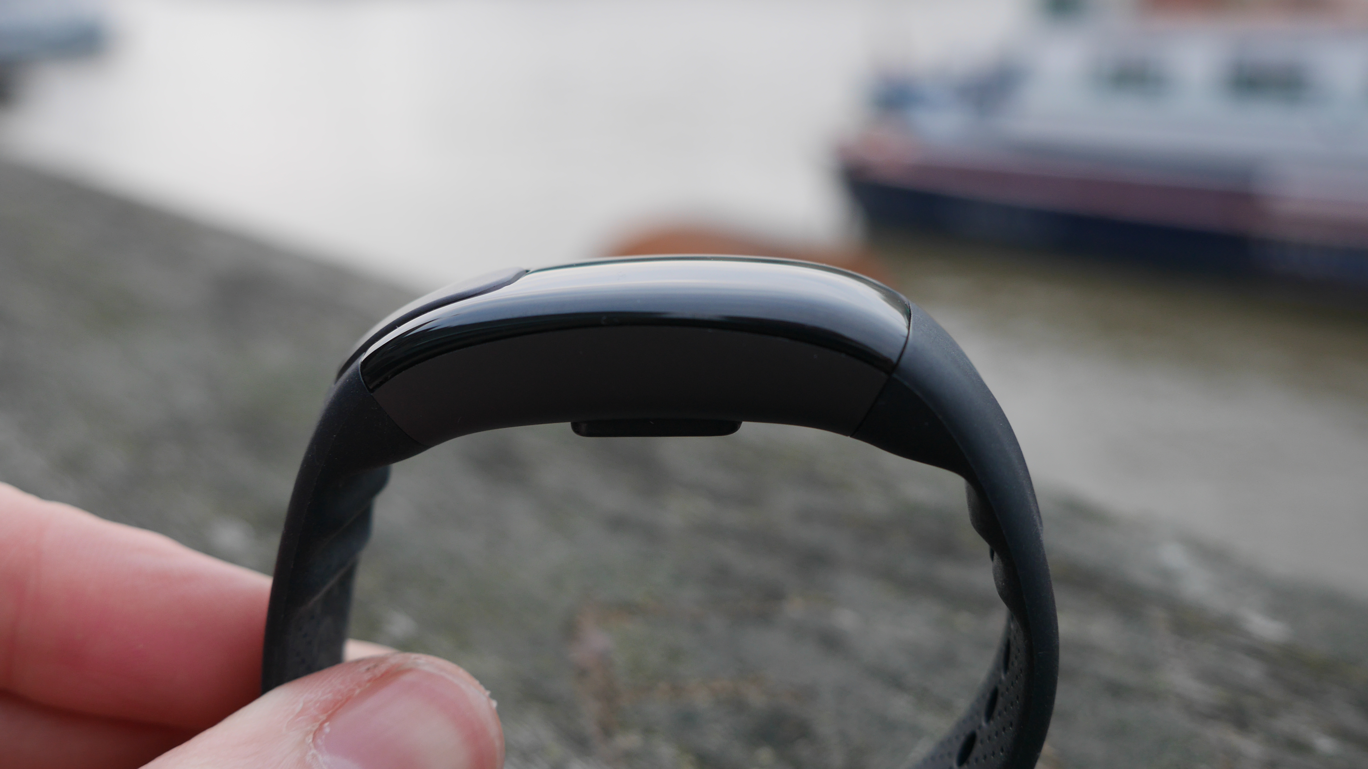
Like the old Microsoft Band 2, everything’s just too stiff and rigid. There’s not enough flex to the Slice’s firm rubbery plastic strap, and the subtle curve to its aluminum and plastic body is too shallow to properly hug the contours of your wrist.
Although being too blocky to ever really feel like a true extension of your arm, it’s during regular daily tasks, such as sat at a desk or eating a meal, rather than vigorous exercise, that the Slice feels most cumbersome.
It’s not a total design dog though. When out running or enjoying a bit of sporting action, the Slice is slim and light enough to forget about. While that doesn’t quite make up for the design shortcomings, it’s arguably the most important element when snapping up a fitness tracker.
That success can be pinned on the device’s compact form factor. There are two strap length options available, meaning there’s a model to fit your wrist, with each lining up at just 1.35cm thick and either 28g for the small version or 29g for the large one.
No, it’s still not going to win any beauty contests, but there are other design triumphs too, namely the wristband’s waterproof skills. Capable of surviving dunks to depths of 30 meters, you can keep the Slice on come swim or shower time.

Sadly, it’s from the good back to the bad, because it’s not just the Slice’s general look that falls short. The device’s design leaves a lot to the imagination when it actually comes to using the thing too.
The integrated OLED display is basic at best, with individual pixels clearly visible. OK, so it doesn’t need to be graphically equal to your phone, but a bit of added sharpness would make mid-run metric tracking a bit easier.
So too would more buttons, as navigating through the Slice’s menus is a bit of a contest. That’s because there are up to 10 menu options (customizable in the app) and just a single button. That means getting where you want to go requires a lot of presses and if you miss your stop, you’ve got to keep going until you loop back around. Not ideal when your arms are flailing around mid-run.
