TechRadar Verdict
Motorola returns to the ultra-affordable smartphone market after an extended absence, but the Moto E3’s performance shortfall makes a strong case for spending a bit more.
Pros
- +
Solid build quality
- +
Decent 5-inch 720p display
- +
Excellent battery life
Cons
- -
Weak performance
- -
8GB isn't enough storage
- -
No NFC means no Android Pay
Why you can trust TechRadar
In one sense, the Moto E3 is Motorola’s most anticipated phone of 2016. After all, it’s been almost two years since Motorola hit us with the Moto E (2015), which swiftly became one of our top ultra-affordable smartphone picks.
At £99 (around $125, AU$170) the Moto E3 continues the price-conscious philosophy of the range. It shouldn’t surprise you to learn that it’s better than the second-generation Moto E in virtually every respect.
The real question now is whether the Moto E3 can justify its existence and hang on to the coat tails of the accomplished Moto G4, which costs just £70 ($70, around AU$160) more.
The budget smartphone tier has taken huge leaps forward since the last Moto E arrived on the scene, so the Moto E3 can’t lean too heavily on its low price.
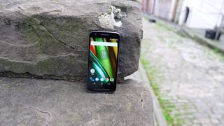
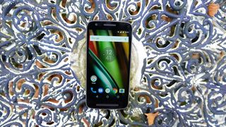
Weight: 140.6g
Dimensions: 143.8 x 71.6 x 8.5mm
OS: Android 6
Screen size: 5-inch
Resolution: 720 x 1280
CPU: 1GHz MediaTek quad-core
RAM: 1GB
Storage: 8GB
Battery: 2800mAh
Rear camera: 8MP
Front camera: 5MP
Especially as there are now other similarly priced players on the market, such as the Vodafone Smart Prime 7 and the Wileyfox Spark.
Put simply, the Moto E3 needs to be competent in all of the areas that matter. The good news is that it’s a considerable step forward for the Moto E line, with a solid build, competent camera, and a major step up in screen quality.
The few areas in which it does slip up, however, left us pondering what the bare minimum standard for a smartphone should be as we head into 2017.
Moto E3 price and key features
- Very low price
- Great interface that’s almost stock Android
Motorola’s latest affordable phone isn’t a complicated device by any means, and it doesn’t have many showy or stand-out features other than the price.
Spending less than $150/£100/AU$200 on a smartphone used to guarantee you a headache-inducing experience, whether you were talking about a tiny and dim display, a creaky build, or a processor that couldn’t keep up with the latest apps. Motorola and parent company Lenovo, however, want you to “Expect more. Spend less” with the E3.
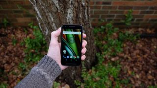
The phone largely stands up to this bold line, too. Our usage of the Moto E3 was sandwiched in between that of an iPhone 6S and a Huawei Mate 9 Porsche Design - two classy ‘premium’ phones that retail for many times the price - and the little Moto acquitted itself admirably in such company.
That’s not to say that we didn’t notice the drop in quality, because we most definitely did. Anyone expecting a flat out premium experience here is deluded. But that drop wasn’t so pronounced that we grew frustrated with the Moto E3, aside from in a couple of areas that we’ll go on to discuss.

Another stand-out attribute of the Moto E3 is common to all Motorola phones - its use of a near-stock version of Android. It’s the stockiest manufacturer by far, and we’re not being rude about its weight.
Using such a stripped-back version of Android has several advantages over phones that don’t. It’s easier on the phone’s hardware resources, which is particularly useful when the CPU is as modest as the example here. It also means that updates from Google can be integrated faster than the rest, as there’s no need to modify or test a flabby layer of extras.
But the main advantage is that stock Android 6.0 Marshmallow is simply a very pleasant, intuitive operating system to use. Far nicer, indeed, than the custom UI efforts found on significantly more advanced and expensive handsets.
Design and display
- Deeply functional plastic design
- Much improved 5-inch display
Aesthetically speaking, the Moto E3 is almost remarkable in its unremarkableness. It’s a deeply generic design that harks back to previous Motorola phones, and its utilitarian curves and heft call to mind similarly rugged efforts from HTC and pre-Microsoft Nokia.
There’s little if any attempt at flair, other than a vaguely metal-effect plastic rim - but even that is muted. This is just fine. Given the heavy use of plastic, any attempt to replicate the look of more expensive phones in the range like the Moto Z would be doomed to tacky failure. These eyes have seen far too much shiny plastic in their time.
The earpiece and speaker form exaggerated slots, almost like they could spit out a receipt or ream of tape at any point, and we’re sure this will become a major lint collector over time. They’re not unpleasant, though, and they help with tactile alignment when you’re scrambling for the phone in your pocket or bag.
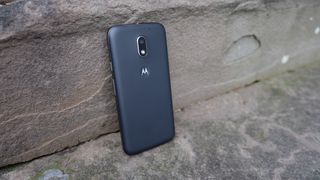
If the Moto E3 is unassuming to look at, it’s reassuringly substantial in the hand. The matt plastic rear may peel away and flex alarmingly easily, but when it’s clicked into place the phone feels sturdy.
Combined with its 8.5mm thickness and 141g weight (about the same as an iPhone 7), the Moto E3 certainly doesn’t feel cheap, yet it won’t weigh your pocket down either.
The power and volume buttons are well-placed under the thumb or forefinger on the right edge of the phone, and we appreciate the fact that Motorola has distinguished the former with a textured finish - particularly as there’s no home button or fingerprint sensor here for speedy access.

Though the Moto E3 hasn’t evolved much from the Moto E (2015) when it comes to design, its display is a massive leap forward. Let’s not forget that the E3’s predecessor featured a now-tiny 4.5-inch display with a mere 540 x 960 resolution.
This new phone has upped the ante on both counts, with a respectable 5-inch size and 720p resolution for a pixel density of 294ppi. For a phone of this price, that’s more than acceptable.
Typically such affordable displays suffer when it comes to brightness, and while we needed to keep it cranked up to max pretty much all of the time, it was fine once we did. Color reproduction is decent, too. It won’t poke your eyes out with punchy reds or deep blues, but it offers a nice balance whether you’re surfing the web or viewing snaps.
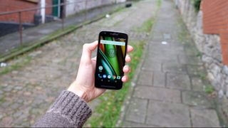
Ultimately, the Moto E3’s improved display has a large effect on its usability in day-to-day tasks. It can render everything well, from games to photos to Facebook posts, which is all you can ask of such a cheap phone.


I tried Gemini's new AI image generation tool - here are 5 ways to get the best art from Google's Flash 2.0

At $15,000, this massive 256GB RAM laptop makes Apple's MacBook Pro look affordable, tiny and very, very slow
Dell just launched a $4,000 75-inch 4K touchscreen display - but I've found one rival that's 50% cheaper

