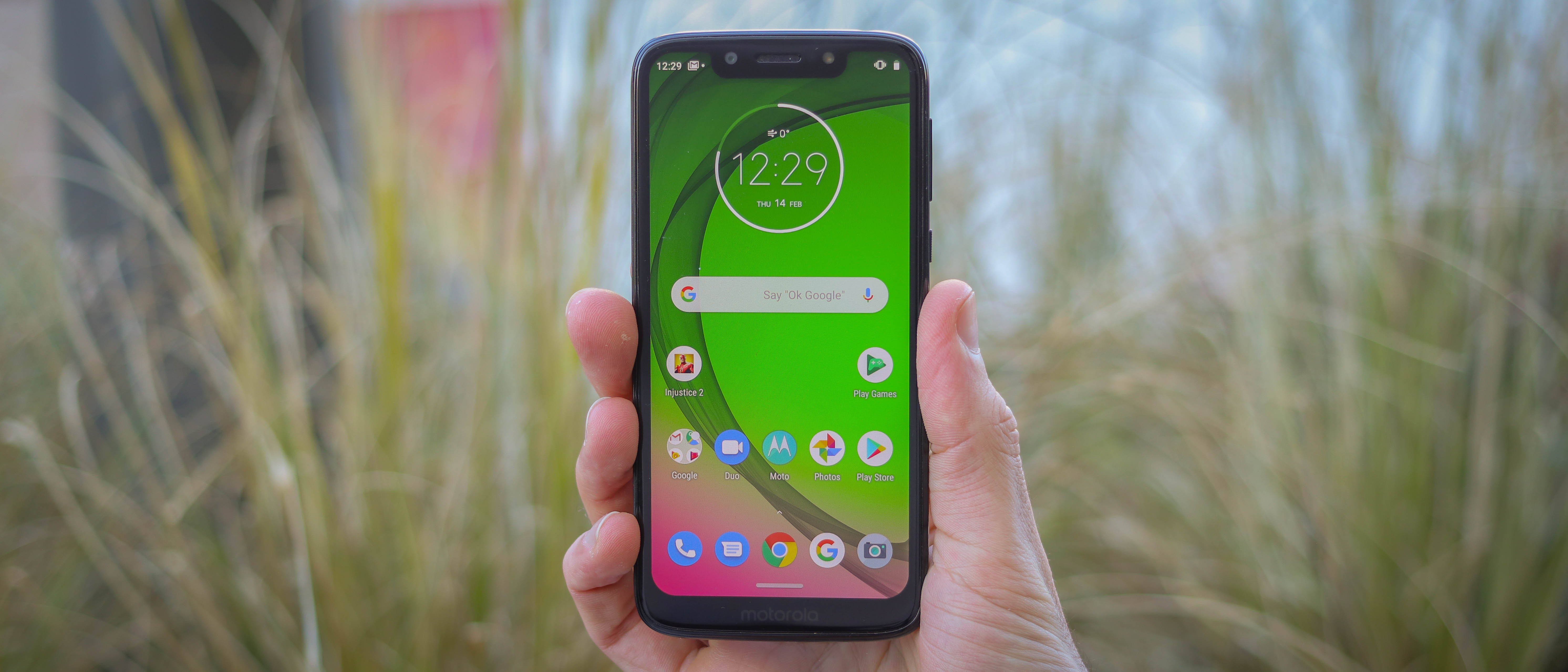
TechRadar Verdict
Pocketable, affordable, zippy in day-to-day use - the Moto G7 Play may be a budget phone - and it isn’t built for gaming, despite its name - but it bears all the hallmarks of a four-star device. It delivers great battery life, gives you access to tons of apps, and it offers value for money that can argue away most of its shortcomings.
Pros
- +
Great battery life
- +
Runs Android 9
- +
Front speaker
Cons
- -
No case in the box
- -
Occasional gaming lag
- -
No NFC
Why you can trust TechRadar
Motorola’s G-series has been a poster child for budget done right over the years, and 2019 is no exception.
The Moto G7 Play, announced alongside the G7 Power, G7 and G7 Plus, is the most affordable of the four, packing most of their specs and design advantages at the lowest price.
The budget phone's main competition comes from the Nokia 3.1 Plus, a very comparably specced phone, and the slightly cheaper Nokia 3.1 and Honor 8A.
Where the G7 Play stands out is power - it’s the only phone in its price-range to feature the new Qualcomm 632 processor, as found in the rest of the G7 line. It also sports 32GB storage and microSD card support up to 512GB.
So, while it’s definitely a budget smartphone, given the heritage of the Moto G line and the specs on offer, we’ve got high hopes for this Moto.
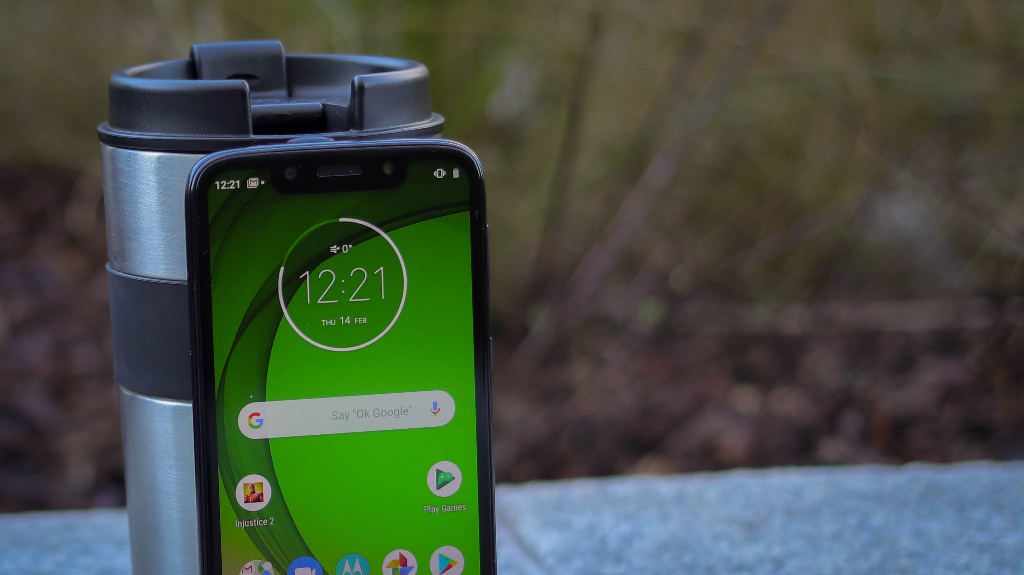
Moto G7 Play price and release date
- Available in the US, UK, India, Australia and other markets
- $200 (£149, AU$270)
The Moto G7 Play is the cheapest device in a range that's not exactly expensive already - it'll only set you back $200 (£149, AU$270).
That means it's actually launching at a cheaper price point than the G6 Play did, which started at $199.99 (£179.99, AU$329).
It has been available since March 1, 2019 from a range of carriers and stores, with the phone being made available on-contract, SIM Free or with a Pay As You Go SIM card.
Moto G7 Play Key features
- 5.7-inch LCD screen
- SD 632 processor + 2GB RAM
- 3,000mAh battery
With its 5.7-inch screen, the Moto G7 Play is the smallest of the G7 family, but still manages to deliver enough size to provide a comfortable viewing, typing, and swiping experience.
When looking at the specs of the G7 Play, its 2GB RAM does set off alarm bells, which could be reflected in mediocre or even poor gaming and multi-tasking performance. Most of the competition runs with 3GB RAM, but in the same breath, most of the competition also packs less fresh internals.
The brand new Snapdragon 632 chipset should be able to deliver respectable performance, and it supports expandable storage by up to 512GB, supplementing the 32GB onboard storage space.
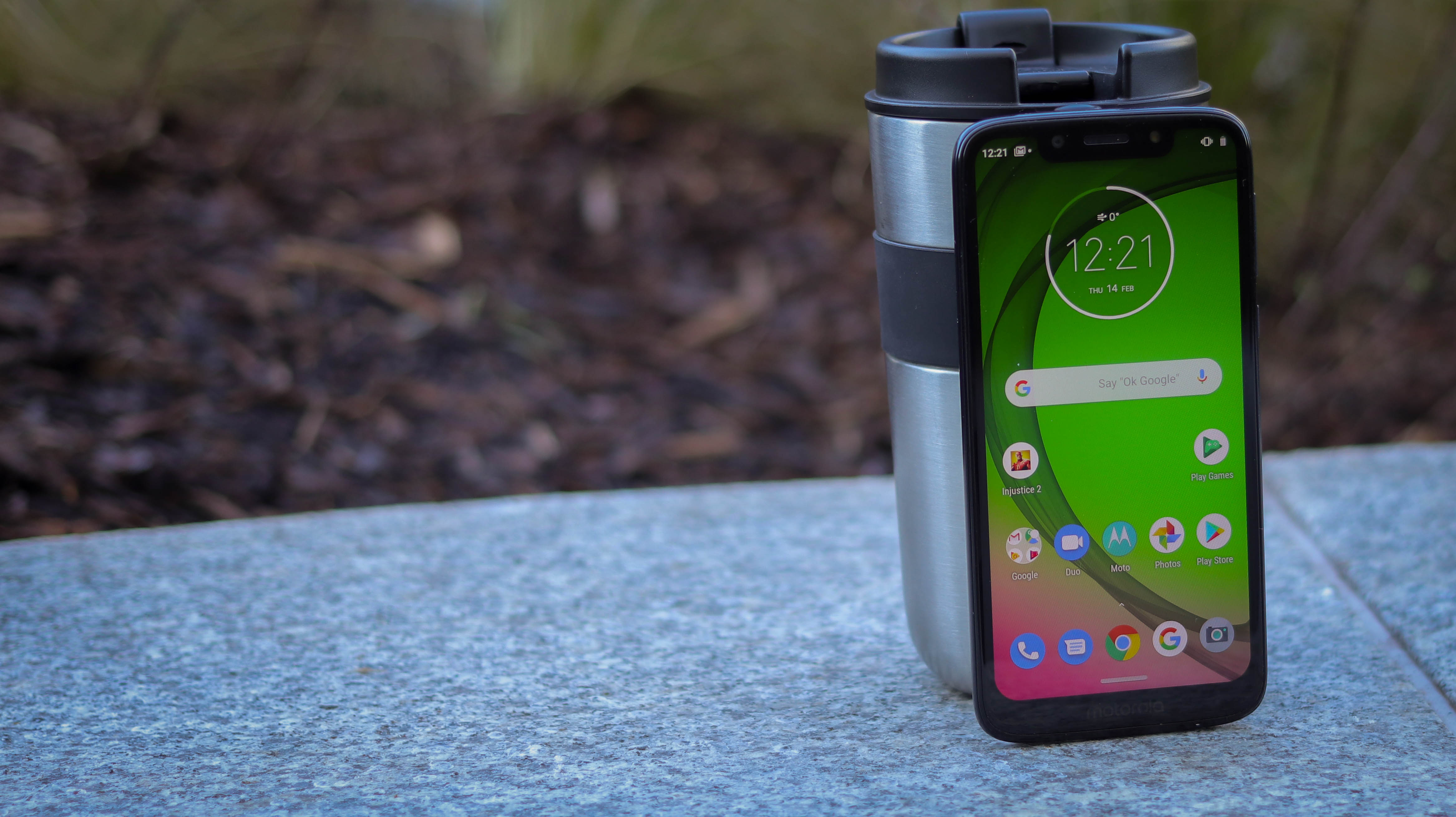
Running Android 9, the user interface is as up to date as we could hope for too, and the combination of a stock Android UI, matched with a few, fun Moto actions - karate chop to launch the torch, for example - is welcome.
The G7 Play is slender at 8.1mm thin, fits great in the hand and the HD+ screen has an aspect ratio of 19:9, so it’s longer than your average phone. As for its battery, with 3,000mAh inside, it’s all looking promising.
Fire up its 13MP camera and before you can even critique the photo quality, you have to tip your hat to Motorola for getting so many shooting modes on a budget phone. Ranging from full manual mode to spot color picker, the G7 Play is set up for victory.
Moto G7 Play Design
- Slim and solid
- Beefy notch
- Textured plastic back
The Moto G7 Play looks and feels good, is well weighted and slim - but its design definitely won’t delight or inspire you.
Unlike the rest of the G7 range, there’s no soft plastic protective case in the box, and we’re okay with this. The textured plastic back sports a concentric circle pattern and is resilient to scratches - much more so than the high-gloss finish of the likes of the G7 Power and Huawei P Smart 2019 for example.
At 8.1mm thick and 168g, the G7 Play is relatively light, slender and comfortable to hold - but its clumsy bezels and utilitarian feel prevent it from ever feeling sleek per se.
The phone’s solid plastic frame is still comfortably curved, as too is the back plastic panel. Easy to grip, difficult to slip, it’s definitely a practically constructed smartphone. We mentioned the textured finish on the back - that's only interrupted by the easy to reach fingerprint scanner and a large, round camera surround that protrudes slightly.
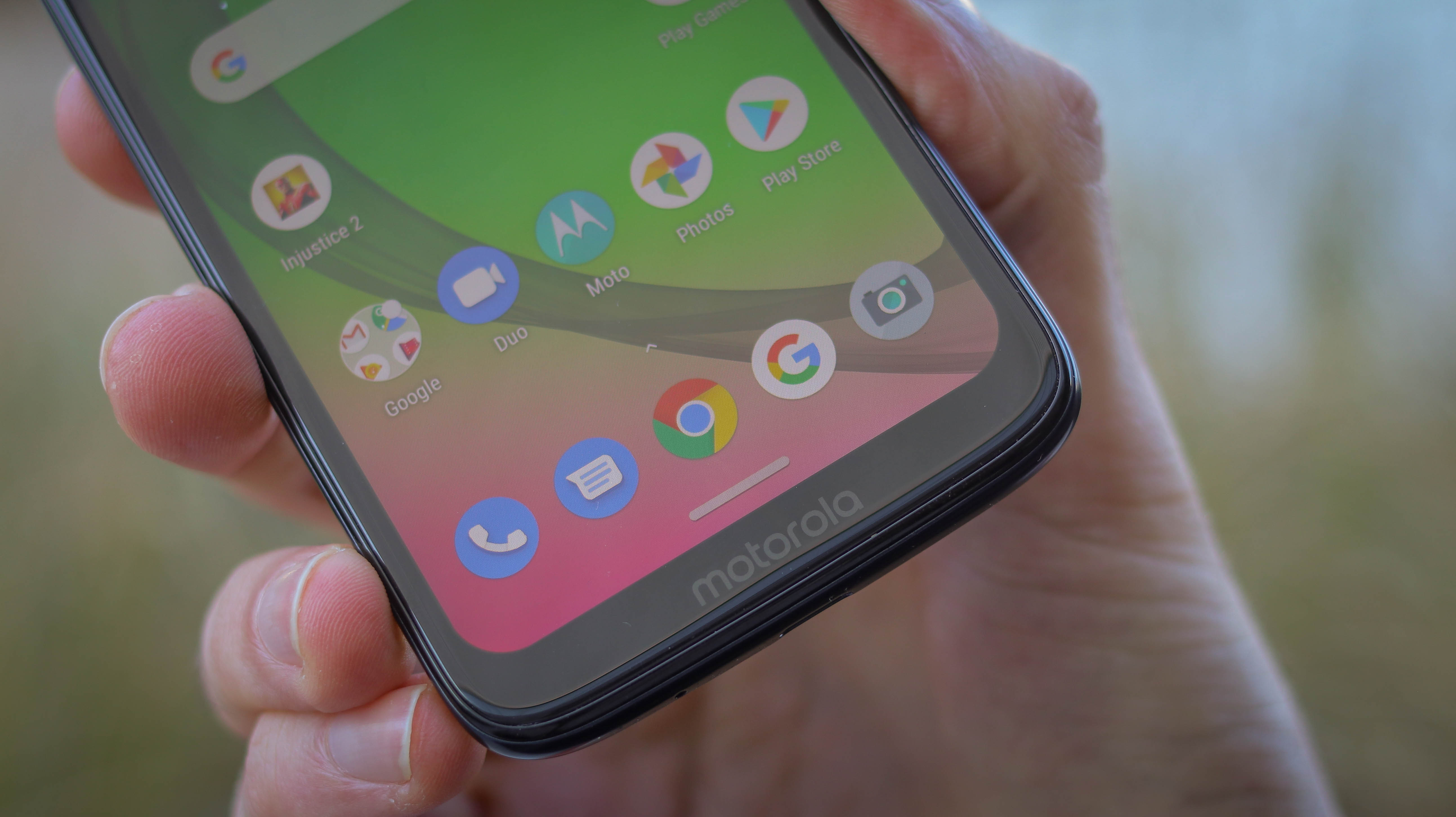
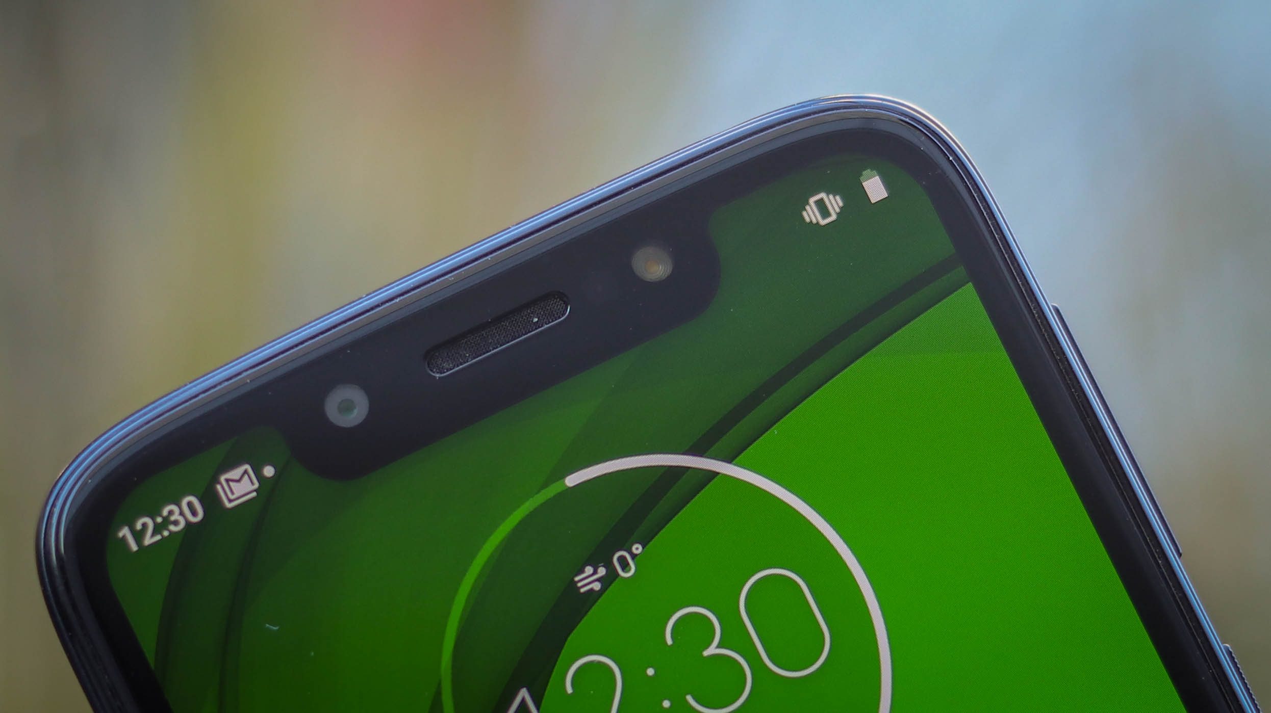
As for the front, the Moto G7 Play’s 5.7-inch screen has a hefty border and an even chunkier chin that’s loaded up with a Motorola logo. Up top, you can find what could be the most substantial notch we’ve seen to date, which houses the loudspeaker, front LED light, and the selfie camera.
This is the first ‘Play’ series Moto G to pack a USB-C port, which can be found on the phone’s bottom side - an excellent step in the right direction when it comes to future-proofing.
The dual-SIM tray slot is on the left, and the phone can take two nano SIM cards and a microSD card simultaneously. Meanwhile, the volume and power buttons are to the right. As for the headphone jack, it’s up on the topside.
The Moto G7 Play is available in three color options: Black, Blue and Gold, all with the same textured plastic finish. Ultimately, while the design doesn’t inspire or delight, it does the job and does it well.
Moto G7 Play screen
- 19:9 LCD screen with notch
- 5.7 inches with 77% screen-to-body ratio
- HD Plus resolution, 294ppi
The G7 Play’s HD display measures 5.7 inches and shines brightly. It’s a long screen thanks to the fact it sports a 19:9 aspect ratio, and it sports an iPhone-esque notch but unlike other widescreen smartphones like the light on bezels Honor 10 Lite, the Play isn’t as edge-to-edge, an experience.
With a resolution of 720 x 1512 pixels, its screen is exactly what we’d expect at the price, going toe to toe with the likes of the Nokia 3.1 Plus and the Honor 8A, and looking as sharp as you'll likely need it to be.
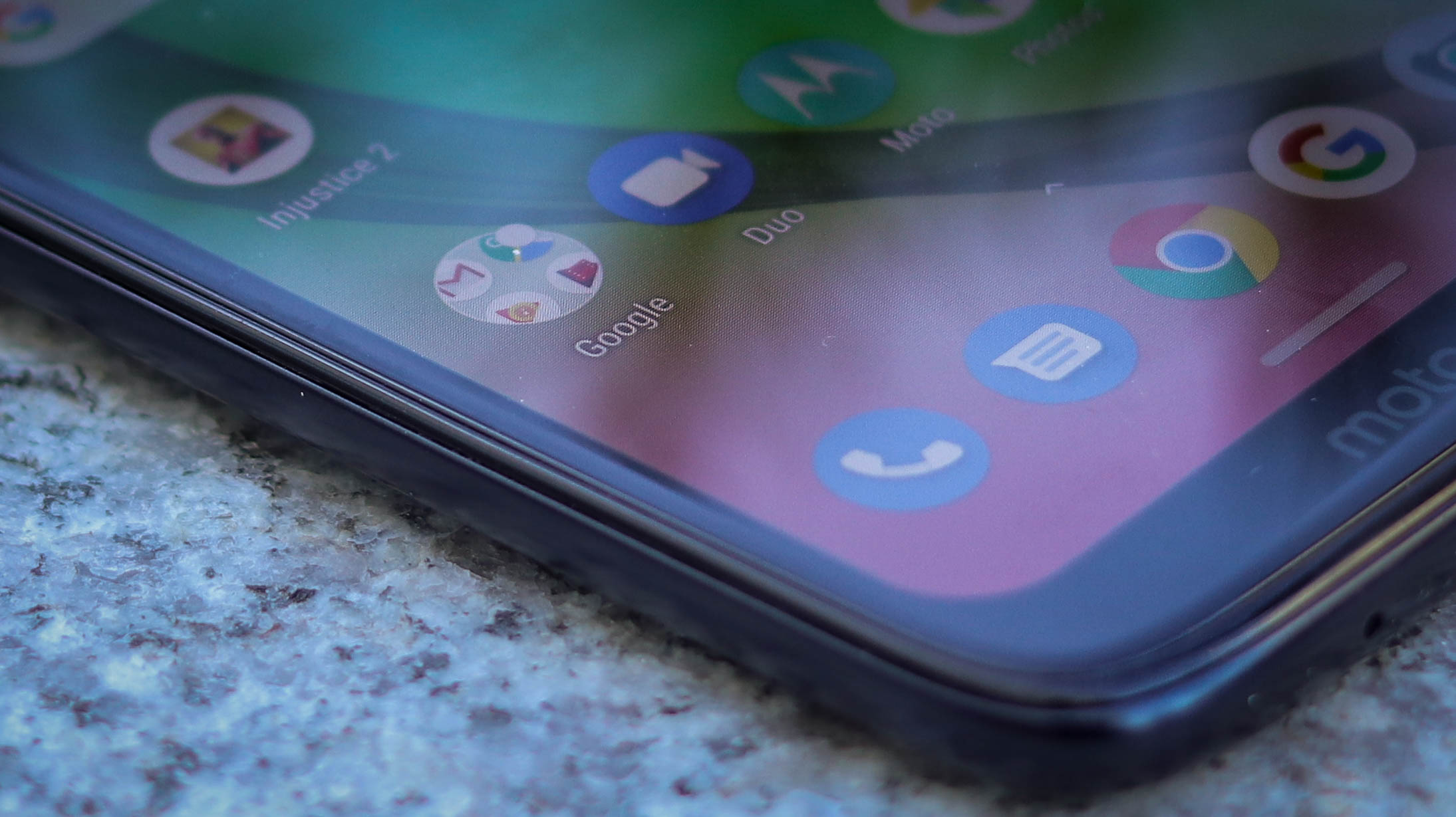

The phone’s screen is bright for a budget phone too, off-angle viewing is good, and it’s easy to see the screen in all but the sunniest conditions.
Onto the notch, and, well, we don’t really get it. That isn’t to say we don’t get notches in general - but we specifically don’t get this one.
It’s super-wide, likely because it houses a flash, front-speaker and camera, so either side, there’s only room for a couple of bits of information. As you can see from the image below - any notifications other than Gmail alerts appear as an all encompassing dot.
There’s a fix - jump into the settings, activate Developer Mode, then select ‘Hide’ from the sub menu titled ‘Cutout’. This completely hides the notch and creates an artificial border, but is a total hack. Part of us wishes Moto just went G6 Play and Pixel 3 style and kept the Play notch free.
Get past the that though, and it’s all good for the price. The LCD tech reproduces colors nicely, there are a bunch of calibration settings so you can change saturation levels and color profiles, and you can activate a blue light filter to keep your sleep patterns protected from all that screen staring.
Basil Kronfli is the Head of content at Make Honey and freelance technology journalist. He is an experienced writer and producer and is skilled in video production, and runs the technology YouTube channel TechEdit.
