Why you can trust TechRadar
Moto G7 Play user interface
- Latest version of Android
- Stock UI with Moto Actions
- Stable and clean
The fact that the Moto G7 Play runs Android 9 is a very good thing. It’s the latest version of Google's smartphone OS, so brings with it the benefits of a customized ‘digital wellbeing’ center, a greyscale UI at the tap of a button, as well as battery, and app-management tools and the latest security updates from Google.
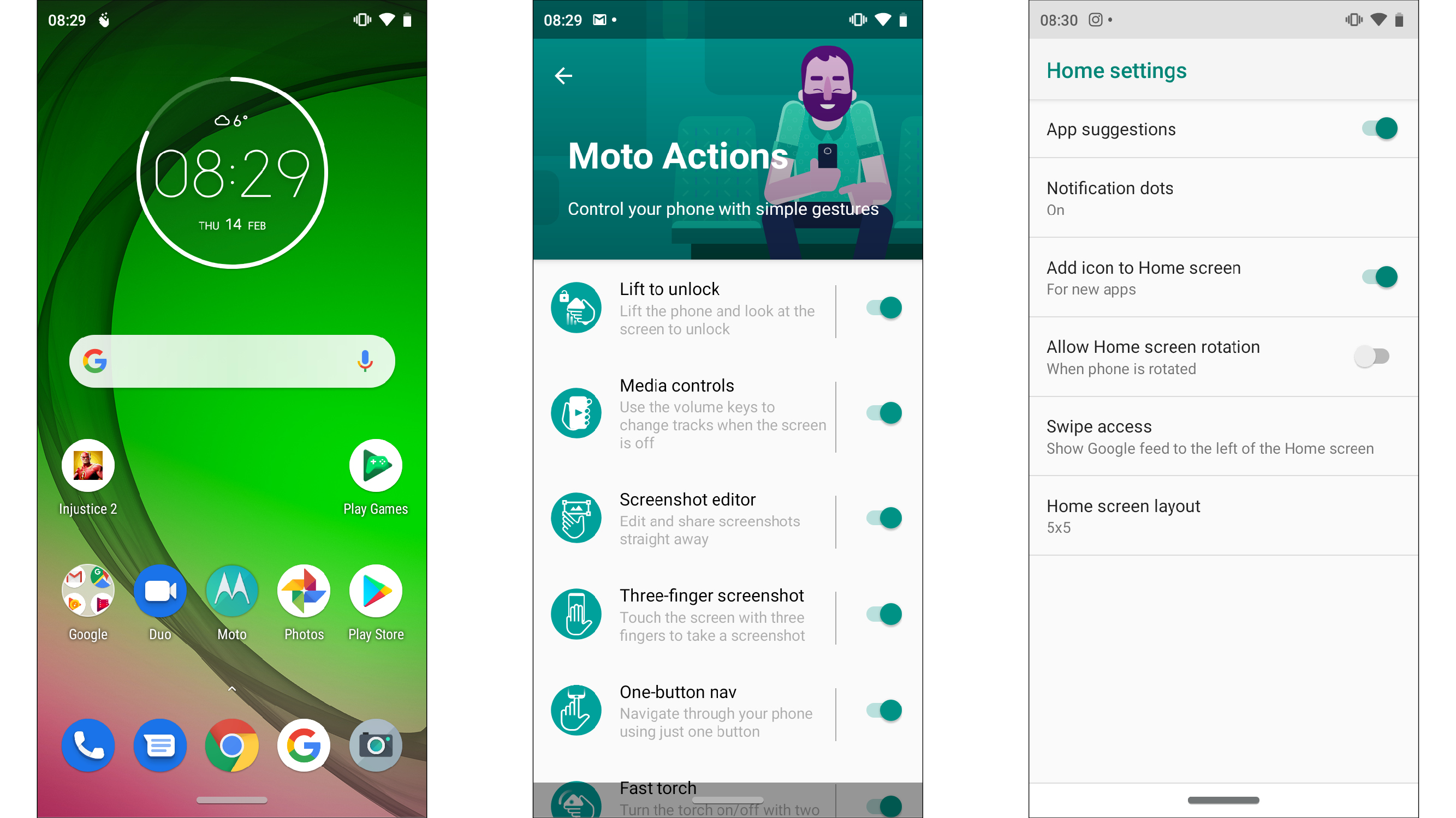
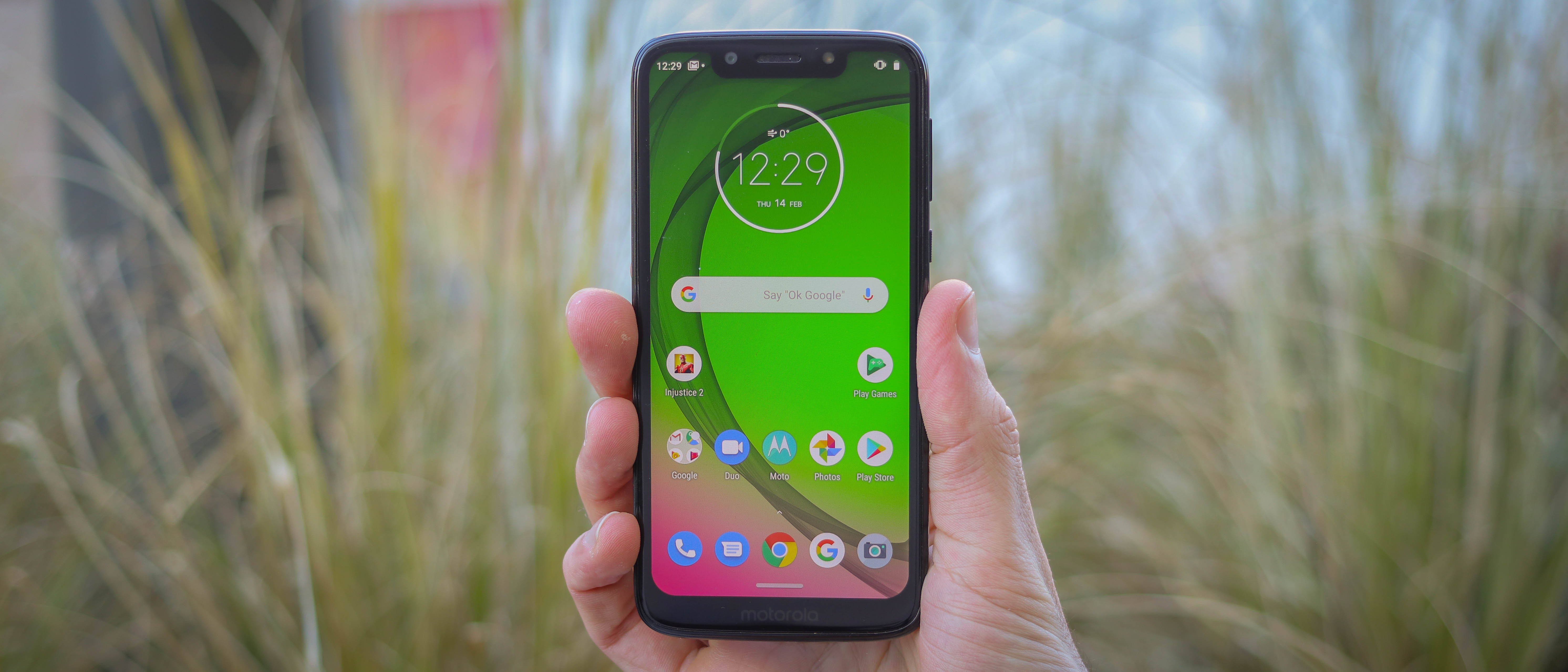
Motorola leaves the bulk of the UI alone, delivering a beautifully stock experience. With home screens and a pull-down notification bar, key elements will be familiar to Android and iOS users alike.
At the heart of the UI are home screens that can be populated by app shortcuts and widgets. To the left of the main home screen is your personalised Google feed, and if you pull down from the top of the screen, in addition to your notifications, you also get access to quick toggles - the equivalent of pulling up from the bottom of an iPhone's screen.

Android 9 introduced a ‘pill’ - a small horizontal bar at the bottom of the screen that enables gestures to access the recent apps menu and applications tray. By default, Motorola has shunned this navigation method - and with good reason in our opinion, as it’s a little confusing to the uninitiated. Instead, a traditional back, home and recent apps button are at the bottom of the screen by default.
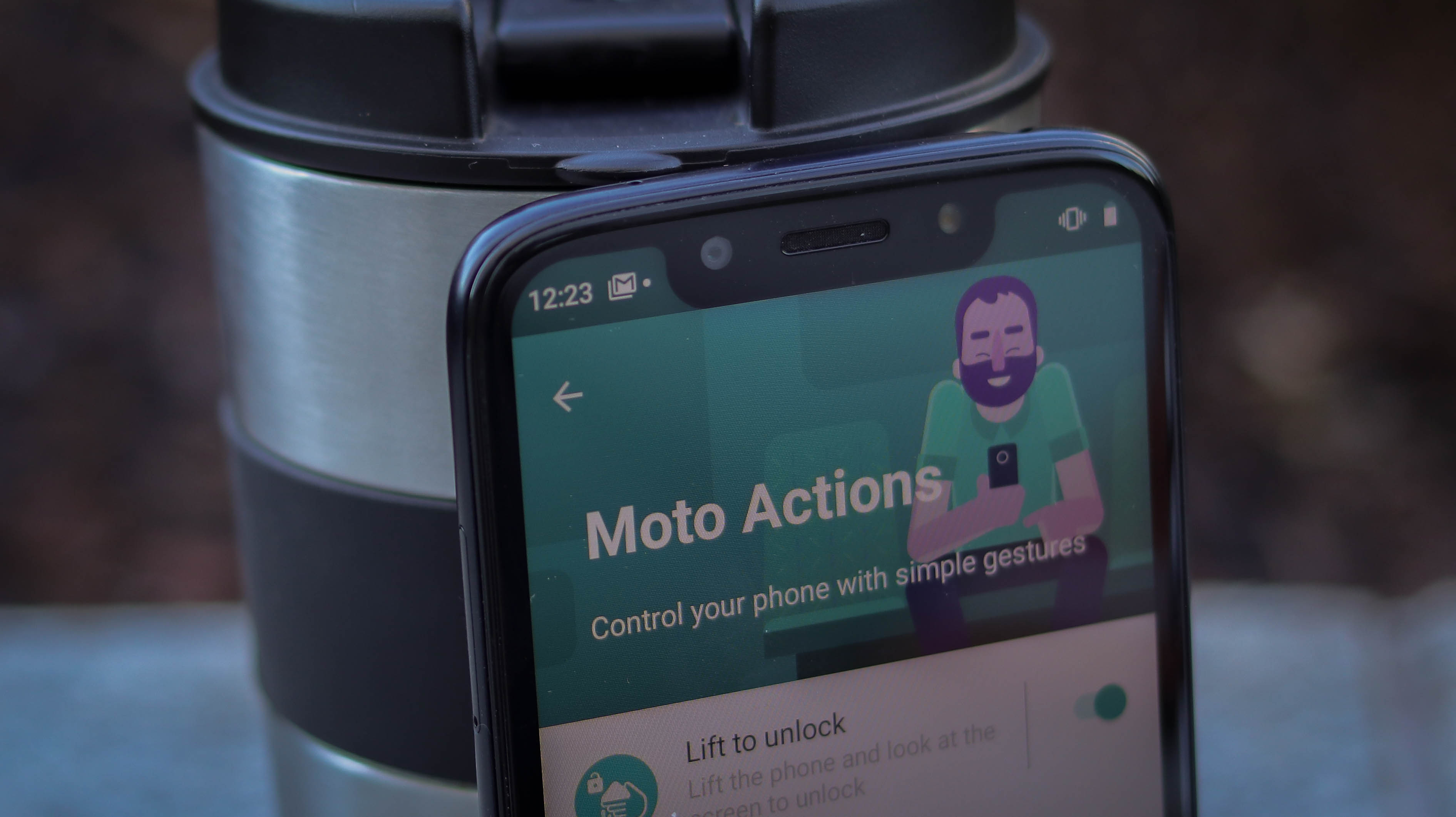
Jump into the Moto app though, giving you control over your Moto Actions and you can shake things up.

For starters, you can swap to the ‘pill’ navigation method we spoke about earlier, dropping the buttons and freeing up some screen realestate. This is also where you can access ‘lift to unlock’, ‘three-finger screenshot’, ‘fast torch’, ‘quick capture’ and more.
These optional extras are fun, add a point of differentiation and some - like ‘fast torch’, which activates the torch with a firm karate chop while holding the phone - are downright useful.
What makes the experience even better is the fact that despite the G7 Play’s humble 2GB RAM, stability across apps and the UI was consistently good in our experience with it.
Performance, storage and connections
- Snapdragon 632 processor
- 2GB RAM
- 32GB storage plus SD card support
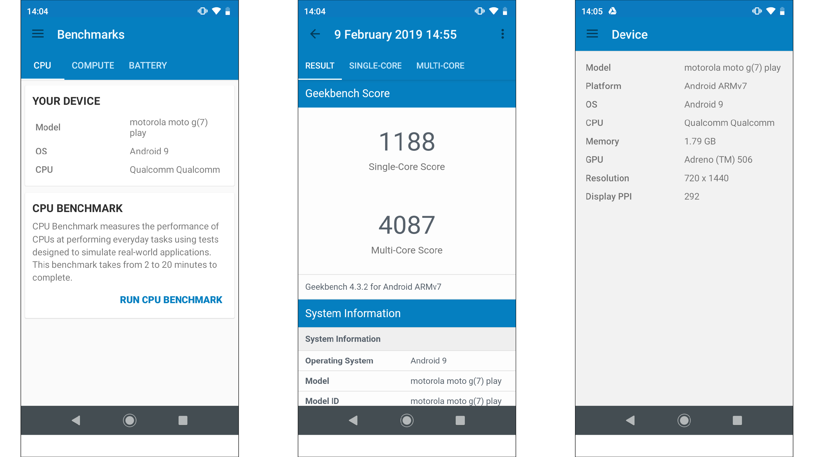
The Moto G7 Play uses the Qualcomm Snapdragon 632 chipset, combined with 2GB of RAM and 32GB storage - a respectable mix of specs given how much it costs.
The phone performs well when powering through daily tasks, and we only occasionally noticed a slowdown when we jumped between power-hungry apps and games.
Basic games are handled without any issues. Even large 2D titles like Valkyrie Profile Lenneth for example don’t drop many frames.
When you start loading up intensive 3D games, it all comes down to optimization - Injustice 2 and PUBG were totally playable, but at low graphical settings which were automatically applied. Meanwhile, other games like Fortnite just won’t run.

As for storage, 32GB coupled with microSD card support of up to 512GB is excellent for a phone of the Moto G7 Play’s price. Provided you don’t have a 13GB+ WhatsApp backup like us, there should be enough room for your apps.
Meanwhile, photos and videos can be offloaded onto a relatively inexpensive microSD card you can buy should things space get a bit cramped.
Connectivity is good, not great on the G7 Play, with 4G, WiFi and Bluetooth 4.2 all on board, though the lack of NFC means there’s no mobile payment or one touch pairing support. On the plus, the inclusion of a USB-C port by comparison to a micro USB port, as found on many pricier phones, is a bonus.
Current page: Interface and performance
Prev Page Key features, design and screen Next Page Battery and cameraBasil Kronfli is the Head of content at Make Honey and freelance technology journalist. He is an experienced writer and producer and is skilled in video production, and runs the technology YouTube channel TechEdit.

