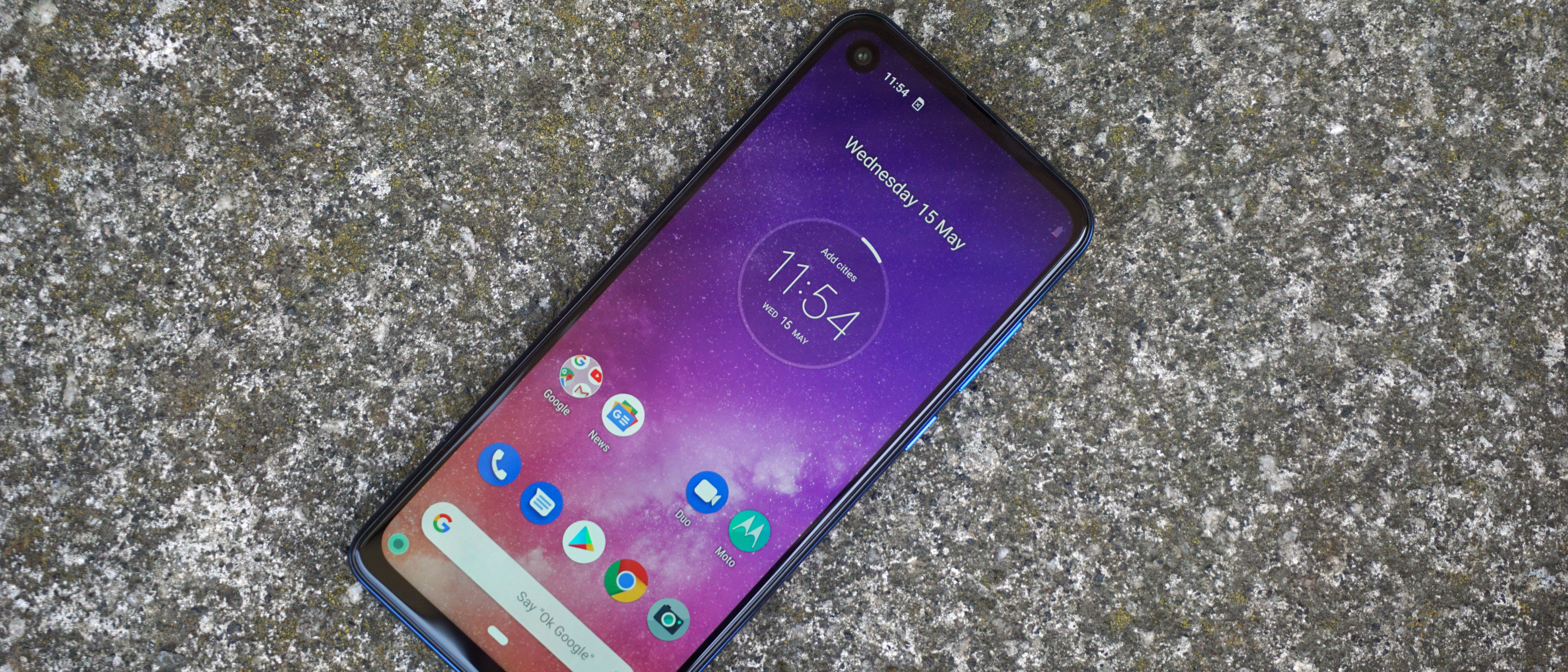
TechRadar Verdict
Motorola redoubled its efforts after the disappointing Motorola One, and came up with the much improved - if quirky - Motorola One Vision. It’s an improvement in virtually every department, and a worthy budget phone contender with a beautifully pure OS.
Pros
- +
Attractive design
- +
Clean Android One OS
- +
Decent performance
Cons
- -
21:9 aspect ratio is troublesome
- -
Camera doesn’t live up to its specs
- -
Plastic build
Why you can trust TechRadar
With a price that pitches the phone directly against its Moto G7 stablemates, you might well wonder what exactly the Motorola One Vision is for. Beyond implanting a Queen song in your head, that is.
Those who recall 2018’s Motorola One will have an inkling of what’s going on here. Like its predecessor, the Motorola One Vision takes an alternative route to the top end of the budget market, with a more adventurous design and an even purer strain of the latest Android OS.
But it also addresses some of the misgivings we had about the Motorola One, while adding some notable features - and one or two fresh quirks - of its own.
Motorola One Vision release date and price
- Out in the UK in May
- Costs £269 (around $350/AU$500)
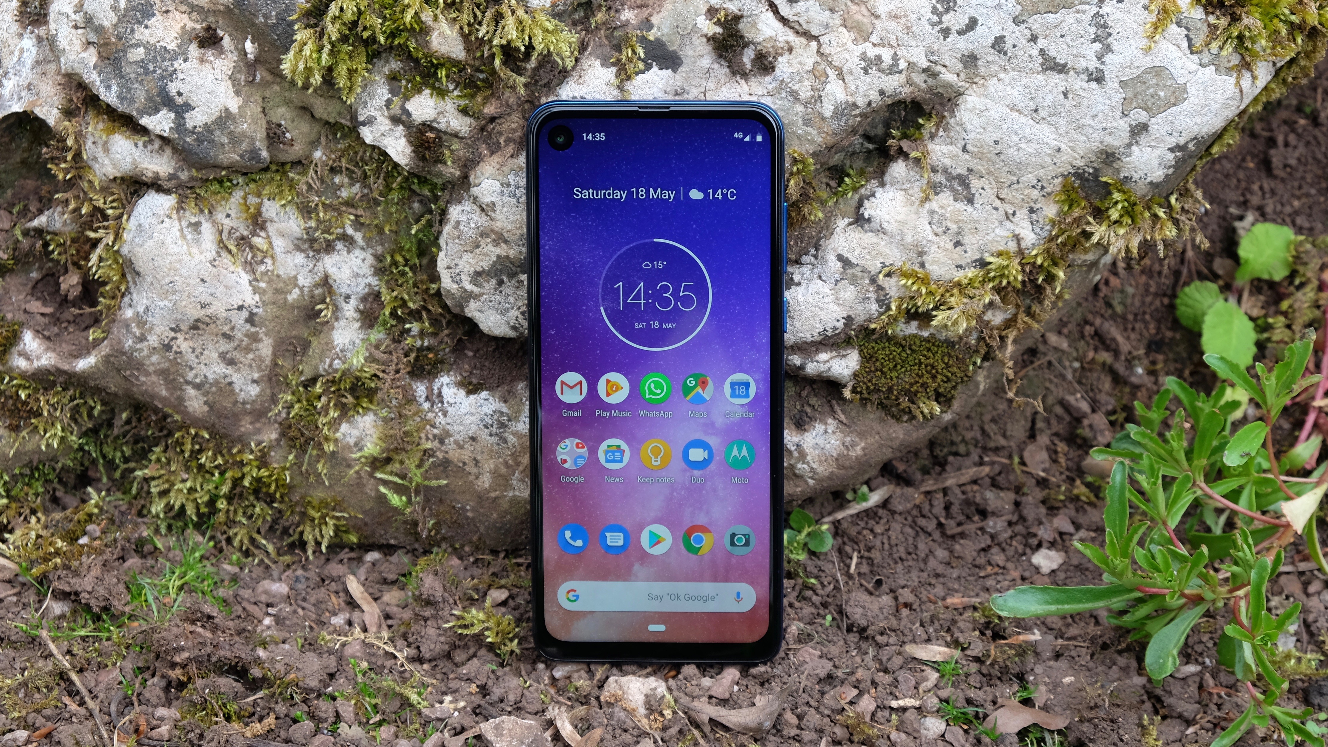
The Motorola One Vision ships in the UK and Europe on May 30 at a price of £269 (about $350 / AU$500). That’s exactly the same figure that the Moto G7 Plus goes for, and is in the same ballpark as the Honor 20 Lite and the Sony Xperia 10.
There are no plans for Motorola to bring the One Vision to the US, but Motorola says it will be hitting Australia over the coming months.
One goal, one mission
- Runs a pure version of Android
- Has a tall 21:9 screen
- Claims to offer big camera improvements
Unlike the Motorola One, there’s much more to talk about with the Motorola One Vision than just its use of Google’s Android One OS. But this is still a major component of the phone, as evidenced by its name.
In a market where the vast majority of smartphone manufacturers think they know best, it remains startlingly refreshing to use a phone that runs on pure, unadulterated Android. Or at least, one particular strand of it.
Android One isn’t identical to the experience you’ll get on the Google Pixel 3a, but it does share a clean, crisp approach to Android 9 Pie and a merciful lack of bloatware. It benefits hugely from a cohesive visual language, where virtually all of the fonts and icons and menu layouts sing from the same design hymn sheet.
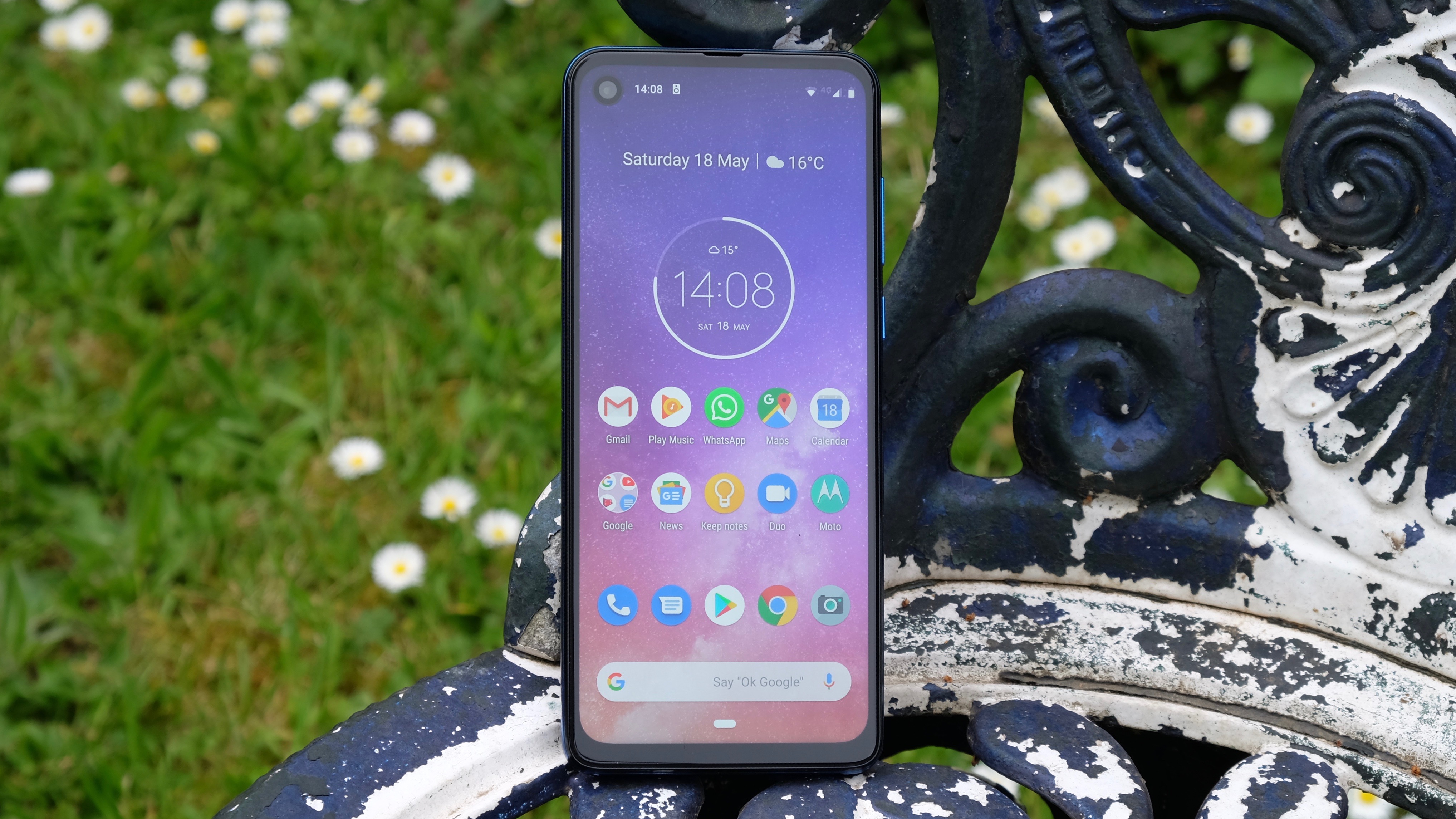
This might not be something that’s massively apparent to you straight away. Functionally, the Motorola One Vision’s software is more or less the same as the Honor 20 Lite’s, for example. But the lack of friction and clutter across a thousand tiny areas of the UI, when experienced over dozens of hours, really stack up. Or rather, they don’t.
The result is that at the end of our week with the phone, we weren’t particularly itching to get back to our flagship daily driver, as we often are with budget phones that use custom UIs.
The other part of the Motorola One Vision’s name relates to the inclusion of the company’s “most advanced camera system ever”. Motorola has packed in Quad Pixel technology and AI assistance for sharper and better lit results.
We’ll dive into the specifics a little more in the relevant section, but after 2018’s lacklustre effort, it’s a welcome shuffle forward.
More immediately noticeable than the One Vision’s Android One OS or its improved camera is its extra-tall screen.
At 21:9, the display’s aspect ratio is far longer than even the stretched-out 18:9 to 19:9 standards that have become the norm of late. Only outliers like the Sony Xperia 10 have gone with these more cinematic proportions.
We’d argue that this approach has more negatives than positives at this point, due to content compatibility issues and general usability issues. We’ll discuss these further in the following section.
Design and display
- 6.3-inch IPS LCD is bright and balanced
- 21:9 aspect ratio makes one-handed use awkward
Motorola has evidently lost its iPhone X fixation for the One Vision, following the distinctly familiar-looking Motorola One.
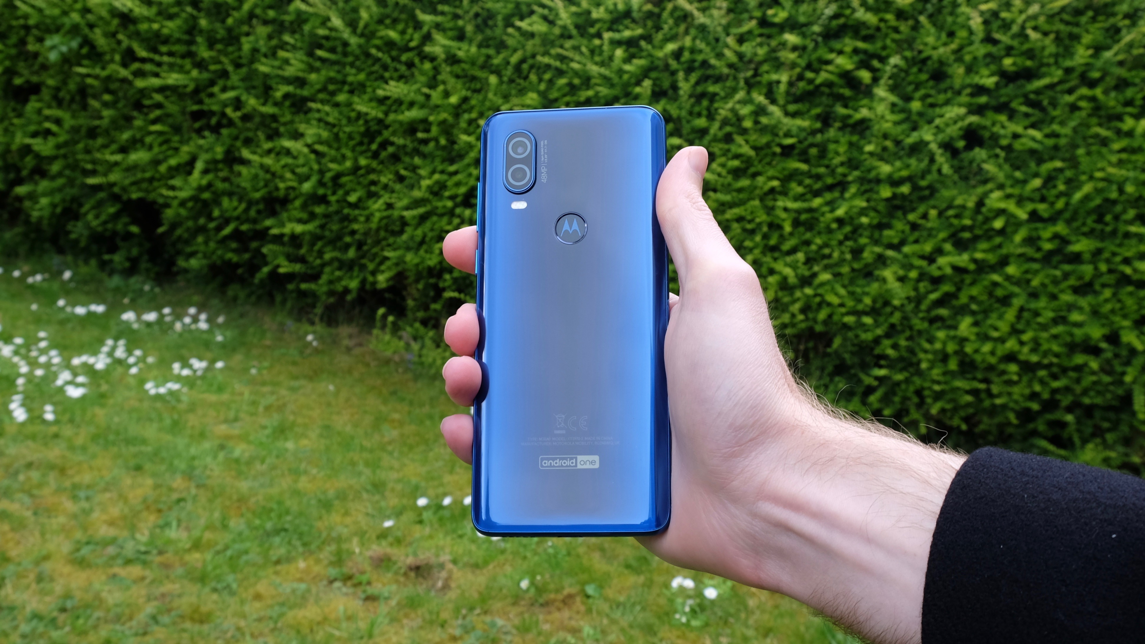
Just about the only shared element with Apple’s design blueprint is the Motorola One Vision’s lozenge-shaped camera module. Otherwise, the back of the phone is the kind of curved shiny plastic surface that befits its budget Android status, complete with a well-placed and sufficiently speedy fingerprint sensor.
That’s not a derogatory statement - the One Vision is easy on the eye and even easier to hold, with a far grippier finish than most glass-backed phones. The rim of the phone is its own distinct form of shiny plastic.
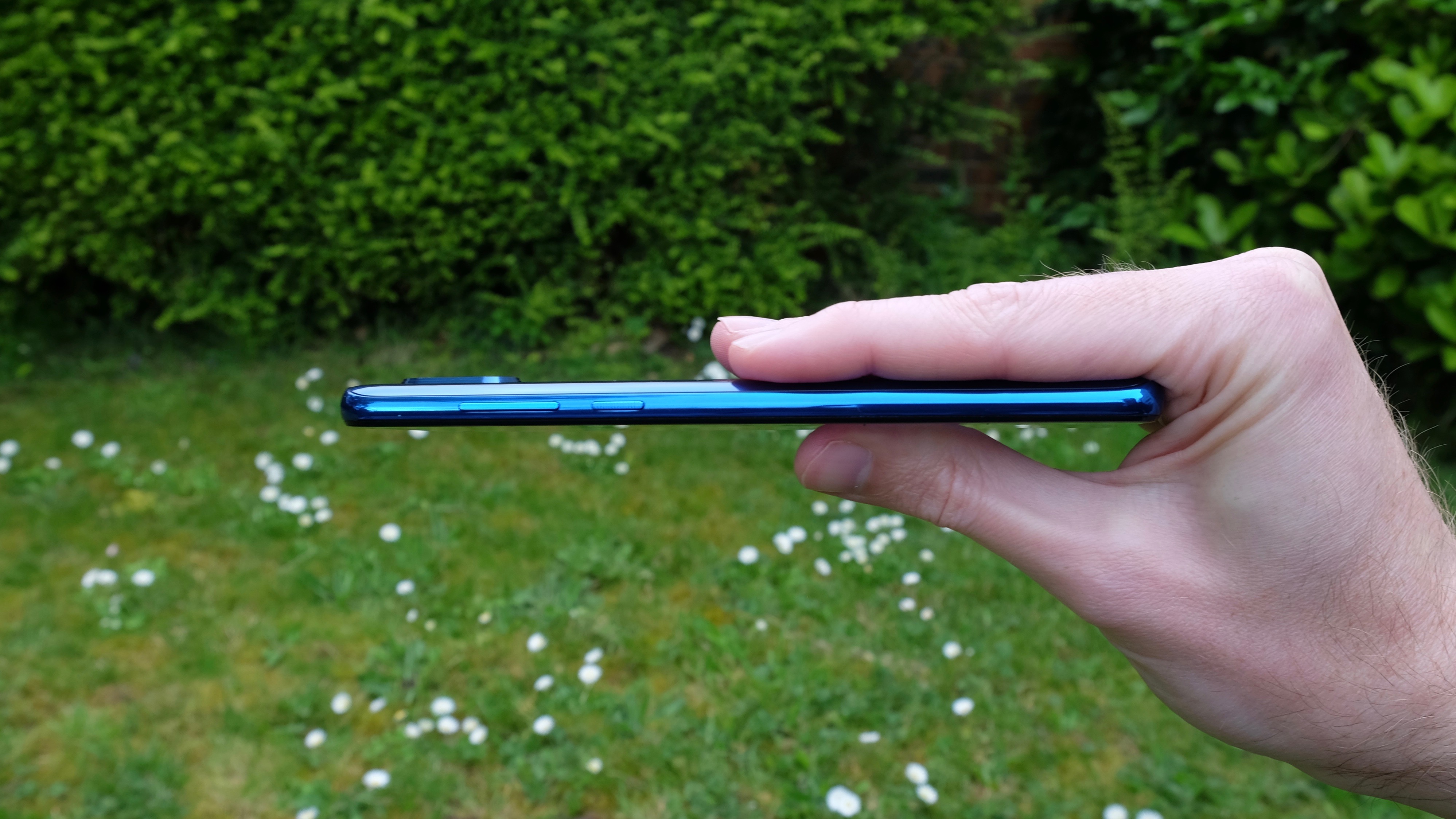
No, it doesn’t feel as premium as a metal equivalent, but at this price point that’s really not a major issue. The fact that this rim contains both a USB-C port and a 3.5mm headphone jack further sweetens the deal.
It’s the front of the phone that brings the biggest changes, though. Motorola has ditched the iPhone X’s fat notch in favor of a Galaxy S10-like hole-punch design. This places the selfie cam in a little round island positioned just off the top left corner of the display.
This is certainly a more modern approach to attaining a near-bezel-less display, and it’s also quite aesthetically pleasing. There are some repercussions when it comes to media playback and the UI, which we’ll come to, but in general we rather like it.
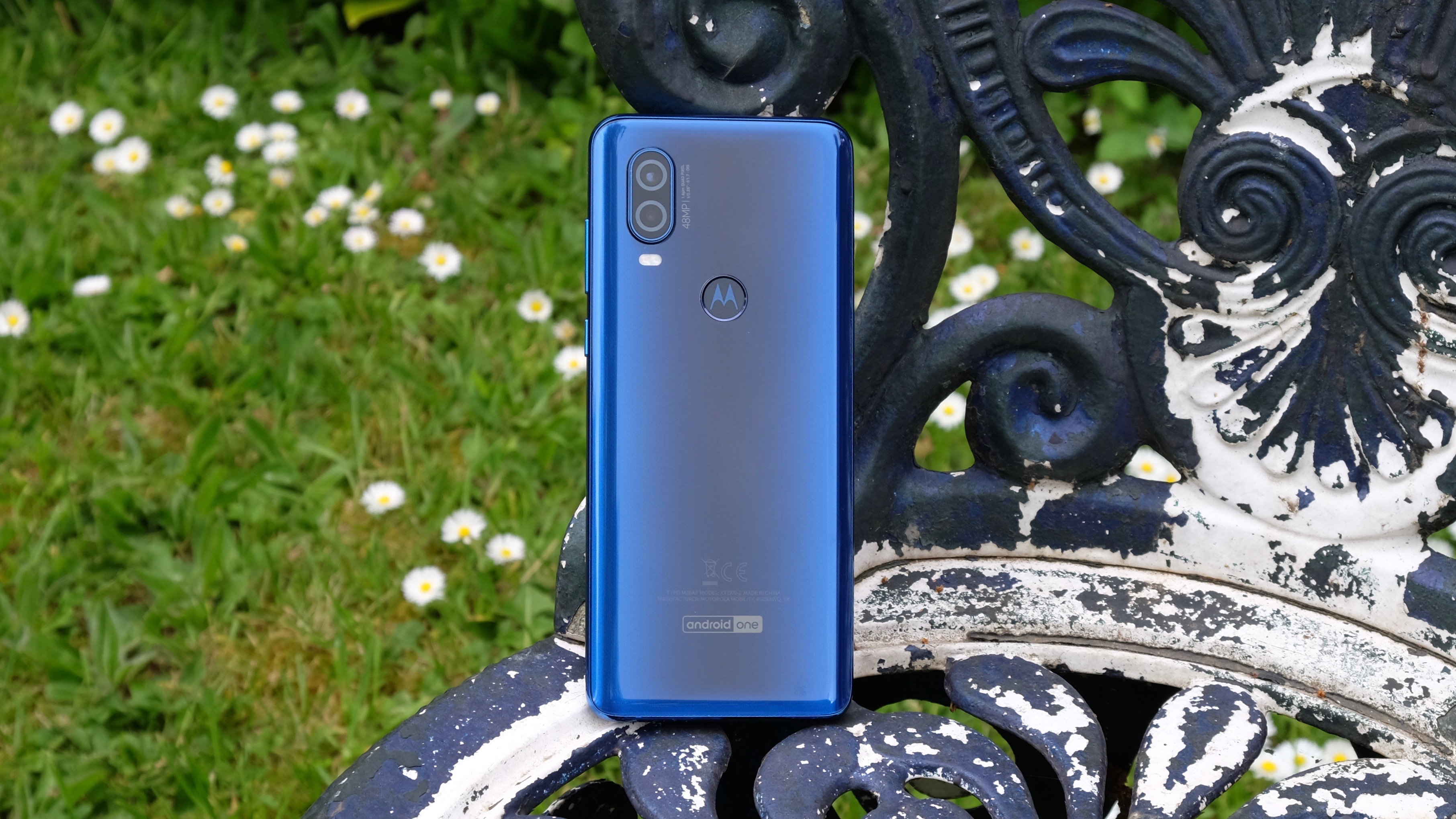
Just as with Samsung’s ‘Infinity-O’ display, it’s a lot less intrusive than a notch, and there’s still plenty of space for notification icons. Indeed, there’s rather a lot of space here from a vertical perspective. The Motorola One Vision display’s 21:9 aspect ratio makes the phone unusually tall.
It’s not quite as gawky-looking as the Sony Xperia 10 and its 21:9 brothers, but it still looks just a little off in our approximation.
This also makes the Motorola One Vision a little tricky to wield one-handed. Held in our natural position, with the bottom of the device resting on our little finger, there was a good third of the screen that we couldn’t reach with our thumb. We also had to shuffle the phone up in our hand to access the volume button, which is far from ideal.
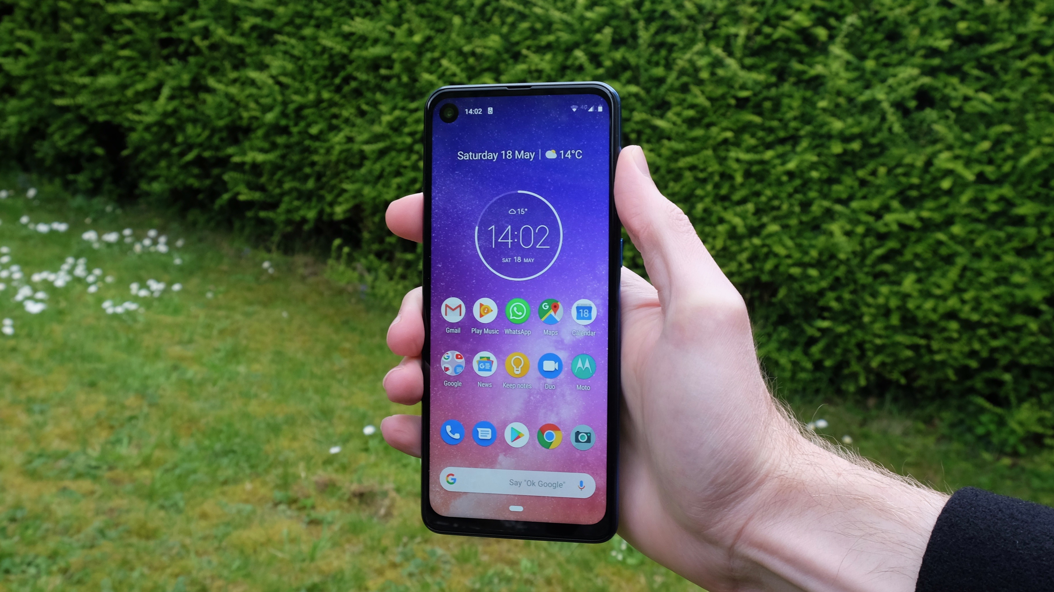
The screen itself is a sharp 6.3-inch IPS LCD with a Full HD+ 1080 x 2520 resolution. This rectifies one of our biggest criticisms of the Motorola One, which shipped with a scarcely forgivable 720p resolution display.
We have absolutely no issue when it comes to the sharpness, brightness or color balance of the Motorola One Vision's screen. Everything looks nice and crisp, though that’s hardly a stand-out feature in a phone of this price any more. The Honor 20 Lite's display, for example, is also very decent.
