TechRadar Verdict
A premium-looking smartwatch that lasts an age - but you’ll find yourself not doing that much with it. It’s well made and looks great on the wrist and having actual hands on the face is inspired rather than a gimmick. But it’s lacking a little too much in the OS, which is a pared down version of what Google offers.
Pros
- +
Smart looks
- +
Analog hands a great USP
- +
Fantastic battery
Cons
- -
The operating system needs work
- -
Screen a tad too laggy
- -
Tracking could be better
Why you can trust TechRadar
With $6 million raised and some 30,000 backers, the MyKronoz ZeTime was undoubtedly the darling of the crowd-funding circuit back in 2017. And for good reason: the smartwatch promised the perfect marriage between Swiss-made traditional watch design and digital smarts.
To boil this down to its simplest form, the ZeTime was pitched as the first smartwatch ever that had traditional hands. It’s a USP that got it noticed and one that highlights the biggest issue with the smartwatch world - not everyone is ready to ditch their analog timepieces for something you have to charge on your nightstand every night.
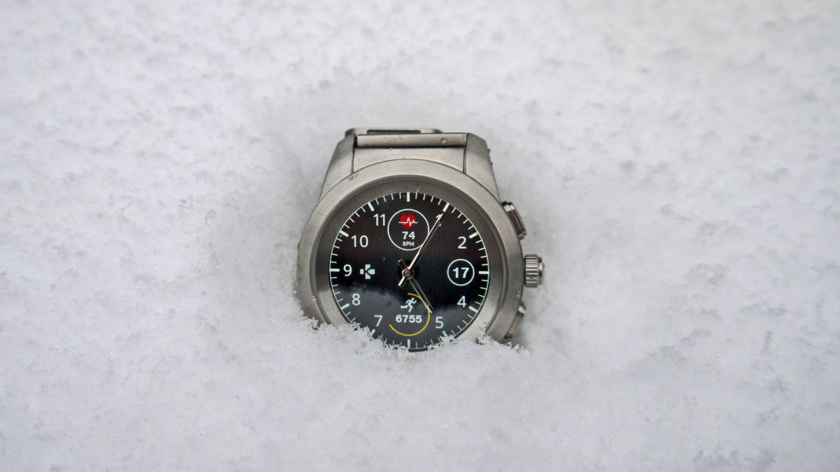
On the surface, this analog-digital dalliance is a decent fit. The watch is well made, complete with rotating crown, and is traditional looking if a little chunky. The real hands really do add to the appeal of the thing and you are only a button press - or a crown rotation - away from your emails, step counting and the like.
Dig a little deeper, though, and some cracks do start to appear.
MyKronoz ZeTime price and availability
Since its Kickstarter success, the MyKronoz ZeTime has been available from the MyKronoz store for £179.99 / $199.99 (about AU$260)
There are two versions to choose from: the one we've reviewed here which is the MyKronoz ZeTime Regular, which consists of a 44mm bezel and 22mm watch band. Then there's the MyKronoz ZeTime Petite which is smaller with a 39mm bezel and 18m watch band.
It is currently available in the UK, US and Europe and Japan. Naturally, it is also available in the place it was developed, Switzerland.
Design and display
- Attractive, no-nonsense design
- Nice use of a smart crown
- Low-res display compared to rivals
Spot the MyKronoz ZeTime from a distance and you would be forgiven in thinking that it’s a traditional watch. It’s the look MyKronoz was going for when it first released the device to the crowd-funded public, opting for a stainless steel case - the one we're reviewing here is the brushed metal variant - and an array of straps.
We tried both the leather band, which felt a little cheap for our liking, and the metal mesh loop, which fared a lot better in our test and became the default strap for us.
If you like to change your straps as often a you change your socks, then the quick-release system will be welcomed. Watch straps are fiddly but MyKronoz has made sure that you can get these ones on and off, without fear of losing a nail in the process.
Back to the bezel: it’s bulky but not embarrassingly so. It’s also full of chiselled corners and smoothed edges that give it a nice, if rather understated, look.

We didn’t find it that heavy, either. It is 90g - the heaviest Apple Watch and strap tips the scales at around 120g - so you definitely feel it on your wrists but we didn’t witness any arm ache or discomfort wearing the thing.
On the right side of the MyKronoz ZeTime are three buttons. Two lozenge-like buttons flank a pressable and rotatable crown.
On the tip of the crown is the MyKronoz logo. The logo design is either clever or worryingly prophetic. It’s a fractured version of the Swiss flag - which means MyKronoz is either breaking the Swiss watchmaking norm, or breaking Swiss watchmaking.
Flip the watch over and you’ll find the charging area and an optical sensor for heartbeat checking.
The display is… okay. It’s made of a nice slab of Sapphire glass so will take a few knocks. This shields a TFT Color touchscreen with 240 x 240px count. It’s certainly not the richest display you will find on a smartwatch. Even something a bit older like the Samsung Gear S3 has a 360 x 360 Super AMOLED screen.
MyKronoz has to also compete with the 400 x 400 OLED screen of the Huawei Watch - both of which show the ZeTime very much lacking.
- 1
- 2
Current page: Introduction, price, design and display
Next Page Features, performance and verdictMarc Chacksfield is the Editor In Chief, Shortlist.com at DC Thomson. He started out life as a movie writer for numerous (now defunct) magazines and soon found himself online - editing a gaggle of gadget sites, including TechRadar, Digital Camera World and Tom's Guide UK. At Shortlist you'll find him mostly writing about movies and tech, so no change there then.
The 'Switch 2 doesn't contain any Switch hardware,' Nintendo explains its new platform and what games will be compatible
The phone-sized Onyx Boox Palma 2 is the compact ereader I can't put down, even if it's not the upgrade I was hoping for

438 crypto masterminds are responsible for the majority of pump-and-dump crypto coin schemes globally, researchers find
