TechRadar Verdict
Google Sites lets you create simple websites quickly and collaboratively within Google's ecosystem, making it ideal for internal company pages, portfolios, and basic informational sites.
Pros
- +
Completely free with unlimited sites
- +
Easy drag-and-drop UI
- +
Google Workspace integration
Cons
- -
Limited customization choices
- -
Very limited SEO capabilities
- -
No ecommerce or blogging features
Why you can trust TechRadar
Google Sites is a simple website builder that stands out, mostly, for its complete lack of cost and complexity. While it may not offer the sophisticated features of premium builders like Wix or Squarespace, it still offers some limited utility through its integration with Google Workspace.
While it's hard to recommend Google Sites among the best website builder platforms, it still presents a viable entry point for first-timers, hobbyists, or students looking for one of the best free website builders to get online without cost. It serves mainly to keep users within Google's product ecosystem, offering unlimited websites, storage, and bandwidth at zero cost.
However, most businesses serious about their online presence quickly encounter its limitations. With no ecommerce or blogging features and very limited room to grow, Google Sites is merely a gateway and not a replacement for serious website building solutions like Wix.
Google Sites: 2-minute review
Google Sites is a relic of Google's early attempts to democratize web development by removing traditional barriers like cost, complexity, and technical knowledge requirements. As part of Google's free suite of productivity tools, it integrates seamlessly with Gmail, Google Drive, and Google Workspace, allowing users to create collaborative websites as easily as sharing a Google Doc.
However, Google Sites occupies a unique position in the website builder market by deliberately limiting features rather than expanding them. While competitors like Wix and Squarespace compete on advanced functionality and design sophistication, Google Sites focuses exclusively on simplicity and collaboration.
This makes it excellent for internal company sites, educational projects, and basic portfolios, but inadequate for ecommerce, professional marketing sites, or any project requiring custom code or advanced SEO optimization. Sites can serve as an entry point but not as a comprehensive solution, with most users eventually migrating to more feature-rich platforms as their needs grow.
What is Google Sites?
Google Sites is a free web-based website builder that allows anyone with a Google account to create simple websites without any coding knowledge or technical expertise. Think of it as the website equivalent of Google Docs, it uses the same drag-and-drop approach but for building web pages instead of documents.
Sign up to the TechRadar Pro newsletter to get all the top news, opinion, features and guidance your business needs to succeed!
You can create unlimited websites, add text and images, embed content from other Google services like Drive and Forms, and share your site with others for collaborative editing — all through a simple browser interface.
Google automatically handles all the technical aspects of web hosting, security, and mobile optimization, so you don't need to worry about servers, databases, or responsive design. Your finished website gets stored in your Google Drive like any other file, and you can publish it instantly to a free Google subdomain (like yourname.sites.google.com) or connect a custom domain if you have a paid Google Workspace account.
Features
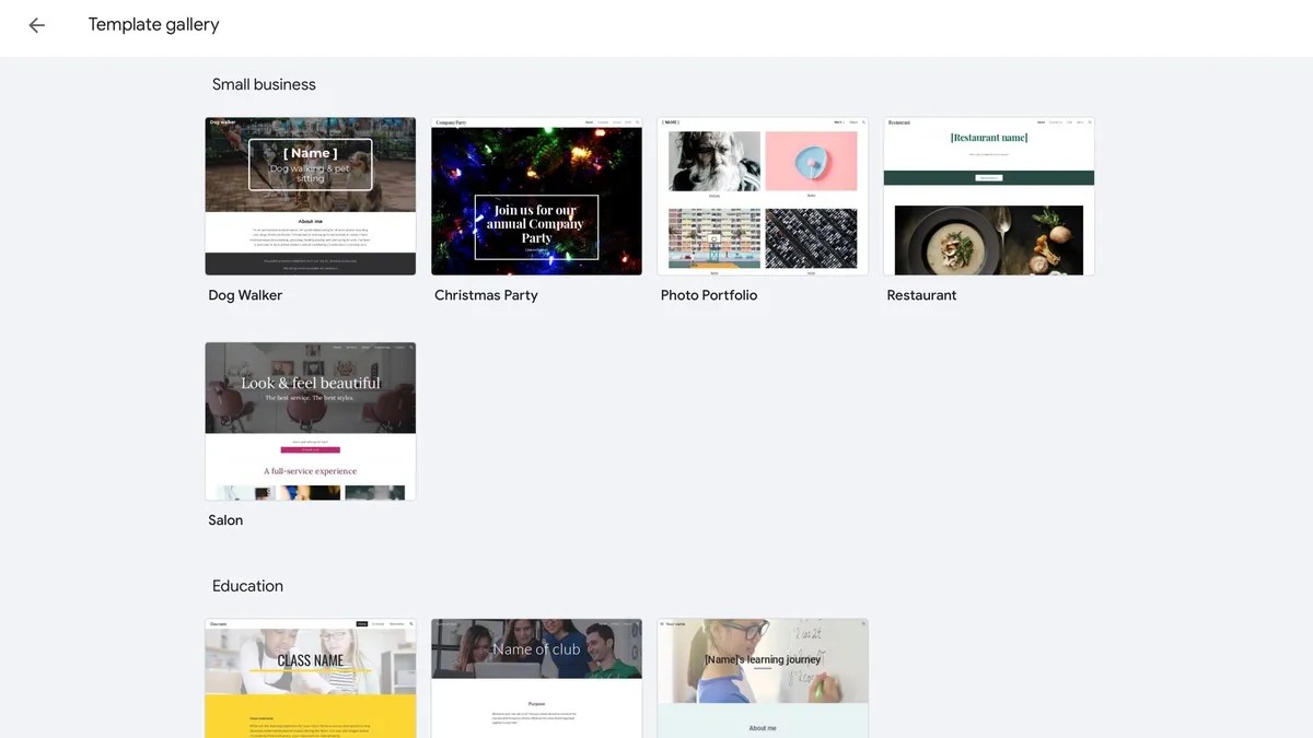
Google Sites deliberately prioritizes simplicity over feature richness, offering a streamlined set of tools designed for basic website creation rather than comprehensive web development. It includes 17 pre-designed templates, a drag-and-drop editor, basic text formatting options, image galleries, embedded content capabilities, and integration with Google Workspace.
These features are executed competently within their limited scope — the drag-and-drop interface is intuitive, templates are mobile-responsive, and Google service integration works seamlessly. But the feature set targets specific user groups like educators, small businesses, internal teams, and professionals looking to create extremely basic online experiences.
Google Sites is really good within collaborative scenarios where multiple users need to edit content simultaneously, using the same sharing and permissions system used across Google Workspace. However, the platform lacks essential features that competitors consider standard. There's no blog functionality, limited options for SEO, no ecommerce capabilities, minimal third-party integrations, and restricted customization options.
Compared to feature-rich alternatives like Wix (800+ templates) or Squarespace, Google Sites feels deliberately constrained. Advanced users will quickly encounter limitations in custom HTML, CSS modifications, advanced forms, marketing tools, and analytics integration beyond basic Google Analytics. The platform lacks password-protected pages, contact forms, and the ability to add custom code or scripts.
At zero cost, Google Sites offers exceptional value for its intended use cases, but the feature limitations mean most users outgrow the platform as their website needs evolve. The pricing model essentially trades advanced functionality for accessibility. Perfect for getting started, but inadequate for long-term professional web presence.
Tools
Google Sites has a focused selection of built-in tools designed for straightforward content creation and collaboration. It emphasizes integration with Google's ecosystem rather than offering extensive standalone features, making it ideal for users already invested in other products within Google Workspace.
Drag-and-drop editor
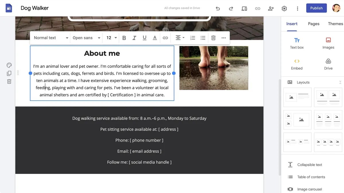
Sites' core website building tool uses a simple UI where users can add, move, and modify elements by simply dragging them into position. An editor includes basic content blocks for text, images, embedded content, and layout elements, with real-time preview capabilities that show exactly how the site will appear to visitors.
Google Workspace integration
Sites seamlessly embeds content from Google Docs, Sheets, Slides, Forms, Maps, and Calendar directly into web pages. This allows users to display live documents, spreadsheets, and presentations that automatically update when the source files change, making it easier for teams to share dynamic content.
Collaboration tools
Multiple users can simultaneously edit website drafts using the same sharing system as Google Docs, with commenting, suggestion, and version control capabilities. Site owners can control permissions for different collaborators and manage who can view the published website separately from editing access.
Template system
Google Sites offers 17 pre-designed and mobile-responsive templates covering basic website types like portfolios, project sites, and informational pages. While limited compared to competitors, these templates provide professional starting points that automatically adapt to different screen sizes.
Publishing and domain management
You can instantly publish sites to free Google subdomains or connect custom domains through Google Workspace. Sites' publishing system includes basic privacy controls, with the ability to make sites public, restricted to specific users, or accessible only to people with a link.
Ease of use
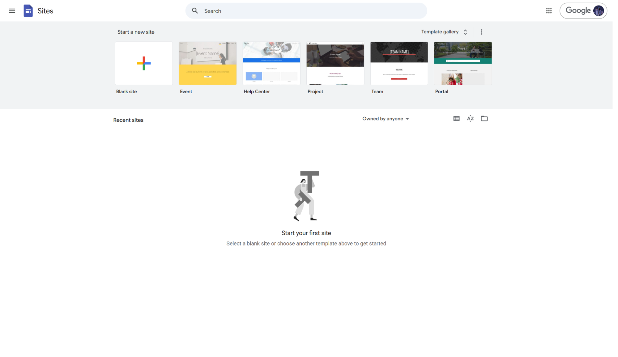
Logging in with your Google account at sites.google.com will take you to the Sites editor. Google Sites offers an extremely minimalist environment, where you can choose to start a site with a blank page or use one of the few available templates. Launching your first project opens a very sparse-looking and minimalist editor. If you choose a template, it will be loaded for you and ready to be customized.
The bulk of the window is taken up by a preview of the current page. A toolbar on the right displays a list of widgets. You have the ability to add text boxes, images, embed code, and connect to your Google Drive. You have a handful of layout options, as well as tools to create collapsible text, image carousels, and a table of content among others. Additional options let you connect to other Google services like YouTube, Calendar, Map, Docs, Slides, Sheets, Forms and Charts.
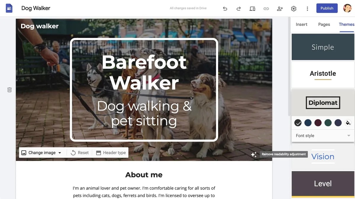
There’s also a Themes tab which gives you a choice of six header and site styles, along with simple tweaks to your colours and font. There’s a good amount of flexibility when adding text and images. And when you add an image to the header, it’s automatically ‘adjusted for readability’, which alters its settings. If you don’t like the result, you can always click on the button lower right of the image to revert it. There doesn’t seem to be a way to manually alter the photo.
While the editor always displays your site in Desktop mode, tapping the preview button enables viewing your site in desktop, tablet or mobile views. The editor isn't exactly powerful, but it's more capable than it initially seems. Sadly, Google has mostly stopped making updates to Sites, although there is a possibility for renewed interest in the platform thanks to the success of Google Gemini.
Pricing
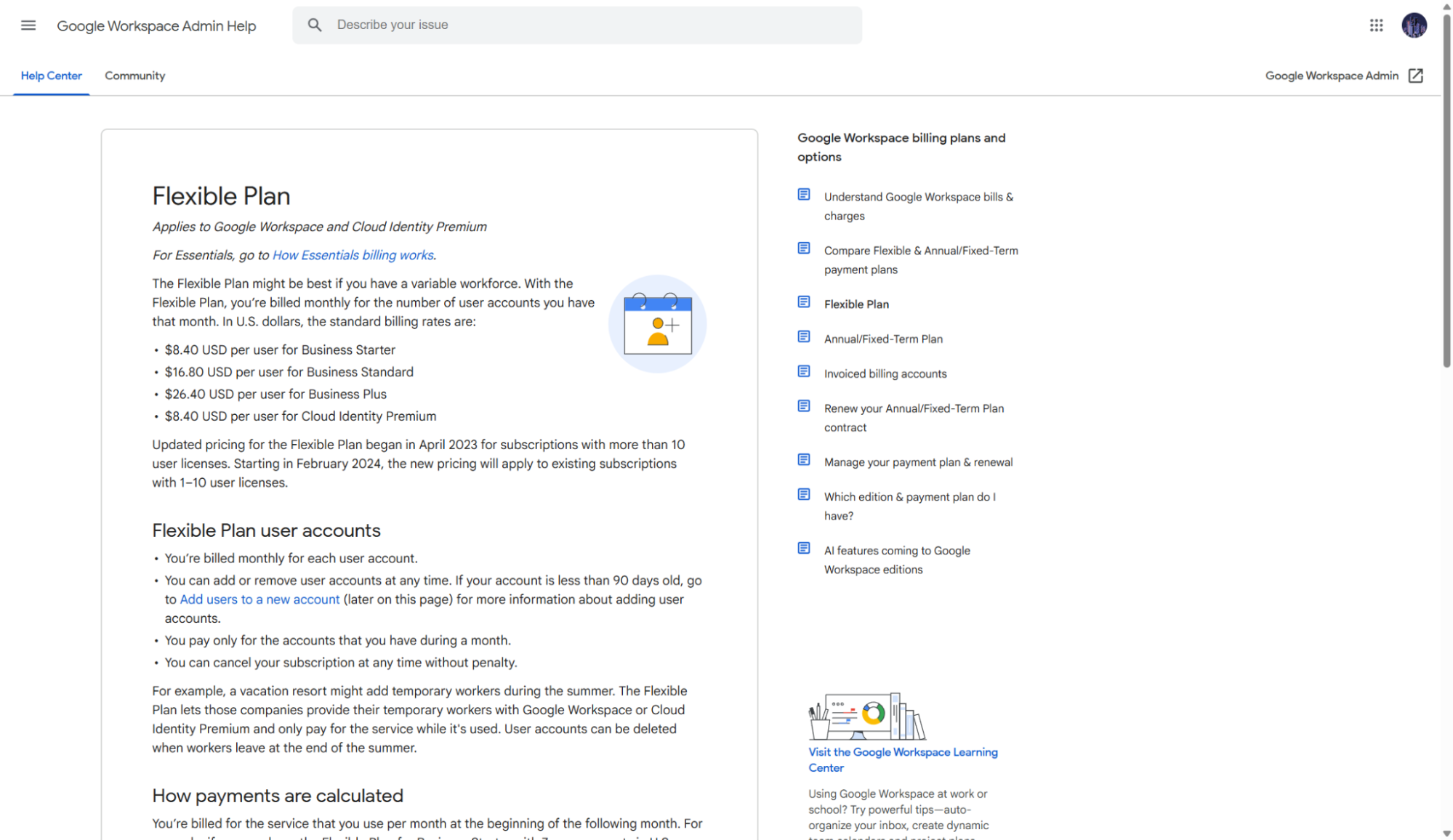
Google Sites operates on a completely free model for personal use, letting you create unlimited websites with no hosting fees. This makes it one of the most cost-effective website builders available, as users can build, host, and maintain their sites indefinitely without any subscription costs. The platform includes generous storage quotas and doesn't count embedded Google documents, calendars, or videos against storage limits.
For businesses requiring custom domains and advanced administrative features, Google Sites integrates with Google Workspace plans starting at $6 per user per month for Business Starter, $12 per user per month for Business Standard, and $18 per user per month for Business Plus. These paid plans unlock custom domain hosting, enhanced security features, and administrative controls, but the core website building functionality remains the same.
Security
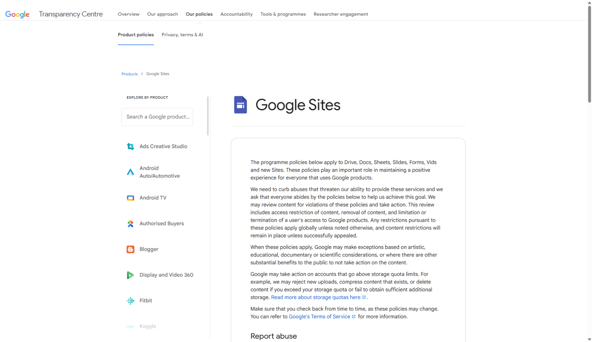
Google Sites benefits from Google's enterprise-grade security infrastructure, implementing multiple layers of protection for user data and websites. All data transmission uses HTTPS encryption with TLS 1.2 or higher and automatic SSL certificates ensure secure connections without user intervention. Sites also leverages Google Cloud Armor for DDoS protection, providing always-on monitoring and automatic attack mitigation to safeguard websites from volumetric network attacks.
Google Sites inherits the same security standards as other Google Drive files, with automatic backup and recovery options preventing data loss. But additional security features are available, like regular automatic security updates, fine-grained sharing controls, and integration with Google's Advanced Protection Program. You can also set precise permissions to control website access, ranging from public visibility to specific individuals or groups.
Support
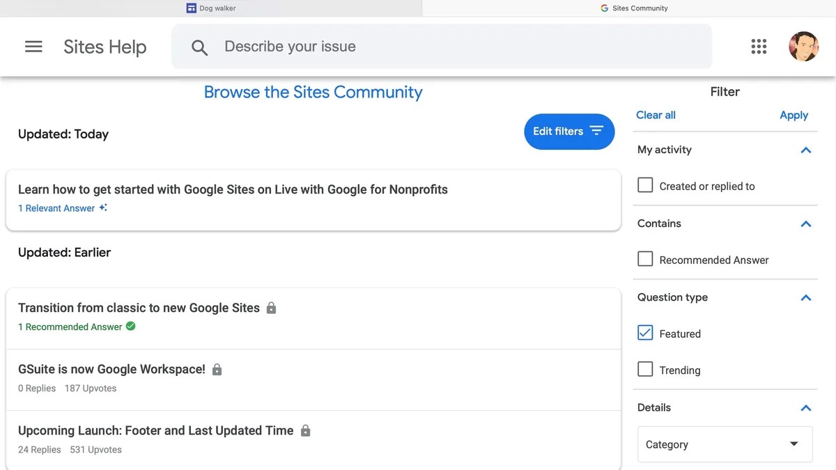
Google Sites support operates through Google's standard help system, primarily offering self-service resources through the Google Help Center. You can access documentation, tutorials, and community forums, but direct support options are limited for free account holders. The platform relies heavily on its intuitive design philosophy to minimize support needs, though this can leave users stranded when encountering complex issues.
Google Workspace subscribers receive enhanced support options, including phone and chat support depending on their plan tier. For example, Business Standard and Business Plus plans typically include faster response times and more comprehensive assistance. However, even paid support focuses primarily on account and billing issues rather than design guidance or website troubleshooting.
Google’s support ecosystem includes active community forums and third-party resources, but no dedicated website building support like with competitors like Wix or Squarespace. Users mostly rely on community-generated content and unofficial tutorials, which can be inconsistent in quality and currency.
Alternatives
Google Sites occupies a unique niche in the website builder market by prioritizing simplicity and cost-effectiveness to an uncanny degree. It’s an ideal entry point for users creating basic informational sites but lacks the advanced features required for professional marketing or e-commerce operations.
Primary competitors include Wix, WordPress.com, Squarespace, Weebly, and specialized platforms like Webflow. Wix offers superior design flexibility and hundreds of templates, while Squarespace provides professional aesthetics and better SEO tools. Meanwhile, WordPress.com delivers more robust content management capabilities. However, none of these alternatives offer zero cost websites, unlimited hosting, and free real-time collaboration.
Google Sites: Summary
Google Sites delivers exactly what it promises: a completely free, user-friendly website builder that removes traditional barriers to web publishing while integrating seamlessly with Google's productivity ecosystem.
Its strength lies in collaborative website creation for educational, internal, and basic informational purposes, offering unlimited sites and hosting at zero cost with enterprise-grade security.
However, the platform's deliberate simplicity becomes a significant limitation for users requiring advanced features like ecommerce, sophisticated SEO tools, or extensive design customization. While it’s just usable as an entry-level solution for budget-conscious users, most will eventually outgrow its capabilities and need to migrate to more feature-rich platforms.
Google Sites review: FAQs
Is Google Sites really free?
Yes, Google Sites is entirely free for personal use with a Google account. You can create unlimited websites, use Google hosting, and access all core features without any subscription fees or hidden costs. The only limitations are storage quotas (which are generous) and the inability to use custom domains without a paid Google Workspace account. Even with these restrictions, you get more value than most paid website builders offer in their basic plans.
Can I use my own domain name with Google Sites?
Custom domains are only available through paid Google Workspace plans, starting at $6 per user per month. Free Google Sites accounts must use Google's subdomain format (yourname.sites.google.com). While this limitation may seem restrictive, the subdomain is perfectly functional for most use cases, and the upgrade cost is reasonable if custom branding becomes essential for your project.
How does Google Sites compare to WordPress or Wix?
Google Sites prioritizes simplicity over functionality, making it ideal for basic websites but inadequate for complex projects. WordPress offers superior content management and customization options, while Wix provides more templates and design flexibility. However, neither matches Google Sites' combination of zero cost, unlimited hosting, and collaborative editing capabilities. Choose Google Sites for simple, collaborative projects; select WordPress or Wix when you need advanced features and don't mind paying for them.
Can multiple people edit a Google Sites website simultaneously?
Yes, Google Sites supports real-time collaborative editing using the same system as Google Docs. Multiple users can simultaneously edit website content, leave comments, and track changes with full version control. This collaborative functionality is one of Google Sites' strongest features, making it exceptional for team projects, educational assignments, and organizational websites where multiple contributors need editing access.
What happens to my Google Sites if I delete my Google account?
Your Google Sites will be permanently deleted along with your Google account, as they're stored within Google's ecosystem. Unlike some website builders that allow account transfers or data exports, Google Sites doesn't offer migration tools to preserve your content outside of Google's platform. Always maintain backups of important content and consider the long-term implications of building your web presence on a free platform tied to a specific account.

Ritoban Mukherjee is a tech and innovations journalist from West Bengal, India. These days, most of his work revolves around B2B software, such as AI website builders, VoIP platforms, and CRMs, among other things. He has also been published on Tom's Guide, Creative Bloq, IT Pro, Gizmodo, Quartz, and Mental Floss.
- Owain WilliamsB2B Editor, Website Builders & CRM
- Mike WilliamsLead security reviewer
You must confirm your public display name before commenting
Please logout and then login again, you will then be prompted to enter your display name.


