TechRadar Verdict
If you need to control your email and don't care about the price, Newton Mail might be the choice for you.
Pros
- +
Terrific baked-in features
- +
Minimalist interface, regardless of platform
- +
Simple to organize your most important emails
- +
Yearly price covers all platforms
Cons
- -
The yearly fee is expensive
- -
The minimalist approach isn't for everyone
Why you can trust TechRadar
Newton Mail has been in the news often in recent years and not because of any of its features, good or bad. In 2018, original creator CloudMagic announced plans to shut down the popular email software package only to see it resurrected by Essential Products a year later. Newton Mail was shut down for a second time in 2020, only to get restarted again by Simform and SoFriendly, its latest owner.
With Newton Mail here to stay, we were interested in seeing whether it remains a powerful choice across its many platforms, including Windows, macOS, Linux, iOS, and Android. For Mac users, there are now Intel-based and Apple silicon-based Newton versions.
Does it deserve a place on our best mail clients of the year list? Take a look.
Plans and pricing
The cross-platform Newton Mail is priced at $49.99 per year. For this, you can run Newton anywhere it's supported. New users can take the software out for an unlimited test drive for 14 days. After this, you'll need to pay the yearly fee since they'll no longer work.
Some might bulk at paying $50/year for an email app. However, it's worth emphasizing that this covers all of your installations. Other paid email services, including Canary Mail, charge a fee for each platform.
The team version of Newton Mail is also available through a Setapp subscription.
Features
Email apps, including the recently reviewed Canary Mail, all perform the same tasks at the highest levels. They also have the same inbox and send/receive buttons Newton's minimalist design is where it shines. You won't find a preview pane here, and the folder lists are hidden, so they're out of your line of sight. Instead, you'll see a list of black on white emails organized by date. These emails reflect the content of a selected folder. You'll also find two icons at the top right, one for searching and another to create a new email.
Along the way, you'll discover different filter buttons, including Starred, Unread, and Recap. The first two are features duplicated on nearly every other email client in one way or another. Starred emails are those most important to you and ones you need to access immediately. Unread emails are messages you haven't had a chance to review yet, plus others that need a second read.
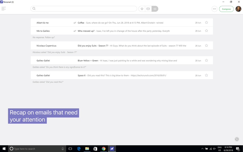
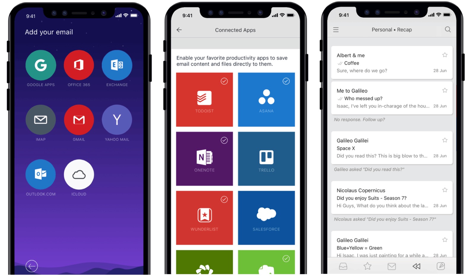
Recap is an entirely different beast. Each morning, you'll see a list of emails you previously pushed aside that are now front-and-center. You can either answer/delete them from this list or push them off again. In addition, you get to decide the time of day each Recap gets sent and determine whether it affects all your email accounts or just select ones. For example, I only use Recap with my work account where I think it's most useful. Your choice might be different.

Moving forward, three additional Newton features also allow it to breakthrough. These are Tidy Inbox, True Inbox, and Zenbox.
With Tidy Inbox, you can have Newton automatically filter social and newsletter emails for all or individual accounts. It's a simple setting that carries across all installed devices. Use it to eliminate non-essential emails from your inbox quickly.
Meanwhile, True Inbox has been designed to eliminate the need for a sent folder. As you answer emails, those conversations go to the top of your inbox, giving them much more of a messenger-type feel. As someone who spends a lot of time checking and sending emails a day, this is perhaps my favorite Newton feature because it helps me stay on track throughout the day.
Finally, there's Zenbox, which changes how we receive and are alerted to new emails. Without Zenbox, we receive a notification every time a new message arrives, which can cause havoc to concentration. When activated, Zenbox pushes out emails and notifications in batches at different times of the day. You can even exclude specific contacts from Zenbox, so their messages continue to arrive in real-time.
Interface and in use
Regardless of the platform, Newton takes a minimalist approach when it comes to design. There are fewer buttons on the surface, and folders aren't nearly as emphasized as they are on other products. Swipes also play no role here and you won't find pinned panes.
I tested Newton on iPhone and Mac. The minimalistic approach Newton takes works much better on mobile where a smaller display means less white space. Moving forward, I can see myself sticking with Newton on mobile; I'm less certain it will remain on my Mac. However, this has to do with me being less willing to change my email habits on the desktop as the design itself is sound. (No matter how hard you try, you sometimes can't teach old dogs new tricks, folks.)

Support
You can contact Newton support at any time, and there's also a tiny but functional community group where users ask and answer questions for fellow travelers. The group is open to anyone, which is a nice touch.
The competition
Two other minimalist email apps stand out, including Spark and Hey. The design for the former is much closer to those of more traditional email systems, while the latter will remain you more of Newton. Only Spark offers a freebie package with Hey currently priced at $99/year. Like with Newton, new users can try either service for free for a limited time.
Final verdict
Newton isn't for everyone and certainly not for those unwilling to learn new ways to clear an inbox. And yet, for those open to change, Newton could be the perfect solution. At $50/year, Newton isn't cheap, but those powerful features are worth it, especially when you consider the membership fee covers all platforms.
One caution: Newton's jump from owner to owner in recent years is troubling, although it looks like the ship is finally upright and sailing comfortably. Hopefully, the newest owners will continue to add new features across its many platforms.
Bryan M. Wolfe is a staff writer at TechRadar, iMore, and wherever Future can use him. Though his passion is Apple-based products, he doesn't have a problem using Windows and Android. Bryan's a single father of a 15-year-old daughter and a puppy, Isabelle. Thanks for reading!

