TechRadar Verdict
The Nixplay Touch 10 is a decent 10.1-inch photo frame that looks much like its non-digital counterparts and has a user-friendly app. However, its presentation of photos can highlight the screen's low resolution, and controlling it through the touchscreen feels clunky and slow.
Pros
- +
Looks like a traditional photo frame
- +
Can sense activity to turn on or off
- +
App is easy to use
Cons
- -
Overly sharpened image
- -
Paid subscription unlocks full powers
- -
Feels slow and clunky to operate
Why you can trust TechRadar
Two-minute review
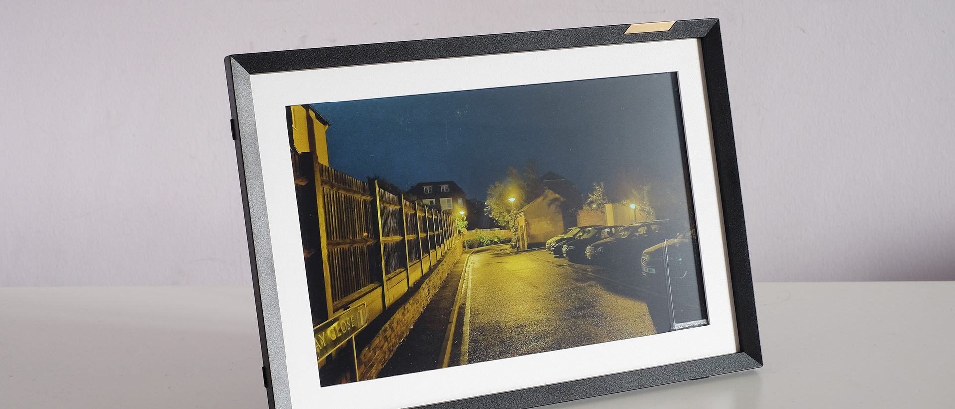
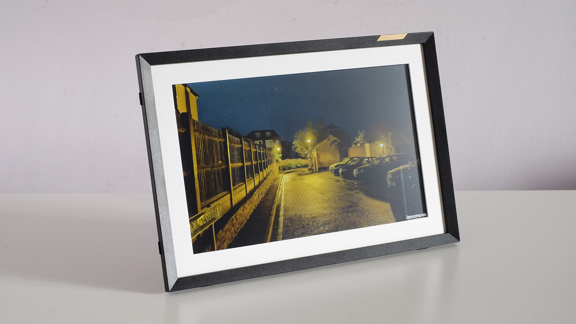
The Nixplay 10-inch Touch Screen Photo Frame (otherwise known as the Nixplay Touch 10) is a simple and relatively easy-to-use photo frame that aims to look like a traditional photo frame. It does not have the wood-and-glass construction of an upscale classic picture frame, but the design doesn’t give this away at arm’s length.
Nixplay wants you to be able to setup the Touch 10 and let it run, without worrying about if it uses up too much energy. It has a schedule function, which lets you set times that it switches on and off. You see this in just about all decent photo frames, but the Touch 10 also has an activity sensor.
You might assume that this sensor is some form of camera, but it isn't. Instead, it's a microphone, so silence means the frame will eventually enter sleep mode, if you choose to use this setting.
Nixplay offers a paid subscription service that unlocks some capabilities, but we don’t think that many people will need to cough up the cash. A totally free Nixplay account still allows the use of up to five frames, 10GB of cloud storage for your photos and five 'playlists' – another word for a virtual photo album.
These playlists can be shared with other folks so they can contribute, rounding out a solid set of features for an everyday digital photo frame. However, we’re not entirely happy with how photos are handled.
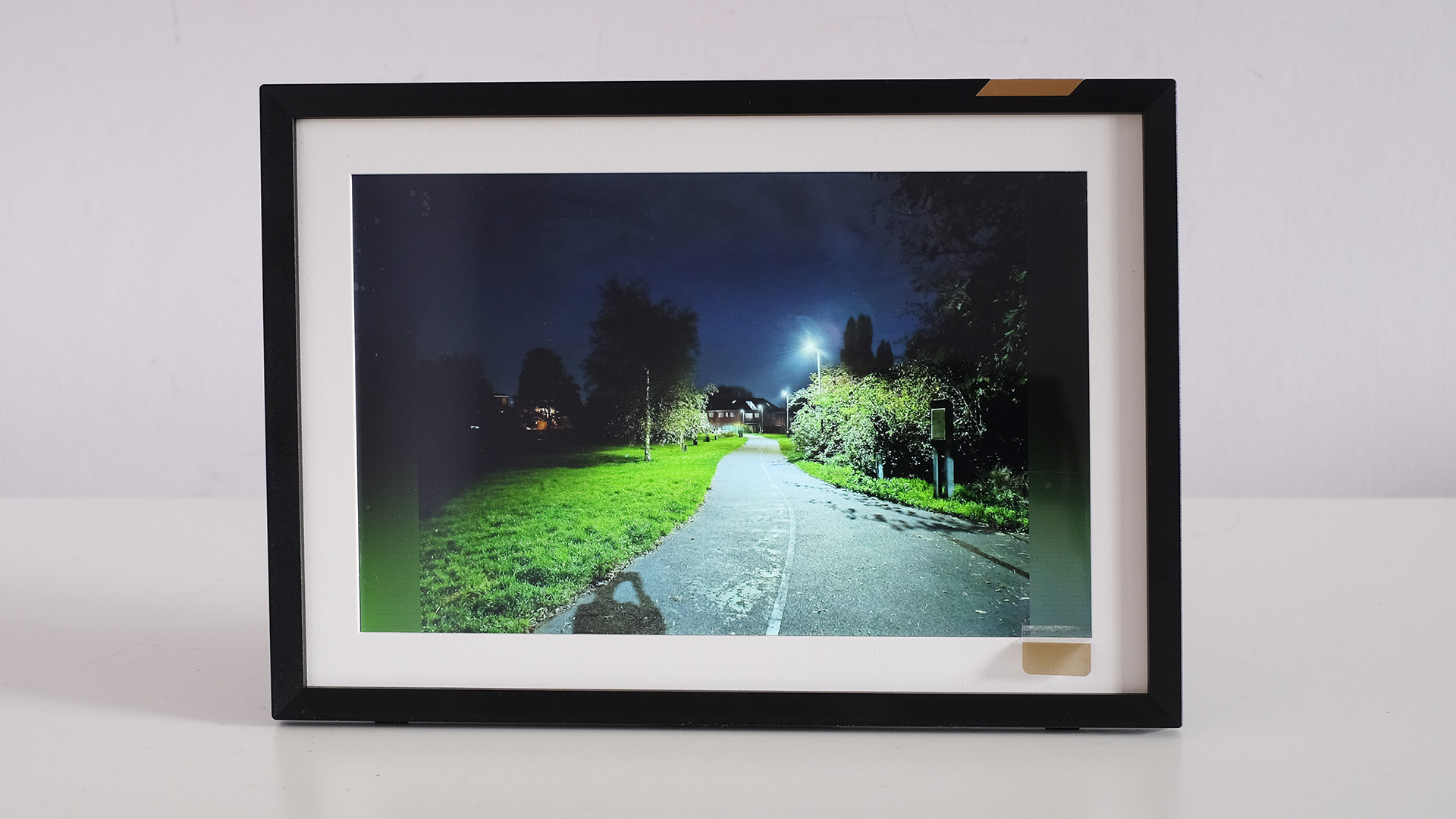
Nixplay is keen on Microsoft Powerpoint-style transitions. We like having the option, but the default setting is cheesy. And the frame’s handling of images is not that great. Its presentation appears too sharp for the Nixplay’s lowly 800p resolution. You might think limited resolution calls for sharpening, but it actually draws attention to the limited number of pixels, causing distracting aliasing in objects like skyscraper outlines and power lines.
Will you actually notice? Not in casual use, but it becomes more apparent when you actually look at the images properly. Still, if this isn't an issue for you and you like the Touch 10's traditional design and 'activity sensor' for automatically entering sleep mode, it's worth considering – and earns a place on our guide to the best digital photo frames.
Nixplay Touch 10: design
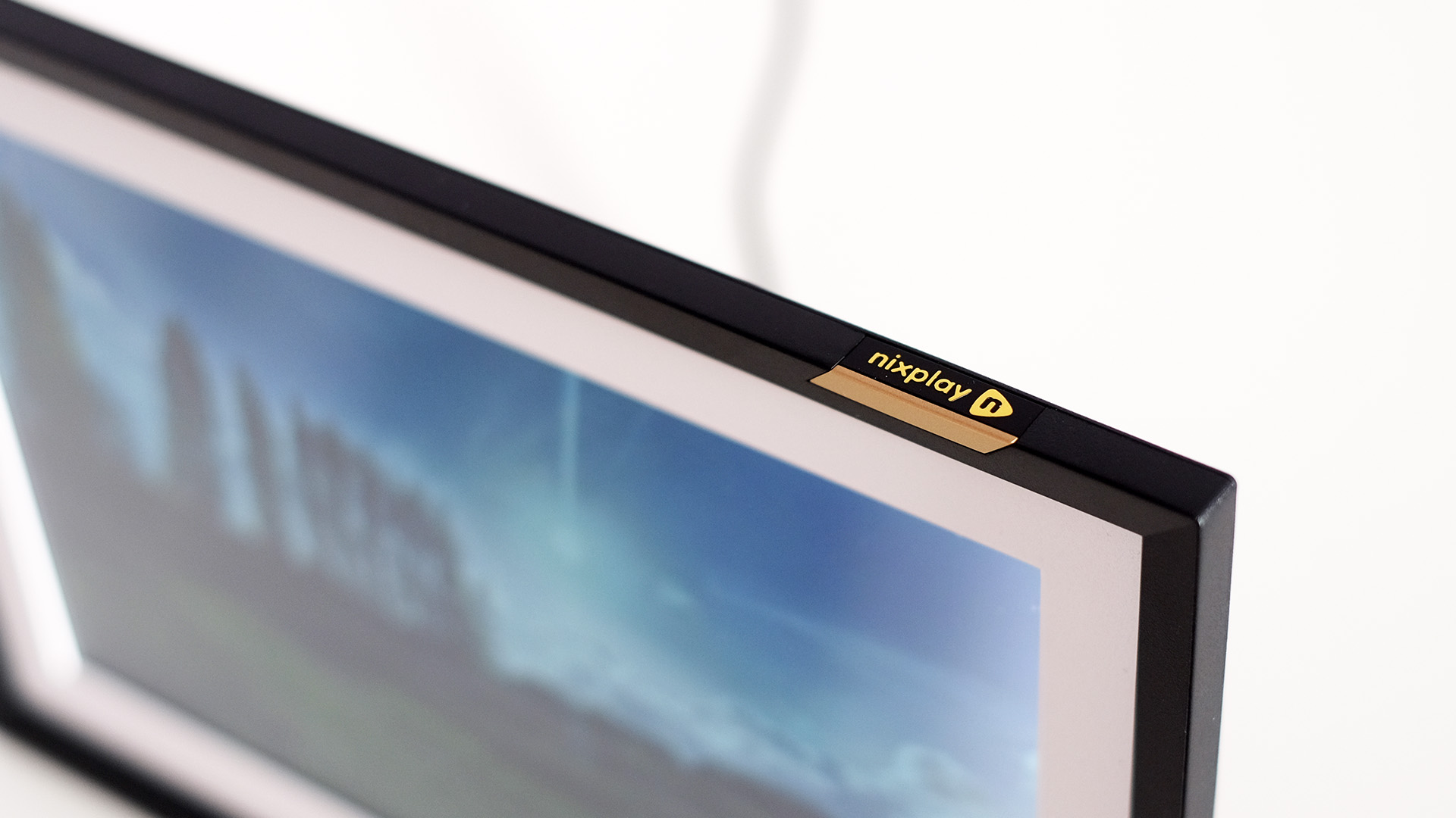
The Nixplay Touch 10 could almost pass for a normal photo frame. We say 'almost' because, like so many tech companies, Nixplay felt the need to insert itself into the picture a little too much with a golden 'Nixplay' logo section on the top.
We wish it hadn’t, but the Touch 10 otherwise looks great. Our sample has a black outer, with a pleasant warm-toned white section between the frame and the display. All of this is plastic, but that lowers the weight.
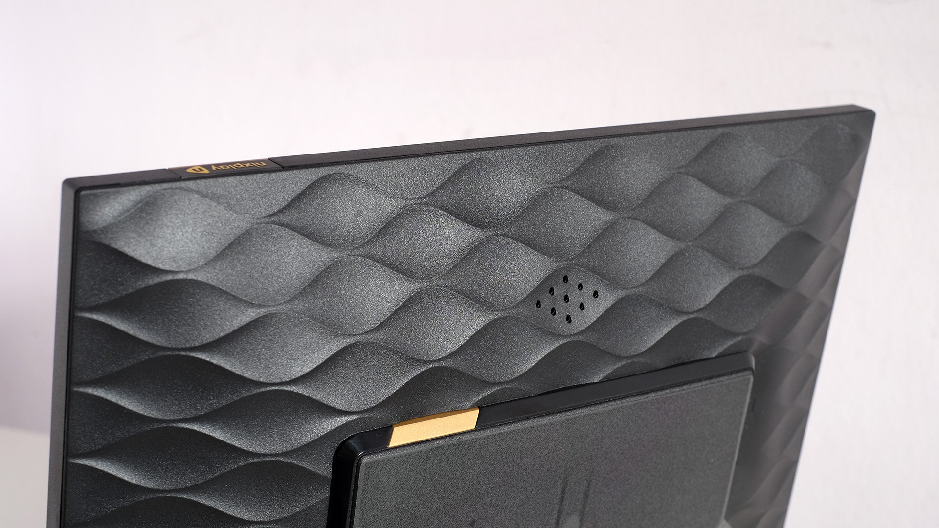
Nixplay lets loose style-wise much more on the back, using a heavily embossed pattern – but who cares when you’ll barely ever see it? The Nixplay Touch 10 has a little slot-in plastic stand. It’s not super-sturdy, and does not need to be when the total weight of the photo frame is not high.
Conclusions? The Nixplay looks more like an ordinary photo frame than the Aura Carver, but the Skylight 10-inch photo frame has the edge for those who want what we might call 'realism', thanks to its even more sober appearance and the use of glass for the screen cover.
The plastic display surface in this 'Classic Mat' version does have a benefit here, though. It softens reflections slightly. The effect is much less pronounced than in the near-mat Aura Carver, but the way it takes the edge off is welcome.
In most respects the reproduction of photos is good, too. We like the Nixplay Touch 10’s color temperature, and find that it can reproduce rich tones well enough, even if it likely wouldn’t get close to the color depth of today’s OLED phones.
The maximum brightness of 260 nits is only passable, but is going to suit your needs just fine unless you intend to put the Nixplay Touch 10 in a bright spot in your home. In that case, the Aura Carver and its 440-nit brightness would be better.
We’re not persuaded the Nixplay approach to sharpening always works out thought. The Nixplay Touch 10 has a 1280x800 pixel 10.1-inch screen. That’s a low number of pixels for this size of display, but the norm for cheaper photo frames.
Nixplay tries to compensate for this low resolution by aiming for high sharpness, but this causes issues in objects that have very well-defined edges. They appear a little pixellated, jaggedy, which we find more noticeable than the appearance of a frame with with a more anti-aliased approach – where these hard transitions are softened.
Photo presentation is just okay as a result. Here’s how much power the photo frame uses according to our power meter.
| Mode | Power consumption | Row 0 - Cell 2 |
| 100% brightness | 5.6W (0.134 kWh per 24 hours) | Row 1 - Cell 2 |
| 50% brightness | 4.3W (0.103kWh per 24 hours) | Row 2 - Cell 2 |
| Standby | 1.1W (0.0254kWh per 24 hours) | Row 3 - Cell 2 |
Nixplay Touch 10: usability
You use the Nixplay app to load up the Touch 10 photo frame with photos. There’s no memory card slot, and while there is a microUSB socket, it is not used for photo storage. Nixplay does make frames with SD slots and USB support, mind.
You add photos to 'playlists' in the Nixplay app, and they get streamed from the company’s servers to the frame. Adding photos is painless – assuming they are on your phone and ready to transfer.
Nixplay offers a subscription for the app, which costs $49.99 / £49.99 a year, but we’re pretty happy with what you can do subscription-free. You can store up to 10GB of photos, you can play videos and have five playlists active. You might have one for a wedding or holiday, for example.
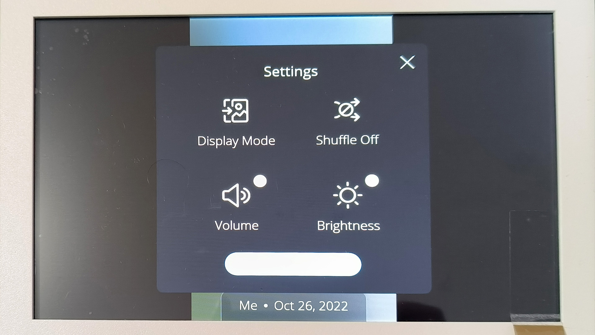
Different people can be added to these playlists too, giving them access to that selection of photos and letting them add more. This is where the playlist concept really opens up – siloing people as you might do with WhatsApp groups.
The Nixplay Touch 10 also supports Alexa and Google Assistant. We hooked it up to Google Home and were able to turn the frame off with a voice command sent through a phone. You can also make the frame display the time, which is handy.
All the smart elements are here, but operating the Nixplay Touch 10 on its own is clunky. It’s often slow to respond, lethargic, and that gets frustrating. There’s no way to see thumbnails from the current playlist to select a particular image, as the on-screen “Go to Gallery” shortcut simply bumps you back to the standard scrolling feed of images. You can’t select particular images to display in the Nixplay app either.
We were also not initially fans of the Nixplay Touch 10’s animated transitions. There are 11 of them, including sillier effects like 'pixelate'. Set to randomly switch between these, the photo frame can devolve into a Powerpoint presentation nightmare. However, find one you like and stick to it, and everything calms down.
Should I buy the Nixplay Touch 10?
Buy it if...
You want an auto switch-off frame
Most good photo frames offer schedules sleep times, to save energy, but the Nixplay also has an 'activity sensor' microphone that can turn off the display when it detects quiet for a certain period. Handy for letting you leave the house without switching the frame off.
You want to go without a subscription
Some photo frames either don’t allow albums at all, or put them behind a paywall. The Nixplay lets you curate five album 'playlists' before making you cough up cash. Playback of short videos isn’t paywalled either.
You don’t want an overly techy look
While Nixplay goes to town on this photo frame’s back, and couldn’t resist putting a gold logo near the top, it is fairly reserved-looking front-on. Its black outer border and white inner one makes it look just like a photo frame you’d pick up at a home interiors store.
Don't buy if...
You want slick operation
This frame runs just fine is you set it to play and let it do its thing, but operating it through the touchscreen does not feel great. It’s slow and clunky, making it seem as though you have to wait for the Nixplay to catch up with your inputs.
You're worried about resolution
This is an 800p photo frame – not ideal but the standard resolution at this price. We find the Nixplay hides this low resolution less effectively than the best in this category, by aiming for pixel-perfect sharpness. Power lines and high-contrast edges of stark buildings can look craggy as a result.
You want to use an SD card
Nixplay makes photo frames designed to run off an SD card but this is not one of them. While it will continue to cycle through recently-viewed images if it loses Wi-Fi connection, this is designed to be an always-connected frame that streams images from Nixplay’s servers.
Andrew is a freelance journalist and has been writing and editing for some of the UK's top tech and lifestyle publications including TrustedReviews, Stuff, T3, TechRadar, Lifehacker and others.
