TechRadar Verdict
While it looks and feels great in the hand, Nokia appears to have cut back a little too much when it comes to everyday performance. The Nokia 4.2 simply doesn’t perform as well as its classy design suggests it should.
Pros
- +
Sharp glass-and-polycarbonate design
- +
Decent camera for the price
- +
Android One OS is lean and glassy
Cons
- -
Poor, sluggish performance
- -
Battery life can't hold up to media
- -
Display underwhelms
Why you can trust TechRadar
Nokia’s smartphone reboot has been a quiet success, thanks to a string of smart and solid Android phones built by hardware partner HMD Global. The Nokia 4.2 is another such phone, offering a clean Android One experience at a budget price.
By concentrating on the essentials and sticking to Google’s bloat-free software template, alongside a sharp yet sober design, the Nokia 4.2 emulates a much more premium smartphone experience. The only question, as always, is whether the underlying hardware can keep up appearances and really sell the whole deal.
While the Nokia 4.2 certainly looks and feels the part, underwhelming performance and a mediocre display rather spoil the premium effect.
- These are the best Nokia phones you can buy
Nokia 4.2 price and availability
Here in the UK, the Nokia 4.2 has launched in a single 3GB/32GB variant at a price of £149 ($199, AU$299). That pitches it right in the middle of the Moto G7 Play and the Moto G7 Power, which both promise a similar blend of svelte design and pure Android for a low price tag.
Indeed, while there are a number of budget contenders out there, it’s only really Nokia and rival Motorola that consistently offer this type of no-nonsense, fuss-free Android experience for less than £200.
Pushing all those Google buttons
Nokia called its latest phone a “mini flagship” at the MWC 2019 launch, which is quite a bold claim. It’s also a rather disingenuous one.
The Nokia 4.2 is clearly no rival to the Pixel 3a, the OnePlus 7 or the Pocophone F1. Such phones deserve the title of “mini flagship” by packing select flagship features into a smartly streamlined package.

Rather, the Nokia 4.2 is a decidedly budget phone that looks and feels a little nicer than its price tag might suggest. Which is a perfectly commendable path to take in its own right.
This is another Nokia phone that sees the Finnish brand (or rather licensee HMD Global) sticking closely to the Google playbook. The OS isn’t merely a light re-skinning of stock Android - it pretty much is stock Android.
Android One offers a faithful take on Google’s OS, complete with the guarantee of major Android updates for two years, and security updates for three.

But Nokia has gone even further with its Google love, to the extent that it’s actually included a physical Google Assistant button. A single press of the little black control on the left edge of the phone will bring up the Assistant over whatever you’re doing (even the lock screen), while a press and hold will have the Assistant listen out for your voice.
If you’ve grown accustomed to using Google’s powerful voice assistant on other devices, this is a handy inclusion. Unless, of course, you already use the ‘OK Google’ prompt with a Google Home device, in which case having to press a button might feel a little prosaic.
Design and display
- Pleasant glass-heavy design with light-up power button
- 5.71-inch LCD isn't particularly sharp or punchy
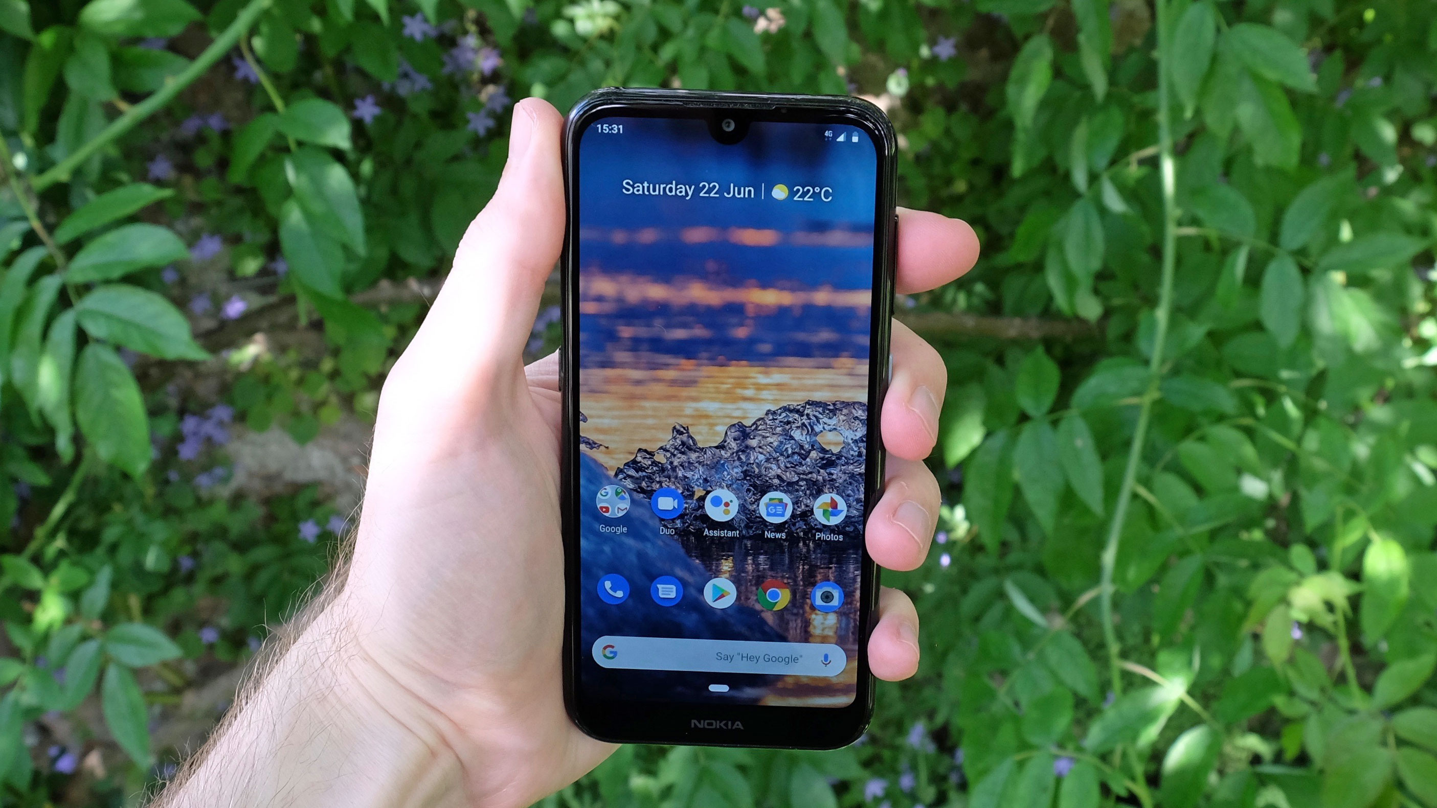
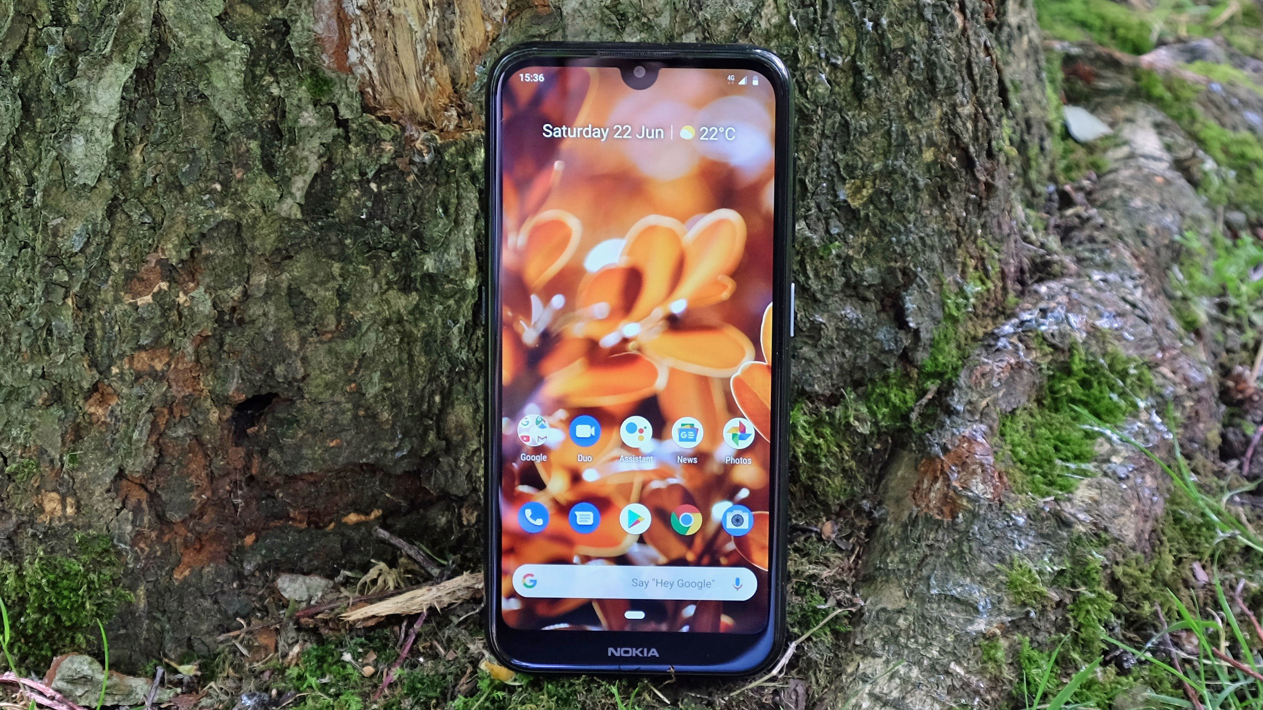
For a £150 smartphone, the Nokia 4.2 looks and feels great. Its two slabs of glass sandwich a plastic body, but there’s a sense of solidity and a commendable lack of creak and flex to the design.
It’s a relatively compact phone at 148.95 x 71.3 x 8.39mm, and it has just the right amount of heft with a weight of 161g. The fingerprint scanner is well placed around the back, just under the central camera module.

Both components sit fairly flat on the rear surface of the phone - the camera slightly above, the fingerprint sensor slightly below the surface. In the case of Nokia’s biometric sensor, it can be a little tougher than we’d like to feel it out in a rush, and we noted a few partial-touch authentication failures as a result.
There’s no USB-C port on the bottom of the device, which is a shame, as it feels well past time that microUSB was put out of its misery. Still, at least there’s a 3.5mm headphone jack.

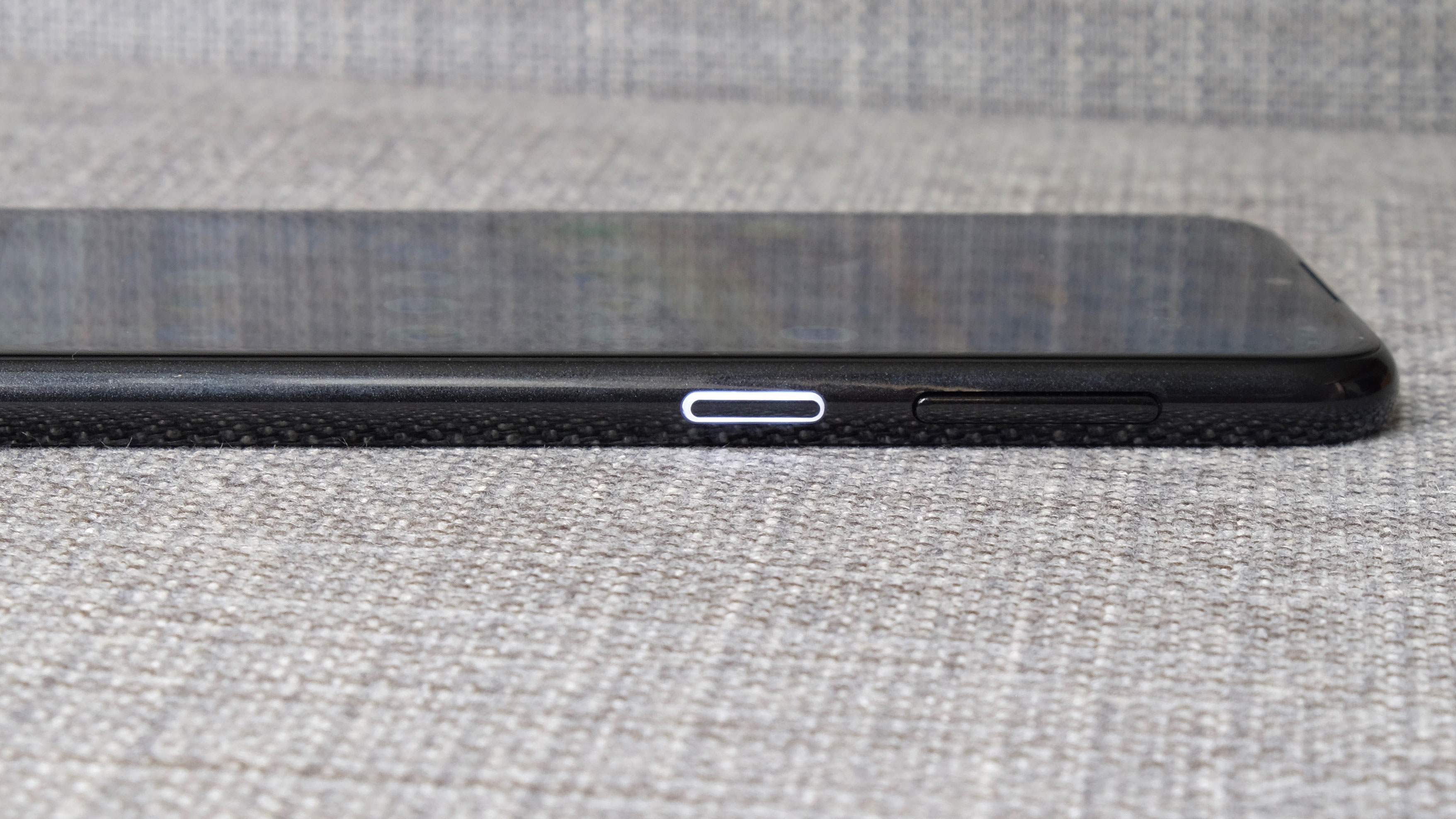
Opposite the aforementioned Google Assistant button, on the right hand edge of the phone, Nokia has given the power key a light-up surround. This serves as a tasteful notification light that you can spot whatever way up the phone is, and it also lights up when the Nokia 4.2 is plugged in. It lends a nice dash of personality without spoiling that classily understated vibe.
The Nokia 4.2’s display fills the front of the device in a way that’s no longer massively noteworthy. You have an unobtrusive teardrop notch to account for the selfie camera, and to allow the screen to push out into the corners. It’s a shame the bottom edge has such a conspicuous chin, but it’s also not a surprise at this price.

More of a disappointment is the quality of the screen itself. It’s a 5.71-inch LCD with an HD+ (720 x 1520) resolution and a 19:9 aspect ratio.
The proportions are fine, but the screen is lacking in both pixels and punchy colour reproduction. True, the likes of the Moto G7 Play and the Xiaomi Redmi 7 also have 720p displays. But then, both can be had for cheaper and have their own distinct advantages, which we’ll discuss more of later.