TechRadar Verdict
Beware of overpaying for the EliteBook Folio G1: its base configuration has all the pros but the $999 price tag exposes the cost of its cons.
Pros
- +
Comfortable, enterprise oriented keyboard
- +
Ultra-thin and light body
- +
Able multi-tasker
Cons
- -
Adapter hungry
- -
Finicky touchpad
- -
Pedestrian battery life
- -
Base runs extremely hot
Why you can trust TechRadar
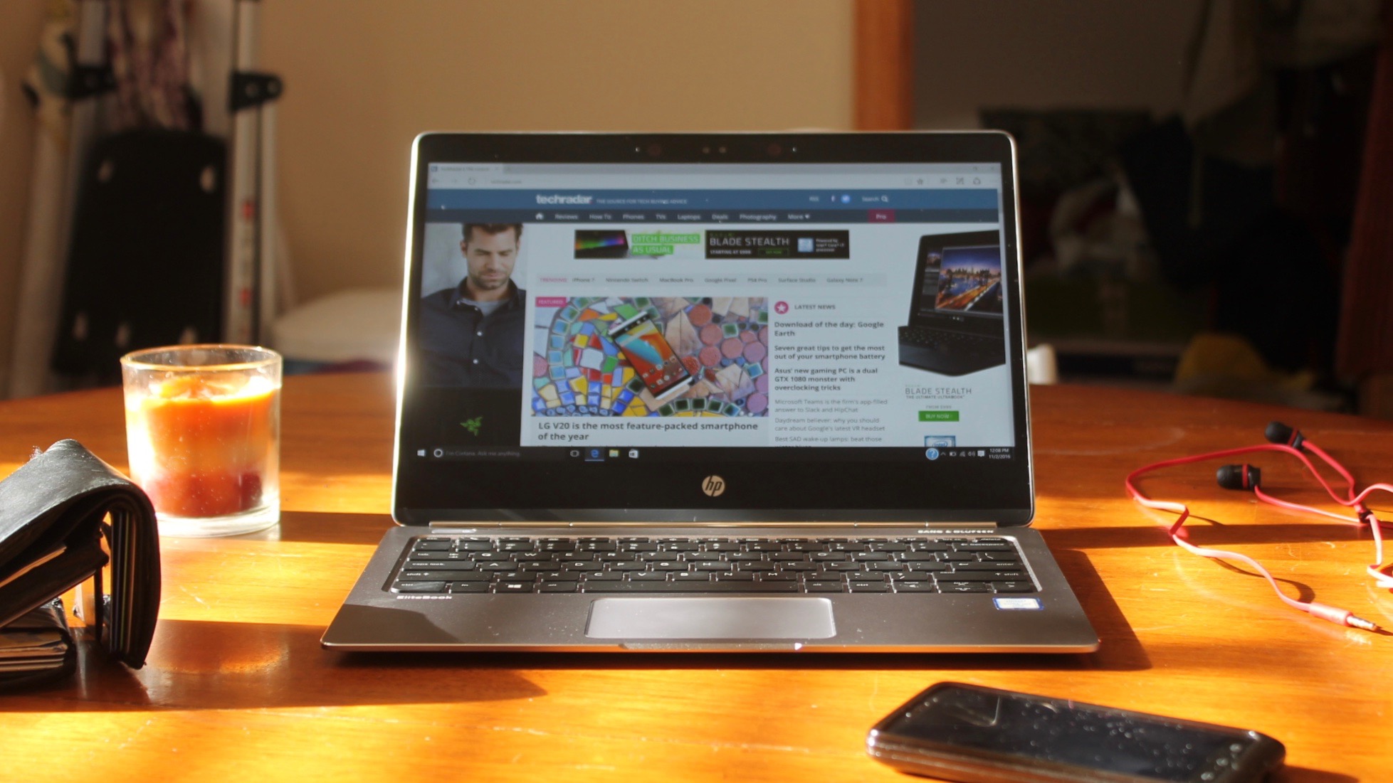
If HP’s EliteBook Folio G1 isn’t a complete Windows clone of the Apple MacBook, then it at least takes much inspiration from Cupertino company’s flagship ultraportable. The two laptops share many characteristics: a black-and-silver color palette, an anorexic frame, 12-inch screen size and a belief that “C” is the only worthy letter in the USB alphabet.
There are notable differences, however. The 1080p display of the Folio G1 we tested isn’t as sharp as the MacBook’s Retina display (though a 4K Folio G1 is available), while the shallow-as-a-kiddie-pool MacBook keyboard isn’t nearly as comfortable as the Folio G1’s.
Additionally, the MacBook’s near all-day charge actually meets “Ultrabook” criteria, while the Folio G1 needs to plug in to finish like the weekend warrior who takes a porta potty break every mile of the marathon.
Lastly, at $999 (similar configurations are sold in the UK for £996 and Australia for AU$2,440) the base Folio G1 is cheaper than the $1,299 (£1,249, AU$1,999) MacBook.
With the Folio G1 (and the MacBook), the draw is its design aesthetics: undoubtedly it’s one of the best looking Ultrabooks available. Other recent thin-and-light Windows laptops, like the $1,099 or £999 (about AU$1,450), Lenovo Yoga 900S may offer more ports or even convertibility, but in terms of aesthetics, they are in another, much less luminous galaxy.
However, looks, as my mother says, aren’t everything. It’s what’s inside that counts, right? And the insides of the base Folio G1 are decent : 8GB of memory, a 1080p display and Core m5 processor. Stick with this tier. Thanks to some unignorable flaws, the more you pay for a Folio G1, the less value you’ll receive in return.
Design
Simple and clean: the mantra of Apple’s HP’s designers.
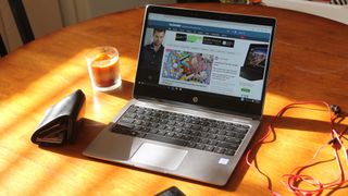
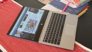
The EliteBook Folio G1 sports a silver aluminum casing, black bezel and keys, and a noticeable but not untoward hinge. Sound familiar? Teasing aside, the Folio G1 is a great looking device whose design accentuates the important bits: namely how thin and light it is.
At 2.14 pounds, the Folio G1 is a tad lighter than the Yoga 900S (2.2 pounds) and a tad heavier than the MacBook (2 pounds). The Folio is also a tad thinner (0.47 inches) than its two Ultrabook peers (0.50 inches). All these “tads” make the Folio G1 seem unremarkable – until you factor in its price. The base Folio is $300 cheaper than the MacBook and $100 cheaper than the Yoga 900S.
Better as a desktop
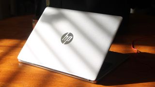
The Folio G1 sits on a pair of rubber feet which keep the laptop balanced and stationary, regardless of surface. That said, you won’t want to use the Folio on just “any” surface, particularly your own lap.
That’s because the Folio’s hinge works like a screen door after a liberal dose of WD-40: shift your legs underneath the laptop and the screen will sprawl. Furthermore, the base gets uncomfortably hot after a few hours of use – you’ll feel the heat through a bed sheet, and even pants. All in all, the best place for a Folio G1 is the top of your desk.
Bezelicious
Because of its extra large bezel, the Folio G1’s screen appears much smaller than its actual 12.5 inch size. The wide top bezel is at least justified by the presence of a webcam and IR camera, but the jumbo bottom reserves space for only a lonely looking HP logo. What gives?
The Folio’s display provides 1920 x 1080 resolution, but the cramped viewing area renders the FHD offering almost superfluous. I can’t imagine upgrading to 4k – it would be downright wasted here.
The Folio’s display also suffers from a blurring/fading issue on the left and right hand sides of the screen. It’s distracting, especially when reading full-screen text. Fortunately, overall viewing angles are crisp even if the glossy screen is prone to glare.

Untouchable
The highlight of the Folio G1 is its keyboard. Backlit and chiclet-styled, the keyboard is an enterprise user’s dream. Despite the limited real estate with which to work, the Folio’s keys are comfortably spaced with excellent travel and uniform feedback across the board.
HP also adds something new to the typical keyboard layout in the form of enterprise-oriented custom function keys. This slight derivation allows for quick access to common business tasks – like calendar management – without the clutter of extra keys.
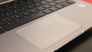
The Folio’s touchpad, on the other hand, is easily its worst feature. The touchpad’s size and location are perfectly fine, as is its “click” feedback, but its multi-touch functionality is incredibly finicky.
Want to two-finger scroll? Nah, we’re zooming. Want to zoom in? Nah, we’re minimizing your browser. Want to minimize? Nah, we’re going into the Upside Down to fight the Demogorgon. These days multi-touch is bog standard on all devices, large and small. Getting it even a little bit wrong is worthy of a furrowed brow.



For a mid-range handset, the Poco F6 Pro is premium in more ways than one, but I found it hard to ignore some of its key pitfalls
This obscure brand wants to launch the most privacy-friendly smartphone ever without Google, but with a mysterious open-source OS at its core
This powerful phone charger has been making faces at me, but I kinda love it
