TechRadar Verdict
The Dell XPS 11 is a fashion statement with carbon fiber and a WQHD screen, but it's too expensive for its own good.
Pros
- +
Attractive carbon fiber body
- +
Stunning, sharp display
- +
Pinpoint touchscreen
Cons
- -
Scratch-prone finish
- -
Aggravating keyboard
- -
Integrated graphics chug
Why you can trust TechRadar
Transforming laptops are finally growing popular outside of the medical and enterprise fields and they're often aimed at. Between the tablet-friendly Windows 8.1 and touchscreens popping up on just about every device, it's clear that vendors are betting big on shape-shifting hybrid machines. To this end, Lenovo designed the back-flipping Lenovo Yoga Pro 2; meanwhile, Asus developed the Asus Transformer Pad with a display that snaps off its keyboard base. Both were interesting devices, but ultimately laptops first and tablets second.
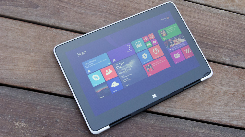
Dell is shooting for quite the opposite with the new Dell XPS 11. Instead of a hybrid notebook that turns into a tablet, the Round Rock, Texas firm is positioning its new machine as a tablet first. If anything, the XPS 11 resembles the Microsoft Surface Pro 2, as the two share soft touch keyboards that users can lay out when they need to sit down and type.
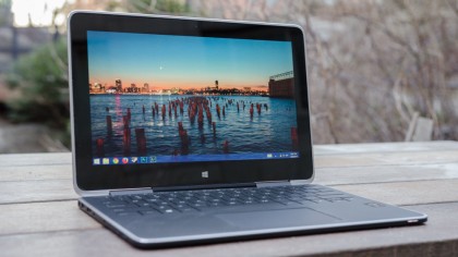
With the Dell XPS 12's 12.5 inch, screen-swiveling design, Dell is no stranger to the transforming form factor. For the XPS 11, however, the company devised something lighter, slimmer, and smaller with an 11.6-inch screen. The result is a device that's much tighter, sturdier - sexy even. With a carbon fiber body and stunning 2560 x 1440 resolution display, the XPS 11 is a fashion statement. But is there any more to this laptop-tablet hybrid than looks?

Design
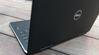
The XPS 11 features a carbon fiber chassis, which not only makes the 0.6-inch (15 millimeter) thin laptop sturdy but also adds a unique look to the notebook. The carbon weave pattern wraps the laptop's body, giving it a futuristic look more common on sports cars and stealth fighter jets.
The entire machine iscoated with a thin, rubbery substance that enhances grip when carting it around in hand. The XPS 11's resistive-touch keyboard is also coated with the same material, letting me keep a sure grip whenever I flipped the screen back into tablet mode. This flat keyboard also helps the device feel more natural as a tablet than mashing keys with my fingers on the physical chiclet keyboard of the 11-inch Lenovo Yoga 2.

Opening the clamshell reveals machined aluminium that wraps around the inside lip of the screen and base. It's a small accent that adds an extra dash of style to the XPS 11's otherwise completely black exterior. The 11.6-inch Wide Quad High-Definition (WQHD) screen, meanwhile, is fronted by a giant sheet of Corning Gorilla Glass NBT carbon fiber glass. This super tough sheet of glass adds some serious rigidity to the laptop's display, which during my testing showed very little flex.
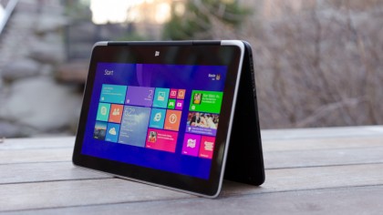
Unfortunately, I can't say the hinge on the laptop shared the same sturdiness. While it takes a decent amount of force to reposition the display, the screen rocks up and down whenever I use the keyboard to type on my lap. The hinges are also not strong enough to stand up to the pressure of tapping on the display. These are both slight disappointments, but it's a shame the hinge is the weakest link of this overall rocksolid laptop. Luckily, the hinge is still firm enough to keep the laptop positioned when it is tented or stood up on its side like a book.

Life in 11.6 inches
Generally, 10 inches is my threshold for tablets before they grow to too bulky and heavy. Unfortunately this is also true for the Dell XPS 11. Even though the machine weighs a stark 2.5 pounds (1,130 grams), it's still rather unwieldy to hold for extended periods of time. This is especially so when holding the device vertically - it felt like balancing a see-saw in my hands.
What's more, the Dell hybrid's 16:9 aspect ratio is simply not conducive to some things I usually use a tablet for. It's perfect for watching movies and playing a few Windows Store games, but not much else. Comics on the Kindle app don't fill the screen vertically or display a two page pane horizontally, as I hoped. Books, meanwhile, are displayed with their text stretching across the entire screen, forcing me dip my neck every time I finish a page.
Kevin Lee was a former computing reporter at TechRadar. Kevin is now the SEO Updates Editor at IGN based in New York. He handles all of the best of tech buying guides while also dipping his hand in the entertainment and games evergreen content. Kevin has over eight years of experience in the tech and games publications with previous bylines at Polygon, PC World, and more. Outside of work, Kevin is major movie buff of cult and bad films. He also regularly plays flight & space sim and racing games. IRL he's a fan of archery, axe throwing, and board games.

