Why you can trust TechRadar
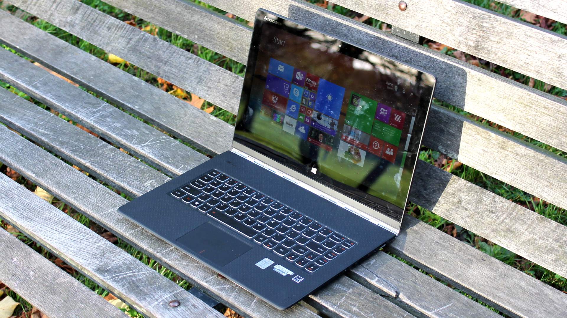
The Yoga 3 Pro gets a QHD+ display, which totes the same 3200 x 1800 pixel resolution found on the Yoga 2 Pro. You'll want to adjust the magnification settings in Windows 8.1 to 150% or higher make fonts and text clearly legible.
Sticking to higher resolutions gives you more desktop real-estate to edit multimedia files and snap documents side-by-side. In some scenarios it can be a real productivity boon, but overall the resolution still feels like overkill at 13 inches.
One option is to lower the resolution to 2048 x 1152 (16:9), a notch under the native resolution, which keeps everything looking sharp while remaining readable with magnification set to 100%.
The display's 300 nits is sufficiently bright for indoor use, but slightly too dim for outside conditions. It's an IPS panel with very good viewing angles - a crucial factor for a device designed to be used in many positions.
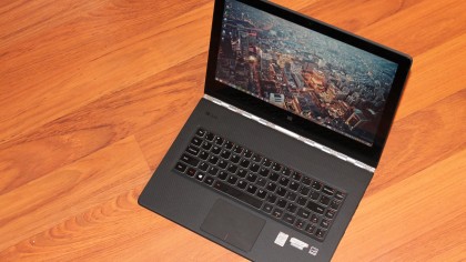
The Yoga 3 Pro is one of the most portable Ultrabooks around, coming in 17% slimmer and 14% lighter than the Yoga 2 Pro, by Lenovo's measurements.
It weighs just 2.62 pounds, making it lighter than the 13-inch MacBook Air's 2.69 pounds, and it's slightly thicker along the middle of the left and right edges, as opposed to the tapered design of Apple's machine.
It's roughly the same weight as Samsung's Series 9 900X3C, and only the ageing Toshiba Portege Z930/Z935 and Sony Vaio Pro 13 come in lighter in the 13-inch category, at 2.50 pounds and 2.34 pounds respectively.
Build inequality
The Yoga 3 Pro measures 13 x 9 x 0.5 inches (W x D x H), and it's astounding just how svelte, portable and slim Lenovo has made it.
It can easily be picked up from any edge with the lid at any angle with ease; however, doing so can expose the Ultrabook's questionable build quality, raising the question of whether Lenovo has made it too thin.
The lid possesses an alarming amount of flex along the left and right-hand edges, and picking it up using the frame's bezel produces a rippling, discoloured effect.
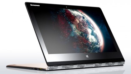
At no point did I feel like the lid would snap, or even that it might cause substantial damage, but the undesired effect made me constantly aware of the need to be gentle when flipping it into different positions.
The Ultrabook's base also suffers from slight flex when force is applied to the left and right areas of the clickpad, an action that makes it creak more than a pensioner's knees.
I'm in the thinner = winner camp when it comes to Ultrabooks, but there is an argument that it can be detrimental for devices to be too slim, especially if it's at the expense of build quality, and Lenovo treads a fine line with the Yoga 3 Pro.
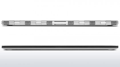
The Yoga 3 Pro is made of a smooth plastic with a dimpled effect on the base and under the display frame. Both the lid and base have a tapered edge, which helps keep it steadfast when in tent mode and prevents it from slipping.
Picking the machine up when the lid is closed is another matter. Lenovo made the decision not to include a recessed section or lip along the machine's front edge, and as a result attempting to open it from the front can be a maddening experience - even with two hands (forget using one - the lid is simply too light).
I eventually clocked on that it's far easier to open the lid by placing my index finger on each of the machine's sides to hold it steady and using my thumb to prise it open. Is it a big deal? No. Could it have been easily avoided? Without doubt.
Ports and connectivity
The Yoga 3 Pro is an impressive feat of engineering, but sacrifices clearly had to be made for it to be so thin at the expense of its I/O capabilities.
Due to the watchband design, there is no room for ports at the rear of the device. Instead they have been lumped into the thicker middle section along the machine's left and right-hand edges.
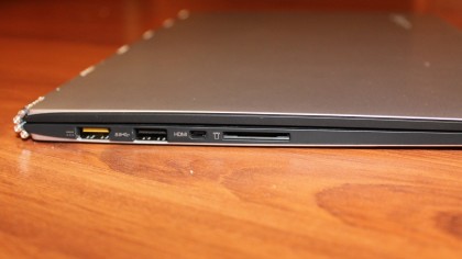
On the left-hand side is a power port, which doubles as a USB port. The power connector itself has a slightly curved lip to prevent you from plugging into another USB port, which could damage the laptop.
Next to that is a USB 3.0 port and a full-size SD card connector. Unfortunately not enough room remained for a full-sized HDMI port, so you'll have to make do with using an adapter. It's not a huge deal, but slightly irritating if you output to a HDMI monitor regularly.
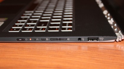
The standout communications protocol onboard is 802.11ac Wi-Fi, which was sorely missing from the Yoga 2 Pro. I found that connectivity held solidly throughout my time with the review model. Bluetooth 4.0 is also present for pairing speakers, peripherals and other devices.
Current page: Specifications and build quality
Prev Page Introduction Next Page Performance and battery life