TechRadar Verdict
The RIM 1000 is certainly an achievement, but it's simply too uncomfortable to use to be worth consideration
Pros
- +
Excellent battery life
Small and compact
Cons
- -
Under-powered
Uncomfortable to use
Why you can trust TechRadar
The PC ain't what it used to be. The days of beige boxes and luggable laptops are well and truly over, and their long-awaited demise is ably signalled by the rise of the UMPC. Or, at least, that's how it should be.
But there are still beige boxes out there (many of which trump the confusingly named RIM 1000 in terms of pure power) and the luggable laptop has simply evolved into the desktop replacement, a usually ludicrous form factor that more resembles a desk. And the UMPC?
Well, it's yet to rise as the undisputed leader of computing. The more things change, the more they stay the same.
So how does Medion's MD RIM 1000 fare? Well it's light and portable, if not pocketable, and comes in a pouch to protect the delicate and otherwise vulnerable screen.
Battery life is, as you would expect from a unit sporting a tiny screen and an ultra low voltage VIA processor, pretty stellar; it managed an easy three and a half hours of everyday use under full screen brightness.
The unit does throw out a fair amount of heat, which struck us as rather surprising given the low-voltage architecture, although it's an almost inevitable consequence of cramming advanced electronics into tiny spaces.
That processor isn't going to be the easiest of choices, either. If you've gotten used to the days of instant-everything and Core Duo slickness, an underpowered CPU coupled with 700MB RAM makes for a sluggish time, especially under the power-hungry auspices of Vista Home Premium.
The puny graphics don't exactly go far towards helping; the Vista we see here is the scaled back, Aero-free incarnation. We're not positive whether Medion is tied to an OEM deal or not, but we certainly would have thought a copy of XP would have been more suited to this particular hardware configuration, even given the touch-screen friendly Origami Experience media player.
Extra components
Although this machine has crammed in just about everything Medion could have hoped in terms of hardware, its over-enthusiasm regarding components and specifications has perhaps gone a little far.
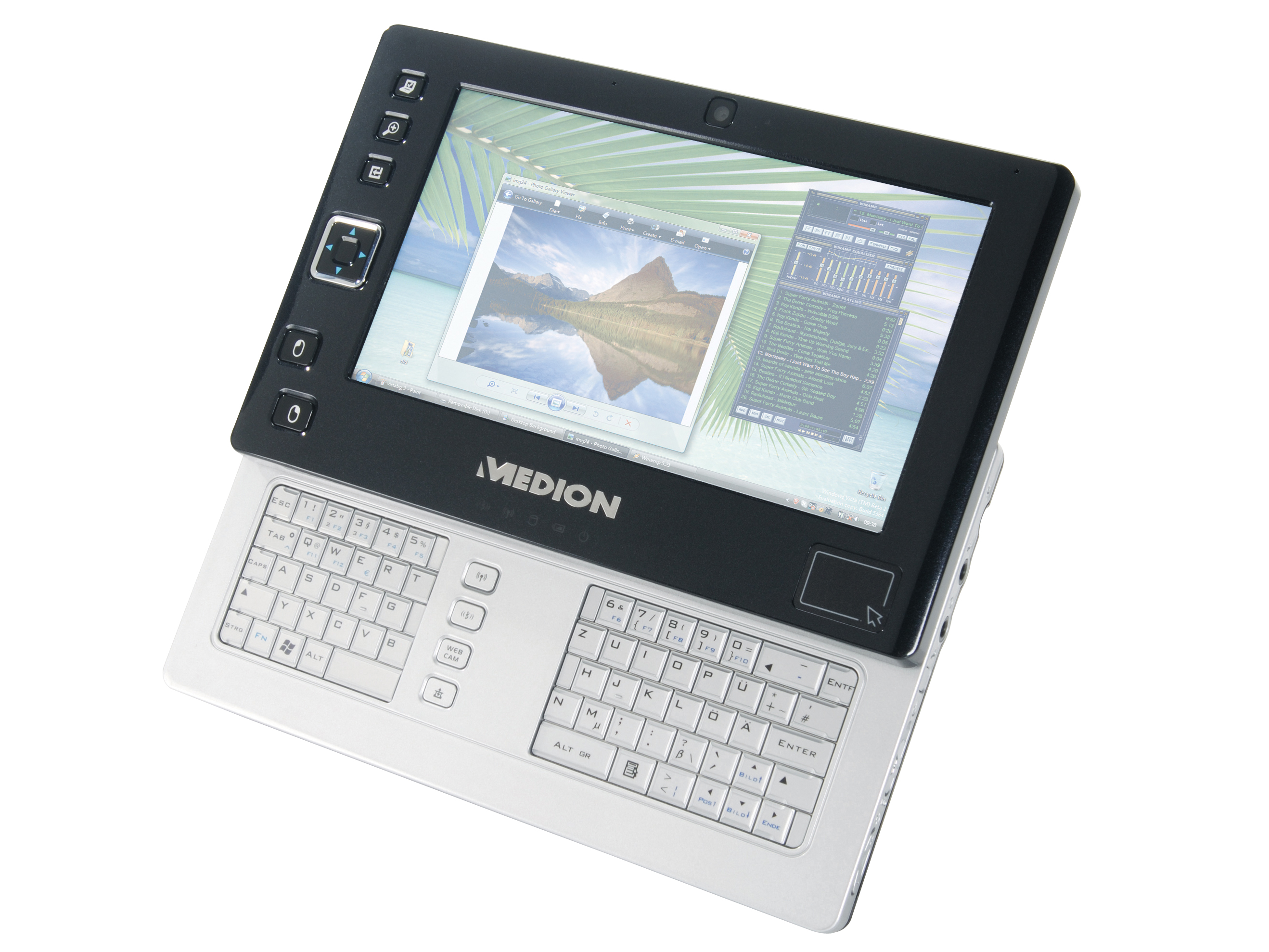
The front-mounted track pad is an excellent option if you're uncomfortable with stylus input, certainly. But its position means it instantly turns into a huge pain if you attempt to make use of Vista's handwriting recognition features, as most of us (barring lefties) found our right pinkie hitting the pad and throwing off the stylus input more often than not.
There's also a little bit of questionable port placement. DSub output, for example, is slap bang in the middle at the front of the machine and screw-free. This is fine if you'll be shoving the unit in a dock (it's placed next to the dock connector and a USB port after all) but not so much if you're going to attempt to use its keyboard while umbilically connected to a larger display.
Many of the other creative touches are to be welcomed: the battery release is on a two-switch system to prevent accidental removal; the power switch has a 'hold' setting to ensure it's only toggled when required; even the aforementioned track pad has its moments of brilliant usefulness, particularly if you're in a hurry.
It's a lot easier than pulling out the stylus, and it's a tad more accurate than jabbing at the screen with an extended thumb. And if you have the temerity to auto-hide your taskbar it's even more useful, because we couldn't mouse over the bottom few pixels of the display using the touchscreen.
A temperamental screen isn't the only lacking part of the design. The thumb keyboard, while indisputably nice in theory, is simply uncomfortable to use. This is a combination of the unit's high centre of gravity, which puts an undue amount of stress on your palms, and the close, microswitched keys, too fl at for any fingertip distinction and too small to reach Beacon-esque speeds.
And that gigantic gap between the two halves? Painful. Although this reviewer is blessed with long thumbs, we struggle to see the need for such an expansive area of nothing between the cramped halves of the keyboard. To cover the whole area needs only a tiny shift in typing position.
Essentially this is a brilliant machine. Cramming a full PC into such a tiny space is a true feat of engineering.
But there's a reason we haven't all binned our laptops in favour of UMPCs, and the fact that such a brilliant effort can be so teeth-clenchingly difficult to use just serves to reinforce it.
Unless some remarkable device pops up that changes our mind, we'll stay convinced that the form factor is too heavy and too restrictive (and frankly, not desirable enough) to pull in the audience it needs. The clamshell laptop design is still the pinnacle of useable computing. The UMPC doesn't really have a use.
