Why you can trust TechRadar
Interface
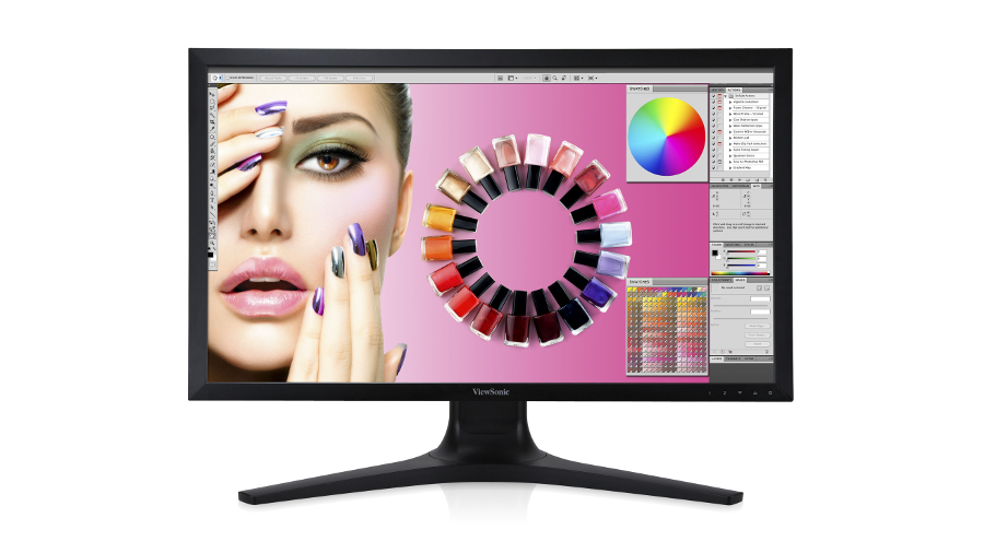
There's no sign of the more adventurous control methods used on the LG UltraWide UC3497 – the ViewSonic's settings are handled using a group of four touch-sensitive buttons in the bottom-right corner.
In theory that's fine, but in practice, the buttons are awkward. Their tool-tips just show arrows rather than anything more descriptive.

The menu isn't much cop, either. It's small and low-resolution, and it's a little sluggish to respond when compared to rivals. It's organised sensibly and it's not a huge problem to use – so it's better than the awkward Acer S277HK, but other monitors have smarter, slicker navigation options.
Performance
The ViewSonic's factory settings proved this panel's stonking colour accuracy. Its measured colour temperature of 6,444K is barely different from the 6,500K ideal figure, and the Delta E of 0.92 is fantastic – anything below 1 generally deserves a round of applause. No rival was able to match these figures. The ViewSonic's sRGB coverage level of 97.2% was good too – not hugely different from the claimed 100%.
Contrast and brightness was trickier. The initial brightness level of 402cd/m2 is hugely high, but it's just too extreme for any office. The black point of 0.38cd/m2 and contrast ratio of 1,058:1 are both good, but rival panels are more balanced and considered – the LG's lower brightness level of 232cd/m2 is still plenty, and its black point and contrast levels of 0.21 and 1,104:1 are much better.
Thankfully, this problem was easy to solve. We toned the ViewSonic's brightness down to 133cd/m2 – about right for an office – and the black point dipped to a deep 0.12, the contrast improved to 1,108:1, and the Delta E improved further to 0.79.

The initial brightness hinders image quality, but turning the backlight down to a more manageable level solves the problem – and that's what you'll be doing in an office anyway.
At factory settings, then, we've little to complain about; the ViewSonic is excellent in every department. The brilliant colour accuracy will be a boon to anyone working in design or photography, and the black point and contrast levels add depth to darker scenes and vibrancy to lighter tones.
Those impressive scores are maintained consistently, too. Only around 6% of the screen's brightness was lost at its top-most edge, with this increasing to about 8% at the bottom of the panel. That's not a drop you'll notice in daily use, and it's better than most rivals.
As ever, this screen comes with a multitude of different modes – and, as usual, they're a mixed bag. The best are the sRGB, EBU and NTSC modes, which maintain good performance while introducing tweaks for those who work in broadcasting and other specialist industries. The power-saving option is good, too – at its most dramatic setting it cuts the brightness down to 118cd/m2 and drops the electricity consumption from 38W to 20W.
Other options aren't as successful. The cool option barely changes the colour temperature and the warm setting drops it to an uncomfortable 4,779K. The text mode has similarly distracting warmth levels, and the game and movie modes match high brightness to poorer Delta E and colour temperature results. In every instance we'd prefer to use this screen's factory settings.
Mike has worked as a technology journalist for more than a decade and has written for most of the UK’s big technology titles alongside numerous global outlets. He loves PCs, laptops and any new hardware, and covers everything from the latest business trends to high-end gaming gear.
