TechRadar Verdict
A remote with a screen that enables you to control your iTunes Library from any room in the house
Pros
- +
Wireless iTunes control
LCD display
Simple installation
Cons
- -
Slow scrolling
Two navigation systems
LCD could be bigger
Why you can trust TechRadar
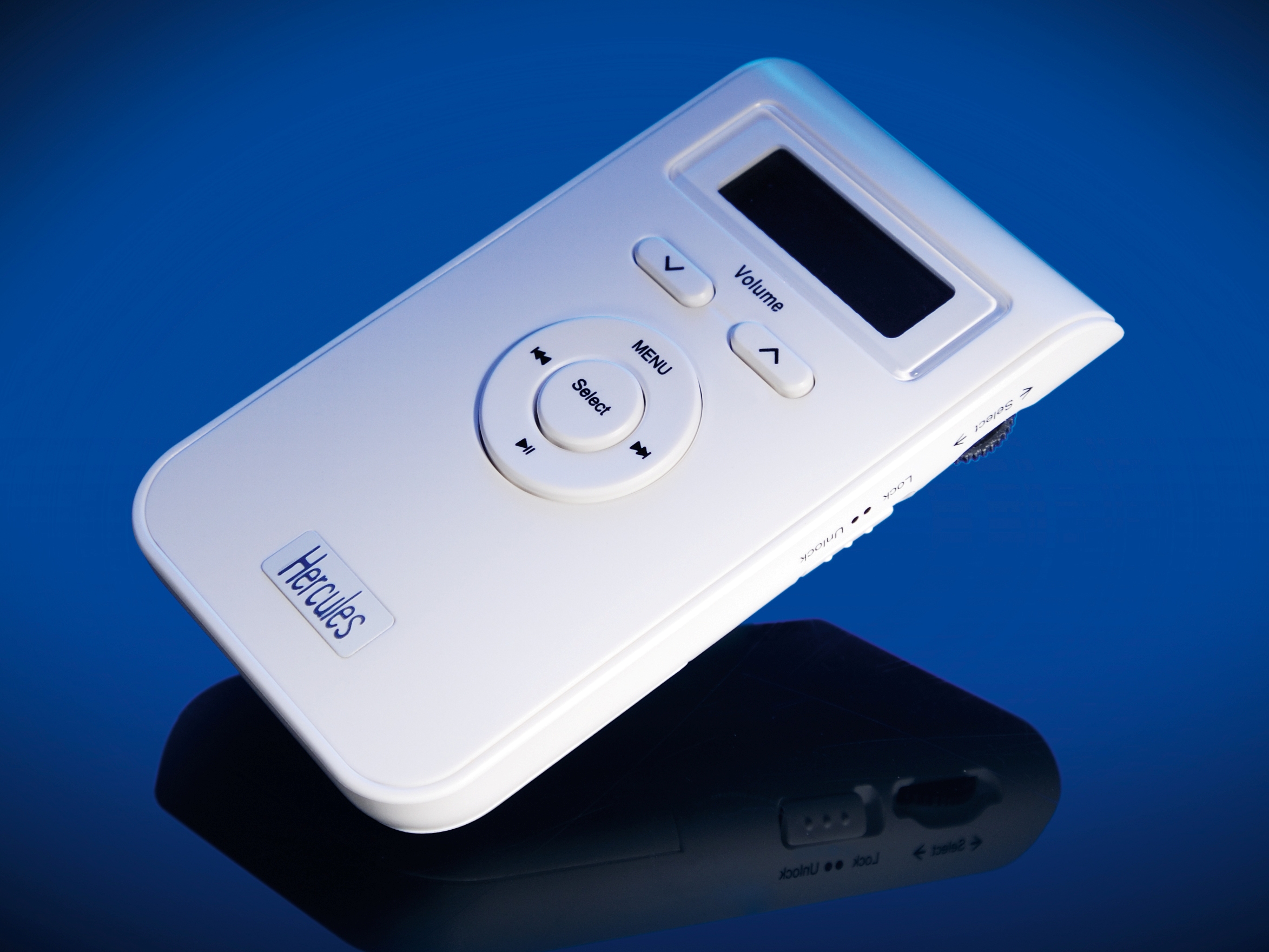
The Hercules Tunes Explorer Wireless creates its own wireless connection to your Mac using a USB receiver and acts as a remote control for iTunes. It differs from other remotes by having a small (but useful) screen, which enables you to browse your iTunes Library - in a similar way to an iPod's navigation interface.
Your first thought may be that the screen is perhaps an unnecessary luxury, given the fact that Apple ships its Front Row software and Apple Remote with every new model. However, if you're listening to music, you don't want to be running back to check which tune you're switching to, and this is particularly relevant if you've hooked up your stereo through an AirPort Express base station.
Using wireless rather than infrared technology, you can set up your Mac in any room and use this device to skip, search, pause and locate tracks or playlists that you want to play. Installation couldn't be easier: you just install the software, slot in the wireless USB key and hold the Select button for a couple of seconds.
iTunes will open and then there's a short delay as the Library list uploads to the device. Once this initial set-up process is complete, you can wander off to another room and still have complete control over finding and selecting your favourite music tracks.
The Hercules Tunes Explorer device itself is about the same size as a standard iPod, but it doesn't succeed in meeting the same high design standards as Apple offers. This is largely because the controls are a little odd. There are two different ways to tackle navigation, depending on what you want to do.
Scrolling dial
For locating your playlists, podcasts and other libraries, you need to use a small dial mounted on the right-hand side of the body, which is for scrolling through menus on the screen and selecting an option. In contrast, the main Volume, Play, Pause, Forward and Rewind buttons are mounted in traditional iPod style on the front of the unit.
This split in location seems quite logical and straightforward at first, until you realise that you need to switch between side and front navigation systems to return to the menus. It's not ideal, but then again it's not a major hassle, either.
The scrolling dial is a bit fiddly, too, requiring you to hold down the Menu button while you scroll. This, combined with having to skip between two kinds of navigation, does slow things down a little, but it doesn't stop them from working.
They're small issues, and placing them to one side, the Tunes Explorer is a handy addition to a wireless home, enabling you to control your tunes remotely and with ease. It's simple, and it works a treat with iTunes. Alistair Jennings
Tech.co.uk was the former name of TechRadar.com. Its staff were at the forefront of the digital publishing revolution, and spearheaded the move to bring consumer technology journalism to its natural home – online. Many of the current TechRadar staff started life a Tech.co.uk staff writer, covering everything from the emerging smartphone market to the evolving market of personal computers. Think of it as the building blocks of the TechRadar you love today.
