TechRadar Verdict
If you want an easy to use, one-remote solution for controlling all your home entertainment gadgets, this is definitely one to consider.
Pros
- +
Activity-based control
- +
Simple setup process
- +
Backlit touch-screen
Cons
- -
May not be as good as all your existing remotes
Why you can trust TechRadar
Most universal remote controls are based on the simple notion of replacing your existing remotes with one handset, and advanced users can set up macros - sequences of commands for several devices.
The Harmony series takes this as a starting point: tell it what devices you own and then tell it what you do with them. The remote is programmed with these activities, for instance, turning on your TV, sat receiver and home cinema amplifier when you select 'Watch TV', setting each to the correct inputs. If you stick with the Harmony, it will track the status of all your devices. The help button steps you through devices if the Harmony gets confused.
One key element in this is the use of a PC/Mac interface and USB connection to set up the remote. There's no need to look up and programme codes for each device; just tell the software what you have, and it does the rest. Control codes are stored in an online database of more than 175,000 devices that's constantly updated. Your remote's details are also stored online, so you can access them from any computer with internet access.
All of this has led to very high marks for the Harmony 785 in the past, but there were snags. For a start, the key layout lacked the intuitive elegance of Sky's remote, so I always use the 785 to turn things on, then the Sky+ handset to control my viewing.
User Friendly
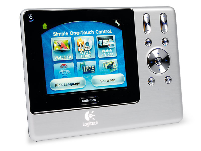
The Harmony 1000 goes a step beyond and drops traditional design in favour of a wide, flat aluminium shape and a 3.5in colour touch screen. The only buttons are for menu navigation, channel and volume control. It's set up in the same way, so each activity has several different touch screen options: e.g. the main Sky+ screen shows the transport controls, one sub-page shows number keys, another shows my TV's text and aspect ratio controls, and the colour and Guide/Info/Back Up buttons are common to all three screens. The transport controls are well laid out, with pause in a larger, central place, so you can quickly hit it while fast-forwarding through ads. It's more responsive than some of the 785's buttons.
You can have up to 15 component devices, including Logitech's own lighting controllers, and if your system is kept in a cabinet, there's even a separate wireless extender using radio instead of infrared.
At twice the price of the 785, this is a big investment, but if you have a complex home entertainment system it may be worth it. It's easy to use, and I can also say that Logitech' free helpline is effective.
The TechRadar hive mind. The Megazord. The Voltron. When our powers combine, we become 'TECHRADAR STAFF'. You'll usually see this author name when the entire team has collaborated on a project or an article, whether that's a run-down ranking of our favorite Marvel films, or a round-up of all the coolest things we've collectively seen at annual tech shows like CES and MWC. We are one.
