TechRadar Verdict
Nothing too earth-shattering, but some useful enhancements that will help beautify your slideshows even more
Pros
- +
Well-designed new themes
- +
Slightly improved interface
- +
New transitions and effects
- +
iPhone and iPod touch remote control
Cons
- -
Ony a few extra functions
- -
Some old functions removed
Why you can trust TechRadar
When most people buy iWork, what they're really after is Keynote. Anyone who's used PowerPoint knows there has to be something else out there that doesn't produce such ugly looking slides by default.
Keynote is that 'something', a presentation package that uses the Mac's graphics capabilities and Apple's design savvy to the full.
To a certain extent, Keynote '09 rests on the laurels of Keynote '08. It was already an excellent product and even the advent of PowerPoint 2008 wasn't enough to make Apple think it had serious competition and spur it on.
While Keynote is the best part of iWork, PowerPoint is the weakest link in Office 2008.
Changes
The experienced Keynote user won't notice too many changes at first: everything's just a little bit glossier, just a little bit more up-to-date than in Keynote 4.0. Some of the modal-sheet dialogs, such as the Theme Chooser, have been replaced, some of the default icons in the toolbar changed.
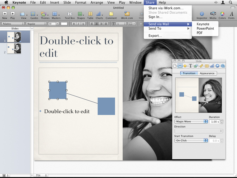
There are also two new menus: Play, to record and play slideshows; and Share, for working with iwork.com and exporting slideshows, and sending them by email in Keynote, PDF or PowerPoint format. And a couple of functions have disappeared: Web View and Flash Export.
The Theme Chooser at the beginning has been improved to allow you to resize the theme thumbnails to see fonts, colours and textures more clearly using a slider at the bottom of the Chooser. One drawback of this is that at top size, third-party Keynote themes look blurry. In addition, there are eight new themes.
Small improvements
If you look hard, you'll notice other little improvements as well, such as a couple of new chart types and object builds. But most of the effort hasn't gone into giving Keynote a wealth of new bells and whistles. So if you're were expecting some kind of layout automation like PowerPoint's Smart Art, think again.
Instead, most of the effort has gone into new kinds of animations. Magic Move is a transition that takes an object that's repeated over various slides and automatically changes its location, scale, opacity and/or rotation across consecutive slides. New text transitions – Anagram, Shimmer, Sparkle and Swing – morph text from one slide to the next.
There are also new object transitions – Object Push, Object Zoom, Perspective, Revolve – that animate objects off one slide while simultaneously animating objects onto the next slide with a choice of effects. A connector line object allows you to move objects around a slide and for its connections to other objects to remain intact.
For those who like 3D charts, these now include cylinder shapes, bevelled-edge pie charts, new textures and four new 3D build effects. There's also an advanced gradient fill that can handle multiple colours and radial fills.
Keynote Remote
The last feature actually comes as a separate download from Apple's app store, costing only 59p. The Keynote Remote application, although not as good as Stage Hand, lets you view slides and presenter notes, and control your presentation with your iPhone or iPod touch.
The slides and presenter notes are a big step up from most slideshow remote controls, but if you only want to go back and forth between slides, there are plenty of options already, including the Apple Remote Control. It also relies on there being a WiFi network that both your iPod/iPhone and your Mac can join.
While Keynote '09 isn't a must-have upgrade, there are enough improvements to be tempted by.
