TechRadar Verdict
Pros
- +
Multiple platforms with regular updates
- +
Classic menu and toolbar interface
- +
Optional sidebar
- +
Tool for using images in presentations
- +
Opens and saves Office files
Cons
- -
Improvements limited in scope
- -
Inconsistent in adding OpenOffice 4.0 features
- -
File format compatibility could be better
Why you can trust TechRadar
While the once popular OpenOffice has languished for the past couple of years, the LibreOffice suite that spun off in 2011 has been steadily improving – although with a combination of under-the-hood bug fixes, improved compatibility with Microsoft Office documents and incremental features rather than any really big developments.
LibreOffice 4.1 continues this trend, with useful new features but no major changes. So how does the open source suite, which was released in July, stack up?
Like OpenOffice, LibreOffice is free and includes the same programs: Writer, Calc, Impress for presentations, the Base database, Draw and the math formula editor. But if you're sending staff the download link it's worth knowing that clicking it also opens a web page that makes an unashamed request for donations to The Document Foundation.
Unlike the single installer for OpenOffice or Microsoft Office 2013, the download is in two separate files that have to be transferred in order if you want the built-in help. That makes it a slightly less polished installation process than for OpenOffice, but The Document Foundation has digitally signed the files so that, unlike with OpenOffice, it doesn't trigger security warnings on Windows and Mac OS.
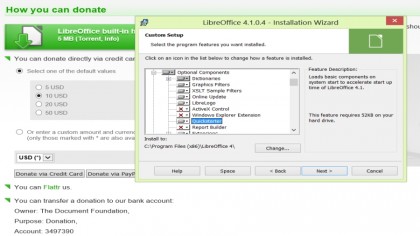
Another oddity is that the Windows release is a generic 'international build'. The English version installs not only the UK and US interface languages, but also the South African variant, plus French and Spanish dictionaries (you can save space by removing them during installation). You may also want to skip the QuickStart component which pre-loads much of LibreOffice as soon as Windows starts; even though it's installed by default, it's not enabled unless you choose to turn it on.
When you have installed LibreOffice 4.1 it looks very much like OpenOffice 4.0 with different icons. It also has broadly the same features, with some extras.
The interface is firmly in the menus and toolbars era, although the toolbar icons in LibreOffice are larger and slightly easier to make out than in OpenOffice. Many dialogue boxes are also larger with better layouts, except for the Find & Replace dialogue, which looks cramped compared to the OpenOffice Writer Find & Replace. However, if you just want to find a word you can use the search bar that opens at the bottom of your document in all the LibreOffice applications. Also, you can now choose whether you only want to find words with the right case (Office rather than office, for example).
LibreOffice 4.1 offers similar links to templates and extensions on its start page as OpenOffice 4.0, and they're equally confusing for inexperienced users. The site concentrates on telling you how to upload templates rather than how to find and download them, and the template section isn't as well designed as the OpenOffice site.
One of new features – the sidebar - may look familiar from older versions of Microsoft or OpenOffice 4.0. It reflects the fact that the Document Foundation that maintains LibreOffice is able to incorporate code from OpenOffice to fix bugs, remove unused features or improve performance.
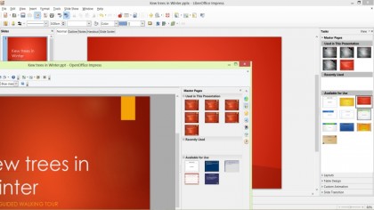
The sidebar is marked as an 'experimental' feature that you have to enable in the advanced options. If you don't, you'll still see a sidebar that works slightly differently from OpenOffice: instead of an obscure list of icons, it shows all the available panes in collapsible sections. In this mode the Gallery is a large pane at the top of the window and the Navigator, Styles and Formatting open as panes you can move around or dock at the side of the screen, where they sit on top of the sidebar rather than opening inside it. This leaves you with small panes that don't show very much.
If you enable the sidebar it becomes full height, as in OpenOffice, and you get the same obscure list of icons, but it still doesn't expose all the properties you can get by right-clicking on an object. The new clipart in the Gallery that comes from OpenOffice is probably more useful.
Similarly, LibreOffice takes advantage of the Office file format compatibility improvements to handle graphical bullets properly, on top of its own improvements such as importing more Excel functions.
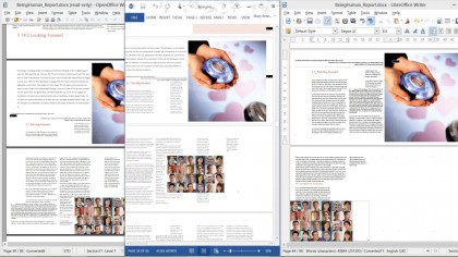
File compatibility still isn't the same in the two suites - or perfect, especially on longer, more complex Office documents with intricate page layouts. In one of our test documents, neither program got page layouts quite right, with images aligned incorrectly or placed on the wrong side of the page.
OpenOffice Writer did slightly better than LibreOffice Writer, but only LibreOffice Writer can open ink written with a stylus in Microsoft Word – although even then it doesn't render the ink as smooth lines.
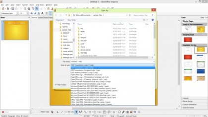
One big advantage over OpenOffice 4.0 is that when you save a file in LibreOffice 4.1 you can choose the XML Office formats as well as the older binary versions and the ODF formats. That makes it more likely that you'll find a format you can share with people.
If you're switching from very old versions of Office, LibreOffice 4.1 no longer exports to version 6 Word and Excel file formats. That's good for security as these older binary formats can carry viruses and do not support newer features. And if you have documents in elderly Mac word processing formats, like Microsoft Word for Mac 5.1, you can now open those in Writer, although LibreOffice no longer runs on PowerPC Macs.
In addition, if you're moving documents between machines or sharing with people who work elsewhere, you can now embed fonts in LibreOffice documents when you save them.
Performance is generally slightly better in LibreOffice 4.1 than OpenOffice 4.0, although both can be slow when opening or navigating through large documents.
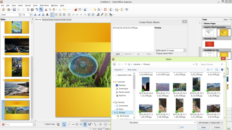
LibreOffice 4.1 also has some useful new features of its own. If you want to turn a set of images into an Impress presentation, you can insert them as a 'photo album'. You have to select images one at a time in the dialog box and you don't get a preview, but you can choose as many images as you want to include and have them placed one, two or four to a slide.
It's a shame Impress doesn't also get Writer's new option to rotate images by right-clicking. You can only choose to rotate 90 degrees clockwise or counter-clockwise, but it's much faster than having to right-click on the image in Impress and delve into a dialogue box.
Also, LibreOffice 4.1 has not matched all the improvements seen in OpenOffice 4.0. For example, it gets the new selection of colour gradients, but still has the old rather random colour palette rather than the more logical new layout. Inconsistencies like this are down to the different teams working on the two projects, and they're frustrating for the user.
Neither LibreOffice nor OpenOffice matches Microsoft Office 2013 for features, but if you don't want to pay for Office or you just can't get used to the ribbon interface (even though you can customise it now), which of the two free suites should you pick?
Verdict
LibreOffice 4.1 is, as the numbering suggests, a point release. Certainly it's not as big an update from LibreOffice 4.0 as OpenOffice 4.0 is from its predecessor. But then LibreOffice 4.0 had already improved on both OpenOffice and its own initial release, adding features such as better support for importing PivotTables and more master pages in Impress.
LibreOffice 4.1 also has several new features that put it ahead of OpenOffice 4.0, while lacking only minor features like the new colour palette. Add to that the commitment from The Document Foundation to six-monthly releases rather than the 'when it's ready' approach of Apache OpenOffice, and you're probably getting more from LibreOffice, now and in the future.
With the continuing issues with Office file compatibility, you'll probably need to keep both suites around in case you receive files that create problems. Given the slow pace of improvements in both suites, it's a shame the two projects can't set aside their philosophical differences and combine to give all their users all their features.
- Now compare with our reviews of OpenOffice 4.0 and Microsoft Office 2013.
Mary (Twitter, Google+, website) started her career at Future Publishing, saw the AOL meltdown first hand the first time around when she ran the AOL UK computing channel, and she's been a freelance tech writer for over a decade. She's used every version of Windows and Office released, and every smartphone too, but she's still looking for the perfect tablet. Yes, she really does have USB earrings.
