Why you can trust TechRadar
The uncluttered new interface works very well in PowerPoint; again the tools fade into the background so you can concentrate on your document.
Like all the Office 2013 applications, when you open PowerPoint you don't go straight to a blank document; instead you get what's almost a welcome page with a list of recent documents and thumbnails for templates and themes (and a blank document if that's what you want).
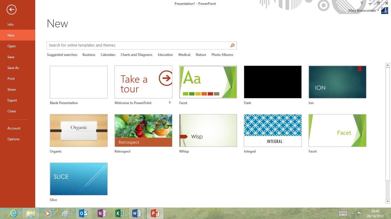
You can search the library of free templates on the Office site from here. The results come up in what Microsoft used to call the 'backstage' view – the full-screen File menu – and you can preview the layout, filter the results by various categories and keyboards, or even look at the templates for other Office applications.
Many of the templates have multiple colour themes to choose from; whichever one you pick to start with you can switch to the other variants later. As with the rest of Office 2013, a lot of the new templates are optimised for widescreen aspect ratios, like the 16:9 tablets Microsoft hopes you'll buy to use Windows 8.
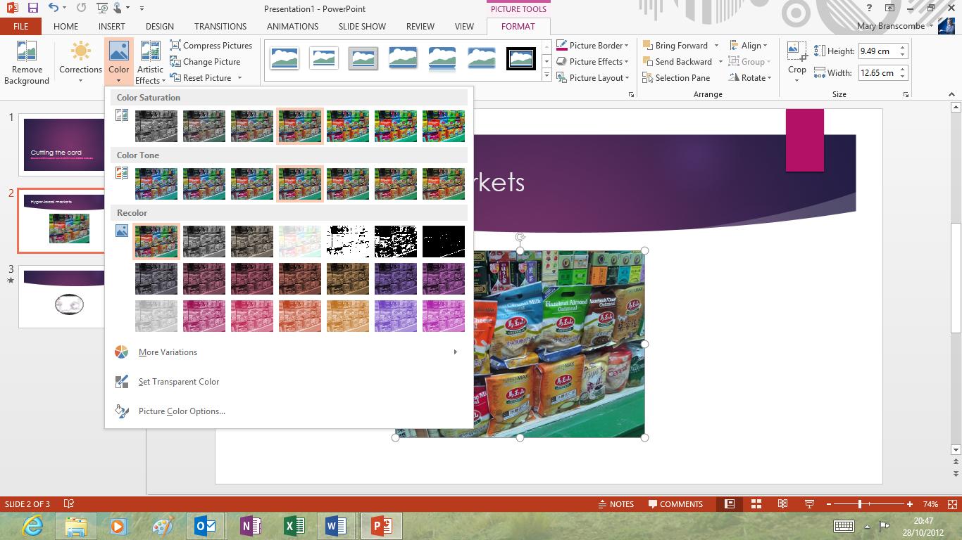
If you're going back to a document you've worked on, before both PowerPoint and Word make it faster to pick up where you left off; just click the pop-up window to jump to the last slide or page you were working on. This really works when you use Office (or SkyDrive and the Office Web Apps) on multiple PCs (or on your PC and your Surface) and you can start from where you were working on a different machine.
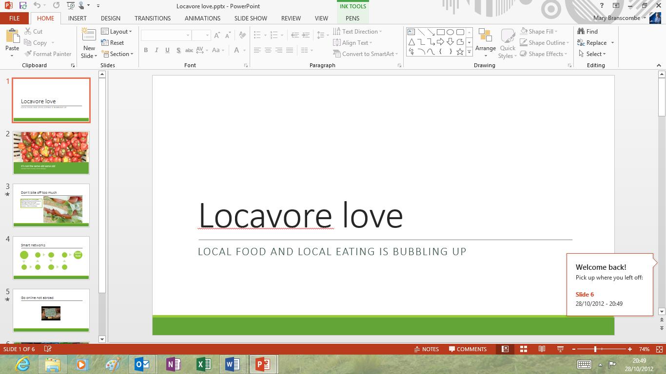
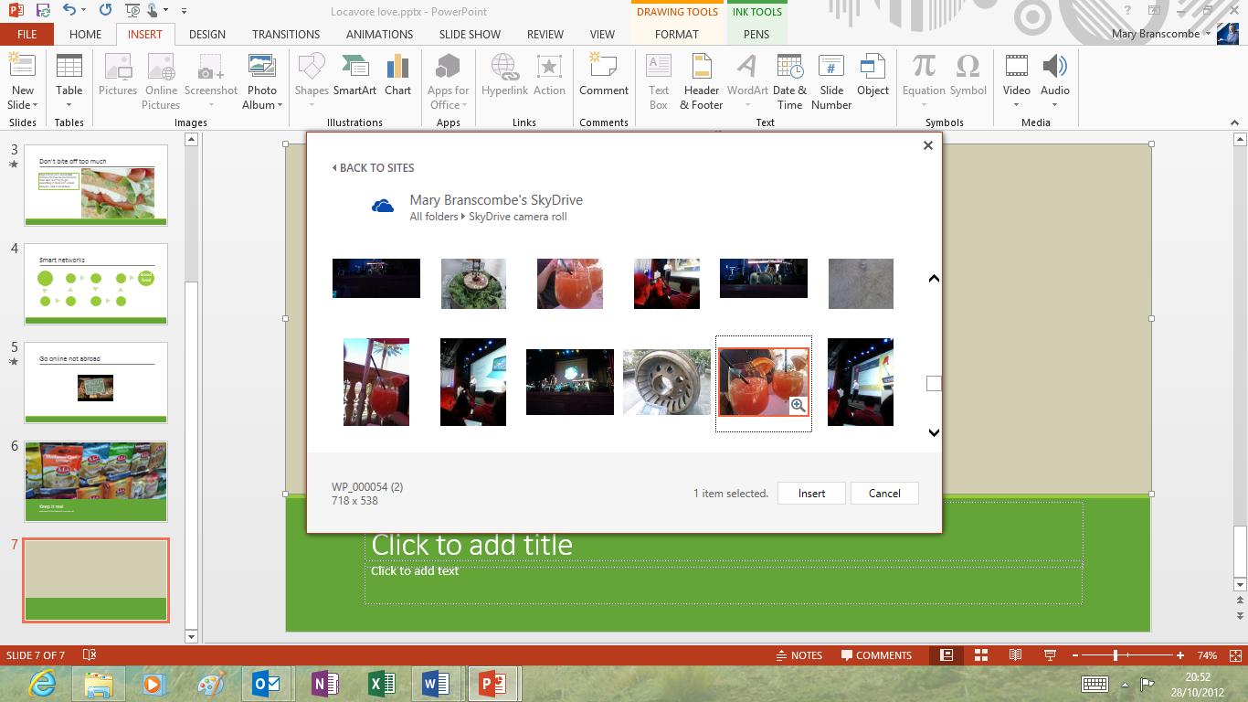
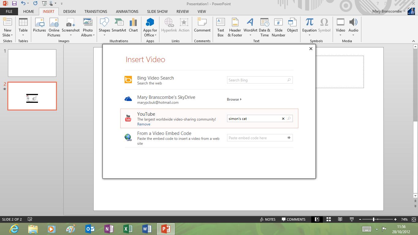
For layout, PowerPoint has the same tools as Word for inserting online images and videos. These are much easier to use than the PowerPoint 2010 video options; a single friendly dialogue enables you to search YouTube or Bing for videos, browse your SkyDrive and local system for video files or paste in the embed code from a video's web page.
It's as simple as searching, previewing and selecting the video you want and it's easy to add frames, effects and corrections – even to online videos.
This is one place where putting controls into task panes works much better than having an on-screen dialogue box, even on an older, low resolution PC. It's much easier to work with the border styles, layout effects, positioning options and video correction tools in a task pane than in a dialogue with 12 tabs that sits right on top of the video you're trying to edit.
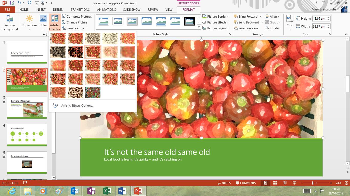
There are also 'quick' formatting tools that appear next to selected objects, much like the Quick Analysis tool in Excel, putting the tools you need the most next to the object you're working on.
For positioning, PowerPoint not only has the new green alignment guides that show when you have an object at the edge or centre of a slide. It also has extra 'smart guides' that show when you're aligned with other graphics, and when objects are evenly spaced across the page – these are in addition to the alignment guides on smart art shapes, which now show both horizontal and vertical alignment instead of just one at a time.
You can set your own guidelines on master slides; for example if you have an image in the background of certain slides that you want to line up with.
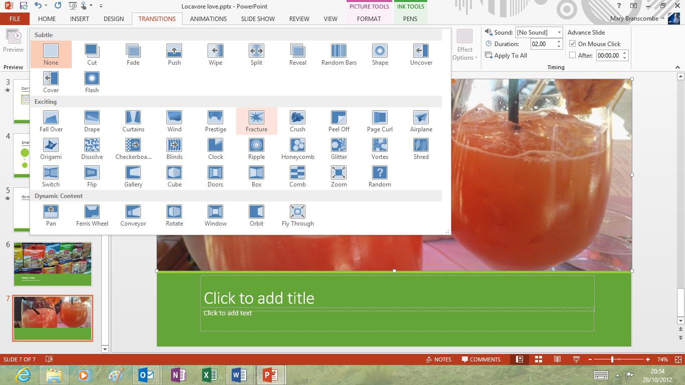
There are new transitions, like Crush, Fracture and Origami, for a total of 48 different ways to get from one slide to another. There are no new shapes to place in presentations, but you can combine two shapes into one – cutting one out of the other, breaking them up into pieces, turning the space between them into a shape or just gluing them together. That enables you to create new shapes far more precisely than trying to draw them out.
There's an eyedropper tool for selecting colours from existing objects (although only within the same presentation, not in other applications or even other PowerPoint windows).
PowerPoint gets Word's friendly comments as well, complete with replies; again, this makes good use of a widescreen resolution. That's especially useful now the PowerPoint web app lets you have two people working on a presentation, in the web app and the desktop version of PowerPoint at the same time.
When it's time to give your presentation, the presenter tools have some great new features, such as a thumbnail grid for reviewing all your slides that only you can see. You can pinch to zoom in and out of this, and it's handy for jumping ahead to a later slide without clicking through one at a time.
You can also zoom in on a specific slide in the presentation if the audience needs to see fine detail.
It's possible to see a preview of the next slide, and your presenter notes, which might stop people cramming pages of text onto a single slide and then reading it all out loud very slowly (we can only hope).
You also get a counter for elapsed time for the current slide and the whole presentation, plus the current time, and tools for drawing on the slides or showing a fake laser pointer to highlight things. And you don't have to have a second monitor or projector connected to see the presenter tools, so you can practice running through the presentation complete with your tools.
Again, these are designed to work well on a tablet so you could hold it in your hand and drive your presentation by touch instead of crouching over the keyboard.
Finally, Microsoft has given PowerPoint's media credentials a boost by adding the ability to play more video formats, and you can now set background audio to play for the duration of your entire presentation.
Mary (Twitter, Google+, website) started her career at Future Publishing, saw the AOL meltdown first hand the first time around when she ran the AOL UK computing channel, and she's been a freelance tech writer for over a decade. She's used every version of Windows and Office released, and every smartphone too, but she's still looking for the perfect tablet. Yes, she really does have USB earrings.
